Hi @Melinda Arendt
Thank you for posting your question in the Q&A Forum.
I’ve noticed that on Mac, charts sometimes default to blue even when a theme is set, due to hidden chart palettes that can override theme colors. I ran a brief test and put together some steps that may help ensure your client’s brand colors appear consistently when creating new charts.
Create a Custom Color Palette
This step ensures the client's exact brand shades are available in your system, especially when you don't have the HEX/RGB codes.
- Go to Design > Variants > Colors > Customize Colors.
- Open the Colors window, then the Color Palettes tab.
- Click the three dots (...) button next to the palette name dropdown.
- Select New to create a fresh, dedicated palette for your client's brand colors.
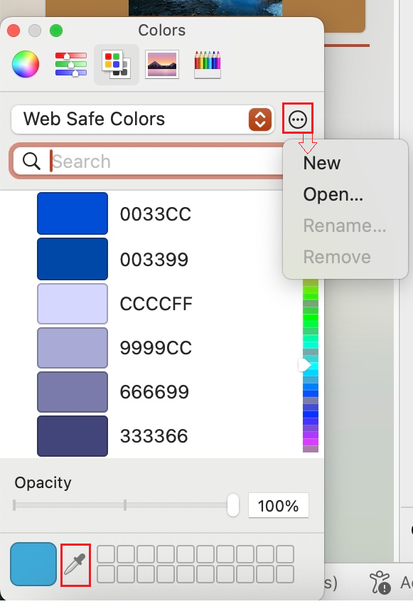
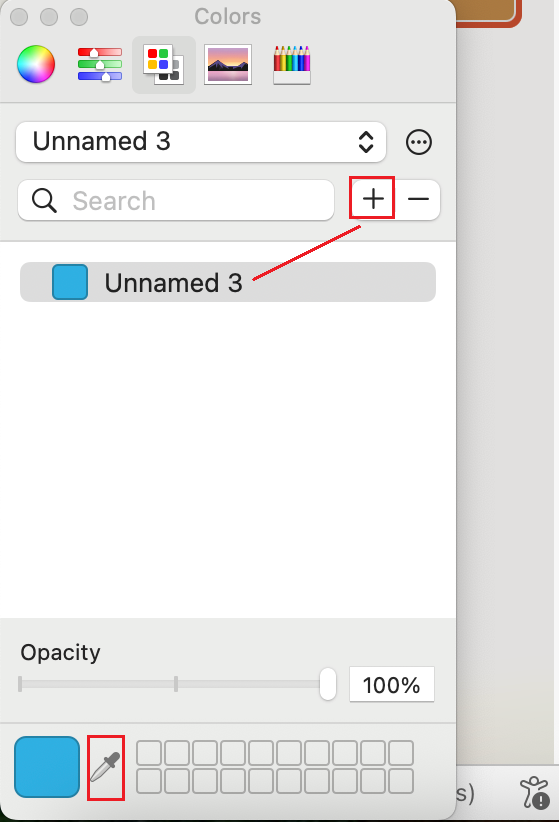
- Use the Color Picker (eyedropper) to sample exact colors from your client’s logo or image.
- Click the plus sign (+) button to save that color permanently into your new custom palette. Repeat for all needed brand colors.
Apply Colors to Theme & Format the Sample Chart
- Insert a new chart onto your slide.
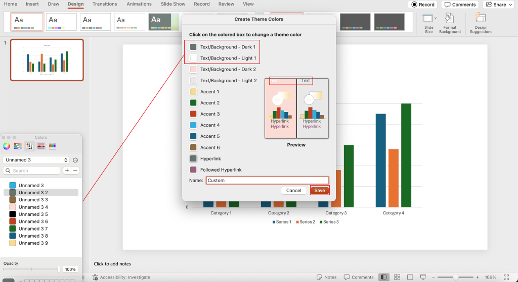
- Go to Design > Colors > Customize Colors...
- In the Create Theme Colors window, assign your client’s brand colors (the ones you created in your custom palette) to Accent 1–6, charts only pull colors from these six accents.
- Ensure Text/Background is set to your custom text color for clear chart titles.
- Name the set (e.g., Client Brand Colors) and click Save.
Save the Master Chart Template
- To make this reusable, go to Design > Save Current Theme and give it a clear name.
- Or select the chart, then Insert > Chart > Save as Template.
You can try testing these steps on your side to see if they work as expected.
If you encounter any issues, feel free to let me know and I’ll check and assist. I hope this assists you in applying your client’s brand colors consistently.
If the answer is helpful, please click "Accept Answer" and kindly upvote it. If you have extra questions about this answer, please click "Comment".
Note: Please follow the steps in our documentation to enable e-mail notifications if you want to receive the related email notification for this thread.
' cx='32' cy='32' r='32' /%3E%3Ctext x='50%25' y='55%25' dominant-baseline='middle' text-anchor='middle' fill='%23FFF' %3EMA%3C/text%3E%3C/svg%3E)

' cx='32' cy='32' r='32' /%3E%3Ctext x='50%25' y='55%25' dominant-baseline='middle' text-anchor='middle' fill='%23FFF' %3EA%3C/text%3E%3C/svg%3E)