إشعار
يتطلب الوصول إلى هذه الصفحة تخويلاً. يمكنك محاولة تسجيل الدخول أو تغيير الدلائل.
يتطلب الوصول إلى هذه الصفحة تخويلاً. يمكنك محاولة تغيير الدلائل.
A list is a data-driven configuration used to render a list of records without the need for a developer to surface the grid in the portal. Lists use Dataverse views to display records on the portal.
A list displays data in a grid view on Power Pages sites. Lists on pages are created from Dataverse table views. Dataverse table views can be created by using the Data workspace or from model-driven apps created in Power Apps. You can use them on pages or with forms to build a complete web application.
Tip
We've created a series of tutorials and videos for you to learn to use Power Pages and how create a view and add a list to a page. For more information, go to Tutorial: Add a list to a page.
To add a list:
Open the design studio to edit the content and components of the page.
Select the page you want to edit.
Select the section you want to add the list component to.
Hover over any editable canvas area, then select the List icon from the component panel.
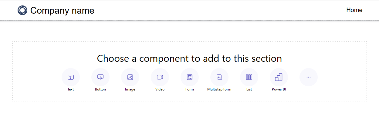
The Add a list window opens.
Choose to create a new list or choose an existing list, then select Ok.
Note
An updated version of lists, modern lists, is available in Power Pages. Switch the toggle on to use this version of lists on your site. More information: Modern list (preview)
- If you choose to create a new list, the Add a list window opens to the Set up tab.
- If you use an existing list, you're redirected to the list displayed in the Pages workspace. Choose the list and select the Edit list button just above the component to access configuration options in the Add a list window. You can also choose to change your list to a modern list when you edit your list.
Modern list (preview)
Modern list is the updated version of existing lists in Power Pages, providing visual interest and enhanced styling capabilities.
- Shimmer loading - Loading animation displays while data is retrieved from your data source.
- Infinite scroll - Content automatically loads at the bottom of the page when users scroll.
- Inline filters - Filters apply automatically to all columns in the list view.
- Styling options - Customize elements such as background and font color, add alternating row colors, and adjust margins and padding.
Tip
You can copy the style from one modern list to other modern lists in your site for a consistent design experience across pages.
Set up your list
You need to specify values for each of the Set up fields. Select the Set up menu tab in the Add a list window to complete this step.
| List | Description |
|---|---|
| Choose a table | The name of the table the views are loaded from. |
| Select Dataverse views | The view of the target table to be rendered. To modify the columns within the view, you need to access the Data workspace. |
| Name your list | The name of the list. |
Choose list actions
Specify what actions you'd like to take for your list by configuring list actions. The actions are listed under the Actions menu tab in the Add a list window. For each of these options, you can also change the default button label by editing the Display label field.
| Data | Description |
|---|---|
| Create a new record | Allows the user to create a new record. You need to select the target webpage, form, or URL that contains the new record. |
| Download list contents | Allows the user to download list contents into an *.xlsx file. |
| View details | Allows the user to view details. You need to select the webpage, form, or URL that contains the details. |
| Edit record | Allows the user to edit the record. You need to select the webpage, form, or URL that contains the record details to edit. |
| Delete record | Allows the user to delete the record. |
Specify more options
You might find that you want to customize your list options even further. Visit the More options menu tab from the Add a list window to configure more options for your list.
| Settings | Description |
|---|---|
| Number of records per page | Determines how many records are displayed per page. If the table contains more records, navigation controls appear for the user to view the next or previous set of records. |
| Enable search in list | Turns on the search feature for the list. Add a placeholder text for the search bar |
Note
You'll need to enable table permissions to ensure that users will be able to view the data on the lists.
You can also specify more options using the Portal Management app.
Duplicate a list
From the Pages workspace inside design studio, you can select the ellipsis (...) on the list component to duplicate a list, move it up or down within the section, or delete it.
List filters
Makers can add list filters to their Power Pages site from the design studio.
Filter types
All types of metadata filters supported in Portal Management app are configurable within Power Pages studio and each one has a simplified name, which matches its visualization. Makers can also edit/delete the filters when working with list component inside the design studio.
| Filter Visualization | Description |
|---|---|
| Text | Filters the list by using a text box to search for matching text in a selected attribute of the given table. |
| Checkbox, Dropdown, and Radio Button | Makers can choose between checkboxes, dropdowns, and radio buttons as visualizations for their filter type. More options to configure the filter appear once makers pick the column. These options vary based on the column's data type. |
| Custom | Filters the list by using a FetchXML filter condition. When a maker selects custom, a text box appears. Makers enter their XML statement in this field. |
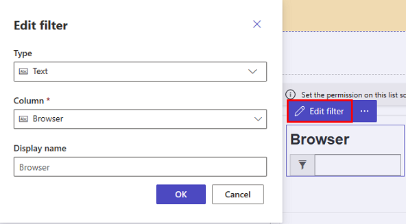
Add a list filter
To add a list filter, select the list component you previously added and configured.
choose the Add filter menu item from the toolbar.
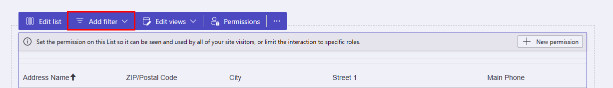
A pop-up window displays in the Pages workspace with list filter options.
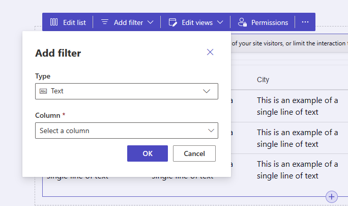
Select the type of filter you'd like to use from the drop-down selector under the Type label.
Choose the column you'd like to filter from the drop-down selector under the Column label.
Note
The studio will display the different options for makers to filter their data based on the filter type and column they choose.
Select the OK button to save your selections.
One the filter is applied, you can edit the filter configuration by selecting the Edit filter button in the design studio.
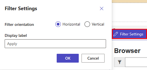
Filter settings
You can edit filter settings by selecting the filter settings option on the component in design studio.