Customize visualization titles, backgrounds, labels, and legends
APPLIES TO:
Power BI Desktop
Power BI service
In this tutorial, you learn a few different ways to customize your visualizations. There are so many options for customizing your visualizations, that the best way to learn about them is by exploring the Format pane (select the paint roller icon). To get you started, this article shows you how to customize a visualization title, legend, background, label, layer, and add a theme.
You can't customize all visualizations. See the complete list of visualizations for details.
Prerequisites
The Power BI service or Power BI Desktop
Retail Analysis Sample report
Note
Sharing your report with a Power BI colleague requires that you both have individual Power BI Pro licenses or that the report is saved in Premium capacity. See sharing reports.
Customize visualization titles in reports
To follow along, sign into Power BI Desktop and open the Retail Analysis Sample report. To follow along in the Power BI service, open the report and select Edit.
Note
When you pin a visualization to a dashboard, it becomes a dashboard tile. You can also customize the tiles themselves with new titles and subtitles, hyperlinks, and resizing.
Go to the New Stores page of the Retail Analysis Sample report.
Select the Open Store Count by Open Month and Chain clustered column chart.
In the Visualizations pane, select the paint brush icon, then General to reveal the format options.
Select Title to expand that section.
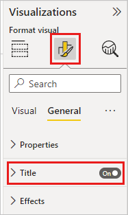
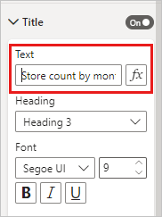
To change the title, enter Store count by month opened in the Text field.
Change Text color to white and Background color to blue.
a. Select the drop-down and choose a color from Theme colors, Recent colors, or More colors.
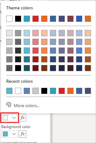
b. Select the drop-down to close the color window.
Increase the text size to 16 pt.
The last customization you'll make to the chart title is to align it in the center of the visualization.
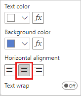
At this point in the tutorial, your clustered column chart title will look something like this:

Save the changes you've made and move to the next section.
If you ever need to revert all of the changes, select Reset to default, at the bottom of the Title customization pane.

Customize visualization backgrounds
With the same clustered column chart selected, expand the Effects > Background options.
Move the Background slider to On.
Select the drop-down and choose a grey color.
Change Transparency to 74%.
At this point in the tutorial, your clustered column chart background will look something like this:

Save the changes you've made and move to the next section.
If you ever need to revert all of the changes, select Reset to default, at the bottom of the Background customization pane.
Customize visualization legends
Open the Overview report page and select the Total Sales Variance by FiscalMonth and District Manager chart.
In the Visualization tab, select the paint brush icon to open the Format pane.
Expand the Legend options. The toggles for Legend and Title are both On by default.
Use the Position field to move the legend to the left side of the visualization.
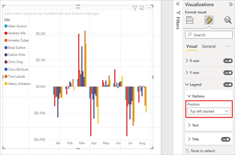
Enter Manager in the Title text field.
Change Color to black.
Save the changes you've made and move to the next section.
If you ever need to revert all of the changes, select Reset to default, at the bottom of the Legend customization pane.
Customize total labels for stacked visuals
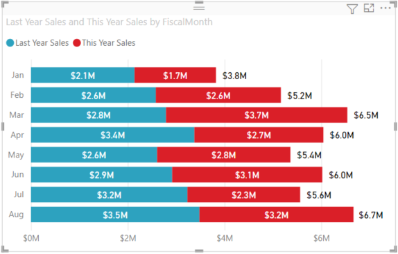
Stacked visuals can display data labels and total labels. On a stacked column chart, data labels identify the value for each portion of a column. Total labels display the total value for the entire aggregated column.
Depending on the visual and its size, data labels may not display. If your data labels don't display, try making the visual larger or viewing it in full screen mode.
In the following video, watch Rien add total labels to a stacked chart, and then follow the steps below to try it out yourself.
Note
This video might use earlier versions of Power BI Desktop or the Power BI service.
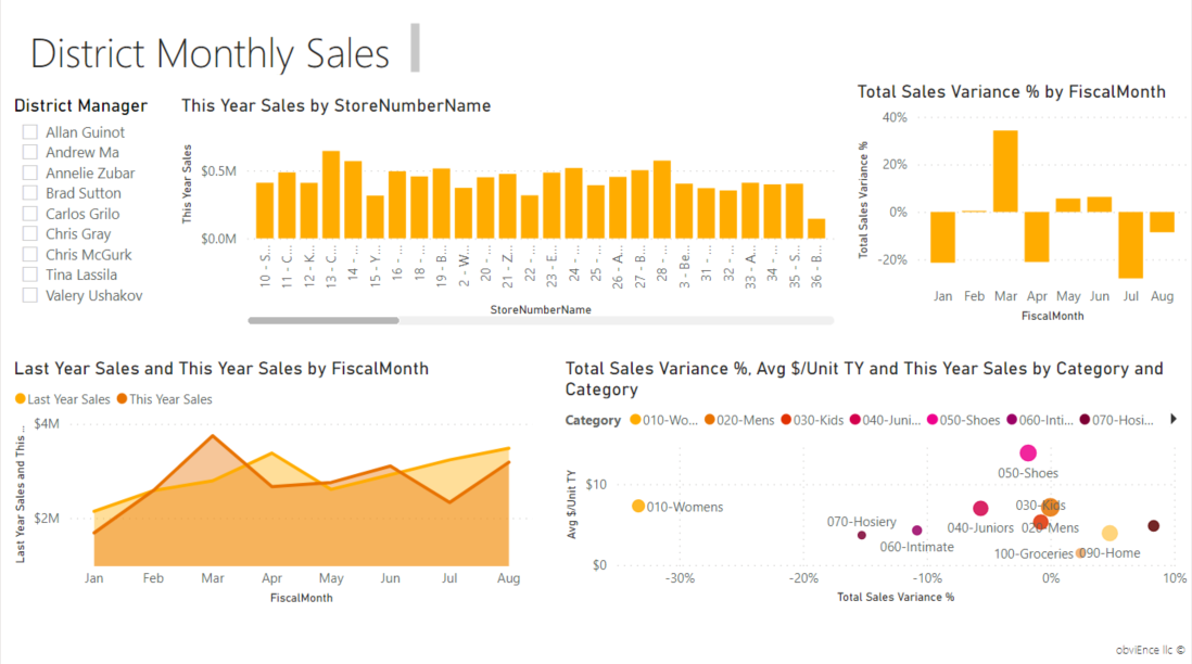
Open the District Monthly Sales report page and select the Last Year Sales and This Year Sales by FiscalMonth area chart.
In the Visualization tab, select
 to convert this area chart to a stacked bar chart.
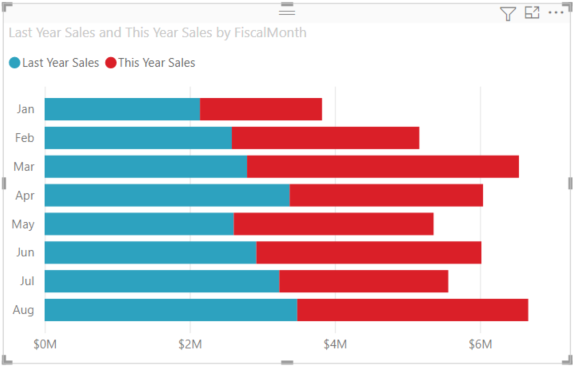
In the Visualization tab, select the paint roller icon to open the Format pane.
Move the Data labels slider to On.
Move the Total labels slider to On.

Optionally, format the total labels. In this example, we've changed color to black, increased font size, and opted to display the values as Millions with one decimal place.
Customize layer order
Change the layering order of visuals and shapes in your reports. Layer order determines which objects will come to the front when selected. Whenever you select an object on the report canvas, it becomes active and moves to the top layer. For visuals, this makes it easier to interact with the selected visual. For shapes and backgrounds, however, you may want to secure them to the bottom layer, so that you can't accidentally select them and cover or obscure your report visuals.
Layering controls are available in the Power BI service, Power BI Desktop, mobile, and Report server. This article shows you how to change layer order behavior in the Power BI Service.
In this video, watch Rien change layer order behavior, and then follow the steps below to try it out yourself.
Note
This video might use earlier versions of Power BI Desktop or the Power BI service.
Add a new report page by selecting the yellow plus sign.
Add a shape to the canvas. Here, we've added a green rectangle.
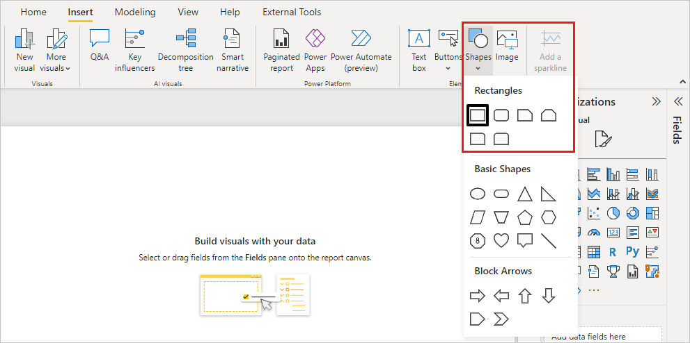
Copy-paste a visual from another page in the report.
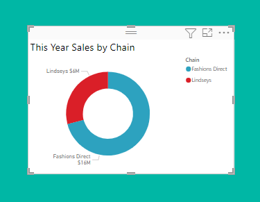
Now that you have two layers, try selecting the pie chart and then the background.
- When you select the pie chart, Power BI makes that object active and displays its header menu.
- When you select the rectangle, Power BI makes that object active and brings it to the front where it obscures the pie chart.
You can change this default behavior.
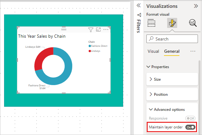
Select the pie chart and open the Formatting pane. Select General, then Properties > Advanced options and switch On the Maintain layer order toggle.
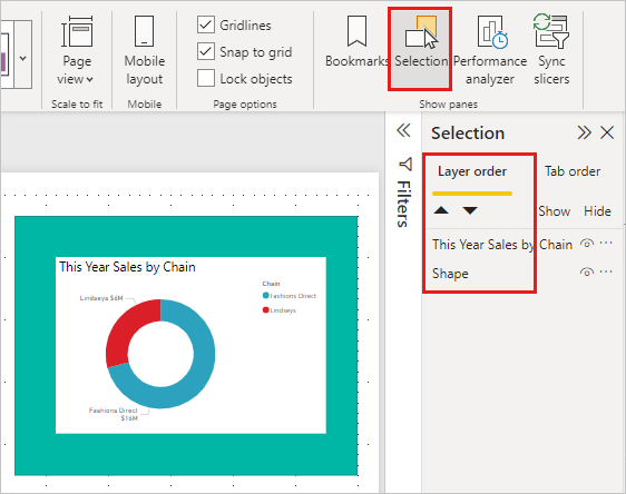
Open the View menu and Selection. The Layer order tab in the Selection pane will let you view and set the layer order.
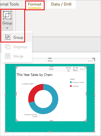
Select the pie chart, hold down the CTRL key, and select the rectangle. Then, select Format > Group > Group. This groups both items together.
Expand the Selection pane. The Layer order should look like this:
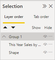
Save the report changes and switch to Reading view.
Now that the visual and the shape are grouped, you can select the shape and it remains in the background. If you leave the Selection pane open, you can see which layer has focus. Notice, that by selecting the canvas in between selecting layers, it activates the Group layer and maintains the layer order. For more information on this behavior, see Selecting visuals within a group.
Customize colors using a theme
You can apply design changes to your entire report by using report themes. For example, change the color scheme to use corporate colors, change icon sets, or apply new default visual formatting. When you apply a report theme, all visuals in your report use the colors and formatting from your selected theme.
To apply a theme to your report, select the View menu and open the Themes dropdown. Choose a theme. The report below uses the Solar theme.
Visualization types that you can customize
Here is a list of the customization options that are available for each visualization type:
| Visualization | Title | Background | Legend | Total labels |
|---|---|---|---|---|
| Area | Yes | Yes | Yes | Yes |
| Bar | Yes | Yes | Yes | Yes |
| Card | Yes | Yes | n/a | n/a |
| Multi-row Card | Yes | Yes | n/a | n/a |
| Column | Yes | Yes | Yes | Yes |
| Combo | Yes | Yes | Yes | Yes |
| Donut | Yes | Yes | Yes | n/a |
| Filled map | Yes | Yes | Yes | n/a |
| Funnel | Yes | Yes | n/a | n/a |
| Gauge | Yes | Yes | n/a | n/a |
| Key Influencer | Yes | Yes | n/a | n/a |
| KPI | Yes | Yes | n/a | n/a |
| Line | Yes | Yes | Yes | n/a |
| Map | Yes | Yes | Yes | n/a |
| Map: Azure Map | Yes | Yes | Yes | n/a |
| Matrix | Yes | Yes | n/a | Yes |
| Pie | Yes | Yes | Yes | n/a |
| Q&A | Yes | Yes | n/a | n/a |
| Scatter | Yes | Yes | Yes | n/a |
| Shape | Yes | Yes | Yes | n/a |
| Slicer | Yes | Yes | n/a | n/a |
| Table | Yes | Yes | n/a | Yes |
| Textbox | No | Yes | n/a | n/a |
| Treemap | Yes | Yes | Yes | n/a |
| Waterfall | Yes | Yes | Yes | n/a |
Related content
More questions? Try the Power BI Community