Emulate mobile devices (Device Emulation)
Use the Device Emulation tool, sometimes called Device Mode, to approximate how your page looks and behaves on a mobile device.
Detailed contents:
- Limitations
- Simulate a mobile viewport
- Throttle the network and CPU
- Emulate sensors
- Set the user agent string
- Set user-agent client hints
Limitations
Device Emulation is a first-order approximation of the look and feel of your page on a mobile device. Device Emulation doesn't actually run your code on a mobile device. Instead, you simulate the mobile user experience from your laptop or desktop.
Some aspects of mobile devices aren't emulated in DevTools. For example, the architecture of mobile CPUs is different than the architecture of laptop or desktop CPUs. For the most robust testing, run your page on a mobile device.
Use Remote Debugging to interact with the code of a page from your machine while your page actually runs on a mobile device. You can view, change, debug, profile, or all four while you interact with the code. Your machine can be a notebook or desktop computer.
Simulate a mobile viewport
To open the UI that enables you to simulate a mobile viewport:
Open DevTools. For example, right-click in a webpage and then select Inspect.
In the Activity Bar, click the Toggle device emulation (
 ) button. Or, in DevTools, select Customize and control DevTools (
...) > Device Emulation: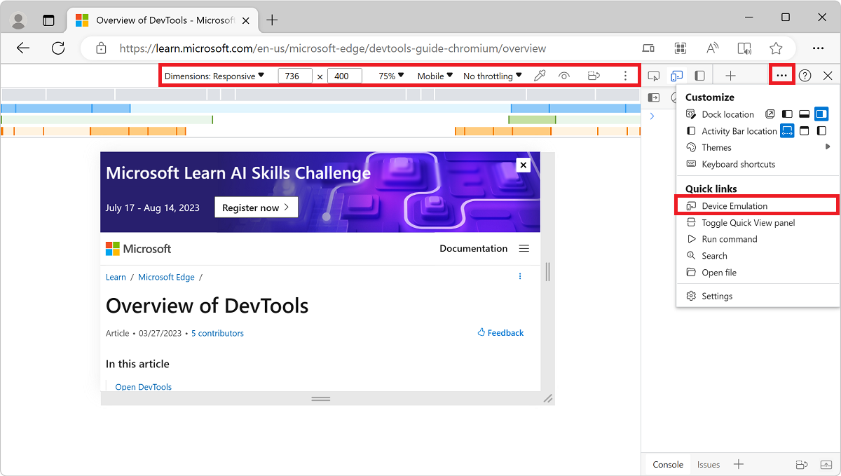
The webpage is rendered within the Device Emulation pane. The Device Toolbar opens in Responsive Viewport Mode.
Responsive Viewport Mode
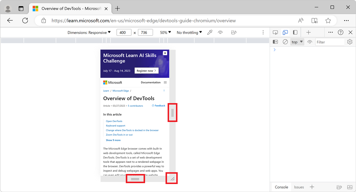
To quickly test the look and feel of your page across multiple screen sizes, drag the handles to resize the viewport to your required dimensions. You can enter any numeric values in the width and height boxes. If you select a size larger than available in the browser window, the viewport will be automatically scaled to accommodate for the larger viewport.
In the following example, the viewport width is set to 400 and the height is set to 736:
If you need more space on your screen, you can change where DevTools is docked in the browser window. See Change DevTools placement (Undock, Dock to bottom, Dock to left).
Show media queries
If you have defined media queries on your page, jump to the viewport dimensions where those media queries take effect by showing media query breakpoints above your viewport. Select More options ( ) > Show media queries.
A CSS media query defines a breakpoint, which is a browser viewport width. A webpage can define a responsive layout for each breakpoint (viewport width) that the webpage's CSS defines.
Media queries can be used to change the layout of a page when the viewport of the device that the webpage is viewed on is over or under a certain width. Media queries allow you to write code to use for page layout either when the screen width is under a certain size, or over a certain size, or within a mininum and maximum size.
To show media query breakpoints above the viewport:
Click the More options (
) button, and then select Show media queries: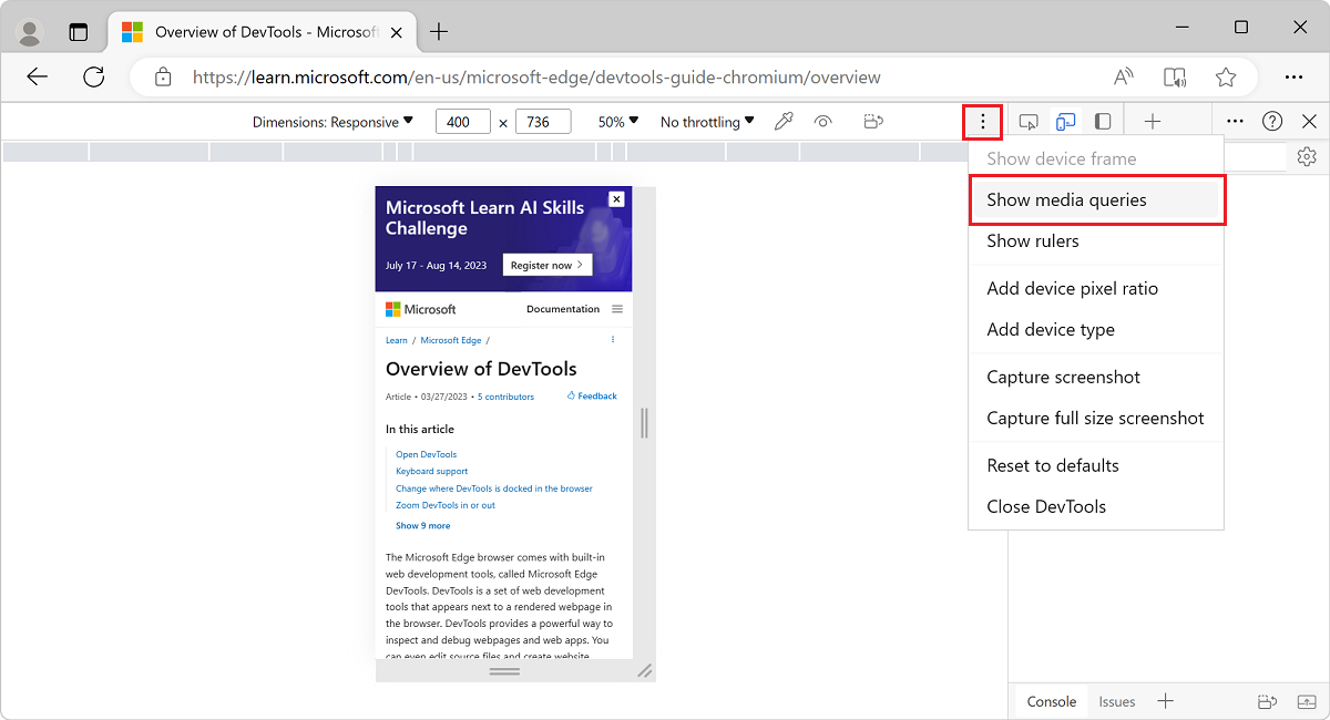
If
max-widthormin-widthbreakpoints are defined by the webpage, DevTools displays additional bars above the viewport:- The blue bar corresponds to
max-widthmedia queries. - The green bar corresponds to media queries that use both
min-widthandmax-width. - The orange bar corresponds to
min-widthmedia queries.
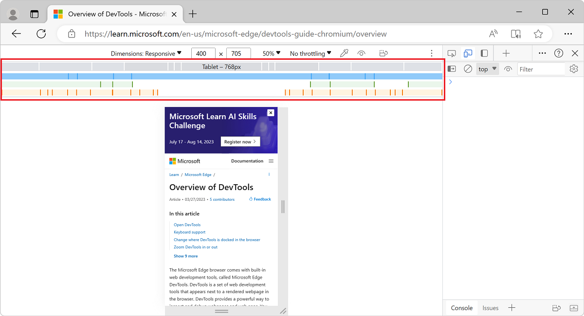
- The blue bar corresponds to
To change the width of the viewport so that the media query for that breakpoint is used, click a breakpoint rectangle in the breakpoints bar. The viewport's width changes so that the breakpoint gets triggered, and the webpage layout is updated.
To go to the corresponding
@mediadeclaration in the code for the webpage, right-click between breakpoint vertical bars, and then select Reveal in source code. DevTools opens the Sources tool and displays the corresponding@medialine in the Editor.
See also:
- Debug media queries in Get started viewing and changing CSS.
Set device pixel ratio
Device pixel ratio (DPR) is the ratio between physical pixels on the hardware screen and logical (CSS) pixels. In other words, DPR tells the browser how many screen pixels to use to draw a CSS pixel. Microsoft Edge uses the DPR value when drawing on HiDPI (High Dots Per Inch) displays.
To set a device pixel ratio:
Select More options (
) > Add device pixel ratio: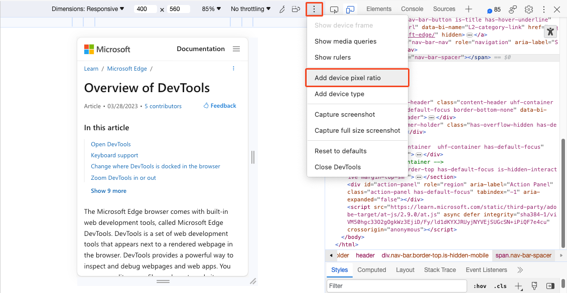
A DPR dropdown list is added at the top of the viewport.
In the DPR dropdown list, select a DPR value (1, 2, or 3). The default value is 2.
To remove the device pixel ratio:
- Select More options () > Remove device pixel ratio.
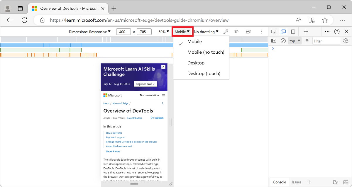
Set the device type
To simulate a mobile device or desktop device, use the Device Type list:
If the Device Type list isn't displayed, select More options > Add device type.
The Device Type list contains the following device types:
| Device type | Rendering method | Cursor icon | Events triggered |
|---|---|---|---|
| Mobile | Mobile | Circle | touch |
| Mobile (no touch) | Mobile | Normal | click |
| Desktop | Desktop | Normal | click |
| Desktop (touch) | Desktop | Circle | touch |
Key for columns in the above table:
| Column | Description |
|---|---|
| Rendering method | Whether Microsoft Edge renders the page as a mobile or desktop viewport. |
| Cursor icon | What type of cursor is displayed when you hover on the page. |
| Events triggered | Whether the page triggers touch or click events when you interact with the page. |
Mobile Device Viewport Mode
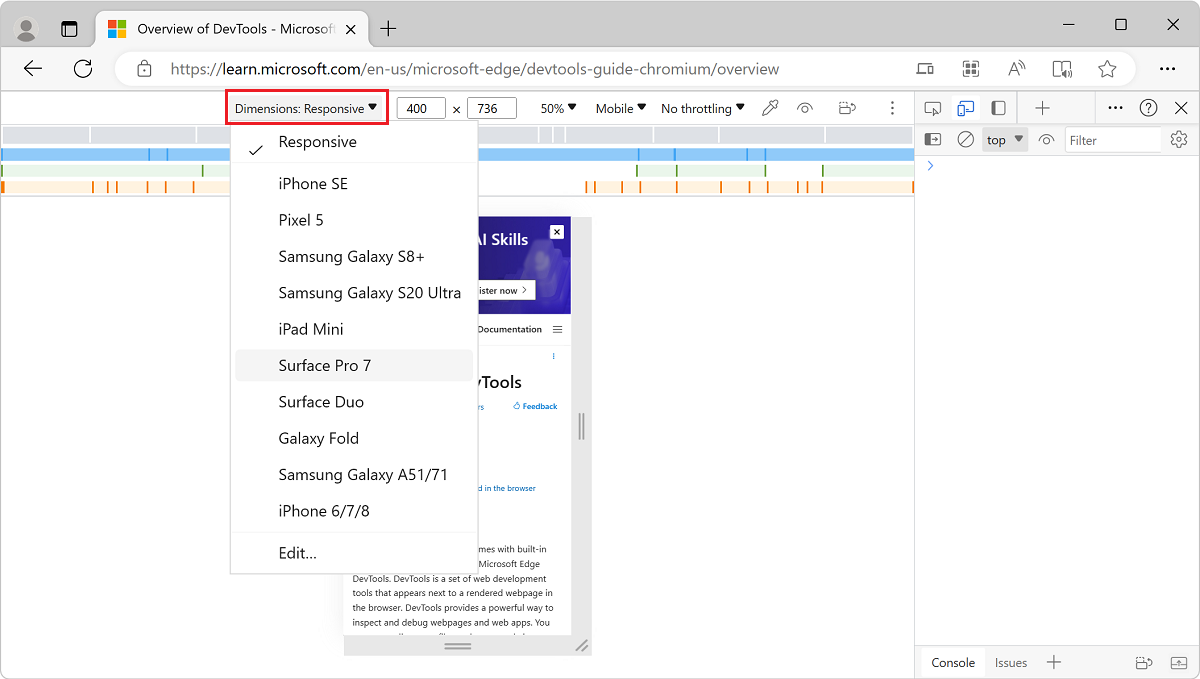
To simulate the dimensions of a specific mobile device, select the device from the Device list:
Rotate the viewport to landscape orientation
Test your webpage in landscape orientation.
To rotate the viewport to landscape orientation, select Rotate (
 ):
):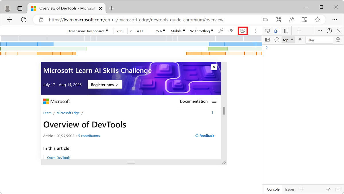
The Rotate button disappears if your Device Toolbar is narrow.
See also Set orientation, below.
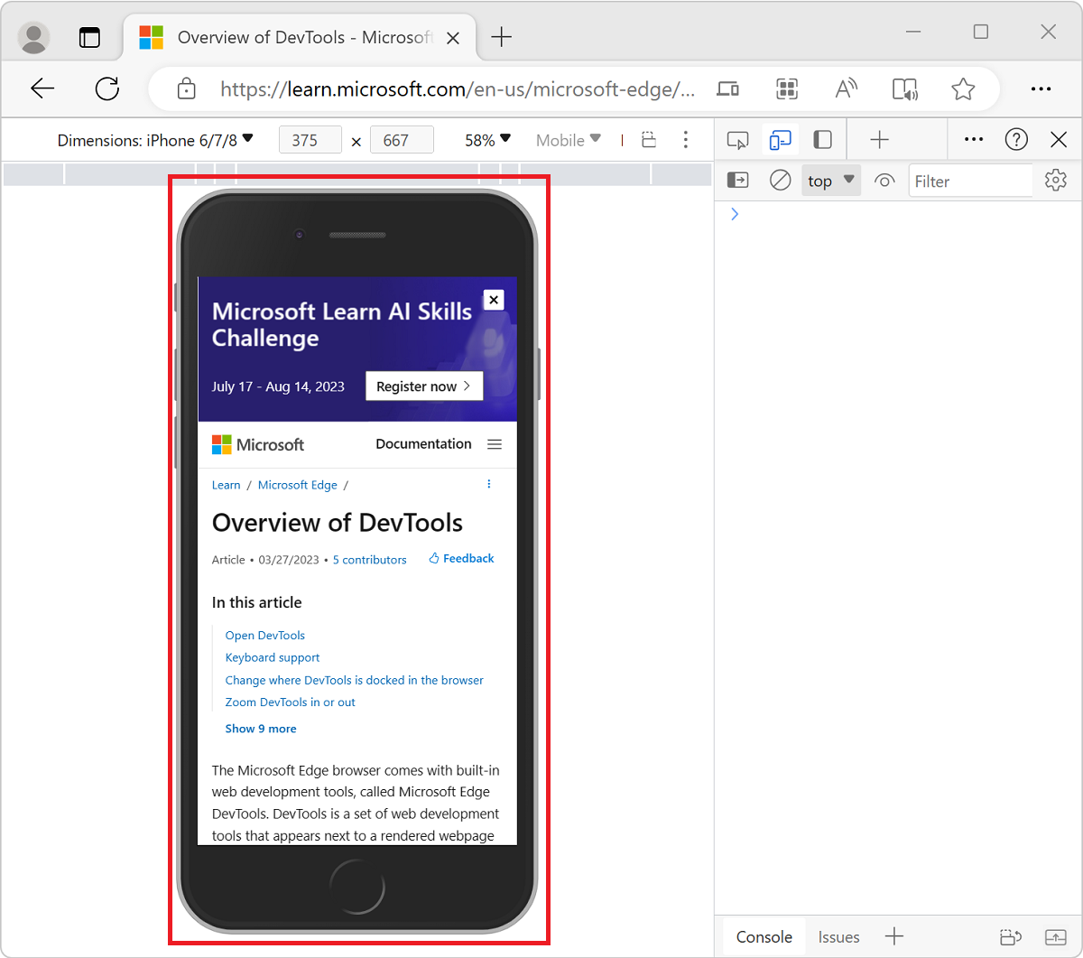
Show device frame
To simulate the dimensions of a specific mobile device, click More options (), and then select Show device frame to show the physical device frame around the viewport:
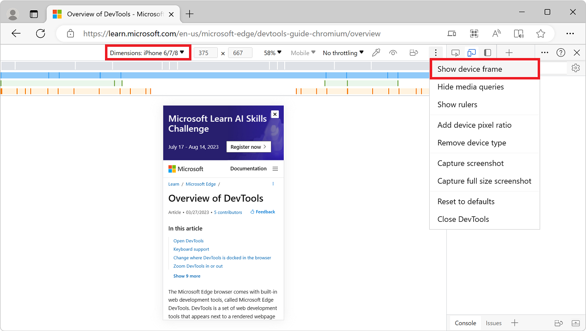
If a device frame isn't shown for a particular device, it means that DevTools doesn't have art for that device.
The device frame for the iPhone 6/7/8:
Add a custom mobile device
If the mobile device option that you need isn't included on the default list, you can add a custom device.
To add a custom device:
In DevTools, click the Toggle device emulation (
) button to turn on device emulation.In the device dropdown list on the left, select the Edit menuitem:
Select the Device list > Edit:
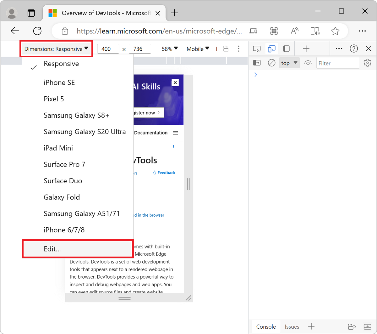
The DevTools Settings > Devices (Emulated Devices) page opens.
Click the Add custom device button. The Emulated Devices page in settings adds a Device section at the top:
The device pixel ratio, user agent string, and device type fields are optional. The device type defaults to Mobile:
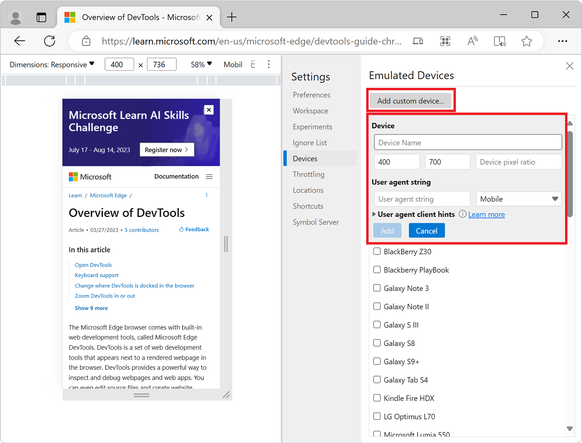
In the Device section, in the text boxes, enter a device name, screen width, and screen height for the custom device.
Optionally, fill in the following fields:
Device pixel ratio. See Set device pixel ratio, above; and Window: devicePixelRatio property, at MDN.
User agent string. See Set the user agent string, below; and User agent, at MDN.
User agent type (device type). See Set the device type, above. Defaults to Mobile.
Click the Add button. The new device is now available in the device dropdown list in the upper left of the device emulator.
To remove a custom device:
- In DevTools > Settings > Devices (Emulated Devices), hover over the custom device name, and then click the trashcan icon.
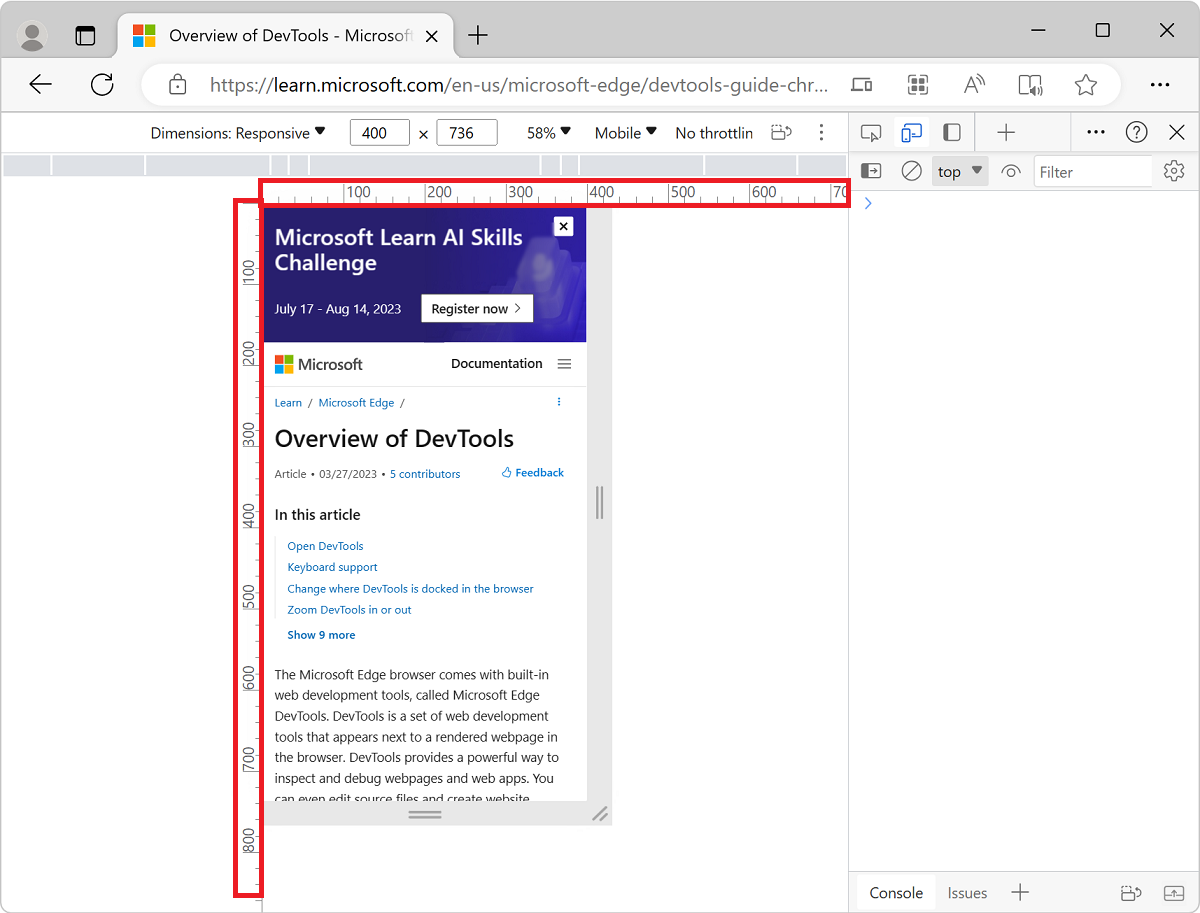
Show rulers
If you need to measure screen dimensions, you can use rulers to measure the screen size in pixels.
To display rulers above and to the left of your viewport:
Select More options (
) > Show rulers: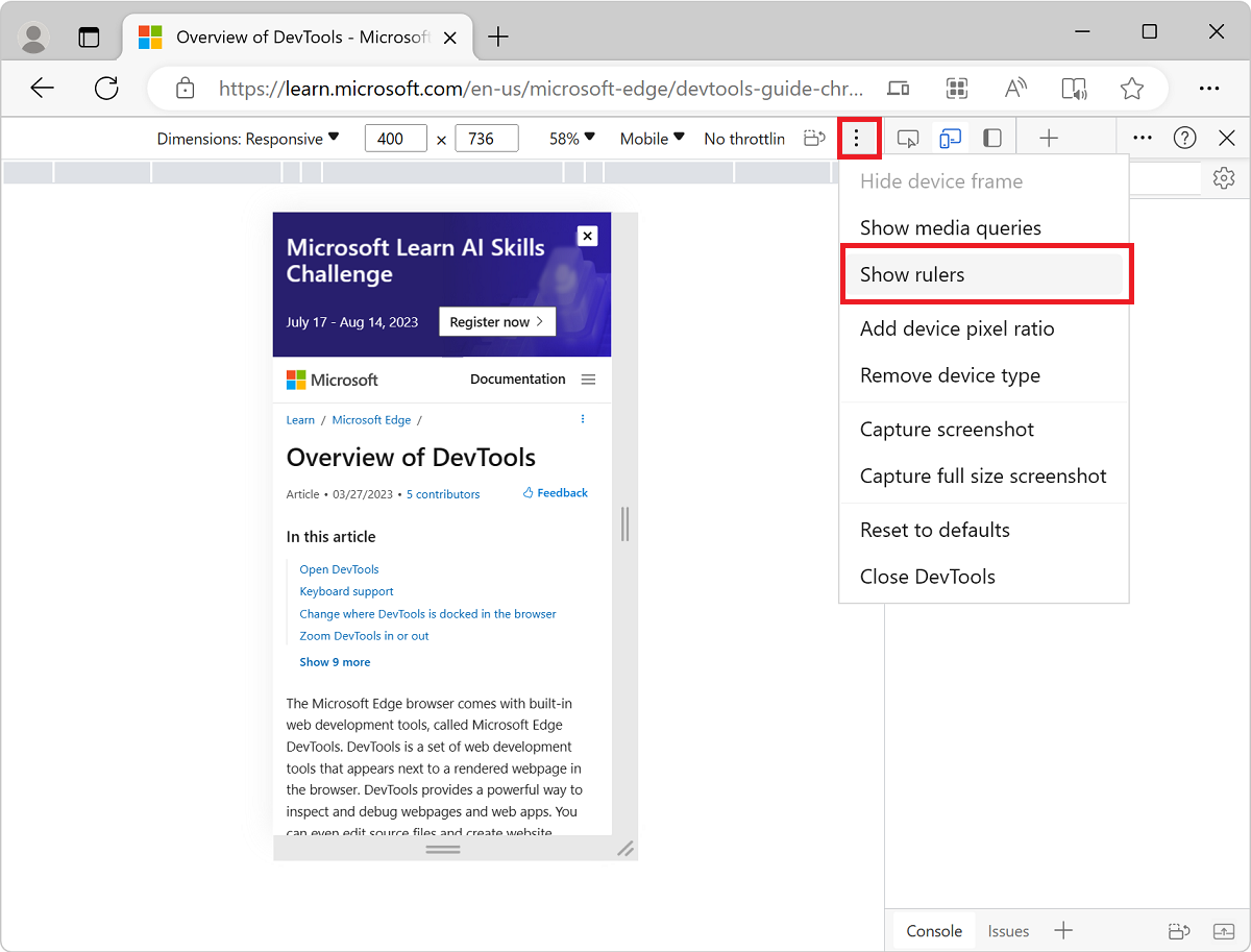
Rulers appear above and to the left of the viewport, indicating dimensions in pixels:
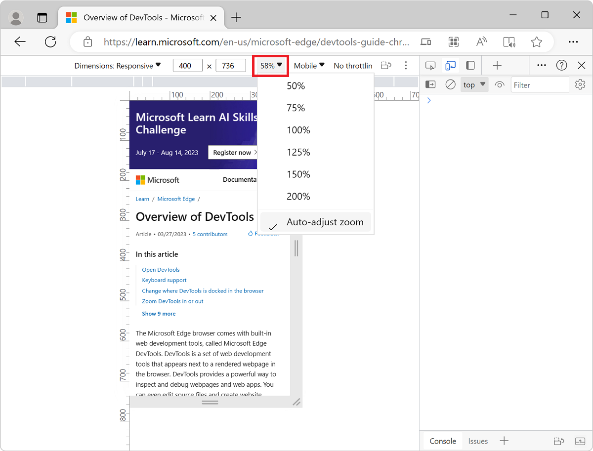
Zoom the viewport
To test the look and feel of your page at multiple zoom levels, use the Zoom list to zoom in or out.
Capture a screenshot
To capture a screenshot of what you currently see in the viewport, click More options () > Capture screenshot:
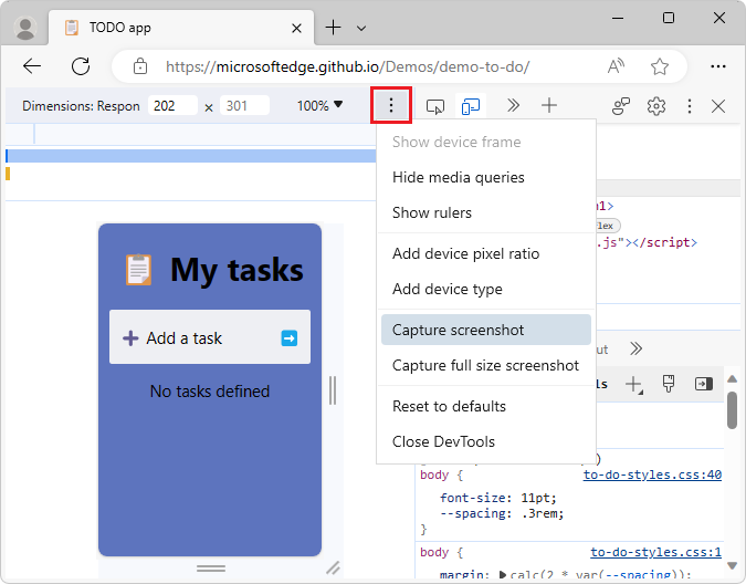
To capture a screenshot of the whole page including the content that isn't currently visible in the viewport, select Capture a full size screenshot from the same menu.
Throttle the network and CPU
Mobile devices often have network and CPU constraints.
To test how quickly your page loads and how it responds at different internet and CPU speeds:
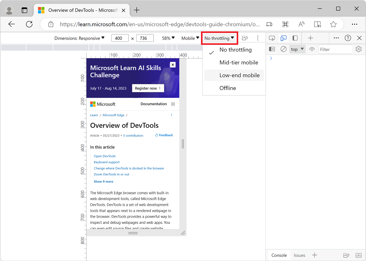
In the Throttle list, change the preset to Mid-tier mobile or Low-end mobile:
If the Throttle list is hidden, widen the Device Toolbar.
Mid-tier mobile simulates
fast 3Gand throttles your CPU. It is four times slower than normal.Low-end mobile simulates
slow 3Gand throttles your CPU. It is six times slower than normal.
All of the throttling is based upon the normal capability of your laptop or desktop.
Throttle the CPU only
To throttle the CPU only, and not the network:
In DevTools, select the Performance tool.
Click the Capture settings (
 ) button in the upper right.
In the CPU dropdown list, select 4x slowdown or 6x slowdown:

Throttle the network only
To throttle the network only and not the CPU:
Select the Network tool, then select Online > Fast 3G or Slow 3G.
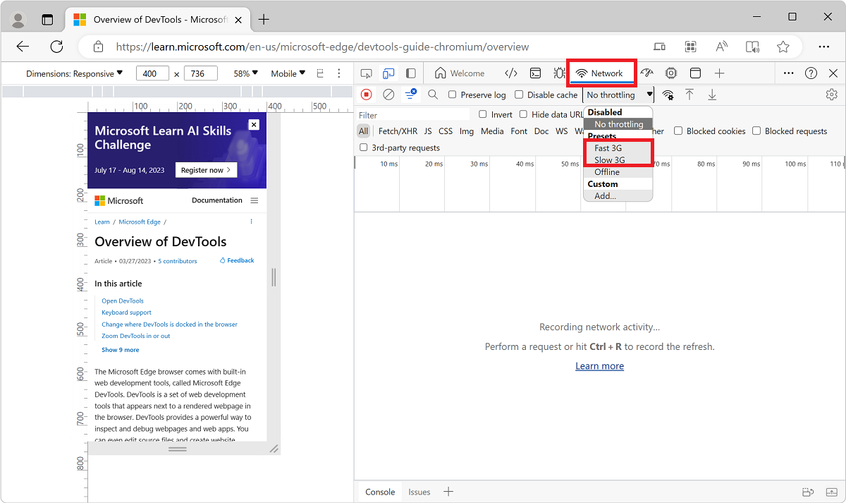
Or, press Ctrl+Shift+P (Windows, Linux) or Command+Shift+P (macOS) to open the Command Menu, start typing
3g, and then select Enable fast 3G throttling or Enable slow 3G throttling.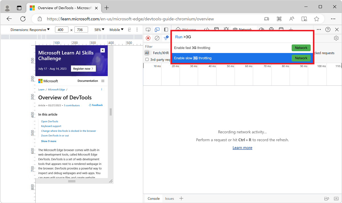
You can also set network throttling from within the Performance tool:
Select Capture Settings (
) and select the Network list and change the preset to Fast 3G or Slow 3G.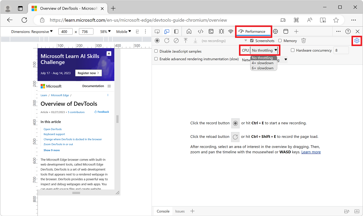
Emulate sensors
Use the Sensors tab to override geolocation, simulate device orientation, force touch, and emulate idle state.
The sections below provide a quick look on how to override geolocation and set device orientation.
Override geolocation
Use the Sensors tool to override geolocation and simulate device orientation.
Override geolocation
If your page depends on geolocation information from a mobile device to render properly, provide different geolocations using the geolocation-overriding UI.
In the Activity Bar, click the More tools (
 ) button, and then click Sensors:
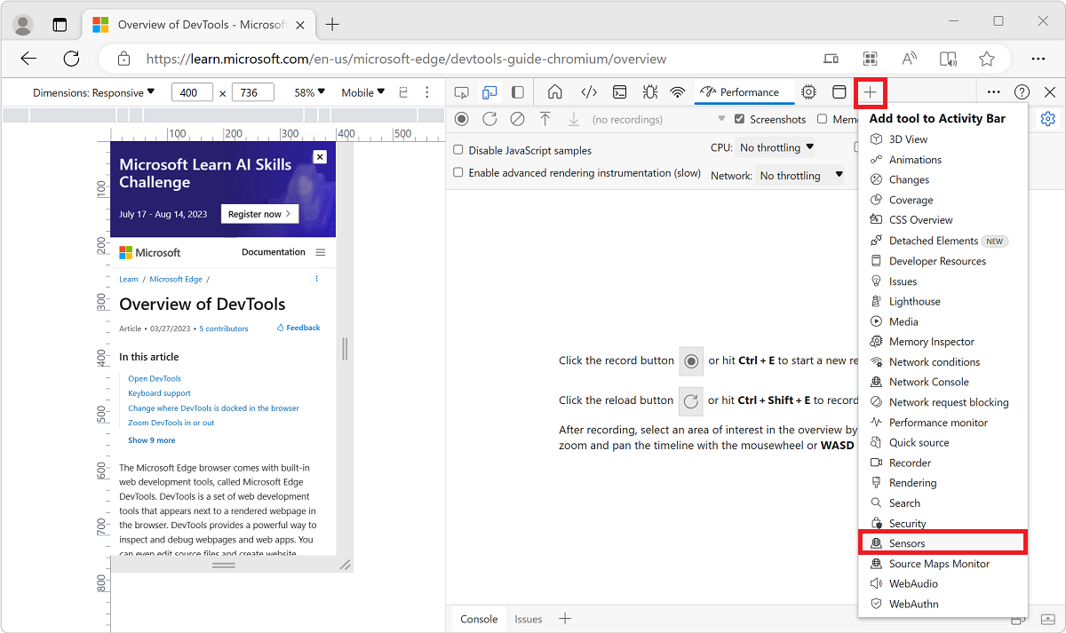
Or, open the Command Menu by selecting Ctrl+Shift+P (Windows, Linux) or Command+Shift+P (macOS). Type
Sensorsand then select Show Sensors: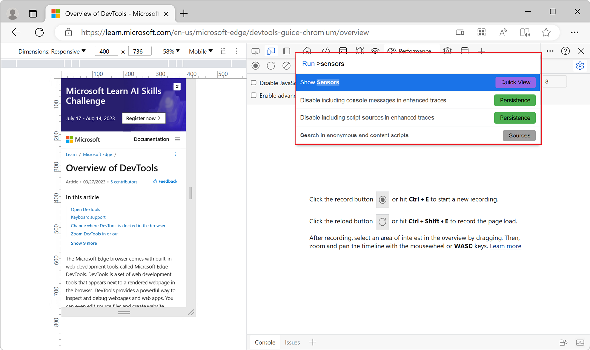
Select the Location dropdown menu, and then select one of the preset locations:
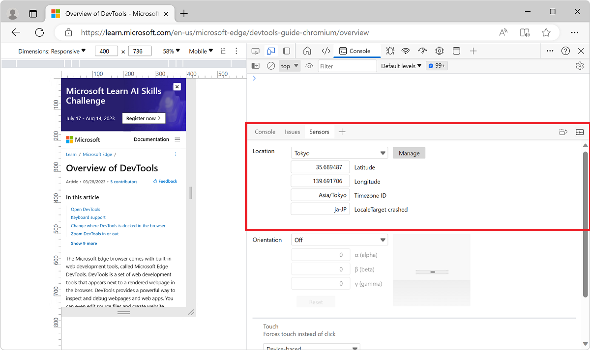
To enter a custom location, select Other and enter the coordinates of your custom location.
To test how your page behaves when location information is unavailable, select Location unavailable.
See also:
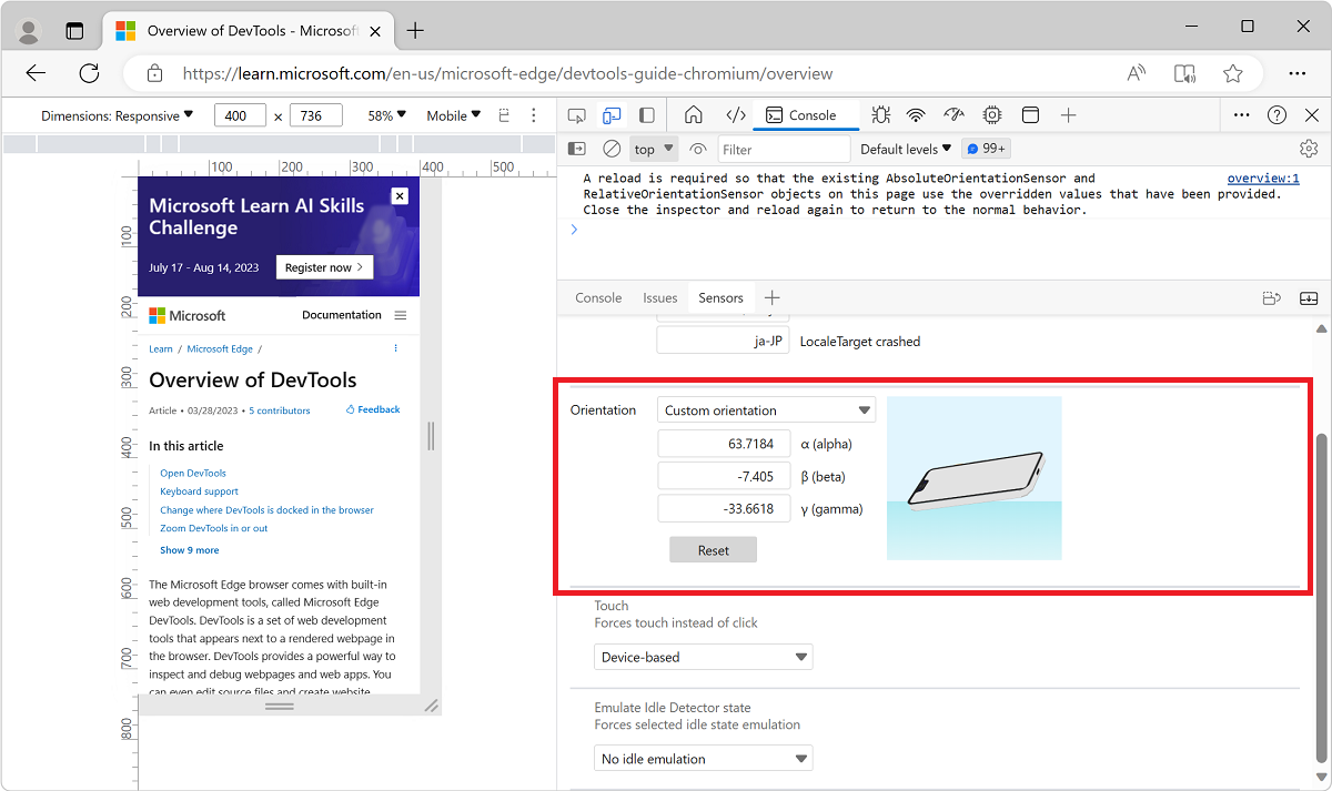
Set orientation
If your page depends on orientation information from a mobile device to render properly, open the orientation UI.
To set the device orientation:
In the Activity Bar, click the More tools (
) button, and then click Sensors:Or, open the Command Menu by pressing Ctrl+Shift+P (Windows, Linux) or Command+Shift+P (macOS). Type
Sensors, and then select Show Sensors:In the Orientation dropdown menu, select a preset orientation.
Or, to enter your own orientation, select Custom orientation, and enter your own alpha, beta, and gamma values:
See also:
Set the user agent string
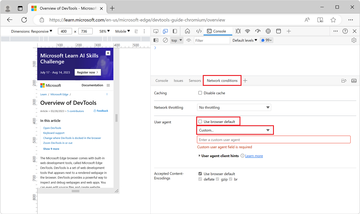
If your page depends on the user agent string from a mobile device to render properly, use the Network conditions tool to specify a different user agent string.
To set the user agent string:
Select More tools (+) > Network conditions:
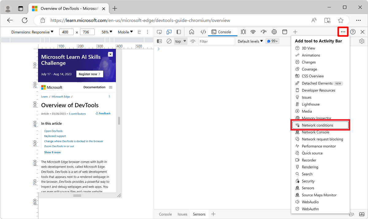
Or, open the Command Menu by pressing Ctrl+Shift+P (Windows, Linux) or Command+Shift+P (macOS).Type
Network conditions, and select Show Network conditions: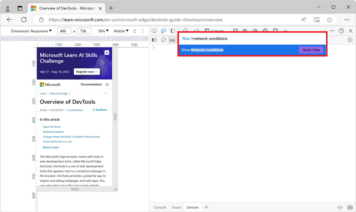
In the User agent section of the Network conditions tool, clear the Use browser default checkbox.
To select from a list of predefined user agent strings, click the menu that initially reads Custom.
Or, to enter your own user agent string, enter the string in the Enter a custom user agent text box:
See also:
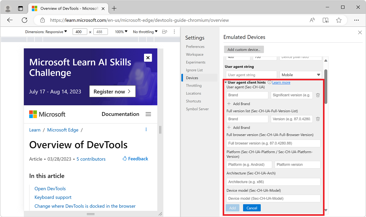
Set user-agent client hints
If your site employs user-agent client hints, use the Emulated Devices tool to add devices and set user-agent client hints:
Right-click in a webpage and then select Inspect.
Select Settings > Devices. The Emulated Devices page of Settings opens.
Click the Add custom device button, and then expand user-agent client hints:
Type a unique name in the Device Name text box such as
Test101.Accept the default values or change Width, Height, and Device pixel ratio as needed.
Set user-agent client hints as follows:
- Brand and Version, such as Edge and 92. Select + Add Brand to add multiple brand and version pairs.
- Full Browser Version such as 92.0.1111.0.
- Platform and Version such as Windows and 10.0.
- Architecture such as x86.
- Device model such as Galaxy Nexus.
You can set or change any of the user-agent client hints. There are no required values.
Click Add. The new device is displayed in the selected state at the top of the Emulated Devices list.
You can also set user-agent client hints in the Network tool; see Network features reference.
Note
Portions of this page are modifications based on work created and shared by Google and used according to terms described in the Creative Commons Attribution 4.0 International License. The original page is found here and is authored by Kayce Basques (Technical Writer, Chrome DevTools & Lighthouse).
 This work is licensed under a Creative Commons Attribution 4.0 International License.
Váš názor
Připravujeme: V průběhu roku 2024 budeme postupně vyřazovat problémy z GitHub coby mechanismus zpětné vazby pro obsah a nahrazovat ho novým systémem zpětné vazby. Další informace naleznete v tématu: https://aka.ms/ContentUserFeedback.
Odeslat a zobrazit názory pro