Poznámka:
Přístup k této stránce vyžaduje autorizaci. Můžete se zkusit přihlásit nebo změnit adresáře.
Přístup k této stránce vyžaduje autorizaci. Můžete zkusit změnit adresáře.
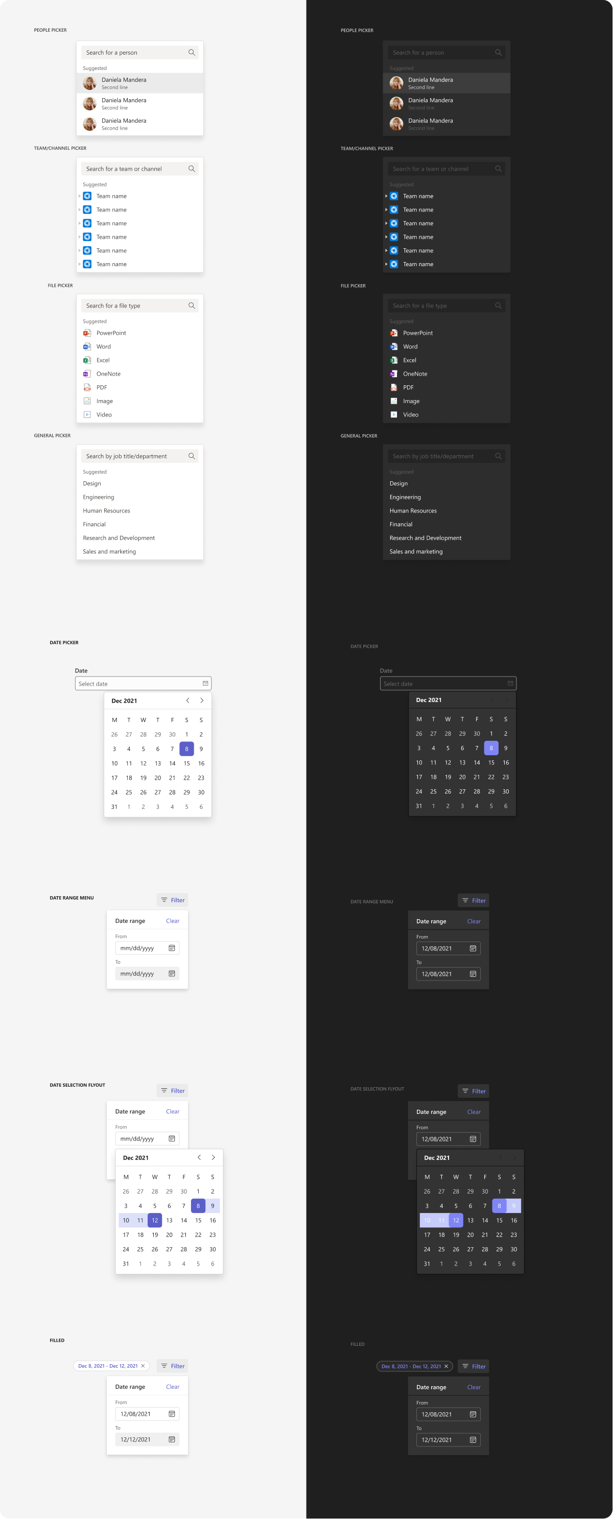
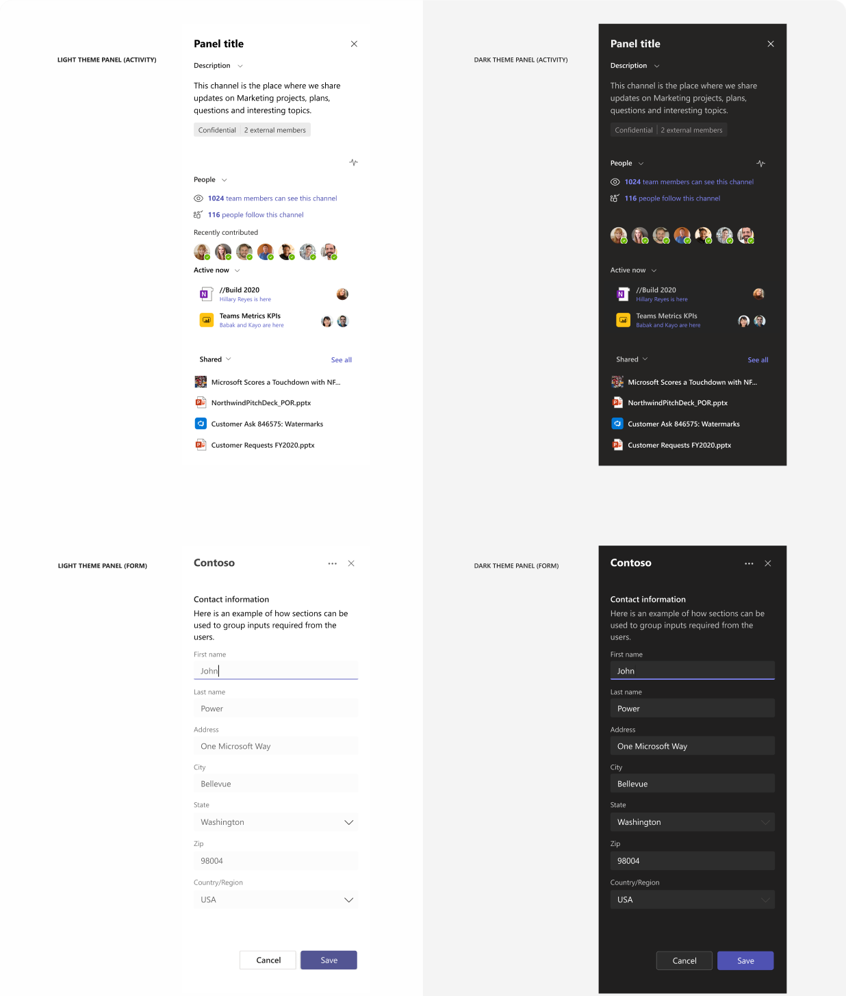
You can design and build your Teams app from scratch with the following basic Fluent UI components. Designed as flat as possible, these components can work across different use cases, themes, and screen sizes.
The illustrations on this page show how components look in Teams default (light) and dark themes.
Microsoft Teams UI Kit
Based on Fluent UI react components, the Microsoft Teams UI Kit includes components and patterns that are designed specifically for building Teams apps. In the UI kit, you can grab and insert the components listed here directly into your design and see more examples of how to use each component.
Alert

Button

Breadcrumb

Card

Carousel

Checkbox

Coachmark

Contextual menu

Dialog

Dropdown

Group list

Hyperlink

Input

Key value pair

Paragraph

Picker
Pivot

Progress indicator

Radio

Scrollbar

Search box

Side panel
Status label

Toast

Toggle
Note: In Fluent UI, toggle is a type of checkbox.

Tooltip

Other resources
Get code samples and implementation details for some of the components listed here and in the Microsoft Teams UI Kit.
Spolupracujte s námi na GitHubu
Zdroj tohoto obsahu najdete na GitHubu, kde můžete také vytvářet a kontrolovat problémy a žádosti o přijetí změn. Další informace najdete v našem průvodci pro přispěvatele.