Poznámka:
Přístup k této stránce vyžaduje autorizaci. Můžete se zkusit přihlásit nebo změnit adresáře.
Přístup k této stránce vyžaduje autorizaci. Můžete zkusit změnit adresáře.
Important
Copilot UX components are currently in preview and are subject to change. Do not use them in production environments. APIs, schemas, and tooling described in this article may change before general availability.
You can use Copilot UX components to extend Microsoft 365 Copilot with custom, interactive experiences that you build using the familiar SharePoint Framework (SPFx) tools, libraries, and client-side development model. A solution can package one or more Copilot UX components - client-side UI components that render inside Microsoft 365 Copilot - together with a declarative agent definition that makes them discoverable and callable from within a Copilot conversation.
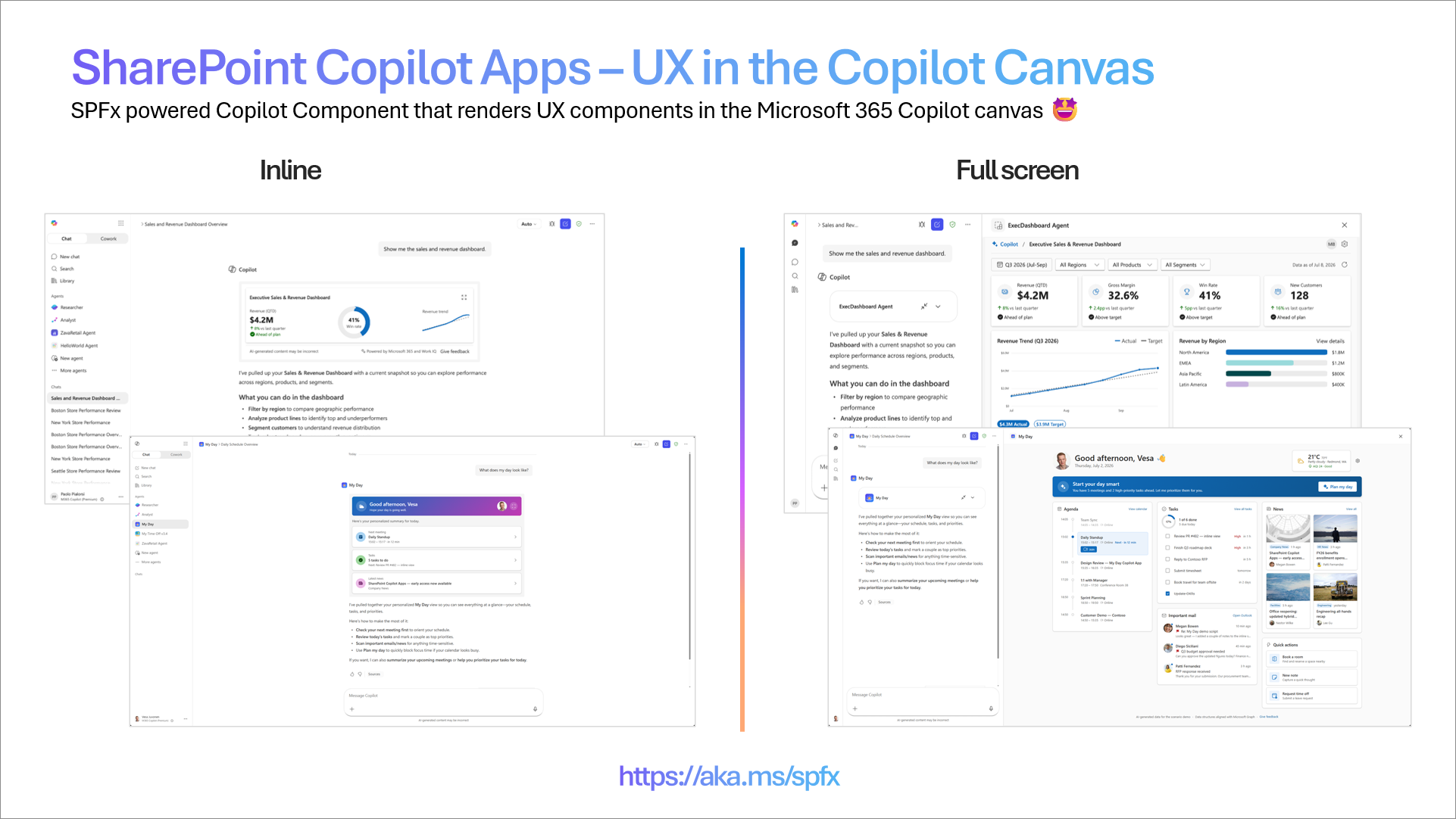
Where SPFx web parts and extensions extend the SharePoint user experience, Copilot UX components extend the Microsoft 365 Copilot experience. You author them with the same toolchain (heft, TypeScript, SCSS, the @microsoft/sp-* libraries), package them in a SharePoint solution package (.sppkg), and deploy them through the SharePoint App Catalog you already use.
Copilot UX components enable you to:
- Render rich, interactive UI inside Copilot - Surface custom, branded experiences directly in a Copilot conversation instead of returning plain text.
- Ship agent logic and UI together - A single package contains both the declarative agent definition and the Copilot UX components it renders.
- Reuse your SharePoint Framework skills - Use the same project structure, build tooling, and deployment pipeline as your existing SPFx solutions.
- Move solutions across tenants easily - Because Copilot UX components are built with SPFx and packaged in a standard
.sppkg, you can move them between tenants simply by deploying the same package to another tenant's SharePoint App Catalog. - Share the same UX across surfaces - Build a UX component once and reuse it across Microsoft 365 - in Microsoft 365 Copilot, in SharePoint, and in Microsoft Teams - for a consistent end-user experience wherever people work.
Build once, reach every surface
A key benefit of the SharePoint Framework model is that your UX components aren't tied to a single surface. The same interactive UI you render inside Microsoft 365 Copilot can also power an SPFx web part in SharePoint or a tab in Microsoft Teams, so users get the same experience regardless of which application they start from.
This works because SPFx separates the hosting concern from the UI concern. A Copilot UX component and a web part derive from different base classes: a Copilot UX component extends BaseCopilotComponent, while a web part extends BaseClientSideWebPart. Each base class adapts the component to its host (the Copilot canvas versus a SharePoint page), but what each one hosts can be the same underlying UX component. You factor your interface, business logic, and styling into shared, framework-agnostic components (for example, React, Angular, Vue, or Svelte), and each surface-specific base class renders them.
A single SPFx solution package (.sppkg) can contain a mix of different component types, such as Copilot UX components, web parts, and extensions, side by side. This lets you ship one solution that surfaces the same shared UX across Copilot, SharePoint, and Teams, while packaging, deploying, and versioning everything as a single unit.
The result is a single investment in your UX that delivers a consistent, branded experience across Copilot, SharePoint, and Teams, without rebuilding the core interaction pattern for every surface.
Note
During the public preview, Copilot UX components render only in the Microsoft 365 Copilot user experience. The cross-surface reuse described here is the direction of the model; support for additional surfaces is on the way. See Known issues for the current preview limitations.
Key concepts
The following sections describe the concepts that are important to understand when you build Copilot UX components.
Two display modes
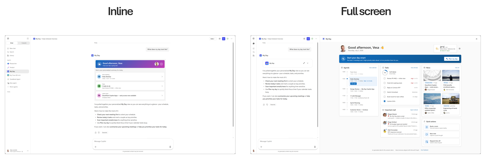
A Copilot UX component declares the display modes it supports in its component manifest through the availableDisplayModes capability. Microsoft 365 Copilot renders the component in one of two layouts:
inline- The component renders inline within the Copilot conversation, alongside the chat flow. This is the default, compact presentation.fullscreen- The component expands to occupy the full Copilot surface, giving it maximum space for richer interactions.
The host owns the layout. Your component reads the current mode from this.hostContext.displayMode and can request expansion to fullscreen by calling this.requestDisplayModeAsync('fullscreen'). Collapsing back to inline is always host-initiated - the user clicks the host's collapse affordance, and your component is notified through onHostContextChanged.
// HelloCopilotCopilotComponent.manifest.json (excerpt)
"capabilities": {
  "availableDisplayModes": ["inline", "fullscreen"]
}
The following example shows the My Day scenario in both display modes.
Multiple tools in one package
A single solution package can expose multiple tools. Each Copilot UX component declares one or more tools in its manifest, and each tool becomes an action the declarative agent can invoke. This lets you group related capabilities, for example a "status" tool and a "reporting" tool, into one deployable unit that shares build output, hosting, and lifecycle.
// HelloCopilotCopilotComponent.manifest.json (excerpt)
"tools": [
  {
    "name": "HelloCopilotTool",
    "description": { "default": "helloCopilot description" },
    "propertiesSchema": {
      "id": "$../../../lib/copilotComponents/helloCopilot/HelloCopilotCopilotComponentProperties.js:default;"
    }
  }
]
Parameterized initial rendering
Each tool can define a properties schema that describes the parameters it accepts. When the declarative agent invokes a tool, Microsoft 365 Copilot passes these properties into the component, which uses them to control its initial rendering. This means the same component can present different content depending on the parameters supplied for a given invocation.
Your component reads these values from this.properties at render time:
// HelloCopilotCopilotComponent.ts (excerpt)
protected render(): void {
  const message: string = this.properties.message;
  // ...use message and other properties to drive the initial render
}
Because parameters shape the first render, a single tool can serve many scenarios without you shipping a separate component for each one.
Automatic hosting from the SharePoint App Catalog
Copilot UX components use the same established SPFx deployment and hosting model as solutions built for SharePoint and Microsoft Teams. You deploy the .sppkg file to the tenant's SharePoint App Catalog. When includeClientSideAssets is set to true in package-solution.json, the component's JavaScript and other static assets are bundled into the package and deployed to the ClientSideAssets folder in the App Catalog site collection. SharePoint hosts these assets automatically and, depending on the tenant configuration, can serve them through the Microsoft 365 CDN.
Microsoft 365 Copilot loads the hosted client-side assets when it renders the component in the Copilot user experience. You don't deploy the UI code to a separate Copilot host or provision an external content delivery network, Azure Storage account, or other hosting infrastructure. Copilot is another host for SPFx solutions, alongside the SharePoint and Teams experiences that use this pattern today.
// package-solution.json (excerpt)
"solution": {
  "includeClientSideAssets": true
}
Declarative agents synced to the tenant agent catalog
A solution with Copilot UX components defines a declarative agent, a Microsoft 365 Copilot agent described by a manifest, an agent definition, instructions, and one or more actions that map to the components' tools.
After you deploy the app package to the SharePoint App Catalog, you can synchronize the declarative agent to the tenant's agent catalog from the App Catalog. There is no separate publishing step in Microsoft 365 Copilot or the Teams admin center. Updating or removing the app in the SharePoint App Catalog likewise updates or removes the corresponding agent.
Note
An administrator uploads and enables the .sppkg file in the SharePoint App Catalog, and then selects Add to Teams for the app. This action deploys the declarative agent to the tenant's agent catalog. The label of this button will be updated in a future release to better reflect that it also publishes the agent.
// declarativeAgent.json (excerpt)
{
  "version": "v1.7",
  "name": "helloCopilot Agent",
  "instructions": "$[file('instruction.txt')]",
  "conversation_starters": [
    { "title": "Get started", "text": "What can you do?" }
  ],
  "actions": [
    { "id": "helloCopilotAction", "file": "ai-plugin.json" }
  ]
}
Anatomy of a Copilot UX component solution
The declarative agent definition lives in a dedicated copilot folder in your project, alongside the Copilot UX component source under src/copilotComponents. The copilot folder contains the agent manifest and the files it references.
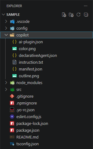
| File | Purpose |
|---|---|
manifest.json |
The Teams/Microsoft 365 app manifest that registers the declarative agent. The developer owns and updates this file - for example, the app name, description, icons, and identifiers. |
declarativeAgent.json |
The declarative agent definition: name, description, instructions, conversation starters, and actions. The developer fully controls this file and can use the full set of declarative agent options - not only the options required by SPFx-powered Copilot UX components. |
ai-plugin.json |
The plugin definition that describes the agent's actions to the model. |
instruction.txt |
The natural-language instructions that shape the agent's behavior. |
Note
Because you author manifest.json and declarativeAgent.json directly, a solution with Copilot UX components includes a full declarative agent. You can add capabilities such as additional instructions, conversation starters, knowledge sources, and other actions supported by the declarative agent schema - the SPFx Copilot UX components are one part of a broader agent you control.
The Copilot UX component itself is a client-side component that derives from BaseCopilotComponent, declares its display modes and tools in a component manifest, and is grouped into an agent through copilot-agent.json.
How the copilot folder is packaged and deployed
You author the source files in the copilot folder - most importantly manifest.json and declarativeAgent.json - and the build combines them with your components. When the solution is built, the toolchain merges your declarative agent definition with the details of the Copilot UX components declared in copilot-agent.json - the components they reference and each component's tools and properties - and bundles the result into the solution package (.sppkg) alongside the component assets. You can see the packaged output under the project's temp/copilot folder during a build.
When you upload and enable that package in the SharePoint App Catalog, SharePoint hosts the packaged component assets in the App Catalog site collection. When you then select Add to Teams for the app, the declarative agent is deployed to the tenant agent catalog. Together, these steps make the experience available to end users through Microsoft 365 Copilot and Copilot Chat, without requiring you to provision a separate host or register the agent in another portal. Updating or removing the app in the App Catalog updates or removes the corresponding agent in the tenant agent catalog.
Choose a starter template
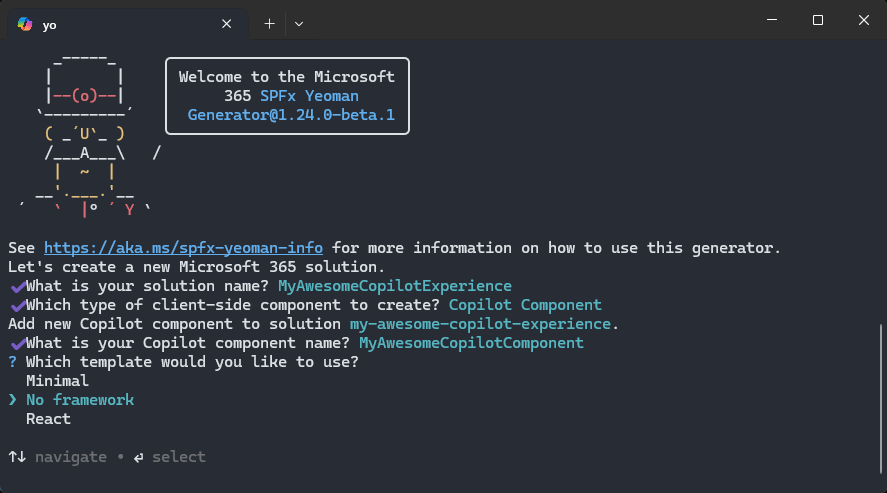
When you scaffold a new Copilot UX component, the SharePoint Framework generator offers three starter templates - just like the framework choices you already know from web parts. Each template gives you a working Copilot UX component that you can run in the Copilot Workbench right away, so you can pick the starting point that best matches your team's skills and the experience you want to build.
- Minimal - The leanest possible starting point, with only the code needed to render a Copilot UX component. Ideal for learning the model or building up an experience from scratch.
- No framework - Plain TypeScript with no UI framework, for full control over the rendering without additional dependencies.
- React - A React-based starting point for teams already building with React.
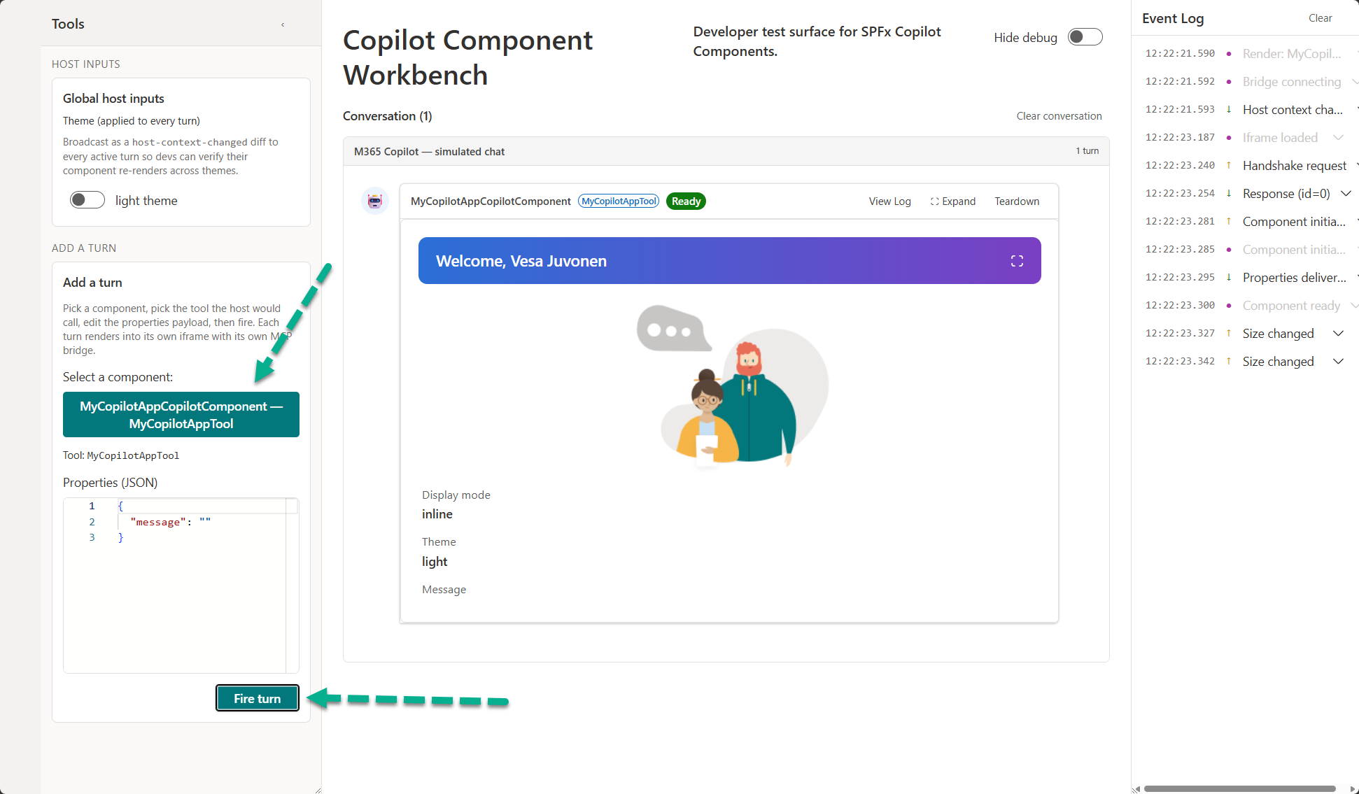
Test with the Copilot Workbench
The Copilot Workbench lets you test your Copilot UX components while they are hosted locally on your development machine, before you package and deploy them to the SharePoint App Catalog and sync them to Microsoft 365 Copilot. This gives you a fast inner-loop: you run your component from localhost, load it in the Workbench, and iterate on rendering, display modes, and tool parameters against a real Copilot surface without a full deployment cycle.
The Copilot Workbench is always available at the /_layouts/15/copilotworkbench.aspx path of any SharePoint site in your tenant - for example, https://yourtenantname.sharepoint.com/_layouts/15/copilotworkbench.aspx. Once your local dev server is running and serving the component from localhost - by running heft start --nobrowser - browse to that URL and the debug version of your component is loaded in the Workbench, ready for testing and development.
Once you are satisfied with the experience in the Workbench, you build the solution package, deploy it to the SharePoint App Catalog, and select Add to Teams to sync the declarative agent to the tenant agent catalog.
Developer guidance and considerations
Keep the following in mind as you build and maintain Copilot UX components, especially during the preview phase. This section will be updated with additional guidance and assets as the preview evolves.
Update the declarative agent version on every change
When you make changes on the declarative agent side - for example, editing declarativeAgent.json, its instructions, conversation starters, or actions - you must update the declarative agent version so the new definition is picked up. If the version stays the same, Microsoft 365 Copilot may continue to use the previously synced agent even after you deploy an updated solution to the SharePoint App Catalog. Bumping the version ensures the changes are recognized and the refreshed agent is applied with the new deployment.
Note
Deployment of the agent to the tenant agent catalog can take some time to complete. Improvements to this deployment experience are planned for a future release.
Availability during preview
Keep the following preview-time considerations in mind as you plan when and how to ship Copilot UX component solutions.
No license required (during preview)
During the preview period, Copilot UX components do not require a Microsoft 365 Copilot license to build, deploy, or run. Both makers and end users can create and use these experiences without a per-user Copilot license while the feature is in preview.
Note
Licensing requirements may change when the feature reaches general availability. Review the licensing guidance again before you plan a production rollout.
Not yet supported in the Microsoft marketplace (during preview)
During the public preview, solutions with Copilot UX components cannot be published to or distributed through the Microsoft commercial marketplace (Microsoft AppSource). While in preview, you deploy them privately to your own tenant through the SharePoint App Catalog. Microsoft marketplace support is planned for when the feature reaches general availability.
Known issues
The following are known issues in the current public preview. They are expected to be resolved in an upcoming release.
- Copilot UX only - Initially during the public preview, components render only in the Microsoft 365 Copilot user experience. Support for other surfaces and hosting options is in the works.
Next steps
- Learn how the
displayModehost context works and how to add an expand-to-fullscreen control. - Review available samples in the GitHub sample repository.