Convert Map and Filled map visuals to an Azure Maps visual
The Azure Maps visual is now Generally Available, providing a streamlined and intuitive experience for working with your data.
How to convert your existing Map and Filled map visuals
A conversion function is available in Power BI desktop to convert any existing Map and Filled map visuals to the new Azure Maps visual.
When opening a report with Map and Filled map visuals, you'll see the following dialog giving you the option to upgrade to the new Azure Maps visual:
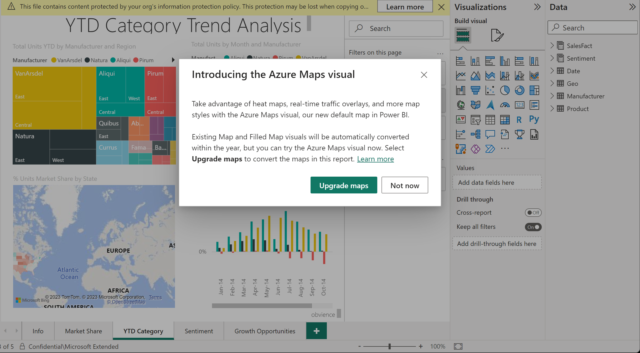
When selecting the Upgrade maps button, all Map and Filled map visuals in the current report are converted. You can also convert a specific Map or Filled Map Visual to an Azure Maps visual in the Visual gallery.
All settings associated with the original visuals are carried over to the new Azure Maps visual, ensuring consistency in the migrated report.
Note
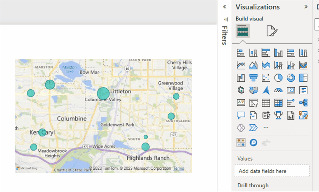
Due to differences in supported bubble size ranges between the two platforms, you may notice that some bubbles appear smaller on the converted Azure Maps visual compared to their original size in the Maps visual. This is because the maximum bubble size in Azure Maps is smaller than the maximum bubble size in Bing Maps. Bubble size differences can vary based on the visual dimension and the report's zoom level.
The migration function streamlines the process of converting Map and Filled map visuals to Azure Maps visuals, providing users with an efficient and easy-to-use solution.
Next steps
Feedback
Kommer snart: I hele 2024 udfaser vi GitHub-problemer som feedbackmekanisme for indhold og erstatter det med et nyt feedbacksystem. Du kan få flere oplysninger under: https://aka.ms/ContentUserFeedback.
Indsend og få vist feedback om