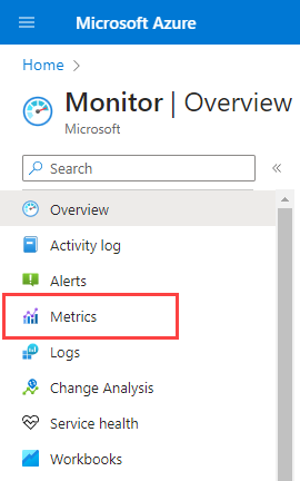
Analyze metrics with Azure Monitor metrics explorer
In Azure Monitor, metrics are a series of measured values and counts that are collected and stored over time. Metrics can be standard (also called platform) or custom. The Azure platform provides standard metrics. These metrics reflect the health and usage statistics of your Azure resources.
In addition to standard metrics, your application emits extra custom performance indicators or business-related metrics. Custom metrics can be emitted by any application or Azure resource and collected by using Azure Monitor Insights, agents running on virtual machines, or OpenTelemetry.
Azure Monitor metrics explorer is a component of the Azure portal that helps you plot charts, visually correlate trends, and investigate spikes and dips in metrics values. You can use metrics explorer to investigate the health and utilization of your resources.
Watch the following video for an overview of creating and working with metrics charts in Azure Monitor metrics explorer.
Create a metric chart using PromQL
You can now create charts using Prometheus query language (PromQL) for metrics stored in an Azure Monitor workspace. For more information, see Metrics explorer with PromQL (Preview).
Create a metric chart
You can open metrics explorer from the Azure Monitor overview page, or from the Monitoring section of any resource. In the Azure portal, select Metrics.
If you open metrics explorer from Azure Monitor, the Select a scope page opens. Set the Subscription, Resource, and region Location fields to the resource to explore. If you open metrics explorer for a specific resource, the scope is prepopulated with information about that resource.
Here's a summary of configuration tasks for creating a chart to analyze metrics:
Select your resource and metric to see the chart. You can choose to work with one or multiple resources and view a single or multiple metrics.
Configure the time settings that are relevant for your investigation. You can set the time granularity to allow for pan and zoom on your chart, and configure aggregations to show values like the maximum and minimum.
Use dimension filters and splitting to analyze which segments of the metric contribute to the overall metric value and identify possible outliers in the data.
Work with advanced settings to customize your chart. Lock the y-axis range to identify small data variations that might have significant consequences. Correlate metrics to logs to diagnose the cause of anomalies in your chart.
Configure alerts and receive notifications when the metric value exceeds or drops below a threshold.
Share your chart or pin it to dashboards.
Set the resource scope
The resource scope picker lets you scope your chart to view metrics for a single resource or for multiple resources. To view metrics across multiple resources, the resources must be within the same subscription and region location.
Note
You must have Monitoring Reader permission at the subscription level to visualize metrics across multiple resources, resource groups, or a subscription. For more information, see Assign Azure roles in the Azure portal.
Select a single resource
Choose Select a scope.

Use the scope picker to select the resources whose metrics you want to see. If you open metrics explorer for a specific resource, the scope should be populated.
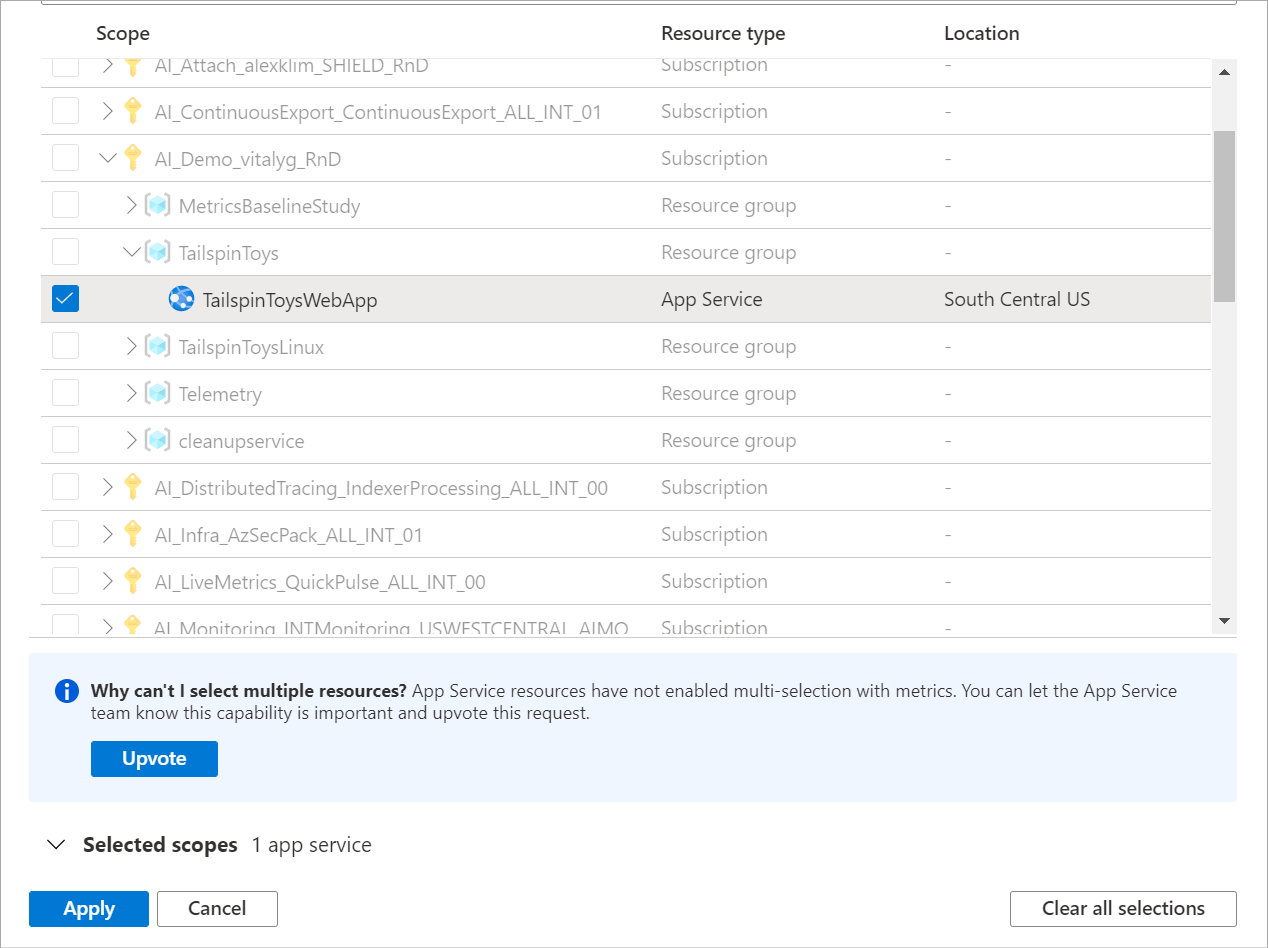
For some resources, you can view only one resource's metrics at a time. On the Resource types menu, these resources are shown in the All resource types section.
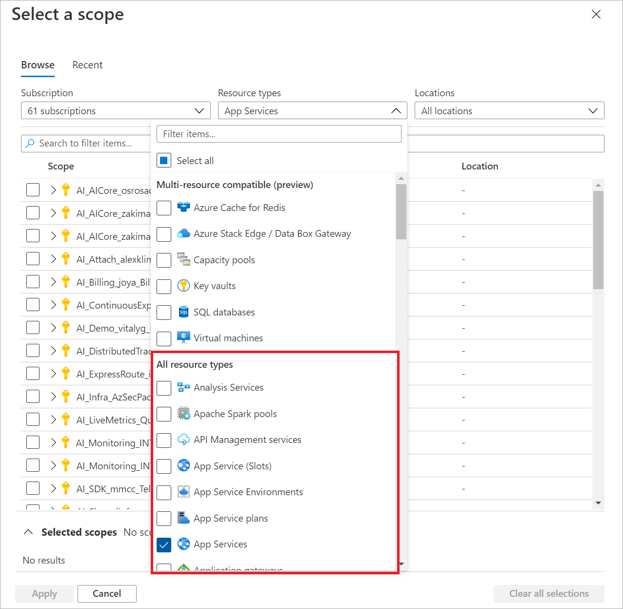
Select a resource. The picker updates to show all subscriptions and resource groups that contain the selected resource.
Tip
If you want the capability to view the metrics for multiple resources at the same time, or to view metrics across a subscription or resource group, select Upvote.
When you're satisfied with your selection, select Apply.


Select multiple resources
You can see which metrics can be queried across multiple resources at the top of the Resource types menu in the scope picker.

To visualize metrics over multiple resources, start by selecting multiple resources within the resource scope picker.
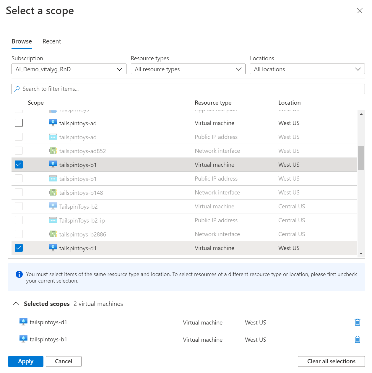
The resources you select must be within the same resource type, location, and subscription. Resources that don't meet these criteria aren't selectable.
Select Apply.
Select a resource group or subscription
For types that are compatible with multiple resources, you can query for metrics across a subscription or multiple resource groups.
Start by selecting a subscription or one or more resource groups.
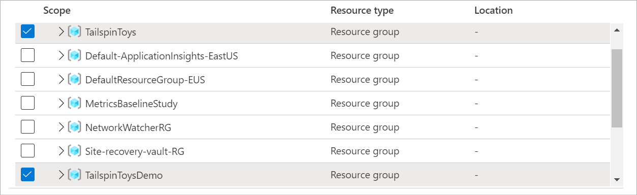
Select a resource type and location.
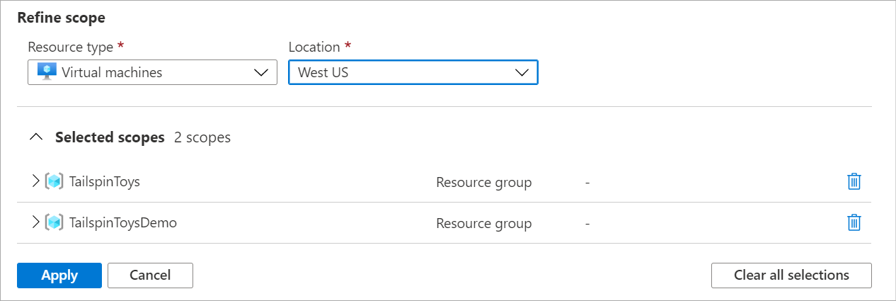
Expand the selected scopes to verify the resources your selections apply to.
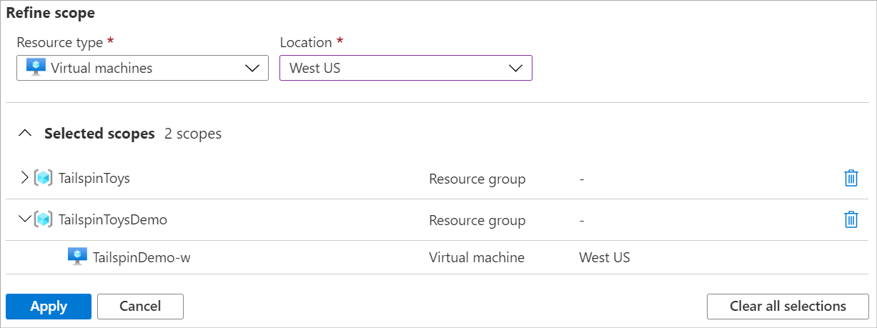
Select Apply.
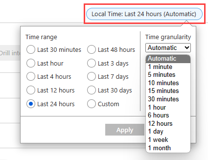
Configure the time range
The time picker lets you configure the time range for your metric chart to view data that's relevant to your monitoring scenario. By default, the chart shows the most recent 24 hours of metrics data.
Note
Most metrics in Azure are stored for 93 days. You can query no more than 30 days of data on any single chart. You can pan the chart to view the full retention. The 30-day limitation doesn't apply to log-based metrics.
Use the time picker to change the Time range for your data, such as the last 12 hours or the last 30 days.

In addition to changing the time range with the time picker, you can pan and zoom by using the controls in the chart area.
Interactive chart features
Pan across metrics data
To pan, select the left and right arrows at the edge of the chart. The arrow control moves the selected time range back and forward by one half of the chart's time span. If you're viewing the past 24 hours, selecting the left arrow causes the time range to shift to span a day and a half to 12 hours ago.

Zoom into metrics data
You can configure the time granularity of the chart data to support zoom in and zoom out for the time range. Use the time brush to investigate an interesting area of the chart like a spike or a dip in the data. Select an area on the chart and the chart zooms in to show more detail for the selected area based on your granularity settings. If the time grain is set to Automatic, zooming selects a smaller time grain. The new time range applies to all charts in metrics explorer.

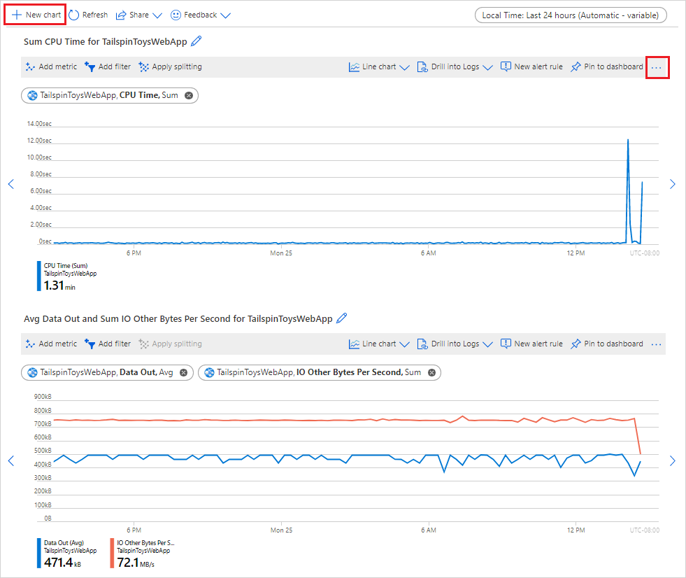
View multiple metric lines and charts
You can create charts that plot multiple metric lines or show multiple metric charts at the same time. This functionality allows you to:
- Correlate related metrics on the same graph to see how one value relates to another.
- Display metrics that use different units of measure in close proximity.
- Visually aggregate and compare metrics from multiple resources.
Suppose you have five storage accounts and you want to know how much space they consume together. You can create a stacked area chart that shows the individual values and the sum of all the values at points in time.
After you create a chart, select Add metric to add another metric to the same chart.

Add multiple charts
Typically, your charts shouldn't mix metrics that use different units of measure. For example, avoid mixing one metric that uses milliseconds with another that uses kilobytes. Also avoid mixing metrics whose scales differ significantly. In these cases, consider using multiple charts instead.
To create another chart that uses a different metric, select New chart.
To reorder or delete multiple charts, select More options (...), and then select the Move up, Move down, or Delete action.

Use different line colors
Chart lines are automatically assigned a color from a default palette. To change the color of a chart line, select the colored bar in the legend that corresponds to the line on the chart. Use the color picker to select the line color.

Customized colors are preserved when you pin the chart to a dashboard. The following section shows how to pin a chart.
Configure aggregation
When you add a metric to a chart, metrics explorer applies a default aggregation. The default makes sense in basic scenarios, but you can use a different aggregation to gain more insights about the metric.
Before you use different aggregations on a chart, you should understand how metrics explorer handles them. Metrics are a series of measurements (or "metric values") that are captured over a time period. When you plot a chart, the values of the selected metric are separately aggregated over the time granularity.
You select the size of the time grain by using the time picker in metrics explorer. If you don't explicitly select the time grain, metrics explorer uses the currently selected time range by default. After metrics explorer determines the time grain, the metric values that it captures during each time grain are aggregated on the chart, one data point per time grain.
Suppose a chart shows the Server response time metric. It uses the average aggregation over the time span of the last 24 hours.
In this scenario, if you set the time granularity to 30 minutes, metrics explorer draws the chart from 48 aggregated data points. That is, it uses two data points per hour for 24 hours. The line chart connects 48 dots in the chart plot area. Each data point represents the average of all captured response times for server requests that occurred during each of the relevant 30-minute time periods. If you switch the time granularity to 15 minutes, you get 96 aggregated data points. That is, you get four data points per hour for 24 hours.
Metrics explorer has five aggregation types:
Sum: The sum of all values captured during the aggregation interval. The sum aggregation is sometimes called the total aggregation.
Count: The number of measurements captured during the aggregation interval.
When the metric is always captured with the value of 1, the count aggregation is equal to the sum aggregation. This scenario is common when the metric tracks the count of distinct events and each measurement represents one event. The code emits a metric record every time a new request arrives.
Average: The average of the metric values captured during the aggregation interval.
Min: The smallest value captured during the aggregation interval.
Max: The largest value captured during the aggregation interval.

Metrics explorer hides the aggregations that are irrelevant and can't be used.
For more information about how metric aggregation works, see Azure Monitor metrics aggregation and display explained.
Use dimension filters and splitting
Filtering and splitting are powerful diagnostic tools for metrics that have dimensions. You can implement these options to analyze which segments of the metric contribute to the overall metric value and identify possible outliers in the metric data. These features show how various metric segments or dimensions affect the overall value of the metric.
Filtering lets you choose which dimension values are included in the chart. You might want to show successful requests when you chart the server response time metric. You apply the filter on the success of request dimension.
Splitting controls whether the chart displays separate lines for each value of a dimension or aggregates the values into a single line. Splitting allows you to visualize how different segments of the metric compare with each other. You can see one line for an average CPU usage across all server instances, or you can see separate lines for each server.
Tip
To hide segments that are irrelevant for your scenario and to make your charts easier to read, use both filtering and splitting on the same dimension.
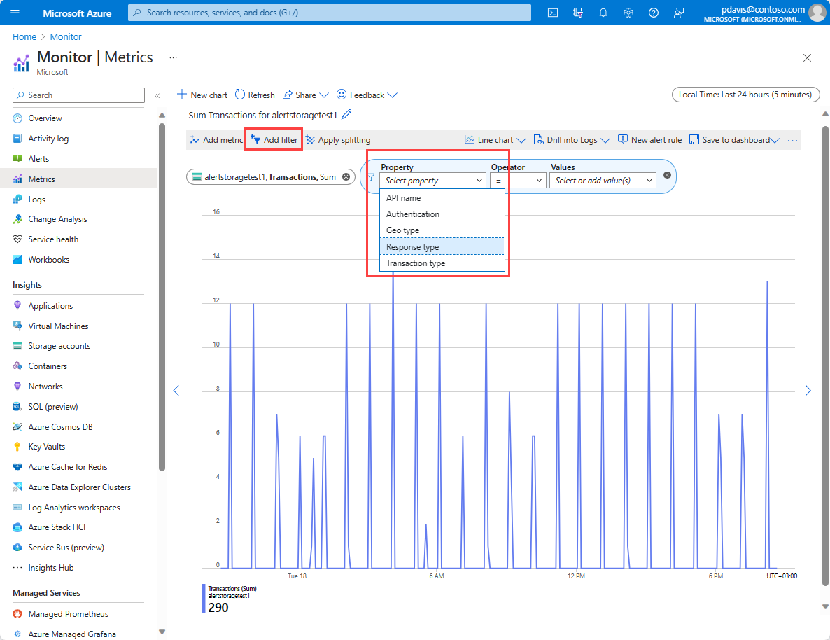
Add filters
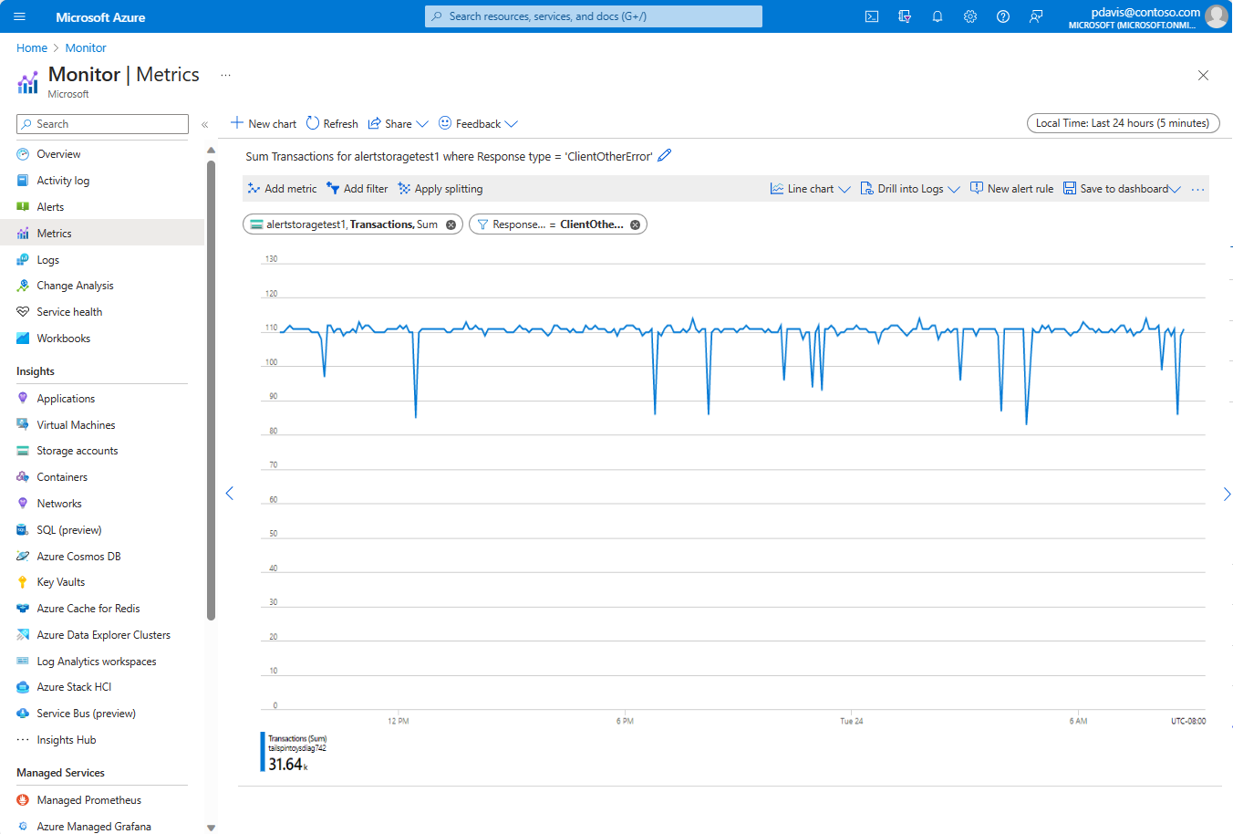
You can apply filters to charts whose metrics have dimensions. Consider a Transaction count metric that has a Response type dimension. This dimension indicates whether the response from transactions succeeded or failed. If you filter on this dimension, metrics explorer displays a chart line for only successful or only failed transactions.
Above the chart, select Add filter to open the filter picker.
Select a dimension from the Property dropdown list.
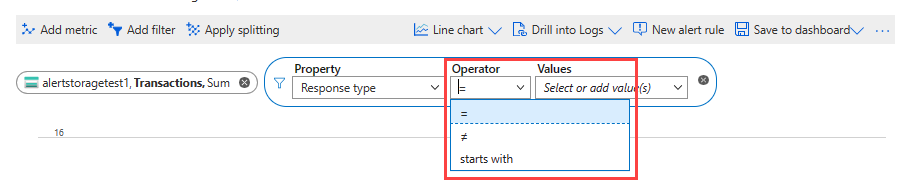
Select the operator that you want to apply against the dimension (or property). The default operator is equals (
=).
Select which dimension values you want to apply to the filter when you're plotting the chart. This example shows filtering out the successful storage transactions.
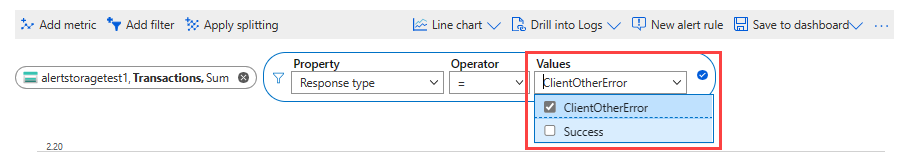
After you select the filter values, click outside the filter picker to complete the action. The chart shows how many storage transactions have failed.
Repeat these steps to apply multiple filters to the same charts.


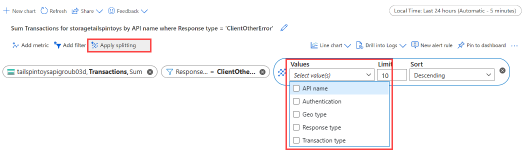
Apply metric splitting
You can split a metric by dimension to visualize how different segments of the metric compare. Splitting can also help you identify the outlying segments of a dimension.
Above the chart, select Apply splitting to open the segment picker.
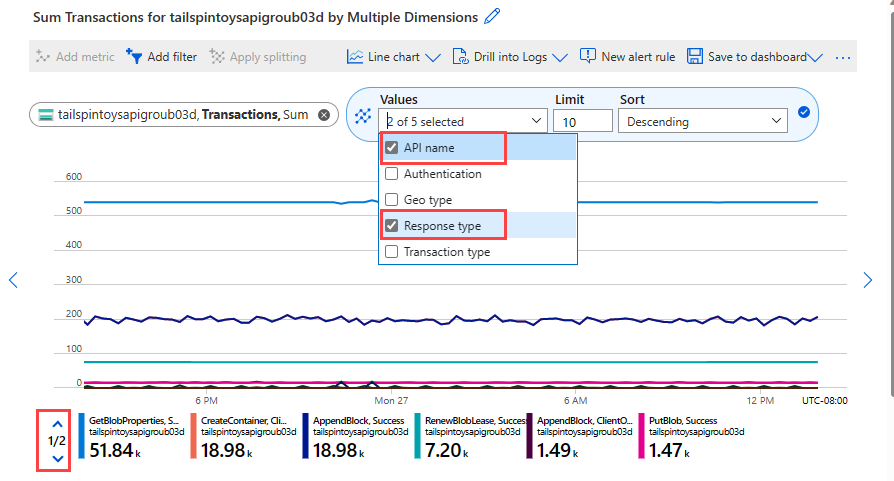
Choose the dimensions to use to segment your chart.
The chart shows multiple lines with one line for each dimension segment.
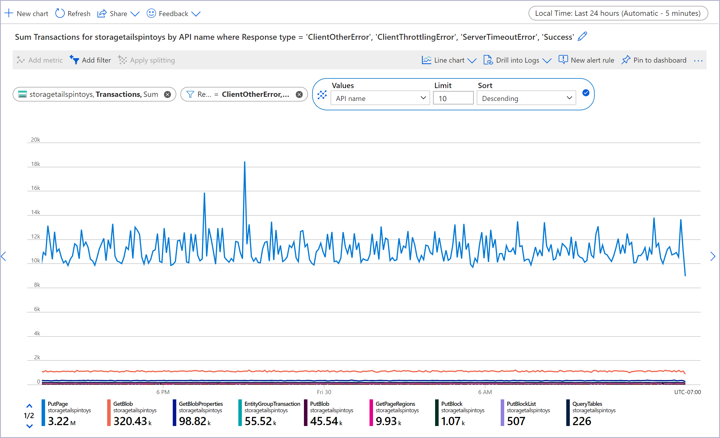
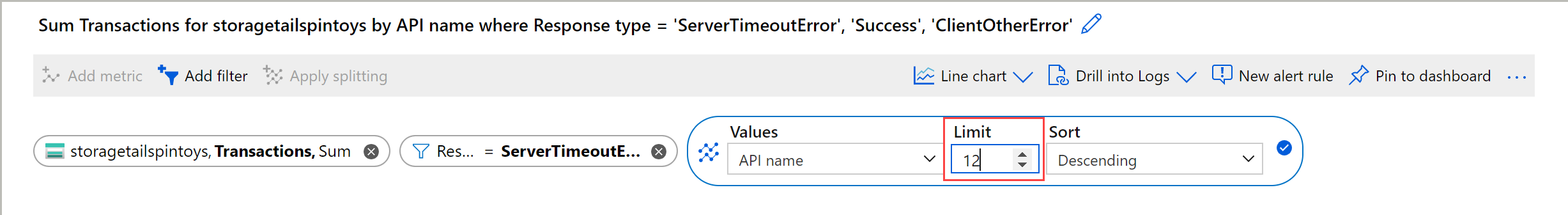
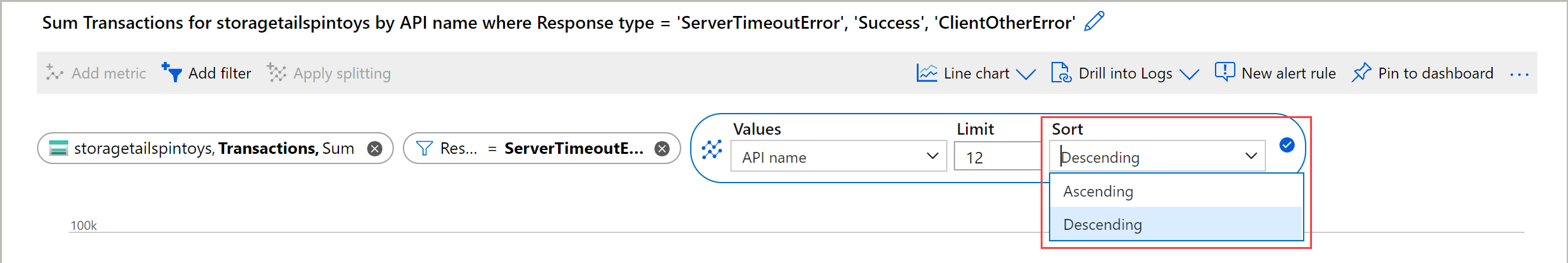
Choose a limit on the number of values to display after you split by the selected dimension. The default limit is 10, as shown in the preceding chart. The range of the limit is 1 to 50.
Choose the sort order on segments: Descending (default) or Ascending.
Segment by multiple segments by selecting multiple dimensions from the Values dropdown list. The legend shows a comma-separated list of dimension values for each segment.
Click outside the segment picker to complete the action and update the chart.


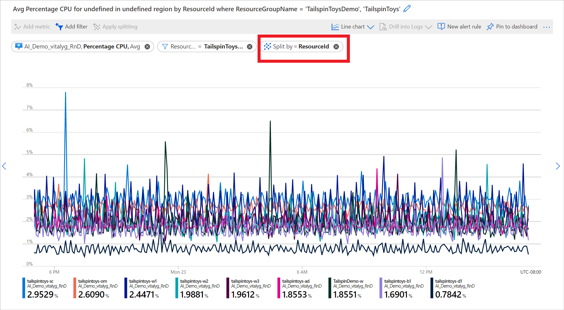
Split metrics for multiple resources
When you plot a metric for multiple resources, you can choose Apply splitting to split by resource ID or resource group. The split allows you to compare a single metric across multiple resources or resource groups. The following chart shows the percentage CPU across nine virtual machines. When you split by resource ID, you see how percentage CPU differs by virtual machine.
For more examples that use filtering and splitting, see Metric chart examples.
Lock the y-axis range
Locking the range of the value (y) axis becomes important in charts that show small fluctuations of large values. Consider how a drop in the volume of successful requests from 99.99 percent to 99.5 percent might represent a significant reduction in the quality of service. Noticing a small fluctuation in a numeric value would be difficult or even impossible if you're using the default chart settings. In this case, you could lock the lowest boundary of the chart to 99 percent to make a small drop more apparent.
Another example is a fluctuation in the available memory. In this scenario, the value technically never reaches 0. Fixing the range to a higher value might make drops in available memory easier to spot.
To control the y-axis range, browse to the advanced chart settings by selecting More options (...) > Chart settings.
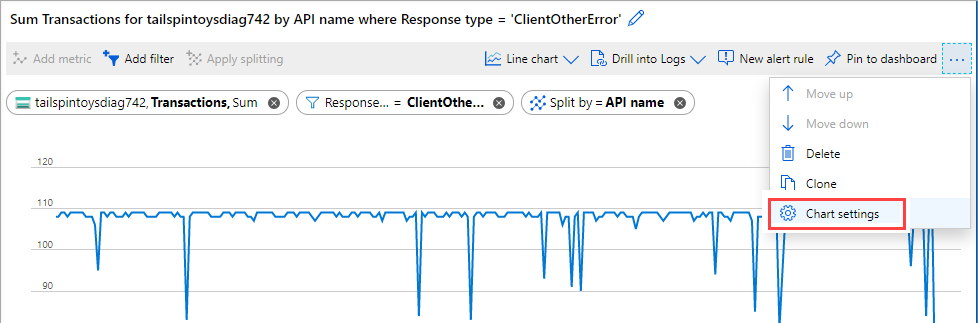
Modify the values in the Y-axis range section, or select Auto to revert to the default values.
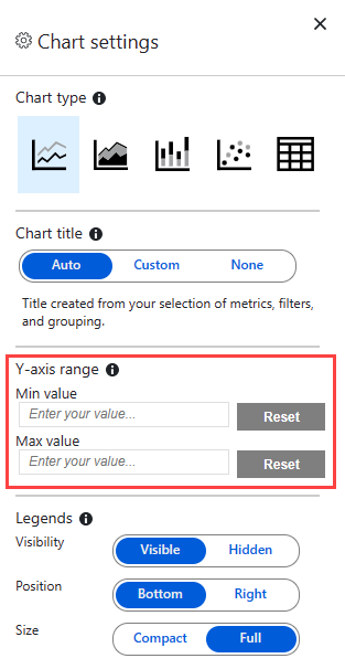


If you lock the boundaries of the y-axis for a chart that tracks count, sum, minimum, or maximum aggregations over a period of time, specify a fixed time granularity. Don't rely on the automatic defaults.
You choose a fixed time granularity because chart values change when the time granularity is automatically modified after a user resizes a browser window or changes screen resolution. The resulting change in time granularity affects the appearance of the chart, invalidating the selection of the y-axis range.
Set up alert rules
You can use your visualization criteria to create a metric-based alert rule. The new alert rule includes your chart's target resource, metric, splitting, and filter dimensions. You can modify these settings by using the Create an alert rule pane.
To create an alert rule, select New alert rule in the upper-right corner of the chart.
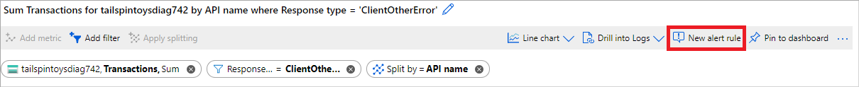
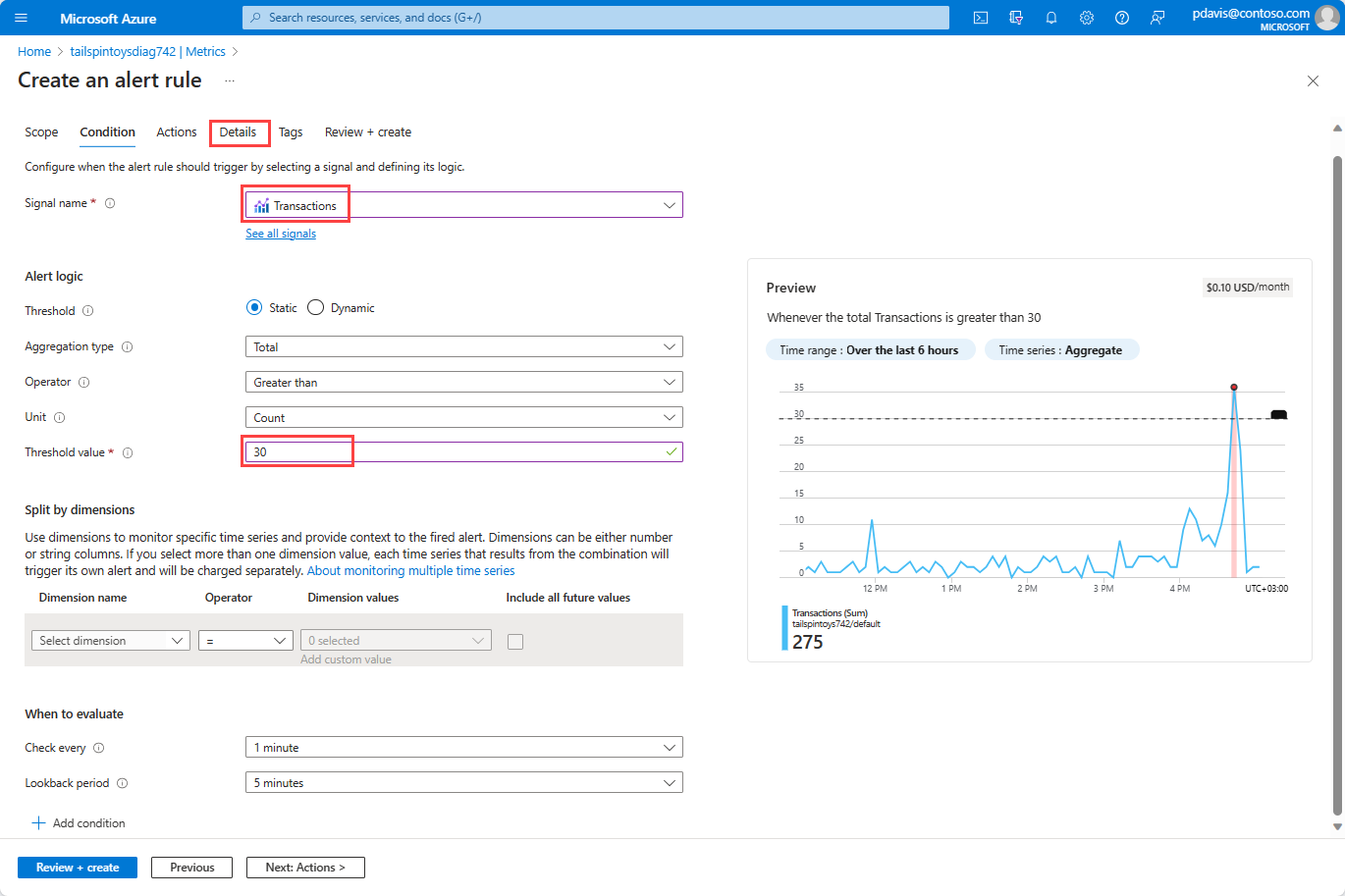
Select the Condition tab. The Signal name entry defaults to the metric from your chart. You can choose a different metric.
Enter a number for Threshold value. The threshold value is the value that triggers the alert. The Preview chart shows the threshold value as a horizontal line over the metric values. When you're ready, select the Details tab.
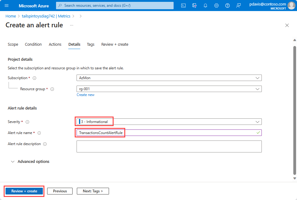
Enter Name and Description values for the alert rule.
Select a Severity level for the alert rule. Severities include Critical, Error Warning, Informational, and Verbose.
Select Review + create to review the alert rule.
Select Create to create the alert rule.


For more information, see Create, view, and manage metric alerts.
Correlate metrics to logs
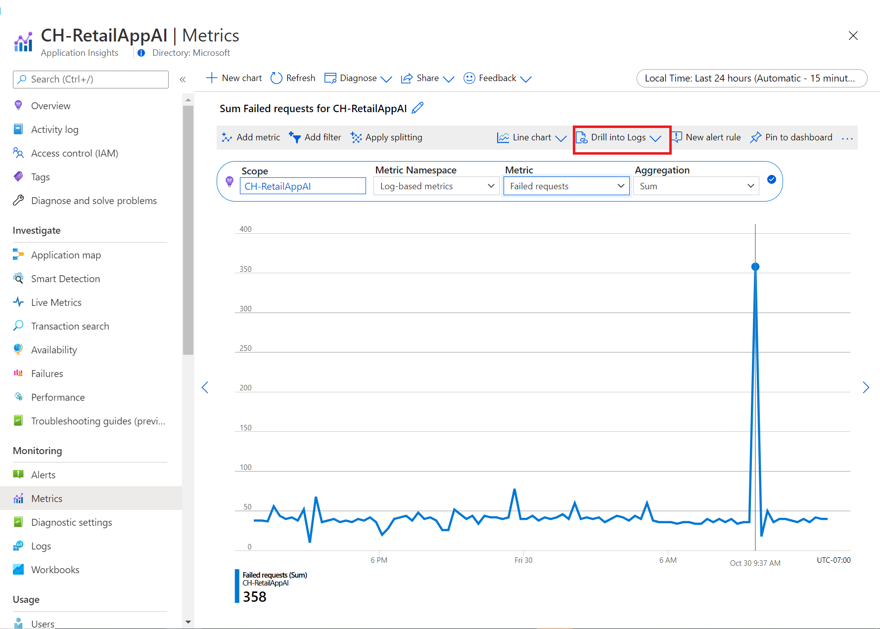
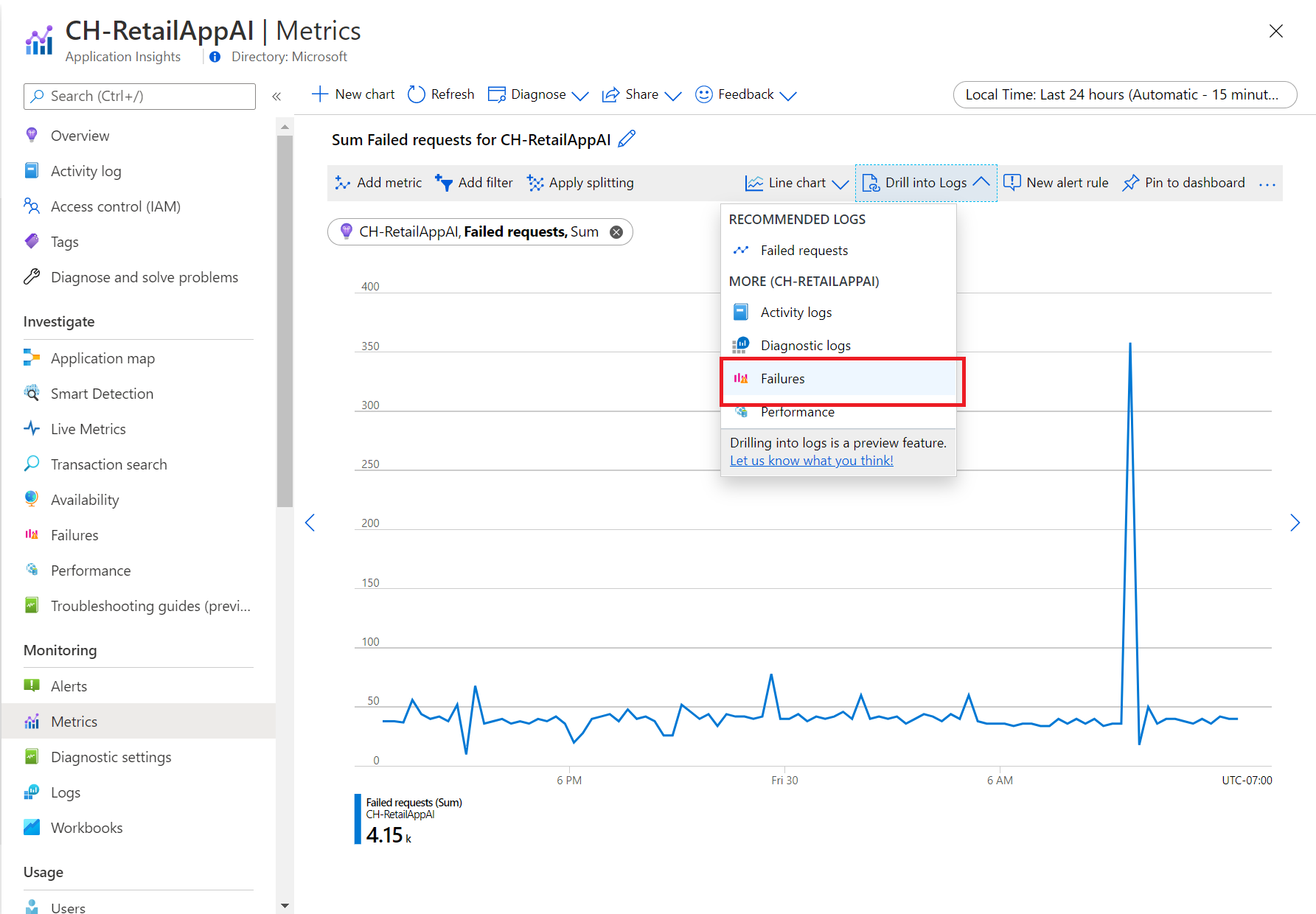
In metrics explorer, the Drill into Logs feature helps you diagnose the root cause of anomalies in your metric chart. Drilling into logs allows you to correlate spikes in your metric chart to the following types of logs and queries:
- Activity log: Provides insight into the operations on each Azure resource in the subscription from the outside (the management plane) and updates on Azure Service Health events. Use the activity log to determine the what, who, and when for any write operations (
PUT,POST, orDELETE) taken on the resources in your subscription. There's a single activity log for each Azure subscription. - Diagnostic log: Provides insight into operations that you performed within an Azure resource (the data plane). Examples include getting a secret from a key vault or making a request to a database. The content of resource logs varies by the Azure service and resource type. You must enable logs for the resource.
- Recommended log Provides scenario-based queries that you can use to investigate anomalies in metrics explorer.
Currently, Drill into Logs is available for select resource providers. Resource providers that offer the complete Drill into Logs experience include Azure Application Insights, Autoscale, Azure App Service, and Azure Storage.
To diagnose a spike in failed requests, select Drill into Logs.
In the dropdown list, select Failures.
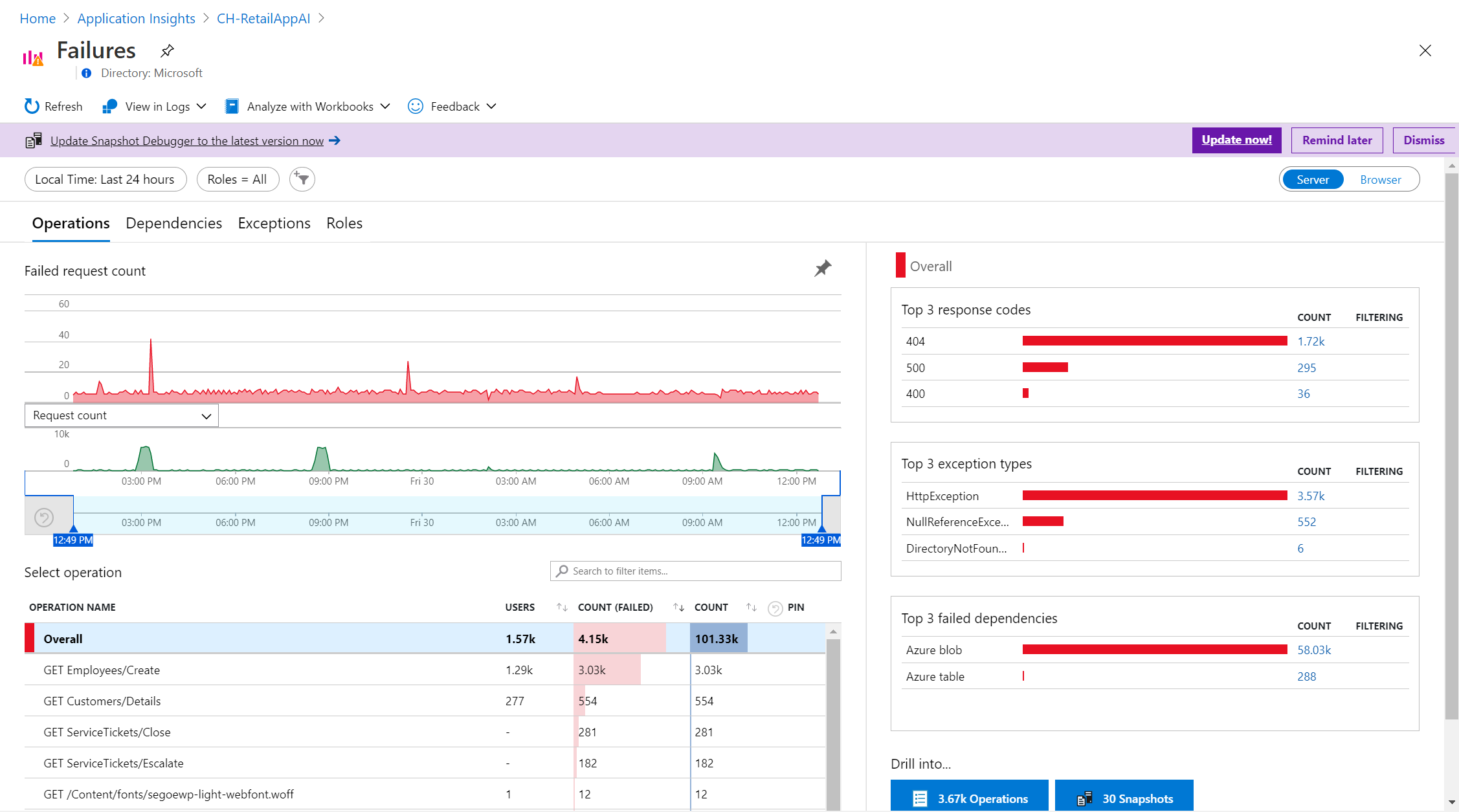
On the custom failure pane, check for failed operations, top exception types, and failed dependencies.


Share your charts
After you configure a chart, you can add it to a dashboard or workbook. By adding a chart to a dashboard or workbook, you can make it accessible to your team. You can also gain insights by viewing it in the context of other monitoring information.
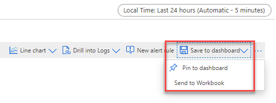
To pin a configured chart to a dashboard, in the upper-right corner of the chart, select Save to dashboard > Pin to dashboard.
To save a configured chart to a workbook, in the upper-right corner of the chart, select Save to dashboard > Save to workbook.
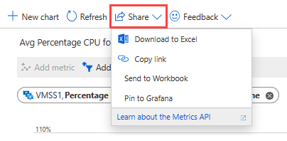
The Azure Monitor metrics explorer Share menu includes several options for sharing your metric chart.
Use the Download to Excel option to immediately download your chart.
Choose the Copy link option to add a link to your chart to the clipboard. You receive a notification when the link is copied successfully.
In the Send to Workbook window, send your chart to a new or existing workbook.
In the Pin to Grafana window, pin your chart to a new or existing Grafana dashboard.
Frequently asked questions
This section provides answers to common questions.
Why are metrics from the guest OS of my Azure virtual machine not showing up in metrics explorer?
Platform metrics are collected automatically for Azure resources. You must perform some configuration, though, to collect metrics from the guest OS of a virtual machine. For a Windows VM, install the diagnostic extension and configure the Azure Monitor sink as described in Install and configure Azure Diagnostics extension for Windows (WAD). For Linux, install the Telegraf agent as described in Collect custom metrics for a Linux VM with the InfluxData Telegraf agent.
Can I view my Prometheus metrics in Azure Monitor metrics explorer?
Metrics explorer with PromQL supports visualizing Prometheus metrics data using PromQL. To use the Metrics Explorer with PromQL support, select the Metrics menu item from any Azure Monitor workspace in the Azure portal. For more information, see Metrics explorer with PromQL (Preview).
Next steps
Feedback
Kommer snart: I hele 2024 udfaser vi GitHub-problemer som feedbackmekanisme for indhold og erstatter det med et nyt feedbacksystem. Du kan få flere oplysninger under: https://aka.ms/ContentUserFeedback.
Indsend og få vist feedback om