Bemærk
Adgang til denne side kræver godkendelse. Du kan prøve at logge på eller ændre mapper.
Adgang til denne side kræver godkendelse. Du kan prøve at ændre mapper.
Panel elements are components that control the rendering of elements—their size and dimensions, their position, and the arrangement of their child content. The Windows Presentation Foundation (WPF) provides a number of predefined Panel elements as well as the ability to construct custom Panel elements.
| Title | Description |
|---|---|
| Create a Custom Panel Element | Shows how to create a custom panel element. |
| Override the Panel OnRender Method | Shows how to override the OnRender method of a Panel. |
| Set the Height Properties of an Element | Shows how to set the height properties of an element. |
| Set the Width Properties of an Element | Shows how to set the width properties of an element. |
Styles and templates
Panel is an abstract base class that doesn't define a default template or visual appearance. Derived panel classes implement their own styling and template behavior.
Content property
This control uses the Children property as its content property.
Parts
This control doesn't define any template parts.
Visual states
This control doesn't define any visual states.
The Panel class
Panel is the base class for all elements that provide layout support in Windows Presentation Foundation (WPF). Derived Panel elements are used to position and arrange elements in Extensible Application Markup Language (XAML) and code.
The WPF includes a comprehensive suite of derived panel implementations that enable many complex layouts. These derived classes expose properties and methods that enable most standard user interface (UI) scenarios. Developers who can't find a child arrangement behavior that meets their needs can create new layouts by overriding the ArrangeOverride and MeasureOverride methods.
Panel common members
All Panel elements support the base sizing and positioning properties defined by FrameworkElement, including Height, Width, HorizontalAlignment, VerticalAlignment, Margin, and LayoutTransform. For additional information on positioning properties defined by FrameworkElement, see Alignment, Margins, and Padding Overview.
Panel exposes additional properties that are of critical importance in understanding and using layout. The Background property is used to fill the area between the boundaries of a derived panel element with a Brush. Children represents the child collection of elements that the Panel is comprised of. InternalChildren represents the content of the Children collection plus those members generated by data binding. Both consist of a UIElementCollection of child elements hosted within the parent Panel.
Panel also exposes a Panel.ZIndex attached property that can be used to achieve layered order in a derived Panel. Members of a panel's Children collection with a higher Panel.ZIndex value appear in front of those with a lower Panel.ZIndex value. This is particularly useful for panels such as Canvas and Grid that allow children to share the same coordinate space.
Panel also defines the OnRender method, which can be used to override the default presentation behavior of a Panel.
Attached properties
Derived panel elements make extensive use of attached properties. An attached property is a specialized form of dependency property that doesn't have the conventional common language runtime (CLR) property "wrapper". Attached properties have a specialized syntax in Extensible Application Markup Language (XAML), which can be seen in several of the examples that follow.
One purpose of an attached property is to allow child elements to store unique values of a property that is actually defined by a parent element. An application of this functionality is having child elements inform the parent how they wish to be presented in the user interface (UI), which is extremely useful for application layout. For more information, see Attached Properties Overview.
Derived Panel elements
Many objects derive from Panel, but not all of them are intended for use as root layout providers. There are six defined panel classes (Canvas, DockPanel, Grid, StackPanel, VirtualizingStackPanel, and WrapPanel) that are designed specifically for creating application UI.
Each panel element encapsulates its own special functionality, as seen in the following table.
| Element Name | UI Panel? | Description |
|---|---|---|
| Canvas | Yes | Defines an area within which you can explicitly position child elements by coordinates relative to the Canvas area. |
| DockPanel | Yes | Defines an area within which you can arrange child elements either horizontally or vertically, relative to each other. |
| Grid | Yes | Defines a flexible grid area consisting of columns and rows. Child elements of a Grid can be positioned precisely using the Margin property. |
| StackPanel | Yes | Arranges child elements into a single line that can be oriented horizontally or vertically. |
| TabPanel | No | Handles the layout of tab buttons in a TabControl. |
| ToolBarOverflowPanel | No | Arranges content within a ToolBar control. |
| UniformGrid | No | UniformGrid is used to arrange children in a grid with all equal cell sizes. |
| VirtualizingPanel | No | Provides a base class for panels that can "virtualize" their children collection. |
| VirtualizingStackPanel | Yes | Arranges and virtualizes content on a single line oriented horizontally or vertically. |
| WrapPanel | Yes | WrapPanel positions child elements in sequential position from left to right, breaking content to the next line at the edge of the containing box. Subsequent ordering happens sequentially from top to bottom or right to left, depending on the value of the Orientation property. |
User Interface panels
There are six panel classes available in WPF that are optimized to support UI scenarios: Canvas, DockPanel, Grid, StackPanel, VirtualizingStackPanel, and WrapPanel. These panel elements are easy to use, versatile, and extensible enough for most applications.
Each derived Panel element treats sizing constraints differently. Understanding how a Panel handles constraints in either the horizontal or vertical direction can make layout more predictable.
| Panel Name | x-Dimension | y-Dimension |
|---|---|---|
| Canvas | Constrained to content | Constrained to content |
| DockPanel | Constrained | Constrained |
| StackPanel (Vertical Orientation) | Constrained | Constrained to content |
| StackPanel (Horizontal Orientation) | Constrained to content | Constrained |
| Grid | Constrained | Constrained, except in cases where Auto apply to rows and columns |
| WrapPanel | Constrained to content | Constrained to content |
More detailed descriptions and usage examples of each of these elements can be found below.
Canvas
The Canvas element enables positioning of content according to absolute x- and y- coordinates. Elements can be drawn in a unique location; or, if elements occupy the same coordinates, the order in which they appear in markup determines the order in which the elements are drawn.
Canvas provides the most flexible layout support of any Panel. Height and Width properties are used to define the area of the canvas, and elements inside are assigned absolute coordinates relative to the area of the parent Canvas. Four attached properties, Canvas.Left, Canvas.Top, Canvas.Right and Canvas.Bottom, allow fine control of object placement within a Canvas, allowing the developer to position and arrange elements precisely on the screen.
ClipToBounds within a Canvas
Canvas can position child elements at any position on the screen, even at coordinates that are outside of its own defined Height and Width. Furthermore, Canvas isn't affected by the size of its children. As a result, it's possible for a child element to overdraw other elements outside the bounding rectangle of the parent Canvas. The default behavior of a Canvas is to allow children to be drawn outside the bounds of the parent Canvas. If this behavior is undesirable, the ClipToBounds property can be set to true. This causes Canvas to clip to its own size. Canvas is the only layout element that allows children to be drawn outside its bounds.
This behavior is graphically illustrated in the Width Properties Comparison Sample.
DockPanel
The DockPanel element uses the DockPanel.Dock attached property as set in child content elements to position content along the edges of a container. When DockPanel.Dock is set to Top or Bottom, it positions child elements above or below each other. When DockPanel.Dock is set to Left or Right, it positions child elements to the left or right of each other. The LastChildFill property determines the position of the final element added as a child of a DockPanel.
You can use DockPanel to position a group of related controls, such as a set of buttons. Alternately, you can use it to create a "paned" UI, similar to that found in Microsoft Outlook.
Sizing to content
If its Height and Width properties aren't specified, DockPanel sizes to its content. The size can increase or decrease to accommodate the size of its child elements. However, when these properties are specified and there's no longer room for the next specified child element, DockPanel doesn't display that child element or subsequent child elements and doesn't measure subsequent child elements.
LastChildFill
By default, the last child of a DockPanel element will "fill" the remaining, unallocated space. If this behavior isn't desired, set the LastChildFill property to false.
Examples
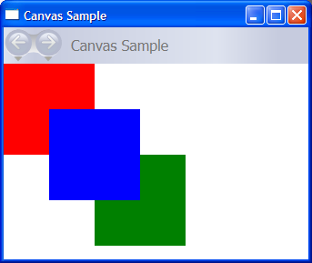
The following example demonstrates how to use Canvas to absolutely position content. This code produces three 100-pixel squares. The first square is red, and its top-left (x, y) position is specified as (0, 0). The second square is green, and its top-left position is (100, 100), just below and to the right of the first square. The third square is blue, and its top-left position is (50, 50), thus encompassing the lower-right quadrant of the first square and the upper-left quadrant of the second. Because the third square is laid out last, it appears to be on top of the other two squares—that is, the overlapping portions assume the color of the third box.
// Create the application's main window
mainWindow = new Window ();
mainWindow.Title = "Canvas Sample";

// Create the Canvas
myParentCanvas = new Canvas();
myParentCanvas.Width = 400;
myParentCanvas.Height = 400;

// Define child Canvas elements
myCanvas1 = new Canvas();
myCanvas1.Background = Brushes.Red;
myCanvas1.Height = 100;
myCanvas1.Width = 100;
Canvas.SetTop(myCanvas1, 0);
Canvas.SetLeft(myCanvas1, 0);

myCanvas2 = new Canvas();
myCanvas2.Background = Brushes.Green;
myCanvas2.Height = 100;
myCanvas2.Width = 100;
Canvas.SetTop(myCanvas2, 100);
Canvas.SetLeft(myCanvas2, 100);

myCanvas3 = new Canvas();
myCanvas3.Background = Brushes.Blue;
myCanvas3.Height = 100;
myCanvas3.Width = 100;
Canvas.SetTop(myCanvas3, 50);
Canvas.SetLeft(myCanvas3, 50);

// Add child elements to the Canvas' Children collection
myParentCanvas.Children.Add(myCanvas1);
myParentCanvas.Children.Add(myCanvas2);
myParentCanvas.Children.Add(myCanvas3);

// Add the parent Canvas as the Content of the Window Object
mainWindow.Content = myParentCanvas;
mainWindow.Show ();
WindowTitle = "Canvas Sample"
'Create a Canvas as the root Panel
Dim myParentCanvas As New Canvas()
myParentCanvas.Width = 400
myParentCanvas.Height = 400

' Define child Canvas elements
Dim myCanvas1 As New Canvas()
myCanvas1.Background = Brushes.Red
myCanvas1.Height = 100
myCanvas1.Width = 100
Canvas.SetTop(myCanvas1, 0)
Canvas.SetLeft(myCanvas1, 0)

Dim myCanvas2 As New Canvas()
myCanvas2.Background = Brushes.Green
myCanvas2.Height = 100
myCanvas2.Width = 100
Canvas.SetTop(myCanvas2, 100)
Canvas.SetLeft(myCanvas2, 100)

Dim myCanvas3 As New Canvas()
myCanvas3.Background = Brushes.Blue
myCanvas3.Height = 100
myCanvas3.Width = 100
Canvas.SetTop(myCanvas3, 50)
Canvas.SetLeft(myCanvas3, 50)

' Add child elements to the Canvas' Children collection
myParentCanvas.Children.Add(myCanvas1)
myParentCanvas.Children.Add(myCanvas2)
myParentCanvas.Children.Add(myCanvas3)

' Add the parent Canvas as the Content of the Window Object
Me.Content = myParentCanvas
<Page WindowTitle="Canvas Sample" xmlns="http://schemas.microsoft.com/winfx/2006/xaml/presentation">
  <Canvas Height="400" Width="400">
    <Canvas Height="100" Width="100" Top="0" Left="0" Background="Red"/>
    <Canvas Height="100" Width="100" Top="100" Left="100" Background="Green"/>
    <Canvas Height="100" Width="100" Top="50" Left="50" Background="Blue"/>
  </Canvas>
</Page>
The compiled application yields a new UI that looks like this.
The following example demonstrates how to partition space using a DockPanel. Five Border elements are added as children of a parent DockPanel. Each uses a different positioning property of a DockPanel to partition space. The final element "fills" the remaining, unallocated space.
// Create the application's main window
mainWindow = gcnew Window();
mainWindow->Title = "DockPanel Sample";

// Create the DockPanel
DockPanel^ myDockPanel = gcnew DockPanel();
myDockPanel->LastChildFill = true;

// Define the child content
Border^ myBorder1 = gcnew Border();
myBorder1->Height = 25;
myBorder1->Background = Brushes::SkyBlue;
myBorder1->BorderBrush = Brushes::Black;
myBorder1->BorderThickness = Thickness(1);
DockPanel::SetDock(myBorder1, Dock::Top);
TextBlock^ myTextBlock1 = gcnew TextBlock();
myTextBlock1->Foreground = Brushes::Black;
myTextBlock1->Text = "Dock = Top";
myBorder1->Child = myTextBlock1;

Border^ myBorder2 = gcnew Border();
myBorder2->Height = 25;
myBorder2->Background = Brushes::SkyBlue;
myBorder2->BorderBrush = Brushes::Black;
myBorder2->BorderThickness = Thickness(1);
DockPanel::SetDock(myBorder2, Dock::Top);
TextBlock^ myTextBlock2 = gcnew TextBlock();
myTextBlock2->Foreground = Brushes::Black;
myTextBlock2->Text = "Dock = Top";
myBorder2->Child = myTextBlock2;

Border^ myBorder3 = gcnew Border();
myBorder3->Height = 25;
myBorder3->Background = Brushes::LemonChiffon;
myBorder3->BorderBrush = Brushes::Black;
myBorder3->BorderThickness = Thickness(1);
DockPanel::SetDock(myBorder3, Dock::Bottom);
TextBlock^ myTextBlock3 = gcnew TextBlock();
myTextBlock3->Foreground = Brushes::Black;
myTextBlock3->Text = "Dock = Bottom";
myBorder3->Child = myTextBlock3;

Border^ myBorder4 = gcnew Border();
myBorder4->Width = 200;
myBorder4->Background = Brushes::PaleGreen;
myBorder4->BorderBrush = Brushes::Black;
myBorder4->BorderThickness = Thickness(1);
DockPanel::SetDock(myBorder4, Dock::Left);
TextBlock^ myTextBlock4 = gcnew TextBlock();
myTextBlock4->Foreground = Brushes::Black;
myTextBlock4->Text = "Dock = Left";
myBorder4->Child = myTextBlock4;

Border^ myBorder5 = gcnew Border();
myBorder5->Background = Brushes::White;
myBorder5->BorderBrush = Brushes::Black;
myBorder5->BorderThickness = Thickness(1);
TextBlock^ myTextBlock5 = gcnew TextBlock();
myTextBlock5->Foreground = Brushes::Black;
myTextBlock5->Text = "This content will Fill the remaining space";
myBorder5->Child = myTextBlock5;

// Add child elements to the DockPanel Children collection
myDockPanel->Children->Add(myBorder1);
myDockPanel->Children->Add(myBorder2);
myDockPanel->Children->Add(myBorder3);
myDockPanel->Children->Add(myBorder4);
myDockPanel->Children->Add(myBorder5);

// Add the parent Canvas as the Content of the Window Object
mainWindow->Content = myDockPanel;
mainWindow->Show();
// Create the application's main window
mainWindow = new Window ();
mainWindow.Title = "DockPanel Sample";

// Create the DockPanel
DockPanel myDockPanel = new DockPanel();
myDockPanel.LastChildFill = true;

// Define the child content
Border myBorder1 = new Border();
myBorder1.Height = 25;
myBorder1.Background = Brushes.SkyBlue;
myBorder1.BorderBrush = Brushes.Black;
myBorder1.BorderThickness = new Thickness(1);
DockPanel.SetDock(myBorder1, Dock.Top);
TextBlock myTextBlock1 = new TextBlock();
myTextBlock1.Foreground = Brushes.Black;
myTextBlock1.Text = "Dock = Top";
myBorder1.Child = myTextBlock1;

Border myBorder2 = new Border();
myBorder2.Height = 25;
myBorder2.Background = Brushes.SkyBlue;
myBorder2.BorderBrush = Brushes.Black;
myBorder2.BorderThickness = new Thickness(1);
DockPanel.SetDock(myBorder2, Dock.Top);
TextBlock myTextBlock2 = new TextBlock();
myTextBlock2.Foreground = Brushes.Black;
myTextBlock2.Text = "Dock = Top";
myBorder2.Child = myTextBlock2;

Border myBorder3 = new Border();
myBorder3.Height = 25;
myBorder3.Background = Brushes.LemonChiffon;
myBorder3.BorderBrush = Brushes.Black;
myBorder3.BorderThickness = new Thickness(1);
DockPanel.SetDock(myBorder3, Dock.Bottom);
TextBlock myTextBlock3 = new TextBlock();
myTextBlock3.Foreground = Brushes.Black;
myTextBlock3.Text = "Dock = Bottom";
myBorder3.Child = myTextBlock3;

Border myBorder4 = new Border();
myBorder4.Width = 200;
myBorder4.Background = Brushes.PaleGreen;
myBorder4.BorderBrush = Brushes.Black;
myBorder4.BorderThickness = new Thickness(1);
DockPanel.SetDock(myBorder4, Dock.Left);
TextBlock myTextBlock4 = new TextBlock();
myTextBlock4.Foreground = Brushes.Black;
myTextBlock4.Text = "Dock = Left";
myBorder4.Child = myTextBlock4;

Border myBorder5 = new Border();
myBorder5.Background = Brushes.White;
myBorder5.BorderBrush = Brushes.Black;
myBorder5.BorderThickness = new Thickness(1);
TextBlock myTextBlock5 = new TextBlock();
myTextBlock5.Foreground = Brushes.Black;
myTextBlock5.Text = "This content will Fill the remaining space";
myBorder5.Child = myTextBlock5;

// Add child elements to the DockPanel Children collection
myDockPanel.Children.Add(myBorder1);
myDockPanel.Children.Add(myBorder2);
myDockPanel.Children.Add(myBorder3);
myDockPanel.Children.Add(myBorder4);
myDockPanel.Children.Add(myBorder5);

// Add the parent Canvas as the Content of the Window Object
mainWindow.Content = myDockPanel;
mainWindow.Show ();
WindowTitle = "DockPanel Sample"
'Create a DockPanel as the root Panel
Dim myDockPanel As New DockPanel()
myDockPanel.LastChildFill = True

' Define the child content
Dim myBorder1 As New Border()
myBorder1.Height = 25
myBorder1.Background = Brushes.SkyBlue
myBorder1.BorderBrush = Brushes.Black
myBorder1.BorderThickness = New Thickness(1)
DockPanel.SetDock(myBorder1, Dock.Top)
Dim myTextBlock1 As New TextBlock()
myTextBlock1.Foreground = Brushes.Black
myTextBlock1.Text = "Dock = Top"
myBorder1.Child = myTextBlock1

Dim myBorder2 As New Border()
myBorder2.Height = 25
myBorder2.Background = Brushes.SkyBlue
myBorder2.BorderBrush = Brushes.Black
myBorder2.BorderThickness = New Thickness(1)
DockPanel.SetDock(myBorder2, Dock.Top)
Dim myTextBlock2 As New TextBlock()
myTextBlock2.Foreground = Brushes.Black
myTextBlock2.Text = "Dock = Top"
myBorder2.Child = myTextBlock2

Dim myBorder3 As New Border()
myBorder3.Height = 25
myBorder3.Background = Brushes.LemonChiffon
myBorder3.BorderBrush = Brushes.Black
myBorder3.BorderThickness = New Thickness(1)
DockPanel.SetDock(myBorder3, Dock.Bottom)
Dim myTextBlock3 As New TextBlock()
myTextBlock3.Foreground = Brushes.Black
myTextBlock3.Text = "Dock = Bottom"
myBorder3.Child = myTextBlock3

Dim myBorder4 As New Border()
myBorder4.Width = 200
myBorder4.Background = Brushes.PaleGreen
myBorder4.BorderBrush = Brushes.Black
myBorder4.BorderThickness = New Thickness(1)
DockPanel.SetDock(myBorder4, Dock.Left)
Dim myTextBlock4 As New TextBlock()
myTextBlock4.Foreground = Brushes.Black
myTextBlock4.Text = "Dock = Left"
myBorder4.Child = myTextBlock4

Dim myBorder5 As New Border()
myBorder5.Background = Brushes.White
myBorder5.BorderBrush = Brushes.Black
myBorder5.BorderThickness = New Thickness(1)
Dim myTextBlock5 As New TextBlock()
myTextBlock5.Foreground = Brushes.Black
myTextBlock5.Text = "This content will Fill the remaining space"
myBorder5.Child = myTextBlock5

' Add child elements to the DockPanel Children collection
myDockPanel.Children.Add(myBorder1)
myDockPanel.Children.Add(myBorder2)
myDockPanel.Children.Add(myBorder3)
myDockPanel.Children.Add(myBorder4)
myDockPanel.Children.Add(myBorder5)
Me.Content = myDockPanel
See also
Samarbejd med os på GitHub
Kilden til dette indhold kan findes på GitHub, hvor du også kan oprette og gennemse problemer og pullanmodninger. Du kan få flere oplysninger i vores vejledning til bidragydere.
.NET Desktop feedback