HorizontalStackLayout
The .NET Multi-platform App UI (.NET MAUI) HorizontalStackLayout organizes child views in a one-dimensional horizontal stack, and is a more performant alternative to a StackLayout. In addition, a HorizontalStackLayout can be used as a parent layout that contains other child layouts.
The HorizontalStackLayout defines the following properties:
Spacing, of typedouble, indicates the amount of space between each child view. The default value of this property is 0.
This property is backed by a BindableProperty object, which means that it can be the target of data bindings and styled.
The following XAML shows how to create a HorizontalStackLayout that contains different child views:
<ContentPage xmlns="http://schemas.microsoft.com/dotnet/2021/maui"
             xmlns:x="http://schemas.microsoft.com/winfx/2009/xaml"
             x:Class="StackLayoutDemos.Views.HorizontalStackLayoutPage">
    <HorizontalStackLayout Margin="20">
       <Rectangle Fill="Red"
                  HeightRequest="30"
                  WidthRequest="30" />
       <Label Text="Red"
              FontSize="18" />
    </HorizontalStackLayout>
</ContentPage>
This example creates a HorizontalStackLayout containing a Rectangle and a Label object. By default, there is no space between the child views:

Note
The value of the Margin property represents the distance between an element and its adjacent elements. For more information, see Position controls.
Space between child views
The spacing between child views in a HorizontalStackLayout can be changed by setting the Spacing property to a double value:
<ContentPage xmlns="http://schemas.microsoft.com/dotnet/2021/maui"
             xmlns:x="http://schemas.microsoft.com/winfx/2009/xaml"
             x:Class="StackLayoutDemos.Views.HorizontalStackLayoutPage">
    <HorizontalStackLayout Margin="20"
                           Spacing="10">
       <Rectangle Fill="Red"
                  HeightRequest="30"
                  WidthRequest="30" />
       <Label Text="Red"
              FontSize="18" />
    </HorizontalStackLayout>
</ContentPage>
This example creates a HorizontalStackLayout containing a Rectangle and a Label object, that have ten device-independent units of space between them:

Tip
The Spacing property can be set to negative values to make child views overlap.
Position and size child views
The size and position of child views within a HorizontalStackLayout depends upon the values of the child views' HeightRequest and WidthRequest properties, and the values of their VerticalOptions properties. In a HorizontalStackLayout, child views expand to fill the available height when their size isn't explicitly set.
The VerticalOptions properties of a HorizontalStackLayout, and its child views, can be set to fields from the LayoutOptions struct, which encapsulates an alignment layout preference. This layout preference determines the position and size of a child view within its parent layout.
The following XAML example sets alignment preferences on each child view in the HorizontalStackLayout:
<ContentPage xmlns="http://schemas.microsoft.com/dotnet/2021/maui"
             xmlns:x="http://schemas.microsoft.com/winfx/2009/xaml"
             x:Class="StackLayoutDemos.Views.HorizontalStackLayoutPage">
    <HorizontalStackLayout Margin="20"
                           HeightRequest="200">
        <Label Text="Start"
               BackgroundColor="Gray"
               VerticalOptions="Start" />
        <Label Text="Center"
               BackgroundColor="Gray"
               VerticalOptions="Center" />
        <Label Text="End"
               BackgroundColor="Gray"
               VerticalOptions="End" />
        <Label Text="Fill"
               BackgroundColor="Gray"
               VerticalOptions="Fill" />
    </HorizontalStackLayout>
</ContentPage>
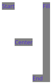
In this example, alignment preferences are set on the Label objects to control their position within the HorizontalStackLayout. The Start, Center, End, and Fill fields are used to define the alignment of the Label objects within the parent HorizontalStackLayout:

A HorizontalStackLayout only respects the alignment preferences on child views that are in the opposite direction to the orientation of the layout. Therefore, the Label child views within the HorizontalStackLayout set their VerticalOptions properties to one of the alignment fields:
Start, which positions the Label at the start of the HorizontalStackLayout.Center, which vertically centers the Label in the HorizontalStackLayout.End, which positions the Label at the end of the HorizontalStackLayout.Fill, which ensures that the Label fills the height of the HorizontalStackLayout.
For more information about alignment, see Align and position .NET MAUI controls.
Nest HorizontalStackLayout objects
A HorizontalStackLayout can be used as a parent layout that contains other nested child layouts.
The following XAML shows an example of nesting VerticalStackLayout objects in a HorizontalStackLayout:
<ContentPage xmlns="http://xamarin.com/schemas/2014/forms"
             xmlns:x="http://schemas.microsoft.com/winfx/2009/xaml"
             x:Class="StackLayoutDemos.Views.HorizontalStackLayoutPage">
    <HorizontalStackLayout Margin="20"
                           Spacing="6">
        <Label Text="Primary colors:" />
        <VerticalStackLayout Spacing="6">
            <Rectangle Fill="Red"
                       WidthRequest="30"
                       HeightRequest="30" />
            <Rectangle Fill="Yellow"
                       WidthRequest="30"
                       HeightRequest="30" />
            <Rectangle Fill="Blue"
                       WidthRequest="30"
                       HeightRequest="30" />
        </VerticalStackLayout>
        <Label Text="Secondary colors:" />
        <VerticalStackLayout Spacing="6">
            <Rectangle Fill="Green"
                       WidthRequest="30"
                       HeightRequest="30" />
            <Rectangle Fill="Orange"
                       WidthRequest="30"
                       HeightRequest="30" />
            <Rectangle Fill="Purple"
                       WidthRequest="30"
                       HeightRequest="30" />
        </VerticalStackLayout>
    </HorizontalStackLayout>
</ContentPage>
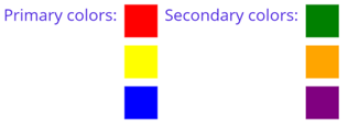
In this example, the parent HorizontalStackLayout contains two nested VerticalStackLayout objects:

Important
The deeper you nest layout objects the more layout calculations will be performed, which may impact performance. For more information, see Choose the correct layout.
.NET MAUI
