User experience guidelines for errors
This article guides you on applying actionable errors to offer users recommended actions for more effective error resolution. It covers the key questions that error dialogs and validation errors should address, along with recommended voice guidelines for writing impactful error messages.
Why should you deliver great error messages?
Improving error handling and error messages reduces friction for the users and highly impacts the user experience. Clear, informative error messages help users understand what went wrong and how to correct it, reducing frustration, and improving user satisfaction.
For guidance on how to formulate good error messages, see Error message best practices - what to say? in the following section.
Unblocking users with actionable errors
With Business Central 2023 release wave 2, the error handling framework has been enhanced to include promoted actions in both error dialogs and validation errors. These promoted actions are designed to assist users in resolving errors more effectively. There are currently two main scenarios to keep in mind when deciding how to use recommended actions:
- Fix-it actions are recommended for scenarios where the system knows the correct value that should be used to resolve the error.
- Show-it actions are recommended for scenarios when the system can identify the location where the error may be fixed by the user.
Here are some quick guidelines on when to use each type of error message and its accompanying recommended actions. However, it's essential to begin by considering whether the error could have been avoided in the first place.
| Error type | Description |
|---|---|
| Task dialogs | Task dialogs are used when an error can be mitigated by the user choosing between two (sometimes three) different options to continue their task without encountering an error. |
| Error messages with Fix-it actions | Fix-it actions can be used when the cause and solution to the error is known and can be solved by users with just one step. |
| Error messages with Show-it actions | Show-it actions can be used when an error must be corrected on a related table. A Show-it action can then offer a shortcut to the related table, enabling users to correct the error by themselves with one or multiple steps, while keeping the context of their current task. |
Error messages with Fix-it actions – when to use them?
Fix-it actions are for when the correct value is known. If all the following four statements are true for your error case, then consider adding a recommended Fix-it action in your error message to enable users to easily unblock themselves from the error.
- Is the solution to the error known?
- Is the error location on the current page?
- Can the error (value) be corrected with one action?
- Does the user have permission to make the required correction?
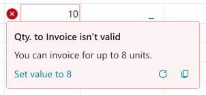
Example of an error message with a Fix-it action:

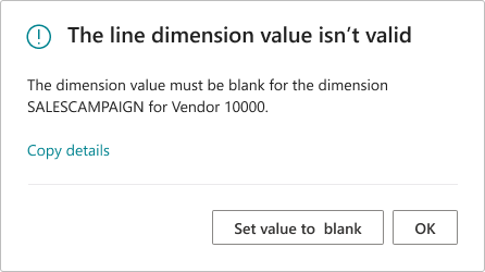
Example of a validation error dialog with a Fix-it action:

For more information, see Error messages with Fix-it actions
Error messages with Show-it actions – when to use them?
Show-it actions are for when the error location is known. A shortcut can then be provided to show the related page to enable users to easily unblock themselves from the error. If all the following four statements are true for your error case, then consider adding a recommended Show-it action in your error message.
- Is the solution to the error known?
- Is the error correction location known and is it on a related table?
- Can you show the related table with one action?
- Does the user have permission to make the required correction?
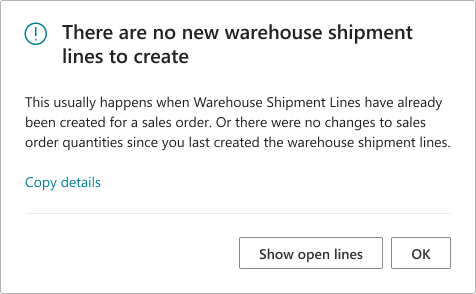
Example of an error dialog with a Show-it action:

Example of a validation dialog with a Show-it action:

For more information, see Error messages with Show-it actions
Error message best practices - what to say?
Error messages are meant to unblock users. The primary purpose of the error dialog is to alert users to the fact that something has gone wrong and that they need to take action to continue. In the following, you find best practices for what to say in an error dialog versus in an in-line validation error situation.
Error message best practices (Error dialogs)
Error dialogs should answer the following questions:
Title: [What went wrong]
Body content: [Why, if relevant] + [How to fix it]
Button label: [Clear action]
Error message best practices (Validation errors)
Validation errors should answer the following questions:
Title (if needed): [What went wrong]
Body content: [How to fix it]
Button label: [Clear action]
Error message voice guidelines – how to say it?
Use the following guidelines to remove friction for the users and positively affect the user experience, even when an error occurs.
Error message titles
The title of an error dialog is the first thing the user sees. Use the title to describe what’s wrong and enable the user to quickly scan the meaning.
- Be concise and describe the issue, not the action to take.
- Be brief. Just one sentence.
- Titles shouldn't end in punctuation.
- Not all validation errors need a title.
- Keep in mind the relation between the title and the recommended actions. Actions should always respond to the title if there's one.
Error message body content
In the body of the error dialog, use positive cases (telling what the user can do) where possible. Sometimes you need to tell what you can’t do, but for validation errors space is limited, so focus on the solution.
Error message button labels (for Fix-it and Show-it actions)
When you need to use error dialogs, where possible use a Fix-it action or a Show-it action. To achieve consistency in the user experience of such error dialogs, consider following these guidelines for button labels.
For Fix-it actions, consider
- Fix-it actions are often phrased: “Set value to...”.
- Such as: “Set value to 10”, “Set Status to Open”, or “Set value to HOME”.
- Fix-it action tooltips are often phrased: “Sets the value...”.
- Value states are capitalized such as: Yes, Open, Released. Avoid signs for values such as = ,“”, ().
For Show-it actions, consider
- Show-it actions are phrased: “Show...”.
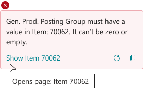
- Such as: “Show User Setup”, “Show Items list” or “Show Item 70062”.
- Show-it action tooltips are often phrased: “Opens page:..”.
- Note: Avoid using “Open” for the button label, as it can be confused with opening the status of the document. Instead use “Show” and use the tooltip to write out “Opens Page:...”.
- Captions are capitalized, such as: Item, Direct Posting and G/L Account.
Error message voice guidelines - do this
When writing error messages, consider using these overall rules of thumb:
- Use the word problem instead of error, issue, or technical problem.
- Refer to the error message as a message and not an error or error message.
- It’s OK to write "please" when asking the user to resolve a problem that isn’t their fault.
- Only use "sorry" (and similar wording) in error messages that notify the customer about a serious problem or one that they might find frustrating. For example:
- Data is lost.
- The user can't continue to use the device, service, or application.
- The user must get help from a support representative.
- A product or service fails.
Error messages voice guidelines - use contractions
To write error messages that are simple and feel human, consider using contractions:
- Use common contractions, such as it’s, you’re, that's, and don’t, to create a friendly, informal tone.
- Don't mix contractions and their spelled-out equivalents in UI text. For example, don’t use can’t and cannot in the same UI.
- Never form a contraction from a noun and a verb, such as Microsoft’s developing many new cloud services.
- Avoid ambiguous or awkward contractions, such as there’d, it’ll, and they’d.
Error messages voice guidelines - avoid this
In error situations, it's crucial to show users we’re on their side. Utilize plain language and steer clear of the following words and phrases:
- “There was an error” or “An error has occurred”
- “Error,” “Failed,” “Denied,” or “Invalid”
- "Hmmm ..." or "Oops ..." or "Whoops"
- Developer error codes like “WDGeneralNetworkError Error 500”. If you need to include a code, hide it under “details”
Remember these rules of thumb:
- Don't overwhelm the user with technical terms
- Avoid robotic language and characters such as
=,", and() - Avoid long how-to or instructional guidance in errors. That content lives on docs.microsoft.com or in your documentation.
Microsoft’s voice guidelines
For more guidelines on how to communicate to the user in a way they understand, see Microsoft's brand voice: Above all, simple and human.
See also
Microsoft’s voice guidelines
Actionable errors
Understanding the error dialog
Dialog.Error(ErrorInfo) Method
AL error handling