Modify colors in charts and visuals
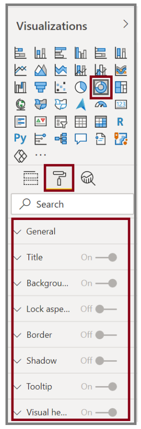
Occasionally, you might want to modify the colors that are used in charts or visuals. Power BI gives you control over how colors are displayed. To begin, select a visual and then select the paintbrush icon in the Visualizations pane.
Video: Modify colors
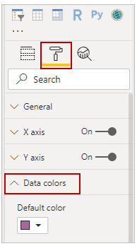
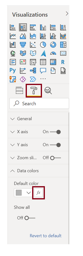
Power BI provides many options for changing the colors or formatting the visual. You can change the color of all bars in a visual by selecting the color picker beside Default color and then selecting your color of choice.
You can change the color of each bar (or other element, depending on the type of visual that you selected) by turning the Show all slider to On. A color selector will then appear for each element.
Conditional formatting
You can change the color based on a value or measure. To do so, select the formula box next to Default color.
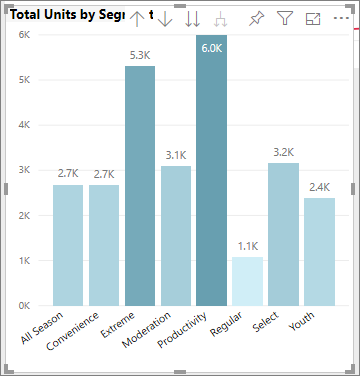
The resulting visuals will be colored by the gradient that you select.
You can use those values to create rules, for example, to set values above zero to a certain color and values below zero to another color.
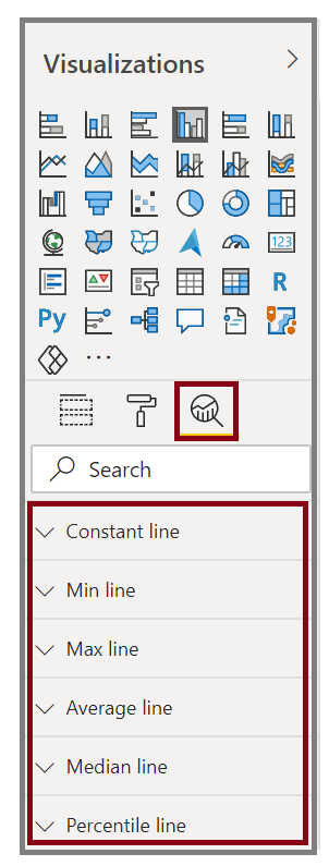
In the Analytics pane, you can create many other lines for a visual, such as Min, Max, Average, Median, and Percentile lines.
You can create a border around an individual visualization, and like other controls, you can specify the color of that border as well.
For more information, see Tips and tricks for color formatting in Power BI.