Developer technologies | .NET | .NET MAUI
A Microsoft open-source framework for building native device applications spanning mobile, tablet, and desktop.
This browser is no longer supported.
Upgrade to Microsoft Edge to take advantage of the latest features, security updates, and technical support.

How can we design a custom themed toggle switch in .NET Maui with .NET 9;
As we know we can do it using C# to design the switch and call it in XAML
If somebody knows, please share your thoughts on this topic.
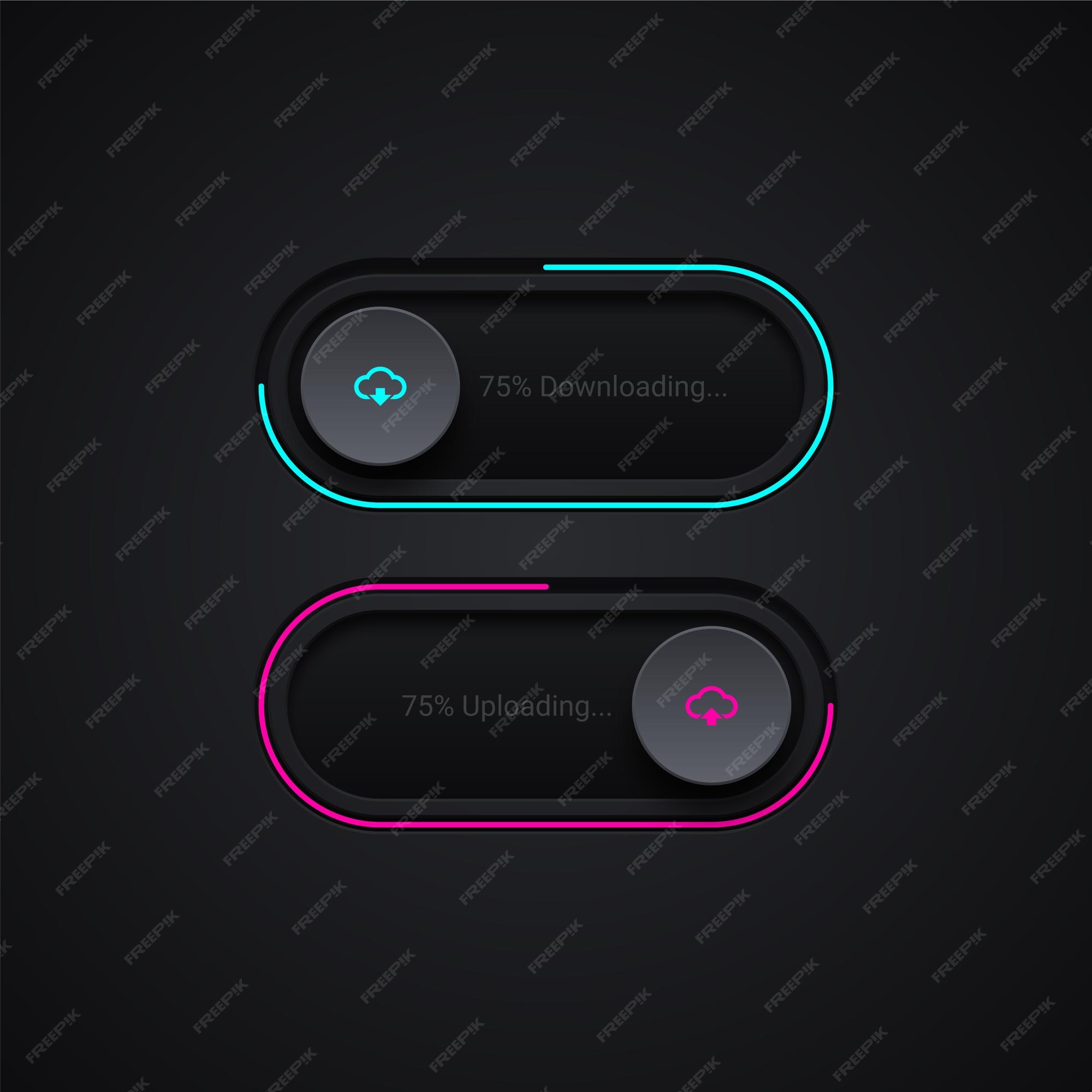
For reference I have shared two links of toggle switch designs.
https://i.ytimg.com/vi/priPsxNtZ-I/maxresdefault.jpg
https://img.freepik.com/premium-vector/download-upload-bar-illustration_6735-1139.jpg?w=2000
' cx='32' cy='32' r='32' /%3E%3Ctext x='50%25' y='55%25' dominant-baseline='middle' text-anchor='middle' fill='%23FFF' %3EWZ%3C/text%3E%3C/svg%3E)
How can we design a custom themed toggle switch in .NET Maui with .NET 9;
Your main purpose is to customize the themed and change the theme when clicking the switch, right?
And you want to load the theme at runtime, right? Please see if this doc can help you - Theme an app - .NET MAUI | Microsoft Learn
If you have any other issues, please feel free to let me know.

To create a custom themed toggle switch in .NET MAUI using the Switch class, you can define properties such as OnColor and ThumbColor to customize its appearance. You can instantiate the switch in XAML or C# and set these properties to achieve the desired theme.
Here’s an example of how to create a themed toggle switch in XAML:
<Switch OnColor="Orange" ThumbColor="Green" IsToggled="true"/>
And in C#:
Switch themedSwitch = new Switch
{
    OnColor = Colors.Orange,
    ThumbColor = Colors.Green,
    IsToggled = true
};
You can also define visual states for the switch to change its appearance based on the IsToggled property. This allows for a more dynamic and visually appealing design.
For more advanced theming, you might consider using styles and templates to create a consistent look across your application.
References:
I have found a solution refer this, it works well; @Wenyan Zhang (Shanghai Wicresoft Co,.Ltd.)
It is my solution for making differeing UI with logic through class file. Hope you like it!
#MAUI @netcore
C# code file (CustomSwitch)
using Microsoft.Maui.Controls;
namespace _34_Switch
{
    public class CustomSwitch : ContentView
    {
        private readonly Image _switchImage;
        private readonly Switch _switch;
        public CustomSwitch() {
            _switch = new() {
                Scale = 2
            };
            _switch.Toggled += OnCustomSwitchToggled!;
            _switchImage = new Image {
                Source = "moon.png"
            };
            var stackLayout = new StackLayout {
                Orientation = StackOrientation.Horizontal,
                Children = { _switchImage, _switch }
            };
            Content = stackLayout;
        }
        private void OnCustomSwitchToggled(object sender, ToggledEventArgs e) {
            _switchImage.Source = e.Value ? "sun.png" : "moon.png";
        }
    }
}
Another C# Code file for another design:
using Microsoft.Maui.Controls;
using Microsoft.Maui.Controls.Shapes;
namespace _34_Switch {
    public class CustomThemeThumbSwitch : ContentView {
        public event EventHandler<ToggledEventArgs>? Toggled;
        private readonly Image _thumbImage;
        private readonly Grid _thumbContainer;
        private readonly BoxView _track;
        private readonly Border _thumbBorder;
        private bool _isToggled;
        public CustomThemeThumbSwitch() {
            _track = new BoxView {
                Color = Colors.LightGray,
                HeightRequest = 30,
                WidthRequest = 50, // Ensure the track size fits the thumb
                HorizontalOptions = LayoutOptions.Center,
                VerticalOptions = LayoutOptions.Center,
                CornerRadius = new CornerRadius(20),
                BackgroundColor = Colors.Transparent
            };
            _thumbImage = new Image {
                Source = "moon.png",
                WidthRequest = 40, // Ensure the thumb size fits within the track
                HeightRequest = 40,
                VerticalOptions = LayoutOptions.Center,
                HorizontalOptions = LayoutOptions.Center,
            };
            _thumbBorder = new Border {
                Content = _thumbImage,
                WidthRequest = 40, // Ensure the thumb size fits within the track
                HeightRequest = 40,
                StrokeShape = new RoundRectangle { CornerRadius = new CornerRadius(20) },
                VerticalOptions = LayoutOptions.Center,
                HorizontalOptions = LayoutOptions.Center,
                BackgroundColor = Colors.DarkBlue,
                Padding = 0,
                Stroke = Colors.DarkGoldenrod,
                StrokeThickness = 3
            };
            _thumbContainer = new Grid {
                WidthRequest = 30,
                HeightRequest = 30, // Ensure thumb container size is accurate
                VerticalOptions = LayoutOptions.Center,
                HorizontalOptions = LayoutOptions.Start, // Initially align it to the start
                Children = { _thumbBorder }
            };
            var grid = new Grid {
                VerticalOptions = LayoutOptions.Center,
                HorizontalOptions = LayoutOptions.Center,
                //BackgroundColor = Colors.Blue,   /* This part helps me to know the total area cover the button */
                ColumnDefinitions =
                {
                    new ColumnDefinition { Width = new GridLength(1, GridUnitType.Star) },
                    new ColumnDefinition { Width = new GridLength(10) } // Ensure the column size fits the thumb container
                },
                Children = { _track, _thumbContainer }
            };
            var tapGestureRecognizer = new TapGestureRecognizer();
            tapGestureRecognizer.Tapped += OnSwitchToggled!;
            grid.GestureRecognizers.Add(tapGestureRecognizer);
            Content = grid;
        }
        private void OnSwitchToggled(object sender, EventArgs e) {
            _isToggled = !_isToggled;
            if (_isToggled) {
                _track.Color = Colors.RosyBrown;
                _thumbBorder.BackgroundColor = Colors.OliveDrab;
                _thumbBorder.Stroke = Colors.MediumVioletRed;
            } else {
                _track.Color = Colors.LightGray;
                _thumbBorder.BackgroundColor = Colors.DarkBlue;
                _thumbBorder.Stroke = Colors.DarkGoldenrod;
            }
            _thumbImage.Source = _isToggled ? "sun.png" : "moon.png"; // Change the image based on the switch state
            _thumbContainer.HorizontalOptions = _isToggled ? LayoutOptions.End : LayoutOptions.Start;
            // Animate the thumb movement
            var translation = _isToggled ? (_track.Width - _thumbContainer.Width) / 2 : -(_track.Width - _thumbContainer.Width) / 2;
            var animation = new Animation(v => _thumbContainer.TranslationX = v,
                                          _thumbContainer.TranslationX,
                                          translation);
            animation.Commit(this, "SwitchThumbAnimation", length: 650, easing: Easing.SpringOut);
            // Raise the Toggled event
            Toggled?.Invoke(this, new ToggledEventArgs(_isToggled));
        }
    }
}
This is MainPage.xaml markup:
<?xml version="1.0" encoding="utf-8" ?>
<ContentPage xmlns="http://schemas.microsoft.com/dotnet/2021/maui"
             xmlns:x="http://schemas.microsoft.com/winfx/2009/xaml"
             xmlns:local="clr-namespace:_34_Switch"
             x:DataType="local:MainPage"
             x:Class="_34_Switch.MainPage">
    <StackLayout>
        <Border VerticalOptions="End" WidthRequest="100" HeightRequest="50" BackgroundColor="LightGoldenrodYellow">
            <Switch x:Name="MySwitch"
                    Scale="2"
                    IsToggled="True"
                    ThumbColor="Teal"
                    OnColor="RosyBrown"
                    Toggled="OnSwitchToggled"
                    HorizontalOptions="Center"
                    VerticalOptions="Center" />
        </Border>
        <Border>
            <!-- Switch with Visual States -->
            <Switch IsToggled="True" VerticalOptions="Center" HorizontalOptions="Center" Scale="2">
                <VisualStateManager.VisualStateGroups>
                    <VisualStateGroupList>
                        <VisualStateGroup x:Name="CommonStates">
                            <VisualState x:Name="On">
                                <VisualState.Setters>
                                    <Setter Property="ThumbColor"
                                            Value="MediumSpringGreen" />
                                </VisualState.Setters>
                            </VisualState>
                            <VisualState x:Name="Off">
                                <VisualState.Setters>
                                    <Setter Property="ThumbColor"
                                            Value="Red" />
                                </VisualState.Setters>
                            </VisualState>
                        </VisualStateGroup>
                    </VisualStateGroupList>
                </VisualStateManager.VisualStateGroups>
            </Switch>
        </Border>
        <!-- Data bind a Switch-->
        <StackLayout>
            <Switch x:Name="styleSwitch" VerticalOptions="Center" HorizontalOptions="Center" Scale="2" />
            <Label Text="Lorem ipsum dolor sit amet, elit rutrum, enim hendrerit augue vitae praesent sed non, lorem aenean quis praesent pede.">
                <Label.Triggers>
                    <DataTrigger TargetType="Label"
                                 Binding="{Binding x:DataType='Switch', Source={x:Reference styleSwitch}, Path=IsToggled}"
                                 Value="true">
                        <Setter Property="FontAttributes"
                                Value="Italic, Bold" />
                        <Setter Property="FontSize"
                                Value="18" />
                    </DataTrigger>
                </Label.Triggers>
            </Label>
        </StackLayout>
        <!-- Custom Themed Switch -->
        <local:CustomSwitch />
        <!-- Custom Thumb Themed Switch -->
        <StackLayout Margin="10, 20, 0, 0">
            <Label Text="My Own Custom Toggle Button" FontSize="16" Padding="80,10" />
            <BoxView x:Name="boxView" Style="{StaticResource DayModeBoxView}" HeightRequest="200" WidthRequest="200" VerticalOptions="Center" HorizontalOptions="Center" />
            <Label x:Name="label" Text="Hello, World!" Style="{StaticResource DayModeLabel}" VerticalOptions="Center" HorizontalOptions="Center" />
            <local:CustomThemeThumbSwitch Toggled="OnToggled" />
        </StackLayout>
    </StackLayout>
</ContentPage>
Corresponding MainPage.xaml.cs code file:
using Microsoft.Maui.Controls;
namespace _34_Switch
{
    public partial class MainPage : ContentPage
    {
        public MainPage()
        {
            InitializeComponent();
        }
        private void OnSwitchToggled(object sender, ToggledEventArgs e) {
            DisplayAlert("Switch Toggled", $"Switch is now {(e.Value ? "On" : "Off")}", "OK");
        }
        private void OnToggled(object sender, ToggledEventArgs e) {
            bool isNightMode = e.Value;
            if (isNightMode) {
                boxView.Style = (Style)Application.Current!.Resources["NightModeBoxView"];
                label.Style = (Style)Application.Current.Resources["NightModeLabel"];
            } else {
                boxView.Style = (Style)Application.Current!.Resources["DayModeBoxView"];
                label.Style = (Style)Application.Current.Resources["DayModeLabel"];
            }
        }
    }
}
This is App.xaml markup:
<?xml version = "1.0" encoding = "UTF-8" ?>
<Application xmlns="http://schemas.microsoft.com/dotnet/2021/maui"
             xmlns:x="http://schemas.microsoft.com/winfx/2009/xaml"
             xmlns:local="clr-namespace:_34_Switch"
             x:Class="_34_Switch.App">
    <Application.Resources>
        <ResourceDictionary>
            <ResourceDictionary.MergedDictionaries>
                <ResourceDictionary Source="Resources/Styles/Colors.xaml" />
                <ResourceDictionary Source="Resources/Styles/Styles.xaml" />
            </ResourceDictionary.MergedDictionaries>
            <Style x:Key="DayModeBoxView" TargetType="BoxView">
                <Setter Property="BackgroundColor" Value="LightYellow" />
            </Style>
            <Style x:Key="NightModeBoxView" TargetType="BoxView">
                <Setter Property="BackgroundColor" Value="DarkSlateGray" />
            </Style>
            <Style x:Key="DayModeLabel" TargetType="Label">
                <Setter Property="TextColor" Value="Black" />
            </Style>
            <Style x:Key="NightModeLabel" TargetType="Label">
                <Setter Property="TextColor" Value="White" />
            </Style>
        </ResourceDictionary>
    </Application.Resources>
</Application>
Rest of the part keep same. This solution is made by me, You can refer this soluton for 'Switch Class' (Microsoft.Maui.Controls) library.
For the first CustomSwitch Class file:
using Microsoft.Maui.Controls;
namespace _34_Switch
{
    public class CustomSwitch : ContentView
    {
        private readonly Image _switchImage;
        private readonly Switch _switch;
        public CustomSwitch() {
            _switch = new() {
                Scale = 2
            };
            _switch.Toggled += OnCustomSwitchToggled!;
            _switchImage = new Image {
                Source = "moon.png"
            };
            var stackLayout = new StackLayout {
                Orientation = StackOrientation.Horizontal,
                Children = { _switchImage, _switch }
            };
            Content = stackLayout;
        }
        private void OnCustomSwitchToggled(object sender, ToggledEventArgs e) {
            _switchImage.Source = e.Value ? "sun.png" : "moon.png";
        }
    }
}