Note
Access to this page requires authorization. You can try signing in or changing directories.
Access to this page requires authorization. You can try changing directories.
Line-of-business apps often display records that users need to scan, select, filter, sort, or edit. WinUI 3 includes virtualizing collection controls, but it doesn't include a first-party DataGrid control.
Choose a control
| Requirement | Starting point |
|---|---|
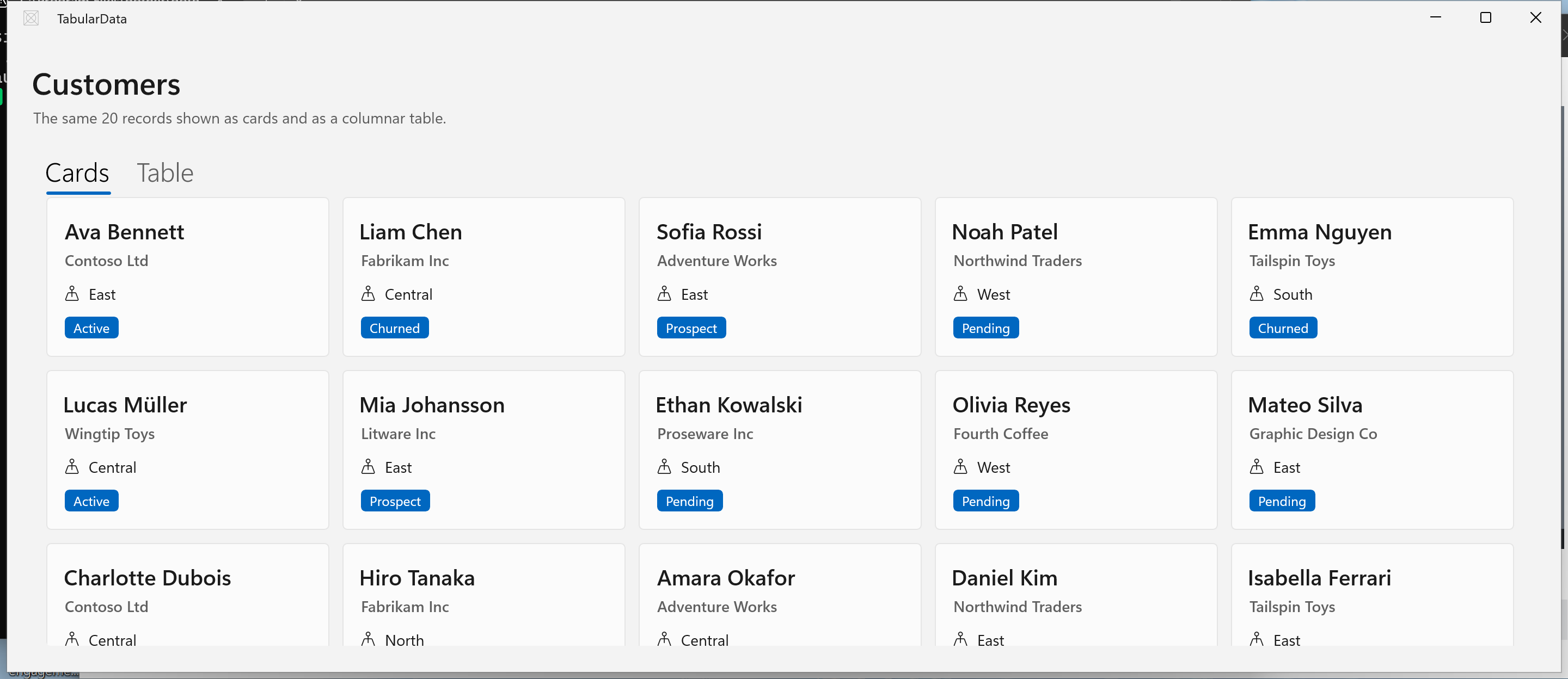
| A list or card layout with custom item content | ListView or ItemsView |
| A simple read-only table with a small, known set of columns | ListView or ItemsView with a columnar DataTemplate |
| Column resizing, grouping, frozen columns, complex sorting, or spreadsheet-style editing | Evaluate a supported third-party grid control against your requirements |
ListView is an established choice with selection and item-invocation behavior. ItemsView separates item presentation from layout and supports flexible layouts. Neither control is a drop-in DataGrid replacement. Choose based on the interactions and accessibility behavior your app requires.
Don't use the older UWP Community Toolkit DataGrid in a WinUI 3 app.
Bind the collection
Expose a collection from your page or view model and set the binding mode explicitly:
public ObservableCollection<Customer> Customers { get; } = new();
<ItemsView
    AutomationProperties.AutomationId="CustomerList"
    AutomationProperties.Name="Customers"
    ItemsSource="{x:Bind ViewModel.Customers, Mode=OneWay}"
    SelectionMode="Single">
    <ItemsView.Layout>
        <StackLayout Spacing="4" />
    </ItemsView.Layout>
</ItemsView>
Use ObservableCollection<T> when items are added or removed after the view loads. Implement property-change notification on an item when edits to that item must update the UI.
Align simple columns
Each item template is measured independently. Auto and proportional (*) columns can therefore produce different widths in different rows. For a simple table-like layout:
- Put a header above the collection.
- Use the same explicit widths for the header and each item template.
- Add text trimming and tooltips for values that can exceed their column.
- Test at different text scales and window widths.
If the design needs user-resizable or dynamically sized columns, a purpose-built grid is a better fit than manually recreating those behaviors.
Add sorting and selection
ListView and ItemsView don't automatically turn headers into sortable columns. Implement sorting in the data layer or view model, then update the bound collection or collection view. Preserve the selected record when applying a new order.
Use selection for choosing a record and a separate command for destructive actions. Ensure each interactive element has an accessible name and keyboard behavior.
Related content
Collaborate with us on GitHub
The source for this content can be found on GitHub, where you can also create and review issues and pull requests. For more information, see our contributor guide.

Windows developer