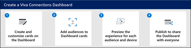
Create and edit a Viva Connections dashboard
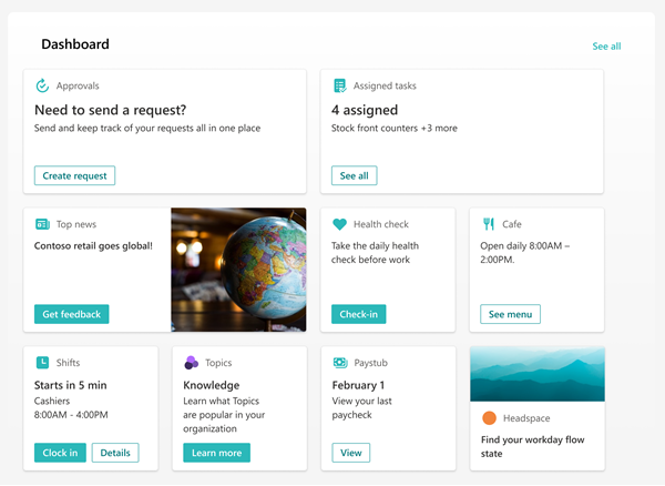
The Viva Connections dashboard provides fast and easy access to information and job-related tasks. Content on the dashboard can be targeted to users in specific roles, markets, and job functions.
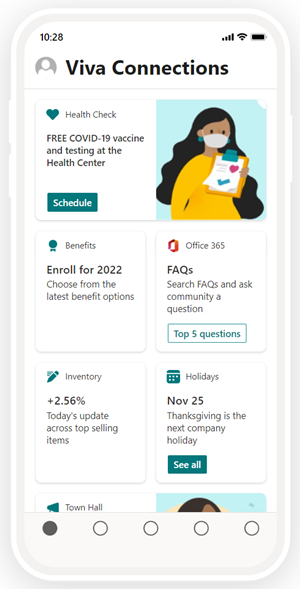
The dashboard consists of cards that engage viewers with existing Microsoft Teams apps, Viva apps and services, partner apps, custom solutions using the SharePoint Framework (SPFx) framework, internal links, and external links.
Edit the dashboard from Microsoft Teams
The Viva Connections dashboard can be edited right from Microsoft Teams. You need member or owner level permissions to get started.
Note
- When setting up Viva Connections for the first time, you’ll be asked to choose a set of default cards based on the intended audience.
- You can choose mobile and desktop views interchangeably as you’re authoring.
- Image recommendations for cards in the dashboard: medium cards should be 300x150 to 400x200 with 2:1 aspect ratio and large cards 300x300 to 400x400 with 1:1 aspect ratio to prevent stretching in the mobile app.
- Image URLS in card properties must be an absolute URL for the link to work in the mobile app.
- It's recommended to limit the number of cards to about 20 on the dashboard for the best viewing experience.
- Users will be able to customize their dashboard on Viva Connections mobile by reordering, hiding, and showing cards. These changes only affect the mobile experience for the user and will not affect their desktop or tablet experience.
Navigate to the Viva Connections app in Teams.
Next, select Edit in the dashboard section.
Select + Add a card.
Select Edit (pencil icon) for each card to edit properties like the label, icon, image, and audience targeting settings where applicable.
Select Delete (trash can icon) to remove cards.
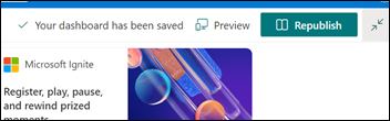
Preview the experience on all devices to ensure usability before publishing or republishing.
Publish or Republish when you're done to share the edits with others.
How to edit the dashboard from SharePoint when you have a home site
If your organization has a SharePoint home site, you can set up and edit the dashboard from the SharePoint home site or in Microsoft Teams. You need edit permissions for the SharePoint home site to make changes.
Note
Images are an important aspect to making your cards rich and inviting. If you're a SharePoint admin, we recommend enabling a Content Delivery Network (CDN) to improve performance for getting images. Consider when storing images that /siteassets is by default a CDN source when Private CDN is enabled while /style library is the default source when the Public CDN is enabled. Learn more about CDNs.
From the SharePoint home site, select the Settings gear at the top-right of the page.
Select Manage Viva Connections.
Select the + Create dashboard or View dashboard button.
Select + Add a card.
Select the type of card you want to add from the dashboard card toolbox and then use the instructions within this article to set up each type of card. As you’re building the dashboard, you can preview its appearance in mobile and desktop for different audiences.
When you're done adding cards and applying targeting to specific audiences, Preview the experience to ensure an ideal viewing experience.
Once you’re satisfied with how the dashboard looks in preview, select Publish or Republish at the top-right of your dashboard to make it available for use on your home site, in Teams, and in the Teams mobile app.
Use the Dashboard web part for Viva Connections
Note
- After editing content on the dashboard, it may take several minutes until the new content is available in the Dashboard web part.
- For best results, we recommend placing the Dashboard web part in a right vertical section.
Once a dashboard is authored and published, you can use the Dashboard web part to display it on your Connections site. You can add the web part to any section on your SharePoint page.
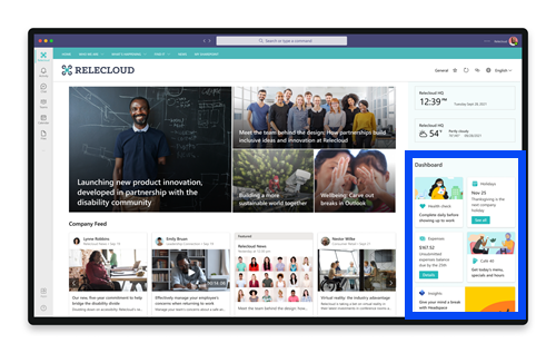
When added, it will automatically be populated with the cards from the existing dashboard on your site. You can set the maximum number of cards you want to display. Learn how to use the Dashboard web part.
Available dashboard cards
For a list of available dashboard cards, along with a description of the tool and steps for setting up, refer to the article on Available dashboard cards in Viva Connections.
Apply audience targeting to cards
Audience targeting can be applied throughout the Viva Connections experience, including cards on the dashboard. Audience targeting creates a personalized viewing experience by filtering the most important content to specific groups. Use audience targeting to:
- Create custom views for distinct roles and regions.
- Generate as many different views as needed to create unique experiences.
- Ensure the intended audience sees the most important content.
Set the target audiences for a card
If your page isn't already in edit mode, select Edit at the top-right of the dashboard page.
Select the card you want to target to one or more audiences, and select the Edit card pencil from the toolbar on the left.
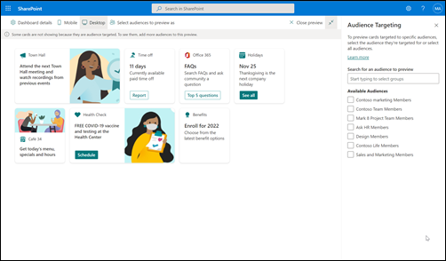
In the property pane on the right, under Audiences to target, type or search for the audience groups you want to target.
Note
If you've selected an audience group that you recently created or changed, it may take some time to see targeting applied for that group.
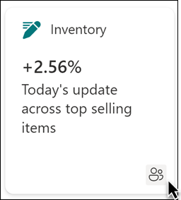
When a card is successfully audience targeted, a people icon appears.
Preview your dashboard to see how it displays for different audiences
After creating or editing cards on the dashboard, make sure you preview the experience for each audience and on both desktop and mobile devices. What you see in preview mode approximates how the dashboard displays for certain audiences and devices. When you apply audience targeting to cards, you can preview how different people view the dashboard depending on the audience or device. While in preview-mode, make sure:
- Physical gaps aren't present between cards that might appear while previewing different audiences and devices. If you see gaps, rearrange cards so that every audience and device has a high-quality viewing experience.
- Icons, graphics, and images are easy to identify and understand.
- Buttons and links are active and go to their intended destinations.
- Labels and description text are helpful, easy to read, and make sense for the intended audience.
To preview different audiences
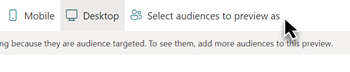
While in edit mode, select Preview on the top right.
Open the Select audiences to preview as drop-down list. (if no cards are audience targeted, you'll see a disabled Audience targeting label).
Search for and select a group. Once added, the group is selected by default. You can select the group again in the Select audiences to preview as drop-down list to deselect it.
- Cards targeted to a specific group display.
- When one or more audiences are selected, cards that don't have audience targeting applied will also display.
- If no audiences are targeted, only cards that aren't audience targeted will display. If there aren't any cards with audience targeting applied, none will display.
- If you aren't part of one of the audiences you've selected, you'll only see cards that aren't audience targeted. If none of the cards are audience targeted, you won't see any cards.
Examples
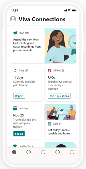
In the following example, the preview is set for mobile devices and highlights the different views that can be created from a single dashboard.
| View 1 | View 2 |
|---|---|
 |
 |
How URLs and single sign-on works
For some cards, you'll use links to URLs. Depending on the location of the content, links to URLs might display content in Microsoft Teams or elsewhere and Single sign-on (SSO) behavior can differ. Get more information about how links to URLs and SSO behave depending on the location of the content you're linking to.
Note
When SSO is not supported, users will be asked to enter their login credentials.
| Opens URL to… | On Teams mobile | On Teams desktop |
|---|---|---|
| Teams App | Teams apps (like Shifts, Approvals, or Kudos) open within Teams and user doesn’t need to authenticate again. | Teams apps (like Shifts, Approvals, or Kudos) open within Teams and user doesn’t need to authenticate again. |
| Forms | Forms open within Teams, user is asked to sign-in on the first time, and user doesn’t need to authenticate again if they stay signed in. | Forms open within Teams, user is asked to sign-in on the first time, and user doesn’t need to authenticate again if they stay signed in. |
| Viva Engage | Viva Engage opens within Teams, user is asked to sign-in on the first time and user doesn’t need to authenticate again if they stay signed in. | Opens a web browser session and the user might need to reauthenticate depending on browser and machine settings. |
| PowerApps | PowerApps opens within Teams, user is asked to sign-in on the first time and user doesn’t need to authenticate again if they stay signed in. | Opens a web browser session and the user might need to reauthenticate depending on browser and machine settings. |
| Power Portals | Power portals open within Teams, user is asked to sign-in on the first time and user doesn’t need to authenticate again if they stay signed in. | Opens a web browser session and the user might need to reauthenticate depending on browser and machine settings. |
| Stream | Stream opens within Teams, user is asked to sign-in on the first time and user doesn’t need to authenticate again if they stay signed in. | Opens a web browser session and the user might need to reauthenticate depending on browser and machine settings. |
| External Links | Web view opens within Teams and the user might need to authenticate again (depending on the site.) | Opens a web browser session and the user might need to reauthenticate depending on browser and machine settings. |
More resources
Step-by-step guide to setting up Viva Connections
Learn more about how to plan a dashboard