Note
Access to this page requires authorization. You can try signing in or changing directories.
Access to this page requires authorization. You can try changing directories.
Without consolidated data, you often need to query telemetry manually, cross-reference incident tickets, and estimate which response plans are effective. That makes it hard to tell whether a response plan resolves 80% of incidents autonomously or escalates most incidents to humans. It also makes it hard to show that the agent resolved incidents overnight or to decide where to invest in additional automation.
The incident metrics dashboard gives you that consolidated view. Use it to measure mitigation rates, time saved, and quality trends across the incidents your agent processes, broken down by response plan.
Tip
- Select any chart segment, severity bar, or root-cause tile to drill down into matching incidents.
- Filter the entire dashboard to a single response plan. All KPI cards, charts, and treemap update.
- KPI cards surface key metrics such as hours saved, success rate, median time-to-mitigate, and quality score with star ratings from 1 to 5.
- Analytics data loads progressively, so each card and chart renders as soon as its data is ready and you see results faster.
- Charts auto-rotate date labels and normalize comparison bars for readability at any time range.

Your agent records an activity snapshot every time it processes an incident. These snapshots capture the outcome, whether the agent mitigated the incident autonomously, assisted the investigation, or escalated to a human. The incident metrics dashboard aggregates these snapshots into real-time KPI cards, a trend chart, and a per-response-plan breakdown.
Go to Monitor > Incident metrics to see the dashboard.
The Incident summary chart plots key metrics over time so you can spot trends.
Each card shows a count, its proportion relative to total incidents reviewed, and a sparkline with percentage change from the prior period.
Core incident metrics include:
| Metric | What it tells you |
|---|---|
| Incidents reviewed | Total distinct incidents your agent investigated in the selected time range |
| Agent mitigated | Incidents your agent resolved autonomously |
| Assisted by agent | Incidents where your agent provided investigation data and the user completed resolution |
| Mitigated by user | Incidents resolved entirely by a human. These are potential automation opportunities |
| Pending user action | Incidents waiting for human input. This is your current backlog |
Quality score
When a detail trend chart displays more than ten data points, the chart automatically rotates x-axis date labels by 45 degrees and increases the bottom margin. This behavior typically appears when your selected time range spans two or more weeks. The rotation prevents labels from overlapping and keeps dates legible whether you're reviewing a 14-day trend or a full month. It applies to the trend charts for Hours Saved, Success Rate, Median TTM, and Quality Score.
The Median Time to Mitigate comparison card normalizes bar widths as proportions of total resolution time. If your agent resolves incidents with a median of 10 minutes and humans take 30 minutes, the agent bar displays at 25% width and the human bar at 75%. This makes the speed gap visible without reading the numbers.
Progressive data loading
The incident metrics dashboard runs its data queries in parallel and renders each result independently. When you open the dashboard or change the time range, individual cards and charts display their data as soon as their backing query completes. You don't wait for every metric to load before seeing results.
In practice:
- Metric cards (incident counts, mitigation metrics, and TTM) typically render first because these metrics are simpler aggregations
- Charts (incident summary, root cause, severity distribution) appear as their data arrives
- Response plan grid loads last because it computes per-plan metrics across all incidents
When you change the time range or select Refresh, the dashboard cancels previous queries and starts new ones. Each result renders as it arrives.
Chart readability
The Quality Score card uses a 5-star rating to make the Intent Met score instantly readable. The same star rating appears in the response plan grid's Quality column.
Interactive drill-down
Every visualization in the dashboard is interactive. Select a segment to open a drill-down modal that shows the matching incidents.
| Selection | What the modal shows |
|---|---|
| Root-cause treemap tile | Incidents with that root cause |
| Severity distribution bar | Incidents at that severity level |
| Volume chart data point | Incidents from that date, optionally filtered by outcome |
| Volume chart legend label | All incidents with that outcome type |
The drill-down modal displays up to 200 incidents with sortable columns: ID, Title, Severity, Status, Created, Assisted By Agent, and Mitigated By. Use the search box to filter by incident title, ID, severity, or status.
Select an incident title to open the investigation thread in a side drawer. You can review what the agent did without leaving the analytics page.
Root-cause treemap
Root causes appear as proportionally sized tiles. Larger tiles mean more incidents with that root cause. Each tile displays the root cause name and incident count. Select any tile to drill down into incidents with that root cause.
Incident volume chart
A stacked chart shows incident volume over time, broken down by outcome: agent mitigated, agent assisted, human mitigated, and active/pending. Toggle between area and bar chart views using the buttons at the top right of the chart.
Select any data point to drill into that day's incidents. Select a legend label to see all incidents of that outcome type.
Severity distribution chart
A horizontal stacked bar chart breaks down incidents by severity level. Each bar shows the outcome proportions. Select a bar to drill down into incidents at that severity.
Response plan performance
Below the charts, a Response plan performance grid shows per-plan metrics with sortable columns.
| Column | Description |
|---|---|
| Response Plan Name | Select to filter the entire dashboard to this plan |
| Mode | Autonomy level badge (Autonomous, Copilot, and so on) |
| Incidents | Distinct incident count |
| Agent Mitigated | Count of autonomous resolutions |
| Success Rate | Percentage with color coding |
| Avg TTM | Average time to mitigate |
| Quality | Star rating plus numeric Intent Met score |
Select any row to filter the entire dashboard. All KPI cards, charts, and the treemap update to show data for only that response plan. A back arrow appears at the top. Select it to return to the overview.
This grid is where you make decisions. You can see at a glance which plans run in Autonomous mode and resolve incidents without human involvement versus plans in Review mode that still require approval. If a plan consistently shows a low success rate or zero autonomous mitigations, adjust the response plan's instructions or increase its autonomy level.
Intent Met score
The Intent Met score measures how effectively your agent resolves work, whether that's an incident investigation or a scheduled task execution. After each thread completes, an automated evaluation scores the outcome on a scale from 1 to 5:
| Score | Meaning |
|---|---|
| 5 | Exceptionally resolved. It exceeded expectations with additional insights |
| 4 | Well resolved. It completed successfully with clear evidence of satisfaction |
| 3 | Partially resolved. It made progress but didn't fully resolve the issue, or the thread is waiting for user action |
| 2 | Poorly resolved. It attempted the task but failed significantly |
| 1 | Completely unresolved. It failed to address the core objective |
The Intent Met card on the Overview dashboard shows the average score across all threads from the past 30 days with a daily trend sparkline.
The Intent Met score card on the Overview dashboard displays:
- Average score: shown as X/5 across all evaluated threads from the past 30 days
- Trend sparkline: daily average scores to track quality over time
The score combines incident threads, scheduled task threads, and conversations into one quality metric. It measures proactive automation, such as scheduled health checks, compliance scans, and cost monitoring, alongside reactive incident response.
Intent Met scoring is fully automatic. No configuration is needed. Every completed incident and scheduled task thread is evaluated using the same scoring criteria. Scheduled tasks that are still waiting for user action receive a score of 3, reflecting their indeterminate outcome.
Tip
If your Intent Met score is lower than expected, review individual thread conversations in Monitor → Session insights to understand where the agent struggled. Common improvements include clearer task instructions, adding relevant connectors, or adjusting the agent's tools.
Before and after
| Before | After | |
|---|---|---|
| Proving agent value | Query telemetry, cross-reference tickets, write manual reports | Open one dashboard. Mitigation rate, trend, and per-plan breakdown become visible instantly |
| Knowing which plans work | Guess based on anecdotal feedback | Per-plan grid shows exact mitigation counts alongside autonomy level |
| Stakeholder updates | Compile weekly summaries by hand | Daily reports generated automatically with incident counts, health status, and recommended actions |
| Identifying automation gaps | No visibility into why incidents escalate | Drill into a response plan to see root cause categories and which incidents the agent couldn't resolve |
| Measuring scheduled task quality | Read each task's thread transcript and manually judge whether the objective was met | Automatic Intent Met score evaluates every completed thread, with incidents and scheduled tasks combined into a single quality metric |
| Dashboard loading | All cards and charts stay blank until every query finishes | Each card and chart renders independently as its data arrives, so you can start reading metrics in seconds |
| Reading charts over 30 days | Date labels overlap and become unreadable, so you must stick to shorter ranges or hover over individual points | Labels auto-rotate at 45 degrees and TTM bars show proportional widths, which keeps charts readable at any time range |
Incident overview
For a real-time view of every incident your agent is handling, go to Incidents in the left sidebar.
The page shows summary cards for incident status (Triggered, Acknowledged) and agent investigation status (Pending user input, In progress, Completed), plus a filterable grid of all incidents. Filter by time range, priority, status, investigation status, or search for specific incidents.
Each row links to the agent's investigation thread, so you can review exactly what the agent did, which tools it called, what evidence it found, and what it recommended.
Daily reports
Your agent generates automated daily reports accessible at Daily reports in the left sidebar.
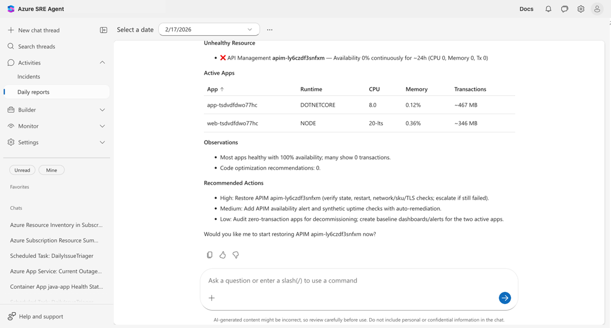
Select a date to view that day's report. Each report covers:
- Security findings: CVE vulnerabilities across connected repositories, grouped by severity
- Incidents: Active, mitigated, and resolved counts with per-incident investigation details
- Health and performance: Per-resource health status with availability, CPU, and memory metrics
- Code optimizations: Performance recommendations identified by the agent
- Recommended actions: Prioritized action items with descriptions and estimated effort
Daily reports replace the "what happened overnight?" morning routine. Instead of asking your agent or querying dashboards, the information is already compiled and waiting.
Limits
| Resource | Limit |
|---|---|
| Drill-down results | Up to 200 incidents per drill-down query |
| Daily reports | Generated once per day |
| Intent Met scoring | Applied to incidents and scheduled tasks |
Get started
Incident tracking is built in. Open Operations Hub > Incident Analytics once your agent starts handling incidents.
| Resource | What you learn |
|---|---|
| Set up a response plan | Configure response plans that generate tracking data |