Xamarin.Android Designer basics
This topic introduces Xamarin.Android Designer features, explains how to launch the Designer, describes the Design Surface, and details how to use the Properties pane to edit widget properties.
Launching the Designer
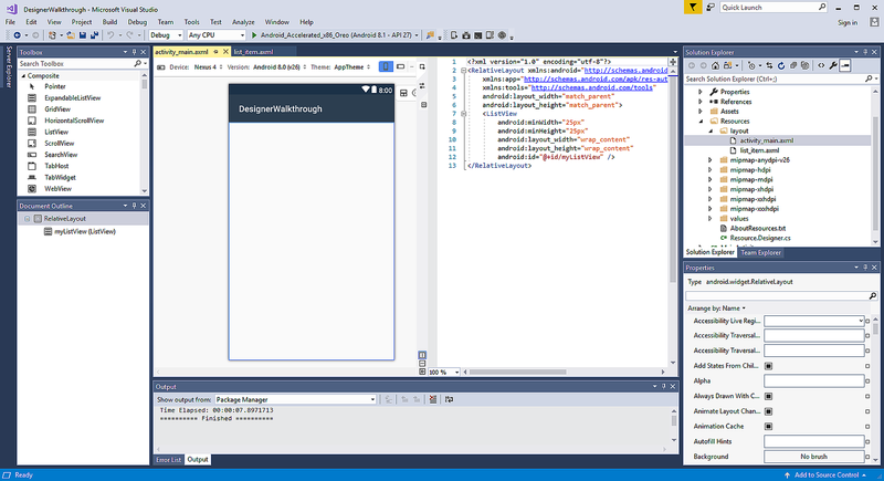
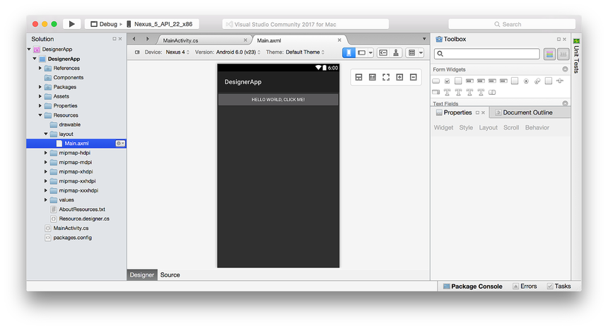
The Designer is launched automatically when a layout is created, or it can be launched by double-clicking an existing layout file. For example, double-clicking activity_main.axml in the Resources > Layout folder will load the Designer as seen in this screenshot:
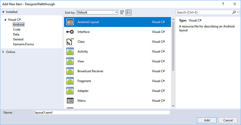
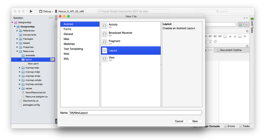
Likewise, you can add a new layout by right-clicking the layout folder in the Solution Explorer and selecting Add > New Item... > Android Layout:
This creates a new .axml layout file and loads it into the Designer.
Tip
Newer releases of Visual Studio support opening .xml files inside the Android Designer.
Both .axml and .xml files are supported in the Android Designer.
Designer features
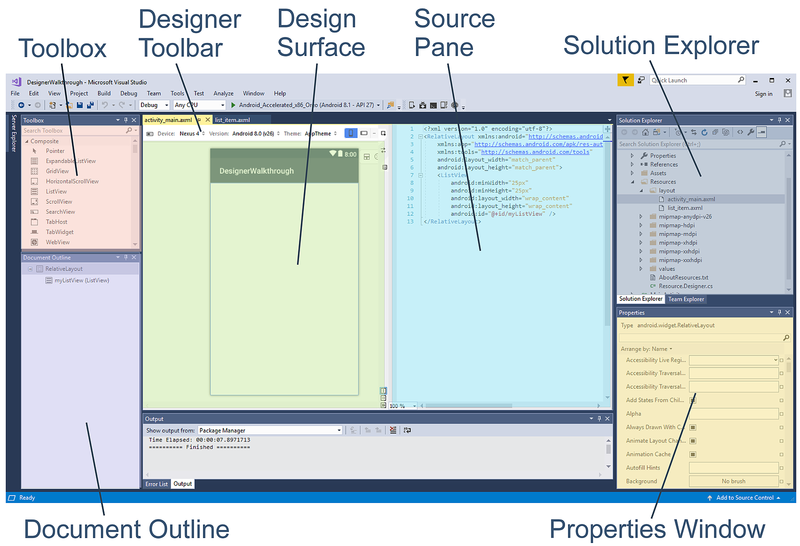
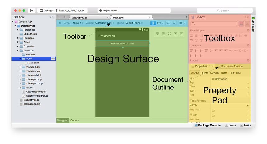
The Designer is composed of several sections that support its various features, as shown in the following screenshot:
When you edit a layout in the Designer, you use the following features to create and shape your design:
Design Surface – Facilitates the visual construction of the user interface by giving you an editable representation of how the layout will appear on the device. The Design Surface is displayed inside the Design Pane (with the Designer Toolbar positioned above it).
Source Pane – Provides a view of the underlying XML source that corresponds to the design presented on the Design Surface.
Designer Toolbar – Displays a list of selectors: Device, Version, Theme, layout configuration, and Action Bar settings. The Designer Toolbar also includes icons for launching the Theme Editor and for enabling the Material Design Grid.
Toolbox – Provides a list of widgets and layouts that you can drag and drop onto the Design Surface.
Properties Window – Lists the properties of the selected widget for viewing and editing.
Document Outline – Displays the tree of widgets that compose the layout. You can click an item in the tree to cause it to be selected on the Design Surface. Also, clicking an item in the tree loads the item's properties into the Properties window.
Design Surface
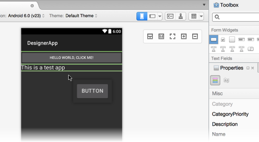
The Designer makes it possible for you to drag and drop widgets from
the toolbox onto the Design Surface. When you interact with widgets
in the Designer (by either adding new widgets or repositioning existing
ones), vertical and horizontal lines are displayed to mark the
available insertion points. In the following example, a new Button
widget is being dragged to the Design Surface:
Additionally, widgets can be copied: you can use copy and paste to copy a widget, or you can drag and drop an existing widget while pressing the CTRL key.
Designer Toolbar
The Designer Toolbar (positioned above the Design Surface) presents configuration selectors and tool menus:
The Designer Toolbar provides access to the following features:
Alternative Layout Selector – Allows you to select from different layout versions.
Device Selector – Defines a set of qualifiers (such as screen size, resolution, and keyboard availability) associated with a particular device. You can also add and delete new devices.
Android Version Selector – The Android version that the layout is targeting. The Designer will render the layout according to the selected Android version.
Theme Selector – Selects the UI theme for the layout.
Configuration Selector – Selects the device configuration, such as portrait or landscape.
Resource Qualifier Options – Opens a dialog that presents drop-down menus for selecting Language, UI Mode, Night Mode, and Round Screen options.
Action Bar Settings – Configures the Action Bar settings for the layout.
Theme Editor – Opens the Theme Editor, which makes it possible for you to customize elements of the selected theme.
Material Design Grid – Enables or disables the Material Design Grid. The drop-down menu item adjacent to the Material Design Grid opens a dialog that enables you to customize the grid.
Each of these features is explained in more detail in these topics:
Resource Qualifiers and Visualization Options provides detailed information about the Device Selector, Android Version Selector, Theme Selector, Configuration Selector, Resource Qualifications Options, and Action Bar Settings.
Alternative Layout Views explains how to use the Alternative Layout Selector.
Xamarin.Android Designer Material Design Features provides a comprehensive overview of the Theme Editor and the Material Design Grid.
Context menu commands
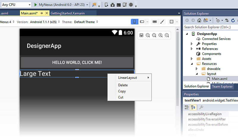
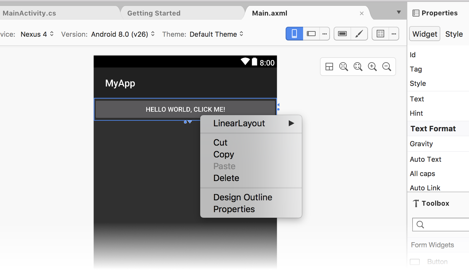
A context menu is available both in the Design Surface and in the Document Outline. This menu displays commands that are available for the selected widget and its container, making it easier for you to perform operations on containers (which are not always easy to select on the Design Surface). Here is an example of a context menu:
In this example, right-clicking a TextView opens a context menu that
provides several options:
LinearLayout – opens a submenu for editing the
LinearLayoutparent of theTextView.Delete, Copy, and Cut – operations that apply to the right-clicked
TextView.
Zoom controls
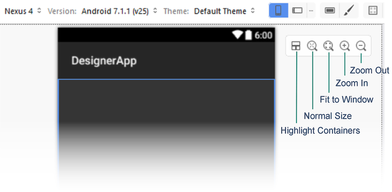
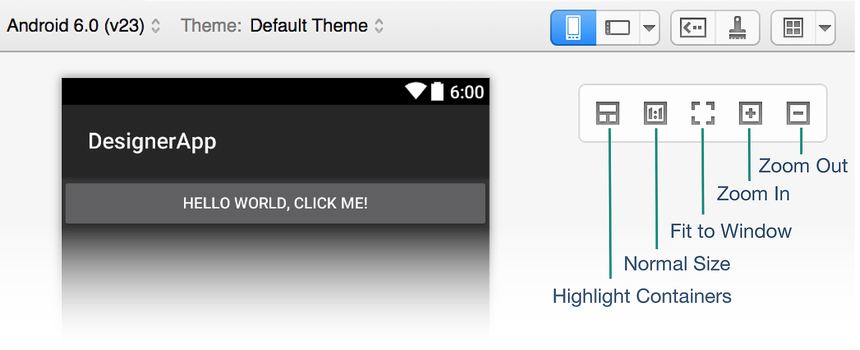
The Design Surface supports zooming via several controls as shown:
These controls make it easier to see certain areas of the user interface in the Designer:
Highlight Containers – Highlights containers on the Design Surface so that they are easier to locate while zooming in and out.
Normal Size – Renders the layout pixel-for-pixel so that you can see how the layout will look at the resolution of the selected device.
Fit to Window – Sets the zoom level so that the entire layout is visible on the Design Surface.
Zoom In – Zooms in incrementally with each click, magnifying the layout.
Zoom Out – Zooms out incrementally with each click, making the layout appear smaller on the Design Surface.
Note that the chosen zoom setting does not affect the user interface of the application at runtime.
Switching between Design and Source panes
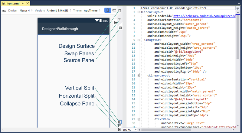
In the center strip between the Design and Source panes, there are several buttons that are used to modify how the Design and Source panes are displayed:
These buttons do the following:
Design – This topmost button, Design, selects the Design pane. When this button is clicked, the Toolbox and Properties panes are enabled and the Text Editor Toolbar is not displayed. When the Collapse button is clicked (see below), the Design pane is presented alone without the Source pane.
Swap Panes – This button (which resembles two opposing arrows) swaps the Design and Source panes so that the Source pane is on the left and the Design pane is on the right. Clicking it again swaps these panes back to their original locations.
Source – This button (which resembles two opposing angle brackets) selects the Source pane. When this button is clicked, the Toolbox and Properties panes are disabled and the Text Editor Toolbar is made visible at the top of Visual Studio. When the Collapse button is clicked (see below), clicking the Source button displays the Source pane instead of the Design pane.
Vertical Split – This button (which resembles a vertical bar), displays the Design and Source panes side-by-side. This is the default arrangement.
Horizontal Split – This button (which resembles a horizontal bar), displays the Design pane above the Source pane. Swap Panes can be clicked to place the Source pane above the Design pane.
Collapse Pane – This button (which resembles two right-pointing angle brackets) "collapses" the dual-pane display of Design and Source into a single view of one of these panes. This button becomes the Expand Pane button (resembling two left-pointing angle brackets), which can be clicked to return the view back to dual-pane (Design and Source) display mode.
When Collapse Pane is clicked, only the Design pane is displayed. However, you can click the Source button to instead view only the Source pane. Click the Design button again to return to the Design pane.
Source pane
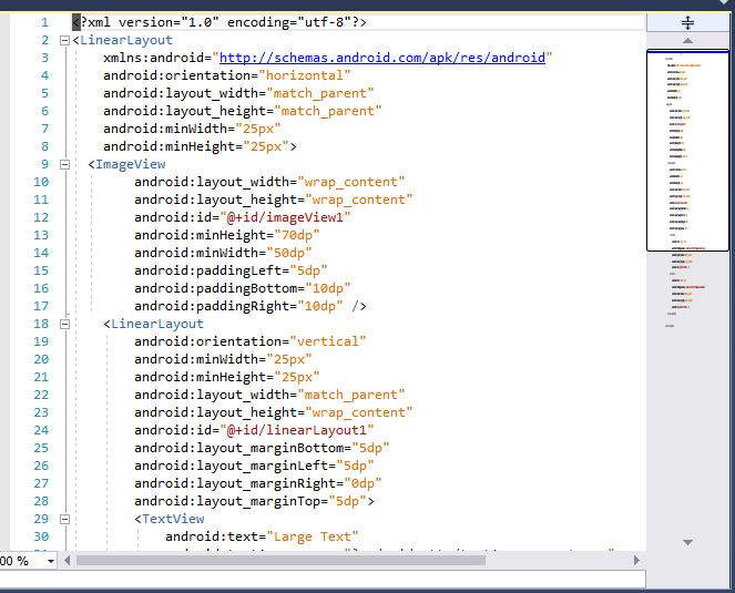
The Source pane displays the XML source underlying the design shown on the Design Surface. Because both views are available at the same time, it is possible to create a UI design by going back and forth between a visual representation of the design and the underlying XML source for the design:
Changes made to the XML source are immediately rendered on the Design Surface; changes made on the Design Surface cause the XML source displayed in the Source pane to be updated accordingly. When you make changes to XML in the Source pane, autocompletion and IntelliSense features are available to speed XML-based UI development as explained next.
For greater navigational ease when working with long XML files, the Source pane supports the Visual Studio scrollbar (as seen on the right in the previous screenshot). For more information about the scrollbar, see How to Track Your Code by Customizing the Scrollbar.
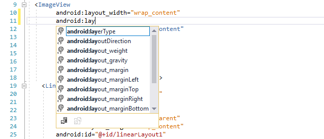
Autocompletion
When you begin to type the name of an attribute for a widget, you can
press CTRL+SPACE to see a list of possible completions. For
example, after entering android:lay in the following example (followed
by typing CTRL+SPACE), the following list is presented:
Press ENTER to accept the first listed completion, or use the arrow keys to scroll to the desired completion and press ENTER. Alternatively, you can use the mouse to scroll to and click the desired completion.
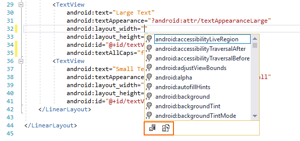
IntelliSense
After you enter a new attribute for a widget and begin to assign it a
value, IntelliSense pops up after a trigger character is typed and
provides a list of valid values to use for that attribute. For example,
after the first double-quote is entered for android:layout_width in
the following example, an autocompletion selector pops up to provide
the list of valid choices for this width:
At the bottom of this popup are two buttons (as outlined in red in the above screenshot). Clicking the Project Resources button on the left restricts the list to resources that are part of the app project, while clicking the Framework Resources button on the right restricts the list to display resources available from the framework. These buttons toggle on or off: you can click them again to disable the filtering action that each provides.
Properties pane
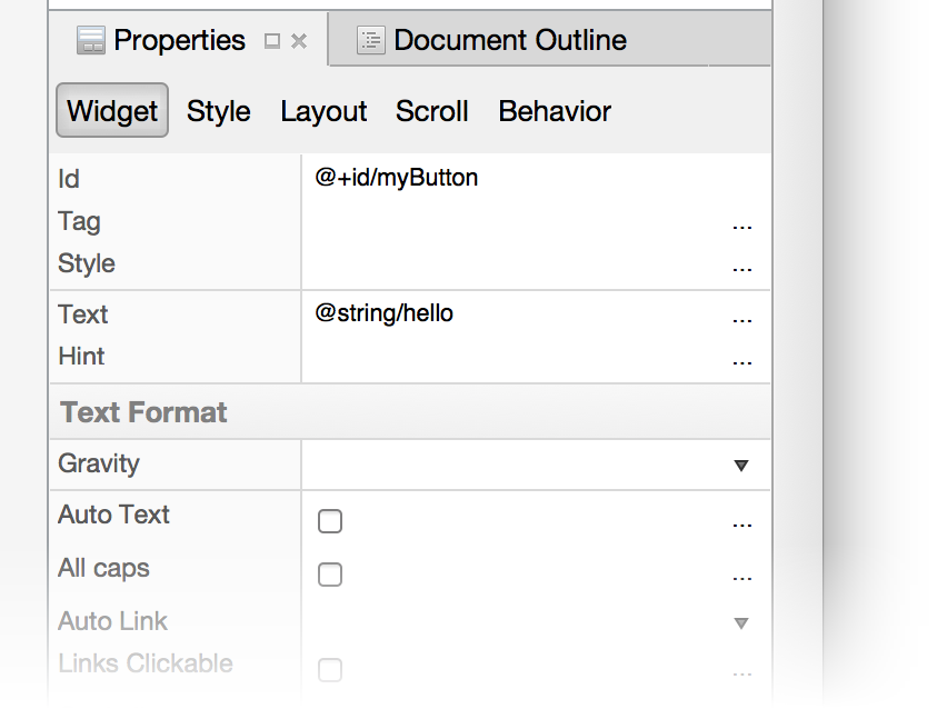
The Designer supports the editing of widget properties through the Properties pane:
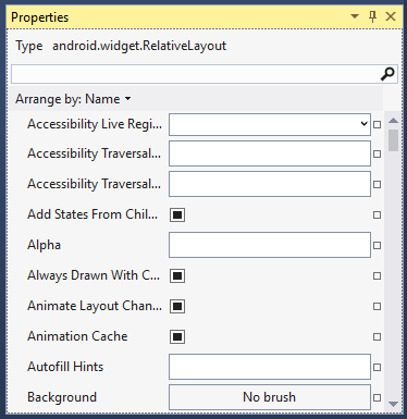
The properties listed in the Properties pane change depending on which widget is selected on the Design Surface.
Default values
The properties of most widgets will be blank in the Properties window because their values inherit from the selected Android theme. The Properties window will only show values that are explicitly set for the selected widget; it will not show values that are inherited from the theme.
Referencing resources
Some properties can reference resources that are defined in files other
than the layout .axml file. The most common cases of this type are
string and drawable resources. However, references can also be used
for other resources, such as Boolean values and dimensions. When a
property supports resource references, a browse icon (a square) is
shown next to the text entry for the property. This button opens a
resource selector when clicked.
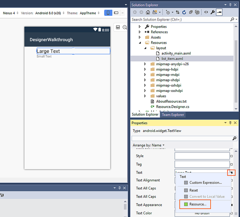
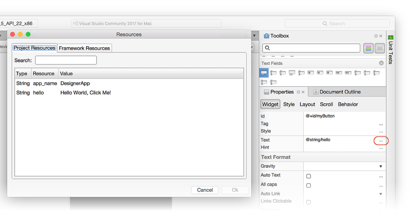
For example, the following screenshot shows the options available
when clicking the darkened square to the right of the text field for a
Text widget in the Properties window:
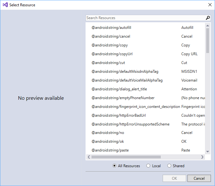
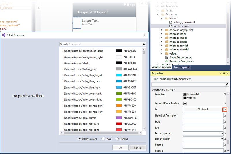
When Resource... is clicked, the Select Resource dialog is presented:
From this list, you can select a text resource to use for that widget
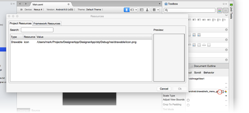
instead of hard-coding the text in the Properties pane. The next
example illustrates the resource selector for the Src property of an
ImageView:
Clicking the blank square to the right of the Src property opens the
Select Resource dialog with a list of resources ranging from colors
(as shown above) to drawables.
Boolean property references
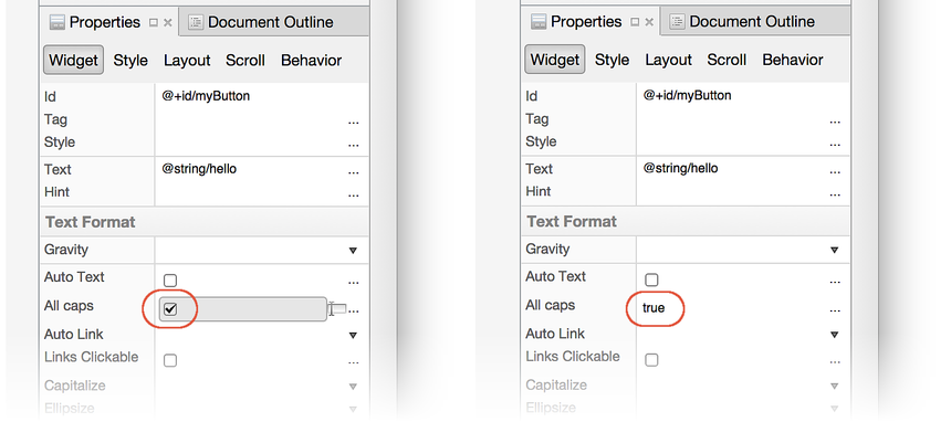
Boolean properties are normally selected as check marks next to a
property in the Properties window. You can designate a true or
false value by checking or unchecking this check box, or you can
select a property reference by clicking the dark-filled square to the
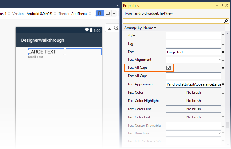
right of the property. In the following example, text is changed to all
caps by clicking the Text All Caps boolean property reference
associated with the selected TextView:
Editing properties inline
The Android Designer supports direct editing of certain properties on the Design Surface (so you don't have to search for these properties in the property list). Properties that can be directly edited include text, margin, and size.
Text
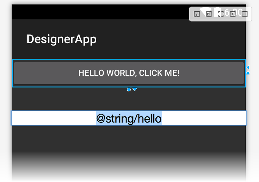
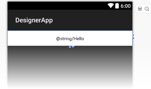
The text properties of some widgets (such as Button and TextView),
can be edited directly on the Design Surface. Double-clicking a
widget will put it into edit mode, as shown below:
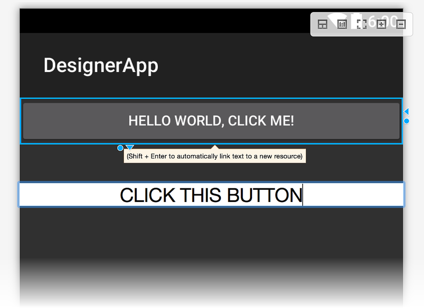
You can enter a new text value or you can enter a new resource
string. In the following example, the @string/hello resource is being
replaced with the text, CLICK THIS BUTTON:
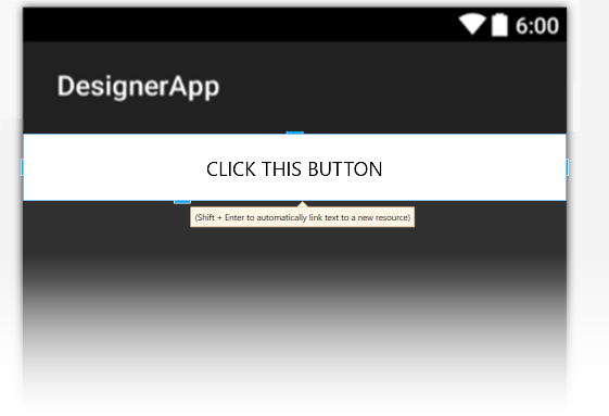
This change is stored in the widget's text property; it does not
modify the value assigned to the @string/hello resource.
When you key in a new text string, you can press Shift +
Enter to automatically link the entered text to a new
resource.
Margin
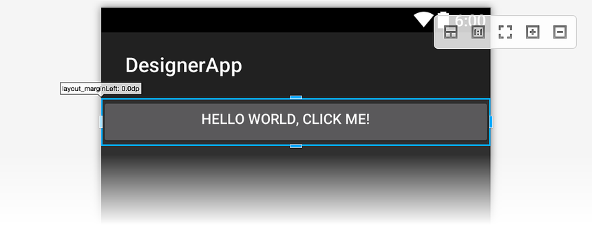
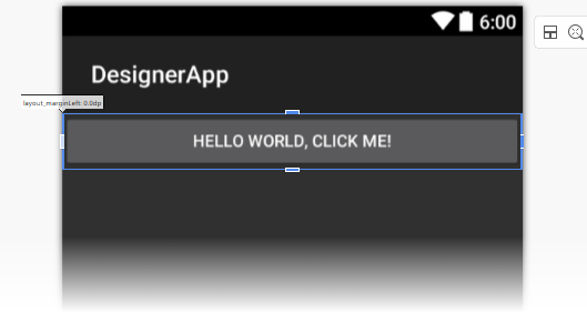
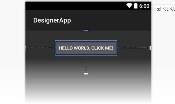
When you select a widget, the Designer displays handles that allow you to change the size or margin of the widget interactively. Clicking the widget while it is selected toggles between margin-editing mode and size-editing mode.
When you click a widget for the first time, margin handles are
displayed. If you move the mouse to one of the handles, the Designer
displays the property that the handle will change (as shown
below for the layout_marginLeft property):
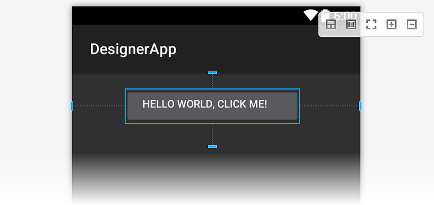
If a margin has already been set, dotted lines are displayed, indicating the space that the margin occupies:
Size
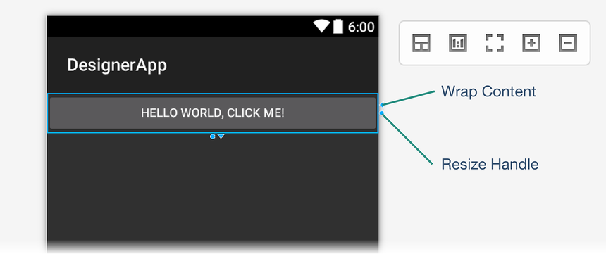
As mentioned earlier, you can switch to size-editing mode by clicking a
widget while it is already selected. Click the triangular handle to
set the size for the indicated dimension to wrap_content:

Clicking the Wrap Content handle shrinks the widget in that dimension so that it is no larger than necessary to wrap the enclosed content. In this example, the button text shrinks horizontally as shown in the next screenshot.
When the size value is set to Wrap Content, the Designer displays a
triangular handle pointing in the opposite direction for changing the
size to match_parent:
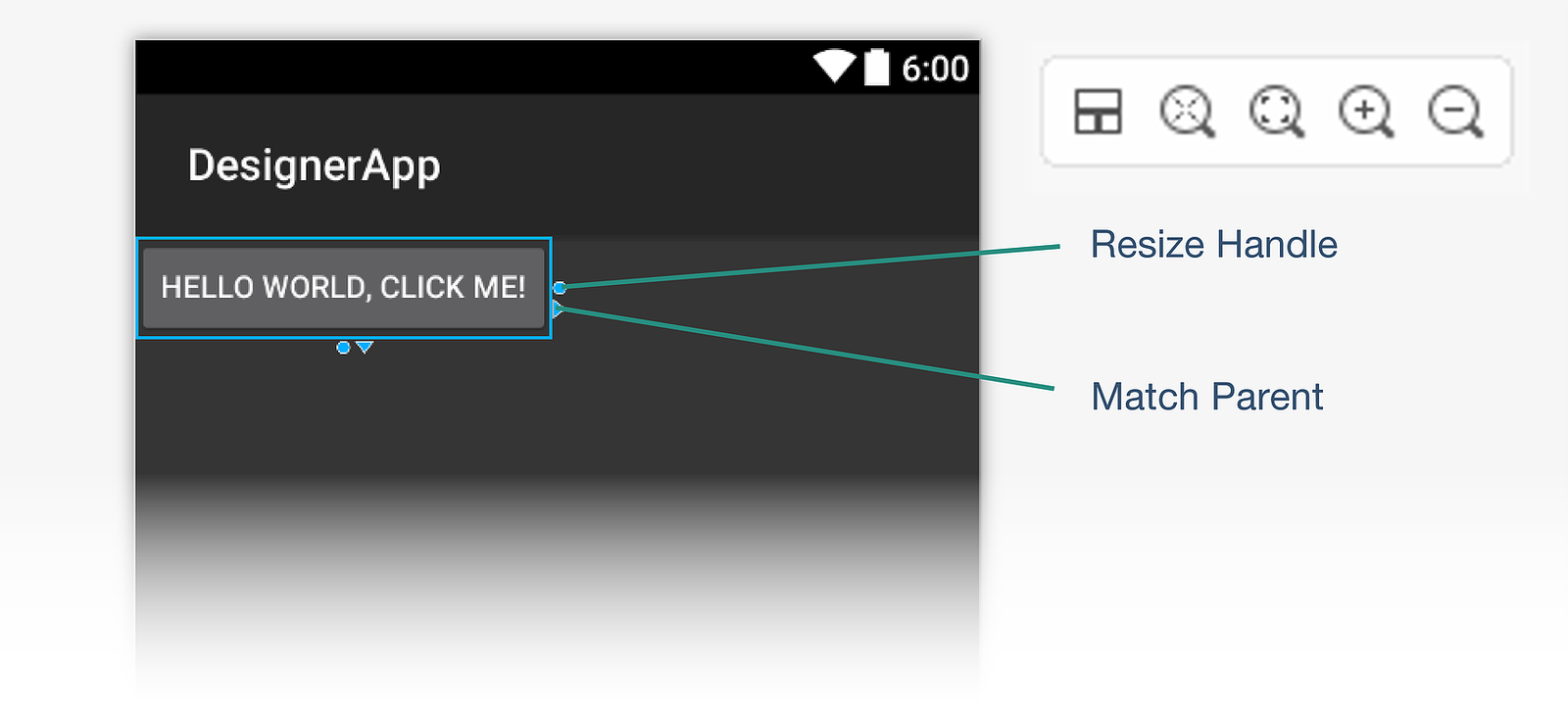
Clicking the Match Parent handle restores the size in that dimension so that it is the same as the parent widget.
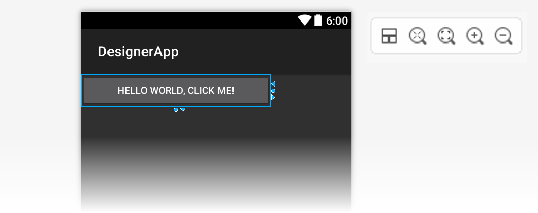
Also, you can drag the circular resize handle (as shown in the above
screenshots) to resize the widget to an arbitrary dp value. When you
do so, both Wrap Content and Match Parent handles are presented
for that dimension:
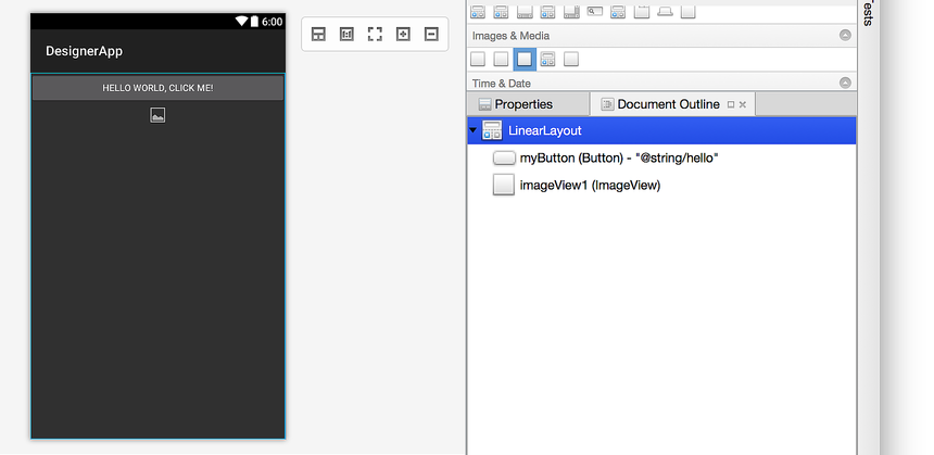
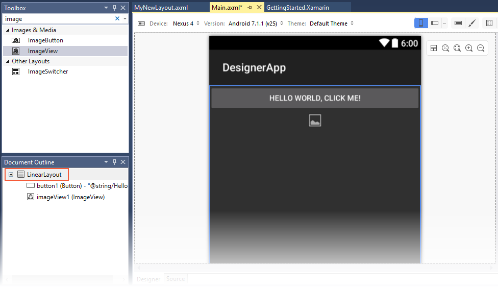
Not all containers allow editing the Size of a widget. For example,
notice that in the screenshot below with the LinearLayout selected,
the resize handles do not appear:
Document Outline
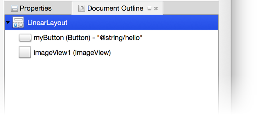
The Document Outline displays the widget hierarchy of the layout.
In the following example, the containing LinearLayout widget is
selected:
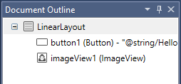
The outline of the selected widget (in this case, a LinearLayout) is
also highlighted on the Design Surface. The selected widget in the
Document Outline stays in sync with its counterpart on the Design
Surface. This is useful for selecting view groups, which are not always
easy to select on the Design Surface.
The Document Outline supports copy and paste, or you can use drag and drop. Drag and drop is supported from the Document Outline to the Design Surface as well as from the Design Surface to the Document Outline. Also, right-clicking an item in the Document Outline displays the context menu for that item (the same context menu that appears when you right-click that same widget on the Design Surface).
