Note
Access to this page requires authorization. You can try signing in or changing directories.
Access to this page requires authorization. You can try changing directories.
APPLIES TO: ![]() Power BI Desktop
Power BI Desktop ![]() Power BI service
Power BI service
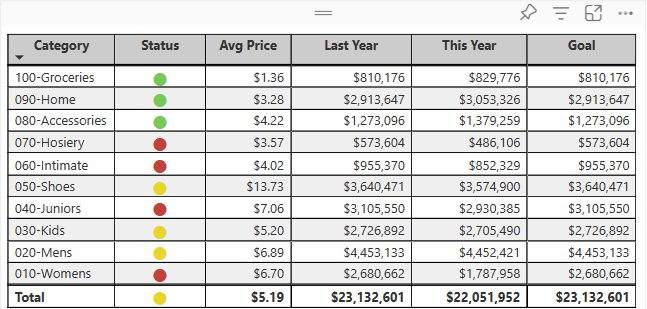
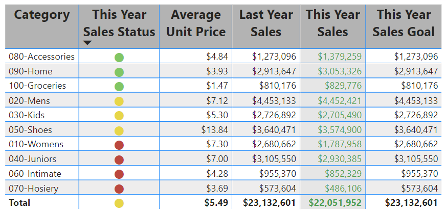
A table is a grid that contains related data in a logical series of rows and columns. A table can also contain headers and a row for totals. Tables work well with quantitative comparisons where you're looking at many values for a single category. In the following example, the table displays five different measures for the Category items, including average prices, year over year sales, and sales goals.
Power BI helps you create tables in reports and cross-highlight elements within the table with other visuals on the same report page. You can select rows, columns, and even individual cells, then cross-highlight the values. You can also copy and paste individual cells and multiple cell selections into other applications.
When to use a table
Tables are a great choice for several scenarios:
- Representing numerical data by category with multiple measures.
- Displaying data as a matrix or in a tabular format with rows and columns.
- Reviewing and comparing detailed data and exact values rather than visual representations.
Note
To share content (or for a colleague without edit rights to view content outside your personal My workspace) both users need either a Power BI Pro or Premium Per User (PPU) license, OR the content must reside in a workspace on a capacity (Fabric F64+ or Power BI Premium (P)). PPU workspaces behave like capacity for feature availability. Free users can only consume content that lives on a capacity.
Get the sample
To follow along, download the Retail Analysis sample .pbix file in Power BI Desktop or the Power BI service.
This tutorial uses the Retail Analysis Sample PBIX file.
Download the Retail Analysis Sample PBIX file to your desktop.
In Power BI Desktop, select File > Open report.
Browse to and select the Retail Analysis Sample PBIX file, and then select Open.
The Retail Analysis Sample PBIX file opens in report view.
At the bottom, select + to add a new page to the report.
Create a table
You can create a table like the one shown at the beginning of this article and display sales values by item category.
On the Data pane, expand Item and select the Category checkbox. Power BI automatically creates a table that lists all the categories in the Retail Analysis Sample semantic model. If you don't see a table visual, use the Visualizations pane to select the table icon.

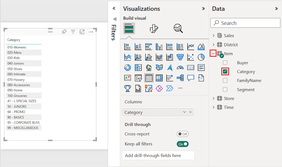
This action configures the Category data as a field in the Columns section on the Visualizations pane.
Let's add more categories to the table.
Expand Sales and select the Average Unit Price and Last Year Sales checkboxes. Under Sales, expand This Year Sales and select the checkboxes for all three options: Value, Goal, and Status.
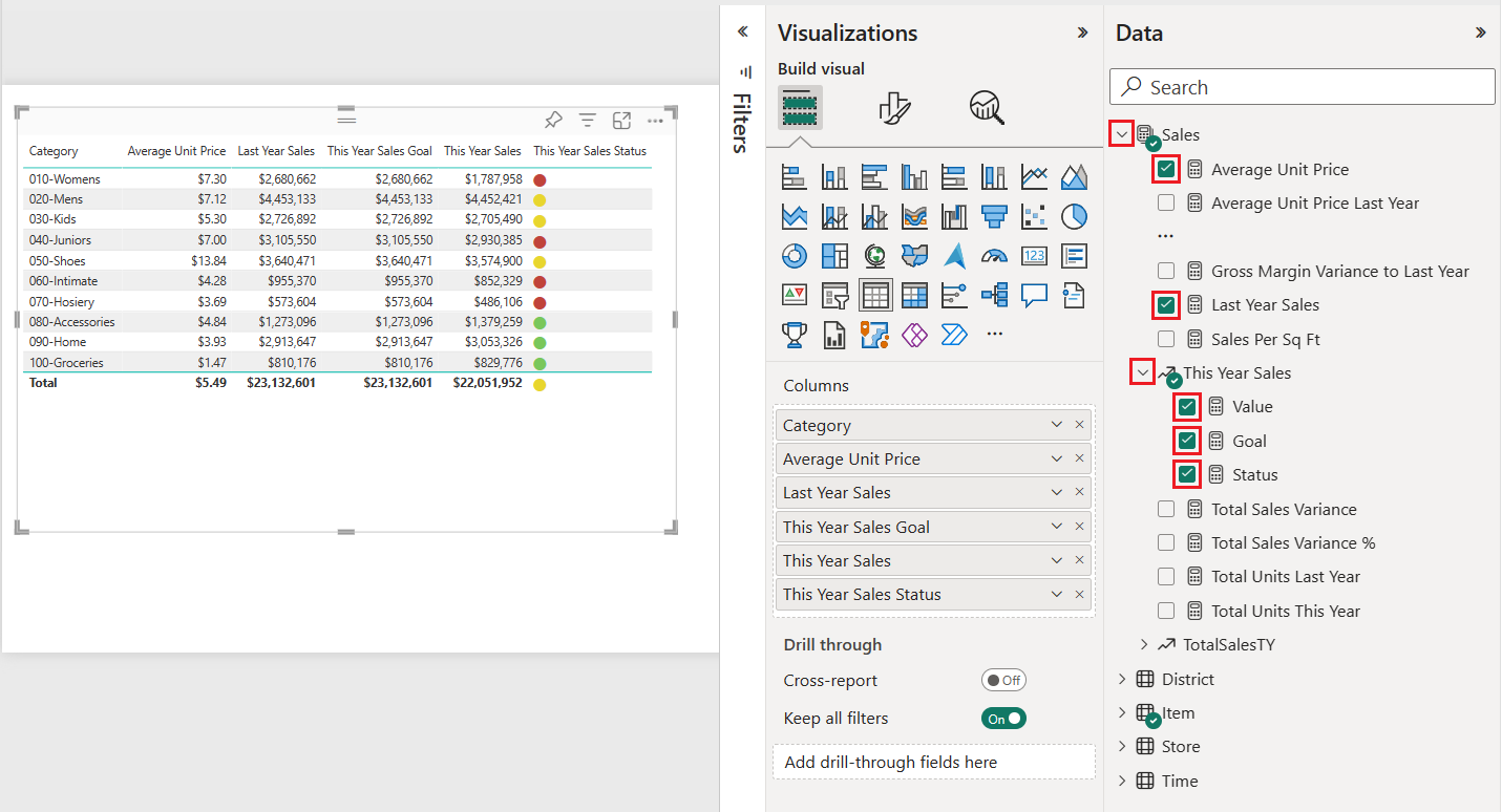
Power BI adds the selected data as fields to the Columns section on the Visualizations pane.
On the Visualizations pane, rearrange the data fields in the Columns section to match the order shown in the following image:
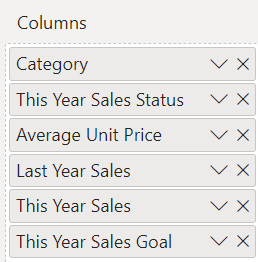
To move a column on the Visualizations pane, select and hold the field in the Columns section. Drag the field to the new location within the order of columns and release the field. The column order in the table updates to match the new order of the fields in the Columns section.
Format the table
You can format a table in many ways. This article covers only a few scenarios.
The following steps show how to configure settings and options to adjust the presentation of the table data.
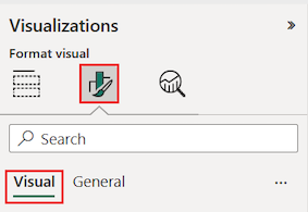
On the Visualizations pane, select the Format your visual (paintbrush) icon to open the Format section. Make sure the Visual tab is selected.
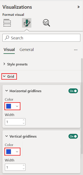
Try formatting the table grid options.
- Expand the Grid > Horizontal gridlines and Vertical gridlines options.
- Change the horizontal and vertical gridlines to use a blue Color.
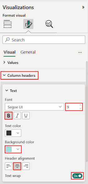
Next, try adjusting the column header text.
Expand the Column headers > Text options.
Set the following options:
- Increase the Font size and apply bold (B).
- Change the Background color.
- Adjust the Header alignment to center the header text.
- Turn on Text wrap to allow long column headings to display across multiple lines.
You can also format individual columns and headers.
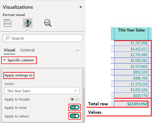
Expand the Specific column section.
For the Apply settings to options, select the specific column to format by using the Series drop-down list.
Select the column This Year Sales.
The data values in the selected column determine the available formatting options.
Expand the Values options and update some settings, such as Text color and Background color.
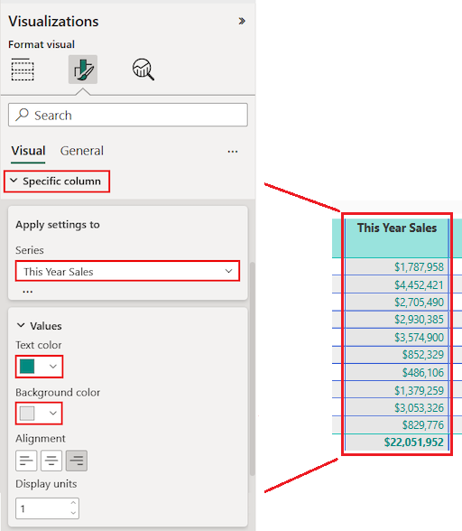
Finally, configure the other Apply settings to options to specify how to use the updated settings for the column data.
Apply the changes to all values in the column and to the row that shows the total of value.
Practice what you learned by updating another specific column field.
- Update the This Year Sales Status column.
- For the Values options, specify center Alignment.
- Configure the Apply settings to options to use the updated settings for the cell values only.
Select File > Save to save your changes for the table report page.
Here's an example of an updated table:
Format tables in other ways to complement your configuration options and settings. In the next section, you explore how to apply conditional formatting.
Use conditional formatting
You can add conditional formatting for subtotals and totals in tables. Power BI can apply conditional formatting for total values to any field in the Columns section of the Visualizations pane. Use the Apply settings to options to specify which table values should use the conditional formatting.
You specify the thresholds or ranges for the conditional formatting rules. For matrices, any Values options refer to the lowest visible level of the matrix hierarchy.
With conditional formatting for tables, you can specify icons, URLs, cell background colors, and font colors based on cell values. You can also apply gradient coloring to show value distribution across a numerical range.
For detailed step-by-step instructions on all conditional formatting options for tables, see Apply conditional formatting in tables and matrices. The following is a brief overview of the most common options:
- Background color shading: Apply a color gradient to cell backgrounds based on numerical values. Configure minimum, maximum, and optional center colors to represent value ranges visually.
- Data bars: Replace numerical values with color bars that represent data magnitude, making columns easier to scan at a glance.
- Icons: Add visual cues such as arrows or KPI icons next to values to represent data ranges or categories.
Copy table values into other applications
Your table or matrix might include content that you'd like to use in other applications, such as Dynamics CRM, Excel, and even other Power BI reports. When you right-click inside a cell in Power BI, you can copy the data in a single cell or a selection of cells onto your clipboard. You can then paste the clipboard contents into other applications.
Copy single cell
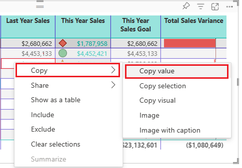
To copy the value of a single cell:
Select the cell to copy.
Right-click inside the cell.
Select Copy > Copy value to copy the cell value to your clipboard.
Note
Power BI copies only the data value in the cell. It doesn't copy any formatting applied to the cell value.
Copy multiple cells
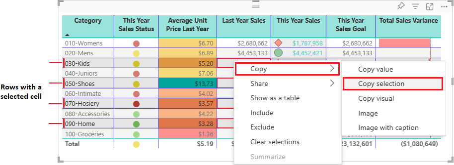
To copy the values for more than one cell:
Select a contiguous range of cells or use CTRL (+ select) to choose multiple cells that aren't contiguous.
Right-click inside a selected cell.
Select Copy > Copy selection to copy the cell values to your clipboard.
Note
Power BI copies the data values in the cells along with any applied formatting.
Adjust column width
Column width in Power BI tables and matrices can be adjusted to improve readability and presentation. You can manually resize columns or use the Layout section of the Format pane to control how columns size, set a default width, and customize widths for individual columns.
Manual adjustment
Sometimes Power BI shortens a column heading in a report or dashboard. To display the full column name, you can resize the column in two ways:
Resize by dragging
Move to the space just to the right of the column heading until the resize arrows appear. Once the arrows are visible, adjust the column width by moving the resize handle left or right.
Resize using menu options
Select the column you want to adjust. From the available options, choose Widen column or Narrow column to change its width by 10px.
Manual resizes are reflected in the Custom widths controls in the Format pane.
Auto-size behavior
Column sizing settings are in the Format pane under Visual > Layout > Column width. The Auto-size behavior dropdown has three options:
- Fit to content: Columns are as wide as they need to be to show the data, assuming there's room in the visual container.
- Grow to fit: Columns automatically expand to fill the visual container for a more balanced layout. Any leftover horizontal space is distributed evenly to each column.
- Fixed width: Columns use a width that you specify. When this option is selected, a Default width input appears so you can set the width for all columns and for any new columns added to the visual.
Default width (Fixed width only)
When Auto-size behavior is set to Fixed width, set a Default width in pixels. With Custom widths off, all columns use this uniform width. New columns added to the visual also use this default width.
Custom widths
Turn on Custom widths to see and customize the width of any column directly from the Format pane:
- If the visual has fewer than 15 columns, each column appears with its own width input.
- If the visual has 15 or more columns, an Apply settings to dropdown appears. Select a column from the dropdown to set its width. Columns that already have a custom width are marked with an asterisk (*).
Width inputs that show (auto) indicate the column is using the auto-size behavior rather than a custom width.
To clear customizations:
- Clear all: Toggle Custom widths off to clear custom widths from every column.
- Clear one: Clear the input box for a single column, or right-click the input and select the option to reset that value to default.
Matrix hierarchies (More granular)
For a matrix with hierarchies on columns, Custom widths by default sets a uniform width for the lowest level of the hierarchy. To set widths for each combination individually, turn on More granular. Each leaf-level combination then appears in the Apply settings to dropdown so you can size them independently.
Mobile view
The Column width settings in the Format pane can be modified independently for the mobile-optimized layout of a report page. This lets you tune column widths so tables and matrices fit well on small screens without changing the desktop layout. For more information, see Optimize Power BI reports for the mobile app.
Custom totals
With custom totals in Power BI tables and matrices, you can easily determine what the total row shows for a specific column if needed.
By default the total row shows the result of evaluating the field across the entire filter context of the report page. This behavior is correct in most cases. However, in some specific scenarios you might want to change what the total row displays. You can use DAX to influence what the total row displays, but custom totals provide an easy way of changing the total row value to the sum, average, min, max, count (distinct), or count of the displayed rows. You can also choose None to hide the total row value for the column.
Working with custom totals
Custom totals are based on visual calculations. To create a custom total, right-click a numerical column in the visual or use the Build pane and choose Customize total calculation:

Then, choose the total calculation to apply. These options are available:
| Custom total option | The total row shows |
|---|---|
| Sum | The sum of the displayed row values |
| Average | The average of the displayed row values |
| Min | The minimum value in the displayed rows |
| Max | The maximum value in the displayed rows |
| Count (Distinct) | The number of unique values in the displayed rows |
| Count | The number of values in the displayed rows |
| None | Hides the total row value for the column |
| Reset to default | Default value (option only enabled if a custom total is set) |
How custom totals work
Custom totals are based on visual calculations. As soon as you select any of the above options, the following happens:
- The original column's name gets a _Base suffix. So if your column is named Number of Customers, the column is now named Number of Customers_Base.
- The original column is hidden.
- A new visual calculation with the original column name is added. The visual calculation is equal to:
EXPANDALL ( <aggregation> ( [Original column_Base] ), ROWS COLUMNS )
For example, if you add a sum custom total for the Number of Customers column, the new visual calculation is:
Number of Customers = EXPANDALL ( SUM ( [Number of Customers_Base] ), ROWS COLUMNS )
- An Excel-like indicator appears in the total cell for the column on which the custom total was set.
The result shown in visual calculations edit mode is:

Note
You can edit a custom total just like another visual calculation by right-clicking on the custom total in the build pane and choosing 'Edit calculation':
Reset to default
Once a custom total is set, you can use the Reset to default option to get back to Power BI's default behavior. Reset to default removes the custom total and reverts the changes made:
- the custom total visual calculation is removed
- the original column is made visible again
- the original column name is reset
Considerations and limitations
- Custom totals aren't available in Explore.
- Custom totals are only available on the table and matrix visual.
- Custom totals are only available for numerical columns.
- Field formatting doesn't transfer to a custom total. You need to format a custom total like you format a visual calculation.
- The same considerations and limitations of visual calculations apply to custom totals.
Considerations and troubleshooting
Review the following considerations for working with tables in Power BI.
- When you apply column formatting, you can choose only one alignment method per column: Auto, Left, Center, or Right. Usually, a column contains all text or all numbers, and not a mix of values. In cases where a column contains both numbers and text, the Auto option aligns left for text and right for numbers. This behavior supports languages where you read left-to-right.
- If text data in table cells or headers contain new line characters, the characters are ignored by default. If you want Power BI to recognize these formatting characters, enable the Values > Values > Text wrap option for the specific element on the Format section of the Visualizations pane.
- Power BI calculates the maximum cell size for a table based on the contents of the first 20 columns and the first 50 rows. Content in cells beyond those table dimensions might not be appropriately sized.