Note
Access to this page requires authorization. You can try signing in or changing directories.
Access to this page requires authorization. You can try changing directories.
APPLIES TO: ![]() Power BI Desktop
Power BI Desktop ![]() Power BI service
Power BI service
The matrix visual in Power BI is a powerful tool used to display and analyze data across multiple dimensions. Similar to a pivot table in Excel, the matrix visual allows you to organize data into rows and columns, making it easier to understand complex datasets. Each cell in the matrix represents a specific data point, with the ability to drill down into more detailed levels of information. This design facilitates a comprehensive view of data, enabling users to identify patterns and trends across various dimensions.
The matrix visual's ability to aggregate data and support hierarchical structures makes it an essential tool for in-depth data analysis and reporting. Matrix visuals are frequently employed in business and finance to analyze performance metrics, such as sales by region or product category. Additionally, they're valuable in marketing for examining customer behavior, campaign effectiveness, and market segmentation.
Prerequisites
- Always make sure you have the latest version of Power BI Desktop installed before proceeding.
- For the purposes of this guide, in Power BI Desktop's Global options, under the Preview features section, the On-object interaction feature is not enabled. In the following guide, we're using the Retail Analysis Sample PBIX file. After downloading the file, let's get started:
- Launch Power BI Desktop.
- On the left-side navigation pane, select Open, otherwise on the top-left of the window, select File > Open.
- Locate and select your copy of the Retail Analysis Sample PBIX file. The file will open in report view, ready for you to begin.
- Select the + icon at the bottom of the window to add a new page to the report.
Note
Sharing your report with a Power BI colleague requires that you both have an individual Power BI Pro or Premium Per User (PPU) license, or that you have saved the report in Premium capacity or Fabric F64 or greater capacity.
Let's create a matrix visual
Before we begin, review the Prerequisites section at the beginning of this article, and follow the steps under the tab for Power BI Desktop.
In this quick and easy three-step guide, let's create a matrix visual starting from the Visualizations pane in Power BI Desktop.
From the Visualizations pane, first select the Build visual icon. Then select the Matrix visual icon, and a visual placeholder is immediately added to the report canvas.
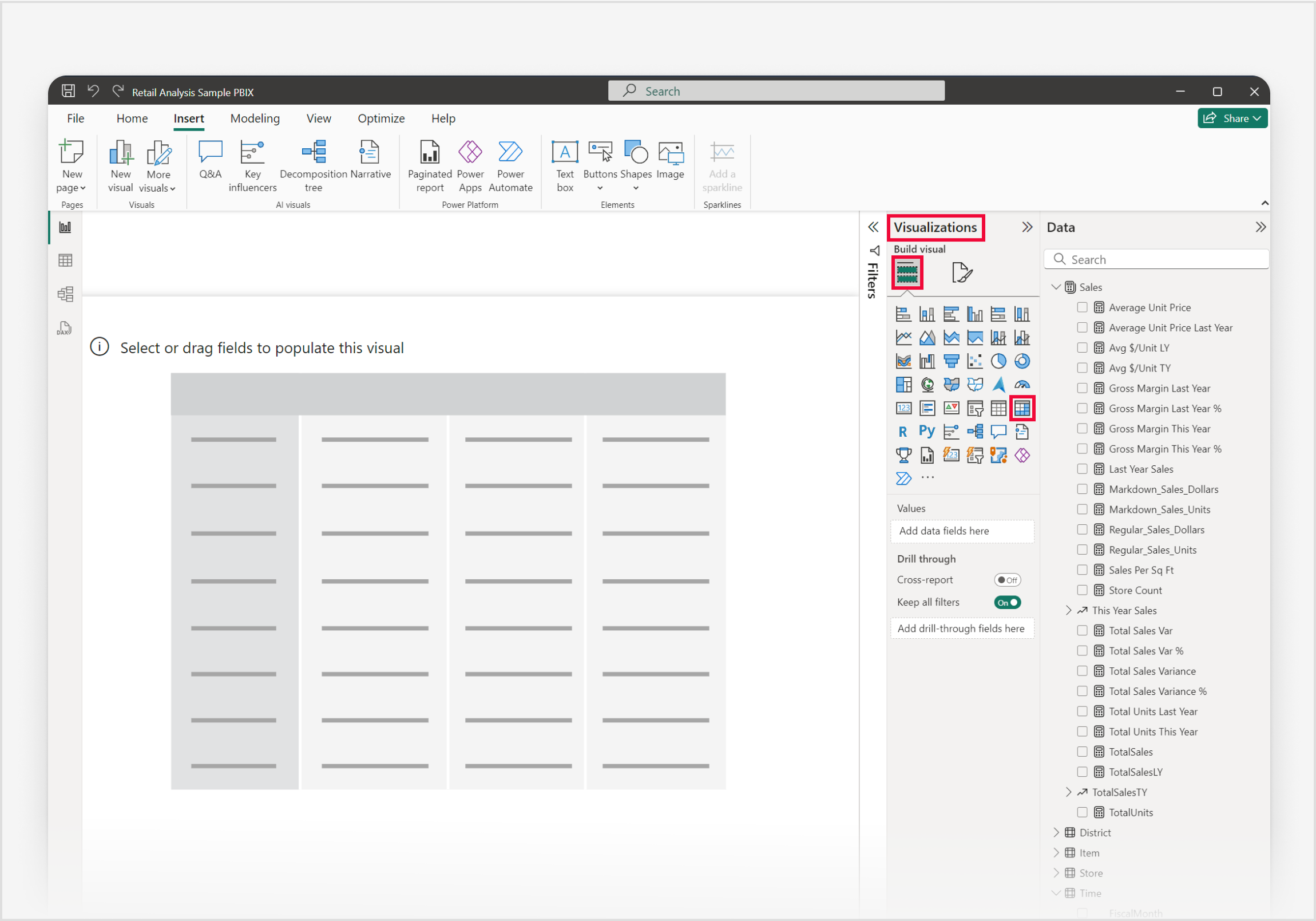
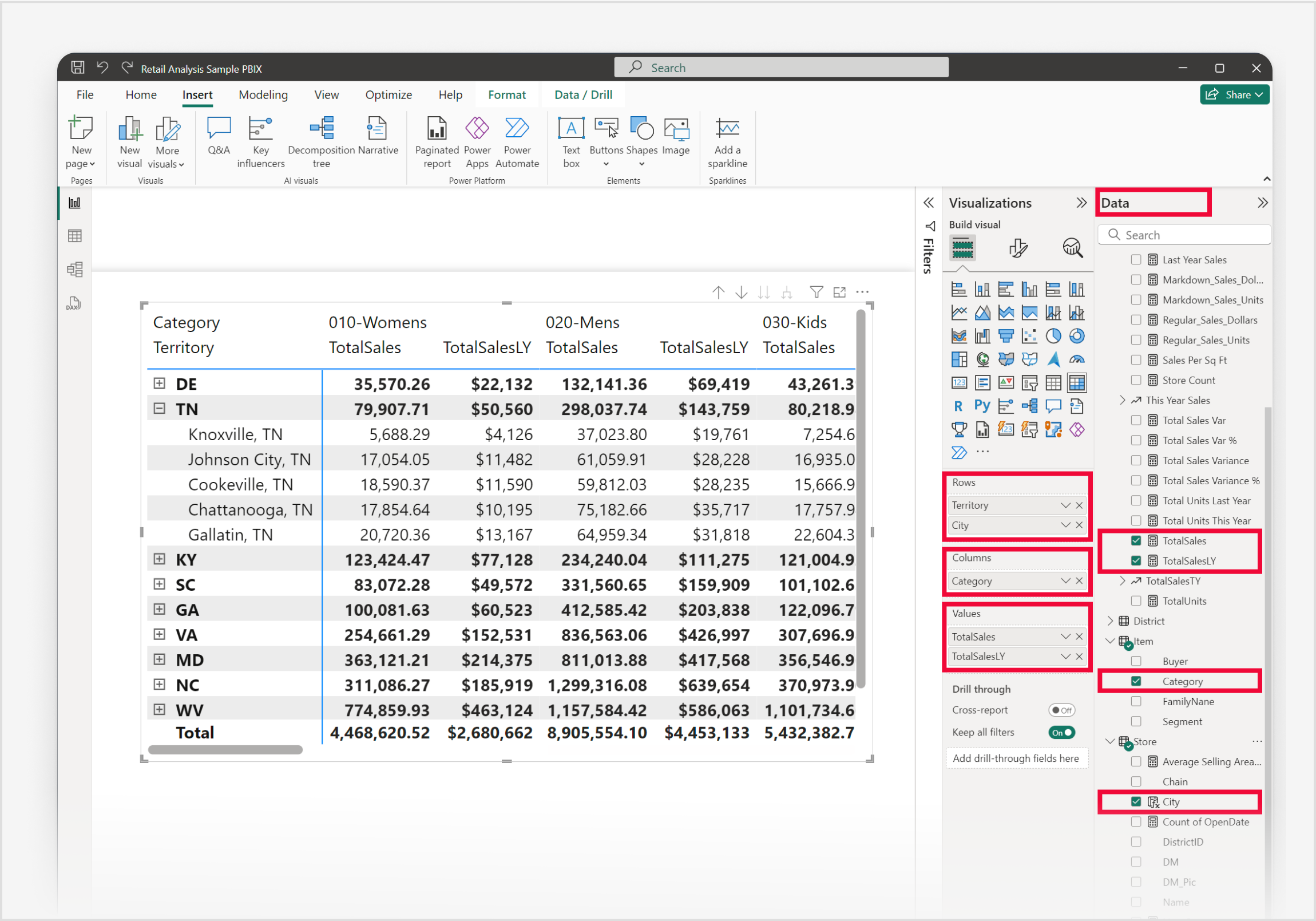
To add data to the visual in this example, let's use the Data pane. Adding data can be done by selecting fields and measures, or dragging fields and measures to the field wells on the Visualizations pane, or dragging fields and measures directly to the visual placeholder in the report canvas. Expand the Sales group, to add TotalSales and then TotalSalesLY to the Values field well. Expand the Item subgroup, to add Category to the Columns field well. And finally, expand the Store subgroup to add Territory and then City to the Rows field well.
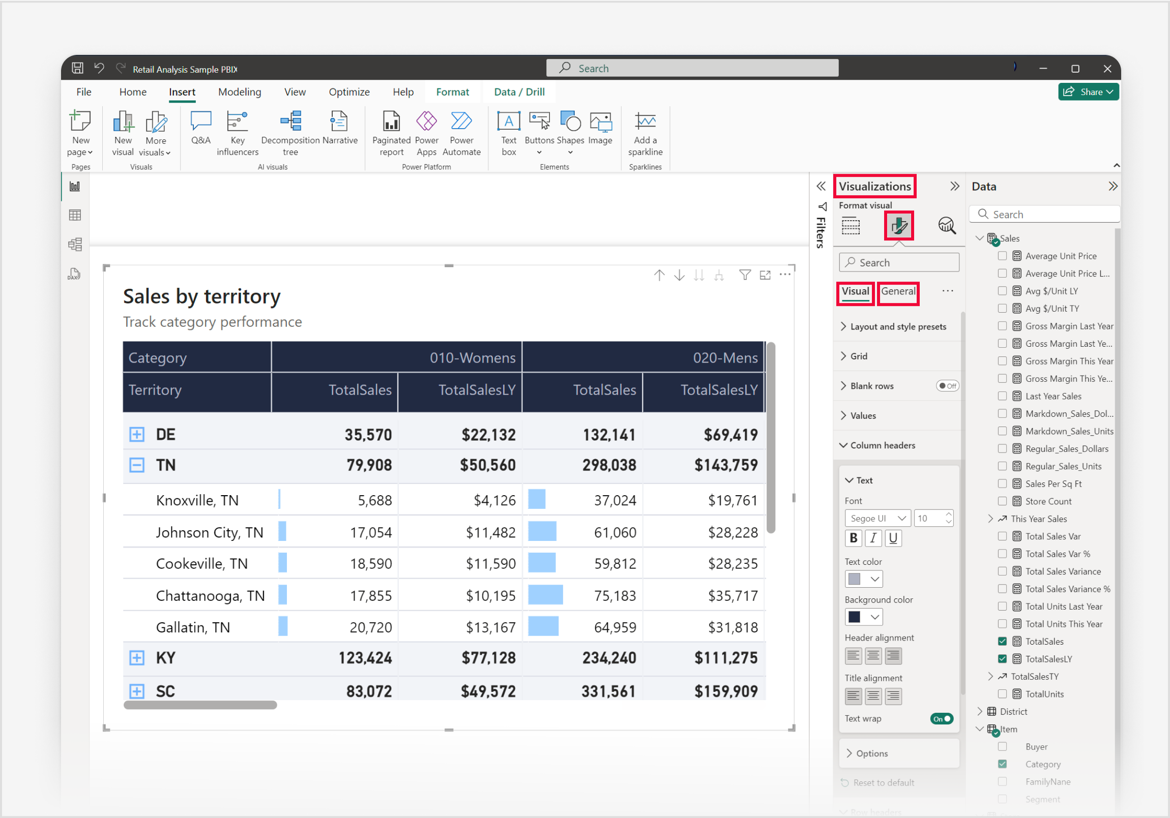
To customize your matrix visual, select the Format visual icon in the Visualizations pane, granting you access to all available settings, allowing you to tailor the matrix visual's appearance and functionality to your specific requirements.


Great job! Congratulations on successfully creating a matrix visual with Power BI. Next, take time to familiarize yourself with the comprehensive list of Matrix visual format settings and other related articles in the Related content section.
Work with the matrix
Expand and collapse row headers
Use expand and collapse icons provided to combine groups or to show more detail.

When report consumers open a matrix visual in Explore, the columns and rows added to the visual are auto-expanded by default so consumers can see all the levels at once.
In embedded scenarios, you can use the Authoring SDK to set the autoExpand property on the rowHeaders and columnHeaders objects so a matrix opens with its rows and columns auto-expanded by default.
Freeze row headers
By default row headers are frozen, which ensures they stay visible when you scroll horizontally.

To unfreeze row headers, and therefore hide them as you scroll horizontally, right-click on the row headers and select Unfreeze row headers.

To refreeze the row headers, right-click on the row headers again and select Freeze row headers.
Note
The freeze and unfreeze options in the right-click menu are transient and apply only to your current viewing session. If you change this setting in an editing scenario, such as Power BI Desktop or web editing, the change isn't saved for report consumers.
Adjust column width
Column width in Power BI tables and matrices can be adjusted to improve readability and presentation. You can manually resize columns or use the Layout section of the Format pane to control how columns size, set a default width, and customize widths for individual columns.
Manual adjustment
Sometimes Power BI shortens a column heading in a report or dashboard. To display the full column name, you can resize the column in two ways:
Resize by dragging
Move to the space just to the right of the column heading until the resize arrows appear. Once the arrows are visible, adjust the column width by moving the resize handle left or right.
Resize using menu options
Select the column you want to adjust. From the available options, choose Widen column or Narrow column to change its width by 10px.
Manual resizes are reflected in the Custom widths controls in the Format pane.
Auto-size behavior
Column sizing settings are in the Format pane under Visual > Layout > Column width. The Auto-size behavior dropdown has three options:
- Fit to content: Columns are as wide as they need to be to show the data, assuming there's room in the visual container.
- Grow to fit: Columns automatically expand to fill the visual container for a more balanced layout. Any leftover horizontal space is distributed evenly to each column.
- Fixed width: Columns use a width that you specify. When this option is selected, a Default width input appears so you can set the width for all columns and for any new columns added to the visual.
Default width (Fixed width only)
When Auto-size behavior is set to Fixed width, set a Default width in pixels. With Custom widths off, all columns use this uniform width. New columns added to the visual also use this default width.
Custom widths
Turn on Custom widths to see and customize the width of any column directly from the Format pane:
- If the visual has fewer than 15 columns, each column appears with its own width input.
- If the visual has 15 or more columns, an Apply settings to dropdown appears. Select a column from the dropdown to set its width. Columns that already have a custom width are marked with an asterisk (*).
Width inputs that show (auto) indicate the column is using the auto-size behavior rather than a custom width.
To clear customizations:
- Clear all: Toggle Custom widths off to clear custom widths from every column.
- Clear one: Clear the input box for a single column, or right-click the input and select the option to reset that value to default.
Matrix hierarchies (More granular)
For a matrix with hierarchies on columns, Custom widths by default sets a uniform width for the lowest level of the hierarchy. To set widths for each combination individually, turn on More granular. Each leaf-level combination then appears in the Apply settings to dropdown so you can size them independently.
Mobile view
The Column width settings in the Format pane can be modified independently for the mobile-optimized layout of a report page. This lets you tune column widths so tables and matrices fit well on small screens without changing the desktop layout. For more information, see Optimize Power BI reports for the mobile app.
Custom totals
With custom totals in Power BI tables and matrices, you can easily determine what the total row shows for a specific column if needed.
By default the total row shows the result of evaluating the field across the entire filter context of the report page. This behavior is correct in most cases. However, in some specific scenarios you might want to change what the total row displays. You can use DAX to influence what the total row displays, but custom totals provide an easy way of changing the total row value to the sum, average, min, max, count (distinct), or count of the displayed rows. You can also choose None to hide the total row value for the column.
Working with custom totals
Custom totals are based on visual calculations. To create a custom total, right-click a numerical column in the visual or use the Build pane and choose Customize total calculation:

Then, choose the total calculation to apply. These options are available:
| Custom total option | The total row shows |
|---|---|
| Sum | The sum of the displayed row values |
| Average | The average of the displayed row values |
| Min | The minimum value in the displayed rows |
| Max | The maximum value in the displayed rows |
| Count (Distinct) | The number of unique values in the displayed rows |
| Count | The number of values in the displayed rows |
| None | Hides the total row value for the column |
| Reset to default | Default value (option only enabled if a custom total is set) |
How custom totals work
Custom totals are based on visual calculations. As soon as you select any of the above options, the following happens:
- The original column's name gets a _Base suffix. So if your column is named Number of Customers, the column is now named Number of Customers_Base.
- The original column is hidden.
- A new visual calculation with the original column name is added. The visual calculation is equal to:
EXPANDALL ( <aggregation> ( [Original column_Base] ), ROWS COLUMNS )
For example, if you add a sum custom total for the Number of Customers column, the new visual calculation is:
Number of Customers = EXPANDALL ( SUM ( [Number of Customers_Base] ), ROWS COLUMNS )
- An Excel-like indicator appears in the total cell for the column on which the custom total was set.
The result shown in visual calculations edit mode is:

Note
You can edit a custom total just like another visual calculation by right-clicking on the custom total in the build pane and choosing 'Edit calculation':
Reset to default
Once a custom total is set, you can use the Reset to default option to get back to Power BI's default behavior. Reset to default removes the custom total and reverts the changes made:
- the custom total visual calculation is removed
- the original column is made visible again
- the original column name is reset
Considerations and limitations
- Custom totals aren't available in Explore.
- Custom totals are only available on the table and matrix visual.
- Custom totals are only available for numerical columns.
- Field formatting doesn't transfer to a custom total. You need to format a custom total like you format a visual calculation.
- The same considerations and limitations of visual calculations apply to custom totals.