Developer technologies | ASP.NET | Other
A set of technologies in .NET for building web applications and web services. Miscellaneous topics that do not fit into specific categories.
This browser is no longer supported.
Upgrade to Microsoft Edge to take advantage of the latest features, security updates, and technical support.

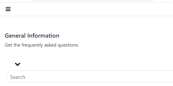
How do I get to create a navigation dropdown that has its contents display horizontally (i.e. having two horizontal sides), just like in the image below?
Here is my navigation bar
<html xmlns="http://www.w3.org/1999/xhtml">
<head runat="server">
<meta charset="utf-8" />
<meta name="viewport" content="width=device-width, height=device-height, initial-scale=1.0, shrink-to-fit=no" />
<link rel="stylesheet" media="all" href="https://cdnjs.cloudflare.com/ajax/libs/font-awesome/5.15.3/css/all.min.css" integrity="sha512-iBBXm8fW90+nuLcSKlbmrPcLa0OT92xO1BIsZ+ywDWZCvqsWgccV3gFoRBv0z+8dLJgyAHIhR35VZc2oM/gI1w==" crossorigin="anonymous" referrerpolicy="no-referrer" />
<link rel="stylesheet" href="https://pro.fontawesome.com/releases/v5.10.0/css/all.css" intergrity="sha384-AYmEC3Yw5cVb3ZcuHt0A9w35dYTsvhLPVnYs9eStHfGJv0vKxVfELGroGkvsg+p" crossorigin="anonymous" />
<link rel="stylesheet" href="https://cdnjs.cloudflare.com/ajax/libs/font-awesome/4.7.0/css/font-awesome.min.css" />
<link rel="stylesheet" href="https://cdn.jsdelivr.net/npm/bootstrap@4.5.3/dist/css/bootstrap.min.css" integrity="sha384-TX8t27EcRE3e/ihU7zmQxVncDAy5uIKz4rEkgIXeMed4M0jlfIDPvg6uqKI2xXr2" crossorigin="anonymous" />
<script src="http://code.jquery.com/jquery-1.11.0.min.js"></script>
<link href="css/bootstrap.min.css" rel="stylesheet" media="all" />
<link href="css/bootstrap.css" rel="stylesheet" media="all" />
<title></title>
<style>
.navbar-nav {
margin-left: auto;
}
#navbarNav li a {
color: #011B33;
font-family: 'Graphik', sans-serif;
font-weight: 500;
font-size: 11pt;
}
.nav-item {
float: right;
}
.navbar-nav .active {
color: steelblue;
}
.nav-item .nav-link:hover {
color: steelblue;
}
#navbarNav li a:hover {
color: steelblue;
}
.navbar-toggler.fas-fa-times {
display: none;
}
.navbar-toggler:not(:empty) .fa fa-bars {
display: inline;
}
@media screen and (min-width: 360px) and (max-width:640px) {
.top {
height: 10%;
}
}
@media all and (min-width: 992px) {
.navbar .nav-item .dropdown-menu {
display: none;
}
.navbar .nav-item:hover .nav-link {
}
.navbar .nav-item:hover .dropdown-menu {
display: block;
}
.navbar .nav-item .dropdown-menu {
margin-top: 0;
}
}
@media screen and (min-width: 360px) and (max-width:640px) {
#qr {
display: none;
}
.tophead {
font-size: 20pt;
}
}
.navbar-toggler > .close {
display: inline;
}
.navbar-toggler.collapsed > .close, .navbar-toggler:not(.collapsed) > .navbar-toggler-icon {
display: none;
}
@media screen and (min-width: 360px) and (max-width: 768px) {
.navbar-nav {
background-color: #ffffff;
color: #011B33;
width: 100%;
}
#navbarNav li a {
color: #011B33;
}
}
.horizontal {
width: auto;
}
@media (min-width: 768px) {
.animate {
animation-duration: 0.3s;
-webkit-animation-duration: 0.3s;
animation-fill-mode: both;
-webkit-animation-fill-mode: both;
}
}
@keyframes slideIn {
0% {
transform: translateY(1rem);
opacity: 0;
}
100% {
transform: translateY(0rem);
opacity: 1;
}
0% {
transform: translateY(1rem);
opacity: 0;
}
}
@-webkit-keyframes slideIn {
0% {
-webkit-transform: transform;
-webkit-opacity: 0;
}
100% {
-webkit-transform: translateY(0);
-webkit-opacity: 1;
}
0% {
-webkit-transform: translateY(1rem);
-webkit-opacity: 0;
}
}
.slideIn {
-webkit-animation-name: slideIn;
animation-name: slideIn;
}
</style>
</head>
<body>
<form id="form1" runat="server">
<div class="col-sm-6">
<nav class="navbar navbar-expand-lg navbar-dark fixed-top" id="header" style="opacity: 0.95;">
<button class="navbar-toggler collapsed" type="button" data-toggle="collapse" data-target="#navbarNav" aria-controls="navbarNav" aria-expanded="false" aria-label="Toggle navigation" style="background-color: transparent; border: none; border-color: none; font-size: 12pt; border-width: 0px; color: #145c7c;">
<span class="close" style="font-size: 16pt; color: #145c7c;"><i class="fa fa-times" aria-hidden="true" style="color: #145c7c;"></i></span>
<span class="navbar-toggler-icon" style="font-size: 14pt; color: #145c7c;">
<i class="fa fa-bars" aria-hidden="true" style="color: #145c7c;"></i>
</span>
</button>
<div class="collapse navbar-collapse" id="navbarNav" style="width: 100%;">
<ul class="navbar-nav mr-auto">
<li class="nav-item dropdown">
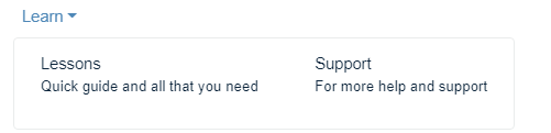
<a class="nav-link dropdown-toggle" data-toggle="dropdown" id="navbarDrop" href="#" data-bs-toggle="dropdown" aria-haspopup="true" aria-expanded="false">Learn<b class="caret"></b></a>
<ul class="dropdown-menu dropdown-menu-end animate slideIn" aria-labelledby="navbarDropdown" style="border: none; background-color: #fff; font-size: 9pt; border: 0.5px solid #e9ebeb;">
<li><a class="dropdown-item" href="#" style="color: #011b33;">
Lessons<br />
<p style="font-size: 10pt; font-weight: 400;">Quick guide and all that you need</p>
</a></li>
<li><a class="dropdown-item" href="#" style="color: #011b33;">
Support<br />
<p style="font-size: 10pt; font-weight: 400;">For more help and support</p>
</a></li>
</ul>
</li>
</ul>
<ul class="navbar-nav">
<li class="nav-item active">
<a class="nav-link active" href="#">Home<span class="sr-only">(current)</span></a>
</li>
<li class="nav-item"><a class="nav-link" href="#">Delivery</a></li>
</ul>
</div>
</nav>
</div>
</form>
</body>
</html>
' cx='32' cy='32' r='32' /%3E%3Ctext x='50%25' y='55%25' dominant-baseline='middle' text-anchor='middle' fill='%23FFF' %3ELH%3C/text%3E%3C/svg%3E)
Hi @Donald Symmons ,
A dropdown menu is constrained by the width of its li container. You just need to add the following code in <style>.
.dropdown-menu {
            margin-right: -1000px;
        }

            .dropdown-menu > li {
                display: inline-block;
            }
Best regards,
Lan Huang
If the answer is the right solution, please click "Accept Answer" and kindly upvote it. If you have extra questions about this answer, please click "Comment".
Note: Please follow the steps in our documentation to enable e-mail notifications if you want to receive the related email notification for this thread.
When I add this code below, will it not give me an irregular display in mobile view?
.dropdown-menu {
             margin-right: -1000px;
         }

             .dropdown-menu > li {
                 display: inline-block;
             }
Hi @Donald Symmons ,
I put the code below into this thread's code for testing. Results are not displayed irregularly in mobile view.