Azure Automation
An Azure service that is used to automate, configure, and install updates across hybrid environments.
This browser is no longer supported.
Upgrade to Microsoft Edge to take advantage of the latest features, security updates, and technical support.
' cx='32' cy='32' r='32' /%3E%3Ctext x='50%25' y='55%25' dominant-baseline='middle' text-anchor='middle' fill='%23FFF' %3EMJ%3C/text%3E%3C/svg%3E)
Hello,
I'm looking for a graph to monitor the activity of an Azure automation account (Completed runbook,failed,Suspended..Etc), the idea is to pin this graph to my Azure Dashboard.
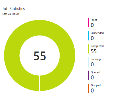
On the overview of the automation account, i can see the following job statistics which is interesting :
But i cannot pin it to my Dashboard.
Any help?

Hello @Mohamed jihad bayali
Specifically for a pie chart, there is no direct way of pinning to a dashboard. You can pin a metrics chart and split the total by status and pin that to a dashboard, but whether you render the results as a grid, or another available chart, you will not get pie chart.
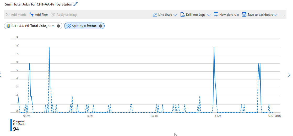
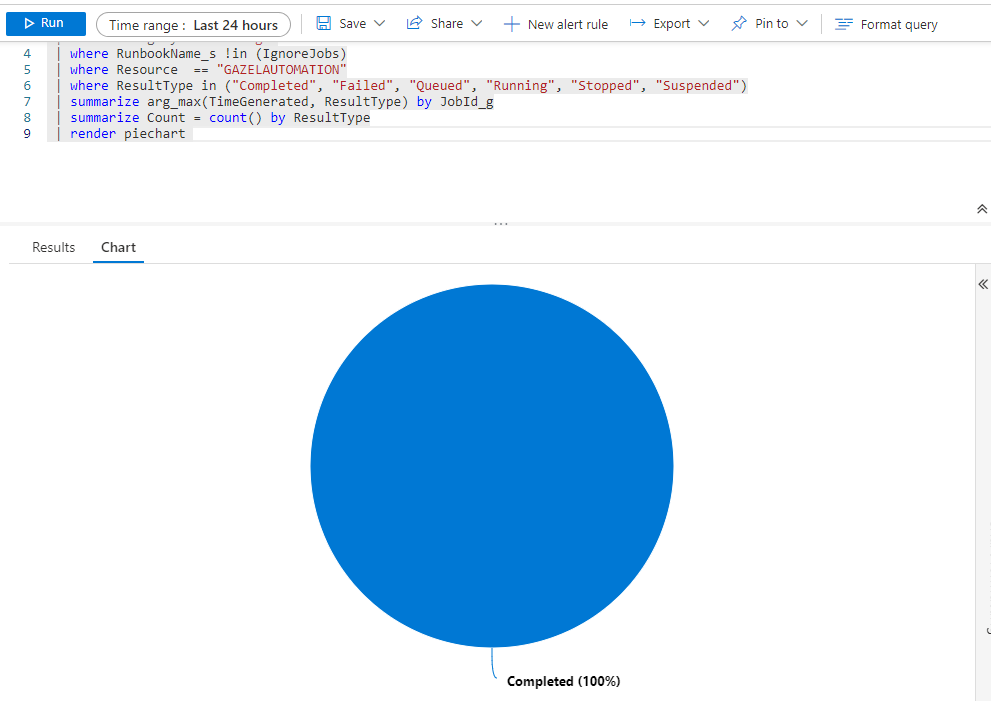
As @JimmySalian-2011 has suggest, you can export the logs to Azure Monitor, specifically the JobLogs diagnostic setting is what you want. I've provided a log query that will render the results for you here. You can then pin this to a dashboard.
let IgnoreJobs = dynamic('["ImportAutomationModule2", "Compile-ConfigurationV3"]');
AzureDiagnostics
| where Category == "JobLogs"
| where RunbookName_s !in (IgnoreJobs)
| where ResultType in ("Completed", "Failed", "Queued", "Running", "Stopped", "Suspended")
| summarize arg_max(TimeGenerated, ResultType) by JobId_g
| summarize Count = count() by ResultType
| render piechart
Note: In this query I have an array called ignore jobs. I used this to filter out the jobs that are displayed in the logs, but not part of the Jobs list in the automation account.
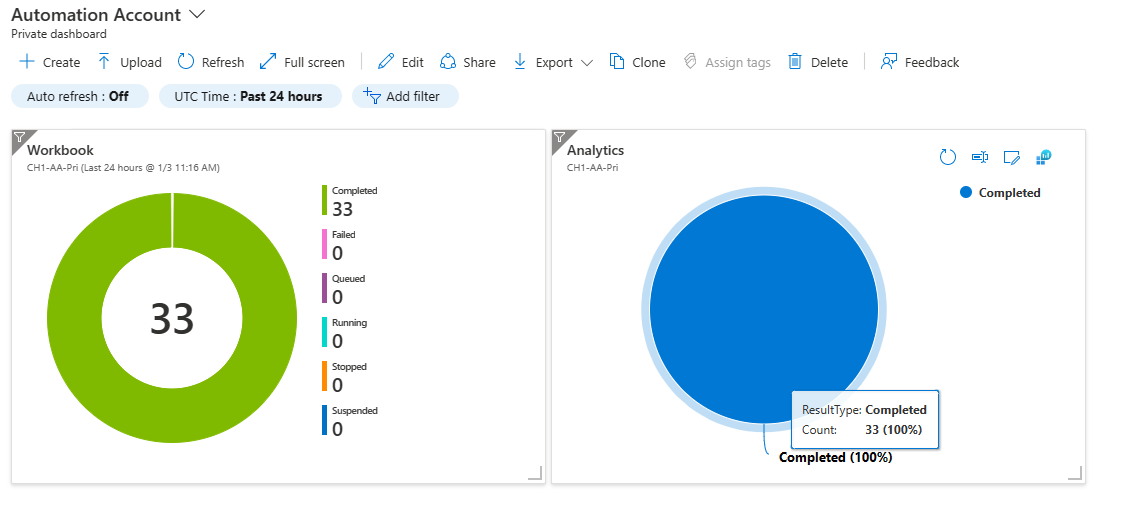
Alternatively you can build the pie chart in an Azure Workbook and use that as your dashboarding tool, or pin the chart to the Azure Dashboard. Personally I prefer workbooks as I can utilise drill down capabilities and have more control over the UI, but it is your choice. Here is my dashboard with the workbook on the left and direct log query on the right.
The workbook can be found here: https://github.com/TheAlistairRoss/AzureMonitor/blob/main/Workbooks/AutomationAccount/JobStatusPieChart.json
I hope this helps provide you with the information you need. If it does, please make sure to mark the question as answered so it helps other people in future.
Kind regards
Alistair

Hi,
I am not sure if this is possible but you can explore the Automation Dashboard page and check this detailed thread on this. Also you can try to export to Azure Monitor Logs and from there can configure the Dashboard.
There is another option to programmitcally configure the Dashboard customize - azure-portal-dashboards-create-programmatically
Hope this helps.
JS
==
Please Accept the answer if the information helped you. This will help us and others in the community as well.
Hello AlistairRoss-msft,
Thank you for your answer, it helped very well.
I was able to redirect the diag logs to my log anlaytics, and then used your query to get the dashboard, it works as expected.
I'm not very familiar with Workbooks but i want to test it, if i understand correctly, i would need to modify the json file that you sent me (Subscription name, Automation account name....)
And then create a new Azure Workbook, and then past the json in it ?
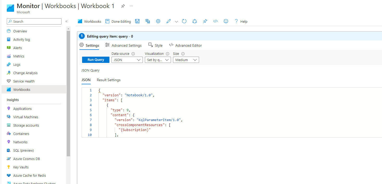
For the creation of the workbook, i go to Azure Workbooks,quick start, add query, on data Source i choose Json, and then i run the query?
Thank you again
When you pin this, the dashboard will retain the parameters selected, therefore you are free to change this workbook to another automation account and pin to another dashboard and get a consistent experience for different automation accounts, using the same workbook.
You're the boss !!!!
Thank you a lot again, it works perfectly