Bar Chart with Categories in reverse order - Data Label Placement

Anonymous
2015-05-14T00:52:06+00:00

I have a bar chart where my categories are in reverse order. When the value of one of the data points is 0, the label is placed to the right of the Y axis. I want the label on the left of the Y axis, as when it is placed on the right side, the data label overlaps with the category name. 

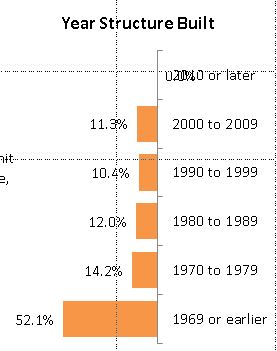
Below you can see that the first category of "2010 or later" has a value of 0.0%, which is labeled to the right of the Y axis.

Labels options are set to:

Label Contains: Value

Label position: Outside End

When the values are not in reverse order, the labeling works correctly, with the 0.0% data label to the right of the Y axis (along with all the other data labels).

I would like to keep the data label, but I do not want to reset the label position manually. I have over 200 documents, each containing 40+ charts, so manually reviewing each document and each chart is cumbersome.

I am open to a VBA solution.

Thank you.

Microsoft 365 and Office | PowerPoint | For home | Windows

Locked Question. This question was migrated from the Microsoft Support Community. You can vote on whether it's helpful, but you can't add comments or replies or follow the question.

0 comments No comments
{count} votes

11 answers

Sort by: Most helpful
  1. Anonymous
    2015-05-14T14:46:46+00:00

    Hello,

    Thank you for posting on Microsoft Community.

    To resolve this issue try the following solution: 

    1. Double-click on the Y Axis (category). This should open the Format Axis dialogue.
    2. Un-check the option Categories in reverse order.
    3. Check if the above resolves the issue.

    Try the above steps and let us know the result.

    Thank you.

    13 people found this answer helpful.
    0 comments No comments
  2. Anonymous
    2015-05-14T15:12:31+00:00

    Thank you for the response.

    No that did not work. Here is the result:

    When I un-check the Primary Horizontal (Value) Axis "Values in reverse order" box, the values label appropriately:

    Due to the graphical layout of my slide, I would really prefer that the Values Labels are in Reverse Order. 

    Thank you for your help in this matter.

    0 comments No comments
  3. John Korchok 224.3K Reputation points Volunteer Moderator
    2015-05-14T17:18:22+00:00

    Oddly enough you change this through the horizontal axis formatting:

    1. With the chart activated in PowerPoint, choose Chart Tools>Layout>Axes>Primary Horizontal Axis>More Primary Horizontal Axis Options.
    2. Set Vertical axis crosses to Maximum axis value, or if it is already at Maximum axis value, set it to Automatic. OK out.

    The vertical axis will switch sides.

    1 person found this answer helpful.
    0 comments No comments
  4. Anonymous
    2015-05-14T17:35:21+00:00

    Thanks again for getting back to me. This didn't work either. Here's what it looks like now. The setting was set to Automatic, and when I changed it to Maximum axis value, this is what happened:

    Thanks again for your help.

    -Katie

    0 comments No comments
  5. John Korchok 224.3K Reputation points Volunteer Moderator
    2015-05-14T19:00:03+00:00

    Right-click the value axis and uncheck Values in reverse order. Then change Vertical access crosses back to Automatic.

    1 person found this answer helpful.
    0 comments No comments