Bar Chart with Categories in reverse order - Data Label Placement

Anonymous
2015-05-14T00:52:06+00:00

I have a bar chart where my categories are in reverse order. When the value of one of the data points is 0, the label is placed to the right of the Y axis. I want the label on the left of the Y axis, as when it is placed on the right side, the data label overlaps with the category name. 

Below you can see that the first category of "2010 or later" has a value of 0.0%, which is labeled to the right of the Y axis.
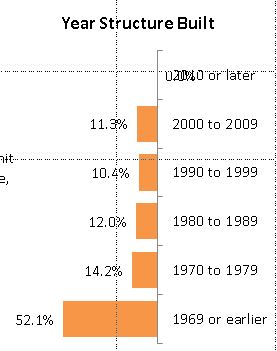
Labels options are set to:

Label Contains: Value

Label position: Outside End

When the values are not in reverse order, the labeling works correctly, with the 0.0% data label to the right of the Y axis (along with all the other data labels).

I would like to keep the data label, but I do not want to reset the label position manually. I have over 200 documents, each containing 40+ charts, so manually reviewing each document and each chart is cumbersome.

I am open to a VBA solution.

Thank you.

Microsoft 365 and Office | PowerPoint | For home | Windows

Locked Question. This question was migrated from the Microsoft Support Community. You can vote on whether it's helpful, but you can't add comments or replies or follow the question.

0 comments No comments
{count} votes

11 answers

Sort by: Most helpful
  1. Anonymous
    2015-05-14T19:11:44+00:00

    Thanks John. That brings my chart back to this state:

    Yes, in this state, the "2010 or later" category data label of 0.0% labels correctly. However, I really want to display this bar chart with the values in reverse order in my presentation. 

    Is there a way for me to attach a .pptx file to this thread so others could view the file directly?

    Thanks.

    0 comments No comments
  2. John Korchok 224.4K Reputation points Volunteer Moderator
    2015-05-14T20:19:16+00:00

    On the last version, your values were in reverse order, with 60% on the left and 0% on the right. Do you mean perhaps that you want your categories in reverse order, with 1969 at the top and 2010 at the bottom? In that case, right-click on the vertical axis, choose Format Axis and check Categories in reverse order.

    You can post a copy of the presentation by uploading it to OneDrive, Dropbox or other cloud storage, then posting a link here.

    0 comments No comments
  3. Anonymous
    2015-05-14T21:38:50+00:00

    I apologize for the confusion. Here is what I want my chart to look like:

    To achieve this, I have the categories of the Vertical (Category) axis in reverse order. I also have the Values in reverse order on the Horizontal (Value) axis. I have the Data Labels set to Outside End. The top category "2010 or later" has a data value of 0. Powerpoint does not place the "0.0%" data label to the left of the Y axis. In order to get it there as above, I have to manually move the data label position. 

    Here is a link to my file. The first slide is how I want my chart to look. The second slide has the chart as it is created by PowerPoint with the labeling problem.

    Problem Chart

    Thanks.

    0 comments No comments
  4. John Korchok 224.4K Reputation points Volunteer Moderator
    2015-05-14T22:07:36+00:00

    Ahh, the data label. Give 2010 a value of 0.00001 and it will fix itself. No bar will display and the label will still read 0.0% because formatting only includes 1 decimal place.

    0 comments No comments
  5. Anonymous
    2015-05-15T01:34:51+00:00

    Thank you. Yes, I can change the underlying value and that does fix the problem. 

    However, I am creating 200 documents with 40+ charts per document. I am using VBA to select and change the data source of the underlying chart data from a database of millions of data points. The value of 0 is a valid data point for this chart in some documents, but will be different in others. I was hoping there was a way to "correct" the data label placement problem with a value of 0. 

    I can try to adjust my code to check for values of 0 and change the data value within the code (without impacting the underlying data). I was hoping there was an alternative to this approach.

    Thanks again for your help.

    0 comments No comments