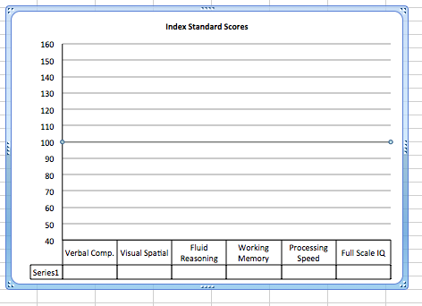
I've created a excel document [mac 2011] to graph test results so that I can then paste the graph into my psychological reports. I want to format a single grid line, so that it is easy for parents to see where the average score is. I know that this is possible,
because I've somehow done it in two of my graphs, but I can't figure out how I did it, after more than an hour of trying to figure it out. Frustrating to say the least.

As you can see, the grid line at 100 has been selected separately from the other grid lines in the graph. When I click on any of the other grid lines, all but this grid line are selected simultaneously.
I know how to insert a line into the graph once I've pasted it into word, and align it with the average score. However, it would make my report writing go faster if I don't have to mess around with adding a line each time.
So, the question really is- How do I make a single grid line in a graph function separately from the other grid lines, so that I can then change it's formatting separately from the other grid lines?
ANSWER: Right click on a gridline, and select format axis. Find the box that says "Horizontal line crosses at:" and enter the value of the gridline you want to format differently than the others [for example, 100 for the graph above]. It will now be selectable
separately from the other gridlines, and so can be formatted separately from the other gridlines.

