An accessibility case study - Reading List. Part 2: Colours and Contrast
This post discusses accessibility considerations around colours and contrast shown in the UI of the Reading List app available in the Windows 8.1 Preview.
The Reading List team’s first considerations here were around the default colours shown in the app. The result was that we felt the colours shown wouldn’t introduce challenges working at the app for customers who have colour blindness. The bulk of the colours shown relates to shades of red used in the list’s group headers, and we were very conscious never to convey information through the use of colour alone.
But this raises the question of whether some customers will be able to discern all the different shades of red shown? The answer to this is no, so we then had to consider what that means from an accessibility perspective. The shades of red shown in the group headers are a supplemental indication of the age of the items in each group. The actual age of a group’s items is displayed as text at the start of the group header, (for example “Today” or “Earlier this month”). In fullscreen, to aid in identifying a transition between groups while scrolling through the list, the header above the first column in the group is taller than later columns. This makes the transition between groups clear, regardless of whether the shade of red in the group header is perceivable.
So after analyzing the use of colours, we felt that things were acceptable from an accessibility perspective. But during this, we also considered the contrast of text on its background using the default colour theme. For example, the “Spotlight” item at the start of the list has text “Continue viewing” shown in grey on a white background. So all text shown in the app was examined, and colours chosen which it was felt had sufficient contrast when using the default theme.
Now, having checked the colours and contrast using the default theme, it’s time to move on to the app experience when a high contrast theme is active. The WinJS ListView does such a good job at supporting high contrast themes, it might be tempting to think that the app doesn’t need to do anything specific itself. Indeed, all the item text and group header text is shown in the current text foreground colour, and all the group header backgrounds are shown in the current background colour. That seems pretty good to me, so maybe it’s time to move onto the next topic right? Well, not so fast. It’s worth taking a few moments to consider how we can enhance the experience as much as we can when a high contrast theme’s active, rather than only meeting some minimum bar.
The sections below describe the actions taken by the Reading List team to elevate the high contrast experience.
Item images
The images shown in the items in the list are presented using background styling on a div rather than creating an element using an “img” tag. (This was originally done in order to leverage some cropping and scaling behavior which was more easily achieved when the image was presenting as a background.) By default, WinJS hides background images when a high contrast theme is active. This reduces the chances that text becomes impossible to discern when a high contrast theme is active, due to the text being positioned in front of some image. So the Reading List team considered whether we should allow that default behavior of having the image on the item hidden in high contrast. Given that we present no text over the image, it seemed preferable to have the image shown. This image would commonly have been shown in the source app from which the image was shared while the same high contrast theme was active, and so it was preferable to maintain the same visuals when presented in Reading list.
As such, by using the following css with the background image, we specified that the image should not be hidden.
-ms-high-contrast-adjust: none;
Item borders
When the default theme is active, the items shown in the list are styled such that they do not have borders around them. So by default, the items would not have borders when a high contrast theme is active. The Reading List team considered whether in general, it would be preferable to show borders when a high contrast theme is active, in order for items to be more clearly delineated. Without borders around the items it’s less clear where text from one item ends and text from an adjacent item begins. We felt in general that it did seem preferable to show borders in this situation, and this was achieved with the following css.
@media screen and (-ms-high-contrast) {
.item {
border-style: solid;
}
}
It’s worth noting here that the border is shown outside of the item, and does not overlap the item near the item’s edges. So if you want the entire space occupied by both the item and its border to be the same as the item alone when a high contrast theme is not active, then you’d need to reduce the size of the item by the size of the border.
As we were working on the borders shown when a high contrast theme is active, we also considered whether we want to customize any other feedback around the item. We want all of the borders, hover feedback, keyboard focus feedback and selection feedback to be clear and shown using colours appropriate to the current active high contrast theme. In the end we only customized the hover feedback to be wider than it is by default. The following feedback shows how this was achieved.
.item:hover {
outline: 6px solid Highlight;
}
As you’d expect, the colour of the hover feedback is a set using a system colour.
Text opacity
Some of the grey text shown on the screen is styled to have some transparency. By default, this gives the effect of the text being less prominent than other nearby text. When a high contrast theme is active we want all text to be as clear as possible, and that means making it 100% opaque. So any text that has transparency when the default theme is active, is made opaque when a high contrast theme is active with the following css.
opacity: 1.0;
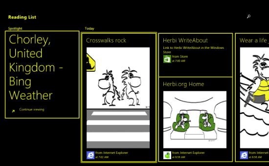
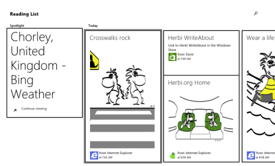
So having considered the image display, item borders and text opacity, the results are shown in the screenshots below.
Figure 1: Reading List app with High Contrast #1 theme active. Keyboard focus is shown around the first item in the “Today” group.
Figure 2: Reading List app with High Contrast White theme active. Keyboard focus is shown around the first item in the “Today” group.
Figure 2 is a reminder that “high contrast” does not mean light text on a dark background. So never be tempted to set some text colour to white when a high contrast theme is active. Always use system colours when in high contrast.
High contrast fixed images
Any fixed images shown by the app will want to have high contrast versions which can be shown when a high contrast theme is active. The Reading List app ships with black-on-white and white-on-black versions of its images. It makes use of the handy WinJS feature whereby the appropriate image is automatically shown if the image files on disk follow a certain naming convention. So say I want to ship three versions of an image. I would ship the following three image files, (all in the same folder on disk):
MyImage.png
MyImage.contrast-black.png
MyImage.contrast-white.png
All I need to do is specify “MyImage.png” in code, and WinJS will load up the appropriate one of the three versions based on which, if any, high contrast theme is active. Preferably each image would also have scaled versions for 100%, 140% and 180%, as described at Quickstart: Using file or image resources. What’s more, you might find you need both left-to-right and right-to-left versions of some images too. This means I could specify “MyImage.png” in code, and get the following 180%, high contrast, right-to-left image automatically loaded:
MyImage.scale-180_contrast-black_layoutdir-RTL.png
That’s pretty powerful stuff.
Note that the image doesn’t automatically get reloaded following a change in the active theme. It’s a common belief that customers don’t switch in and out of high contrast themes while an app is running. While in general many customers of high contrast themes will maintain the same theme throughout their use of the device, it’s not always the case. Say an app presents small UI, which is less easy to discern than the rest of the UI in the app. A customer may specifically turn on a high contrast theme while interacting with that small UI, and once done, turn off the high contrast theme. If the app didn’t react to the change in high contrast theme while the app is running, then the customer would have to restart the app twice during this operation. That’s not a good customer experience.
So do consider whether it would be helpful to react to a change in the state of high contrast while the app’s running. In the Windows 8.1 Preview, the Reading List app doesn’t need to do this, but it could have set up a high contrast changed event handler in the following way:
var mediaQueryHighContrast = matchMedia("screen and (-ms-high-contrast)");
mediaQueryHighContrast.addListener(this.onHighContrastChanged);
And then take whatever action is appropriate in the event handler later.
onHighContrastChanged: function (listener) {
…
}
Note that the event handler will get called when the customer changes between a high contrast theme and a theme that’s not high contrast. It doesn’t get called when the active theme moves from on high contrast theme to another. Typically if a high contrast theme is used at all, it’ll be the same high contrast theme.
The screenshot below shows the Share flyout UI provided by the Reading List when the High Contrast #1 theme is active. The fixed images shown for the app icon and button on the flyout respect the current high contrast colours. As mentioned earlier, the image itself is unaffected by the active high contrast theme.
Figure 3: Share to Reading List flyout respecting current high contrast colours.
Summary
The WinJS framework automatically provides lots of support for high contrast themes to the Reading List app. By carefully analyzing those default results, the Reading List team could enhance the experience further with simple adjustments to control image display, item borders and text opacity. We also shipped high contrast versions of fixed images which were selected automatically by the framework when the app started.
In addition to considering high contrast, we also considered the default contrast and colour use. A great many of our customers will have some level of colour blindness.
An accessibility case study - Reading List. Part 1: Introduction
An accessibility case study - Reading List. Part 2: Colours and Contrast
An accessibility case study - Reading List. Part 3: Keyboard accessibility
An accessibility case study - Reading List. Part 4: Programmatic accessibility
An accessibility case study - Reading List. Part 5: Live Regions
An accessibility case study - Reading List. Part 6: Using Narrator with touch input only


