An accessibility case study - Reading List. Part 4: Programmatic accessibility
This post discusses accessibility considerations around programmatic accessibility of the Reading List app available in the Windows 8.1 Preview.
Programmatic access allows software tools to report details relating to visual elements shown on the screen, and to interact with those elements. This allows assistive technology (AT) tools such as screen readers or magnifiers to interact with your app. In Windows, programmatic access is made possible through the UI Automation (UIA) API.
UIA can generally be split into three areas:
1. Properties. For example, the name or bounding rectangle of an element.
2. Patterns which describe the behaviors of an element. For example, can it be invoked or selected?
3. Events raised when something changes on the screen. For example, keyboard focus moves or an element becomes selected.
The WinJS framework provides a great deal of programmatic access automatically. The ListView exposes properties, patterns and events through UIA, and given that the heart of the Reading List app is the ListView, we had a great head-start when it comes to shipping a fully accessible app. If we were building custom UI, then we’d have to carefully consider how best to represent it through UIA. For example, what patterns do we want exposed by the UI, and how can we achieve that? Keeping the amount of custom UI to a minimum always reduces the amount of work we need to do in order to ship an accessible app.
The Inspect SDK tool is essential for examining the UIA properties and patterns being exposed by an app’s UI. The AccEvent SDK tool will show you what UIA events are being generated by your UIA. The UIA API is the one and only supported mechanism for propagating accessible data from a Windows 8 app, over to the assistive technology tools that the customer’s using. So when building the Reading List app, we could point the Inspect and AccEvent tools to the app and learn what data was being exposed. If we felt that that data didn’t match what our customers will need when they use tools like the Narrator screen reader to interact with our app, then we needed to look more closely at that.
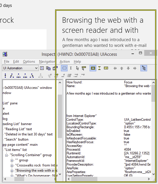
Figure 1: The Inspect SDK tool showing the relationship of a Reading List item to other elements in the UIA tree of elements, and the UIA properties and patterns exposed by the item.
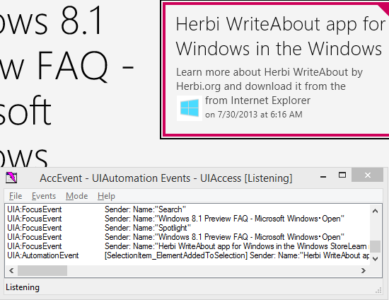
Figure 2: The AccEvent SDK tools showing UIA focus and selection events being raised by the Reading List app.
While the bulk of the UI shown in the Reading List app is the ListView, the Reading List team carefully examined the accessibility of other hosted UI. While the hosted SearchBox control is visually much smaller than the ListView, it’s critical to the efficient use of the app. So if that was somehow inaccessible, it would mean that in practice, some customers would be blocked from using the app. By pointing the Inspect SDK tool to the SearchBox, we could see that it exposed a lot of programmatic accessibility by default. For example, the edit field supported the UIA Text pattern, (allowing screen readers to analyse the contained text string at different granularities), and the search button supported the Invoke pattern, (allowing the button to be programmatically invoked by a screen reader).
While it was extremely helpful to the Reading List team for the WinJS framework to provide the app with so much programmatic accessibility by default, the team carefully considered whether there were specific steps we could take to enhance the accessible experience in some ways. The sections below describe the areas we considered.
But before we move on to that, I really want to emphasize one point…
While considering the programmatic accessibility of your app, you may hear someone say the following to you:
Programmatic access? That’s Narrator right?
And while programmatic access is a critical piece in allowing your customers who use Narrator or other screen readers to fully leverage the features of your app, this is what you can reply:
No. “Programmatic access” is not the same thing as “Narrator”.
Programmatic access allows your customers to use a wide range of assistive technology (AT) tools. For example:
1. Tools like Windows Speech Recognition to control apps through speech.
2. Tools like Magnifier which track keyboard focus and magnify the area on the screen occupied by the element with focus.
3. Tools like the On-Screen Keyboard which change their behavior depending on the attributes of the edit control where text is being entered. (In the case of the On-Screen Keyboard, it doesn’t show predictions when working in a password field, in order to make it less likely for someone nearby to learn something about the customer’s password.)
4. And yes, tools like Narrator and other screen readers.
In fact programmatic access allows any dev to build tools to help people access apps. For example, the UIA API helped me experiment recently into how someone who’s blind and has very limited ability can browse the web, https://blogs.msdn.com/b/winuiautomation/archive/2013/07/01/how-ui-automation-helped-me-build-a-tool-for-a-user-who-s-blind-and-who-has-mnd-als.aspx.
Having said all that, I will refer to the Narrator screen reader extensively below, as an example of interaction between an app and an assistive technology tool.
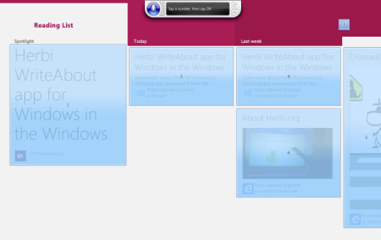
Figure 3: Windows Speech Recognition’s Show Numbers feature highlighting interactable elements in the fullscreen Reading List app.
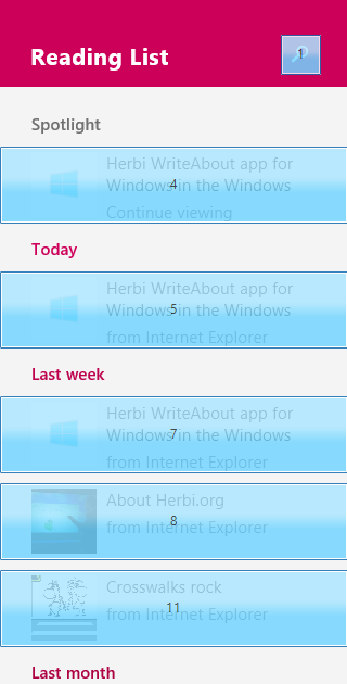
Figure 4: Windows Speech Recognition’s Show Numbers feature highlighting interactable elements in the narrow Reading List app.
Ok, so now on to the things that the Reading List team considered...
Accessible Name for elements
While the WinJS framework does a great job at repurposing visual text strings to become the accessible Name property for elements, sometimes there is no visual test to use. This means in certain places we had to explicitly set some friendly localized text as the accessible Name properties.
For example, the ListView could automatically provide accessible Name properties for the items that it is contains, (based on the text shown inside the items), but it can’t provide an appropriate Name for itself. So we set a Name for the list, with the following HTML in the WinJS.UI.ListView div tag.
data-win-res="{attributes: {'aria-label' : '<Some label id>'}}"
And then we added the localized string to the string table in the same way we do for visually displayed strings.
"<Some label id>" : "List items",
And since we’re talking about accessible Name properties - never ever ship a list whose items have no accessible names. It’s bad enough when a list doesn’t have a name, but if an app prevents its customer from discerning one list item from another, the list might as well not be there.
So having set the Name for the ListView with “aria-label”, we used the same approach for some container elements which exists in the DOM, even when they have no visuals themselves. For example, the “header” and “section” tags. This means that a customer who’s exploring all the elements in the UI will get an idea of what purpose the container is serving when they encounter it.
Using “aria-label” can make it really quick ‘n’ easy to add localized strings to elements that have no text shown on them. This includes images, and buttons that show some image rather than text, and also for edit controls. For example, the Reading List app uses the WinJS.UI.WinJS.UI.Searchbox, and that control presents an element which contains an edit field. The edit field has a very descriptive accessible Name property provided by the control itself, so that’s handy. But the container element doesn’t get an accessible Name property by default, as so the Reading List team added one. If the app presented some label for the field visually nearby, it could use the “aria-labelledby” value to set the accessible Name property to be the nearby label. But the app shows no such nearby label visually, so instead we used “aria-label” for that container element.
It’s important to remember that any element being referenced by “aria-labelledby” must have a role that makes the element accessible. So if the element is simply a div, then the “aria-labelledby” won’t work. This can be fixed by setting a role of the div, (such as “heading”), or to changing the element to be something other than a div, (such as “label”).
One more note on adding accessible Names, you can use “aria-labelledby” inside the group header template for a list. So if you build up the structure of your group header and want some part of it to have the same accessible Name property as another, you can use “aria-labelledby” to reference that other element. This is handy when the referenced element’s accessible Name property is based on data bound to the group header.
Roles
By explicitly setting a role on an element in HTML, we can change the UIA representation of the element. For example, a particular role might add support for a UIA pattern that seems most appropriate to the function of the element in the app. Also, the role can change the reported control type.
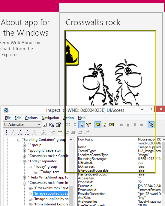
As mentioned in an earlier post, the image shown in an item does not use an “img” tag. Rather it is presented as the background image style of a div tag. So by default, an assistive technology tool can’t inform our customers that this element is an image. In order to fix that, we gave the div a role of image. As a result of this, UIA reported the element to have an image control type.
element.setAttribute("role", "img");
Figure 5: The Inspect SDK tool reporting that the element presenting an image on an item has an image control type.
We also assigned the roles of the “header” and “section” containers in the HTML to be “banner” and “main” respectively. For more information on those roles, see https://www.w3.org/TR/wai-aria/roles.
The role of the group headers
In the Windows 8.1 Preview, group header can get keyboard focus. This means if the Reading List customer has many items contained in many groups, rather than using the arrow keys to move item-by-item through the list, they can instead set focus to the group headers, use the arrow keys to move quickly group-by-group, and the press Shift+Tab to set focus to the items in the group of interest.
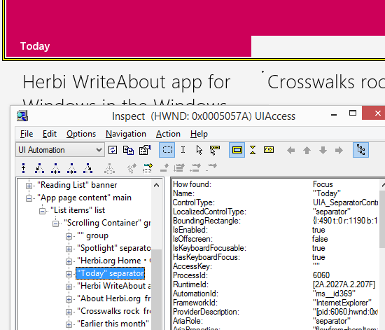
The ListView also supports invoking of a group header, if that’s desired by the app. While that’s really handy for many apps, in the case of Reading List, we didn’t leverage that. As such, we set the ListView’s groupHeaderTapBehavior to WinJS.UI.GroupHeaderTapBehavior.none. This automatically led to the UIA control type which is exposed by the group header to be “Separator”. This makes it clear to the customer that the group header is not something that can be invoked.
If we had wanted to react to the customer invoking the group header, then we would have set the ListView’s groupHeaderTapBehavior to one of the invoke-related values described at https://msdn.microsoft.com/en-us/library/windows/apps/hh701303.aspx. That would have resulted in the UIA control type for the group header being “Link”, and support for the UIA Invoke pattern would automatically be added. It’s really neat to only have to set the one property of groupHeaderTapBehavior in order to control how invoke-related support gets exposed through UIA.
Figure 6: The Inspect SDK tool showing how the Reading List group headers are exposed as “separator” controls through UIA.
Efficiently move through the items in the list
The customer will often move through the items in their list in order to find a particular item. They need to know quickly when they’ve encountered an item which is not the one they’re trying to reach. So it’s very important that if they’re using the Narrator screen reader, they shouldn’t have to hear text that’s unlikely to help then quickly identify the item. For example, if when moving to an item they first hear details of which app provided the item and the date that the item was generated, that would be unlikely to help identify the item. As such, it would be really frustrating to have to listen to all that information first, for every item in the list. Instead our customers should hear the title of the item very quickly, and so be able to move away from the item and onto the next as soon as they know it’s not the item they want. If they stay on the item, Narrator will continue speaking through the title, summary, source app and date.
So this is all about efficiency. The Reading List app should not only be technically accessible, but it should strive to provide an efficient way for all customers to interact with it.
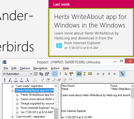
Now as it happens, the Narrator behavior I describe above is provided by default. The WinJS framework will set an accessible Name property on an item based on the contents of the item. So in the case of Reading List, the Name property will be the item title, summary, source app name and date.
An additional thing to consider here is what gets spoken by Narrator as the item enters different states. For Reading List items, this means whether an item is selected or not. If Narrator told the customer that the item is selected after it had spoken the item’s Name, (remembering that the Name is built up from the entire item content), that would soon get frustrating. The full content of the item can take a while to speak. In the Windows 8.1 Preview, if an item’s selected, Narrator informs the customer of that first, before speaking the item’s Name. That’s just what the Reading List customer needs.
So together, the WinJS framework and Narrator automatically enable the Reading List experience we were after. We didn’t have to look into providing custom accessible Names for the items. Instead the Narrator customer can quickly move through the items in the list, hearing first whether the item’s selected, and then the title of the item for fast identification.
Figure 7: Inspect showing the Name property built up from the title, summary, source app name and date contained within the item.
Names for images
While the customer can move keyboard focus to all items in the list, keyboard focus cannot be placed on UI elements within the item. For example, it cannot be placed on the title text or the image shown. This is intentional, as it would serve no purpose to do that. However, a customer who uses Narrator can move the Narrator cursor to elements shown which cannot get keyboard focus. This can be useful when the customer wants to explore all elements shown on the screen, as they become familiar with the app. (The “Narrator cursor” is represented with the blue box shown when Narrator’s running.)
This means the customer can move the Narrator cursor to the image shown in the item. It would have been straightforward to remove the image from the UIA tree of elements, and that would mean that assistive tools would not be told that the image exists. (See the next section for details on how to remove elements from the UIA tree.) But the Reading List team felt that the existence of the item might be significant to the customer, (some items are provided with images when shared to Reading List, and some aren’t), so the customer should be made aware that the image exists. As such, we need to provide some Name property for the image. We don’t actually know what the image shows as it’s just an image provided to us. So we added a generic “Image supplied by source app” string as the accessible Name property.
And of course, this is a localized string.
Removing elements from the UIA tree of elements
Having constructed an app’s UI in HTML and css, it’s always interesting to learn how the structure of that UI is represented by default through the UIA API. If something that looks like a single element visually on the screen is actually composed of three nested divs (say), then if all of those divs are exposed to the customer using Narrator, that can at the very least be a distraction to the customer. While exploring the UI, the customer may encounter all three elements, and wonder what the purpose of each of the elements is. In fact the customer might only really want to encounter the one container element, and it’s just time lost trying to understand the others. Or worse, if the customer’s using some assistive technology tool which hit-tests over the UI, the customer might often encounter the contained divs and find it difficult to reach the container div that they can interact with. This might effectively block the customer from app functionality.
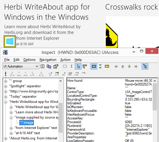
In the Windows 8.1 Preview, the Reading List app demonstrates the case where a contained element is exposed but serves no purpose to the customer. If I use the Inspect SDK tool to examine the image element in an item, I see it has a child element with type “image” and no Name property. When the customer encounters that, they’ll wonder what that is, and eventually move on. The container element is really the only thing that should be exposed. That element has type “image” and the “Image supplied by source app” Name property.
The unexpected image element can be removed from the UIA tree by giving the element an “aria-hidden” value of “true”. By using the “aria-hidden” value, your UIA tree can be pruned to provide a more precise representation of your UI to your customer. It’s important to remember that by using “aria-hidden”, all descendants of the element will also be removed from the UIA tree.
Figure 8:
The “Spotlight” item
The first item shown in Reading List’s Home view is an item in the ListView, but its contents are styled in a different manner from the other items. It has an “Open” button which shows hover feedback, and so the team made sure that keyboard focus feedback and hover feedback would appear somewhere on the item or the Open button.
Given the unique purpose of the Spotlight item, we decided that it should not be explicitly deleted. The item referenced by the Spotlight item can be selected and deleted, but the Spotlight item only exists to help the customer quickly invoke the target of the referenced item. As part of having the Spotlight not explicitly deletable, it is not selectable. This is achieved by the Reading List app handling the ListView “selectionchanging” and removing the Spotlight item from the selection if necessary.
However, if I point the Inspect SDK tool to the Spotlight item, it reports that it supports the UIA SelectionItem pattern. This is expected, as the WinJS framework makes sure that if the item can be selected, then an assistive technology tool can programmatically select or deselect the item and report its selection state. So simply preventing an actual selection in the “selectionchanging” event handler does not affect the fact that a customer using Narrator will he told that they can select the item, or that the item is “non-selected”. It would be preferable for the Spotlight item to not support the SelectionItem pattern, as that would mean the customer wouldn’t be told that the item can be selected. UIA patterns are not explicitly set on HTML elements in WinJS apps. Rather the elements can be assigned roles, which can sometimes affect what specific UIA patterns are supported by the element, (as described at https://msdn.microsoft.com/en-us/library/windows/apps/hh452705.aspx). It is not straightforward to simply drop support for a UIA pattern for one particular item in the list, and so Reading List does declare the Spotlight items as supporting the UIA SelectionItem pattern, despite the fact that the item cannot actually be selected.
Deleting an item
When the Reading List customer deletes an item from the list, progress UI is not presented. Rather, the item is simply removed from the list, and if it had keyboard focus, then focus moves onto an adjacent item. As such if the customer is using Narrator to interact with the app, no “in progress” UI will be announced. Narrator always announces changes in keyboard focus as focus moves from one element to another, and so the first thing that the Narrator will announce after the item has been deleted, is the other item that receives focus after the delete has occurred. A number of apps behave in this way when deleting items from lists.
If Reading List had instead shown progress UI when the item is deleted, it would have been important to announce that UI to the customer. What’s more, it would be important to let the customer know when that progress UI is removed. That gets more interesting given that it would mean the Narrator output would relate to UI that’s no longer visible on the screen.
Transient UI elements
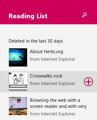
When an item in the vertically laid-out list is selected, a button appears on the item.
Figure 9: An “Add Back” button appearing on a selected item in the Recently Deleted view.
It’s important that the customer can efficiently reach the button that appears. It would be frustrating to have to make multiple key presses in order to reach the button once it’s made visible after an item is selected. Again, WinJS made this simple for us. As mentioned in the “Keyboard accessibility” post of this series, when the button was shown, due to its position in the HTML DOM structure it automatically became the next element in the tab order. So the customer can arrow around the list in order to reach the item of interest, press the Spacebar to select it, tab once to set focus to the button that appeared on the item, and then press the Spacebar to invoke the button.
That’s efficient, and that’s what the customer wants.
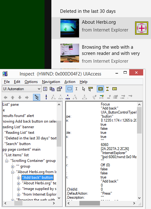
One additional note on these buttons - they don’t show text visually, and so there’s no way for a friendly localized accessible Name property to be set on the buttons by default. We must explicitly take action to make sure a friendly accessible Name is assigned to the button when we generate the UI. We could do this through the use of the “aria-label” value, but instead we simply set the title property of the buttons to the appropriate localized resource. That title string becomes both the tooltip and the accessible Name property for the button. Super-convenient for us.
button.title = WinJS.Resources.getString(<some friendly localized resource>).value;
Figure 10: The Inspect SDK tool reporting that the “Add Back” button shown on a selected item in the Recently Deleted view has an accessible Name property of “Add back”.
Summary
Much of the UI in the Reading List app exposed sufficient programmatic access by default. Some essential steps were taken by the Reading List team to provide accessibility where the framework could not do this by default. This included adding accessible Name properties for images, buttons showing images, and the main ListView itself.
The Inspect SDK tool was used extensively to examine the UIA representation of the app. This allowed the Reading List team to identify elements that were missing properties, (such as the Name property), or exposing inappropriate properties, (such as image-related elements which didn’t have an image control type.) It also allowed us to recognize where elements which were of no value to the customer were inappropriately exposed, such that we could then proceed to remove them from the UIA tree of elements.
Also, using the Narrator screen reader we considered the efficiency of the experiences we were building for our customers. Our goal was to deliver experiences that were not only fully accessible, but also efficient.
An accessibility case study - Reading List. Part 1: Introduction
An accessibility case study - Reading List. Part 2: Colours and Contrast
An accessibility case study - Reading List. Part 3: Keyboard accessibility
An accessibility case study - Reading List. Part 4: Programmatic accessibility
An accessibility case study - Reading List. Part 5: Live Regions
An accessibility case study - Reading List. Part 6: Using Narrator with touch input only
