Messing Around With Power BI Bookmarks - Part 2
Intro
Welcome to part two of this article series, where we explore Power BI bookmarks and how we can use them to provide better User Experience (UX) and built a more visually compelling report for our business users.
What we did in our previous endeavor with Power BI Bookmarks was to build a pop-up filter pane. This generally gives us the flexibility to utilize more space and produce more clear visualization. You can check out the full article here.
To freshen up our memory, we reached to this stage:

What we want to do next is to provide to the user the ability to switch between pages (let’s suppose for the sake of this article that we have two reports, one for heroes and one for villains)
We roll up our sleeves and we are ready to begin.
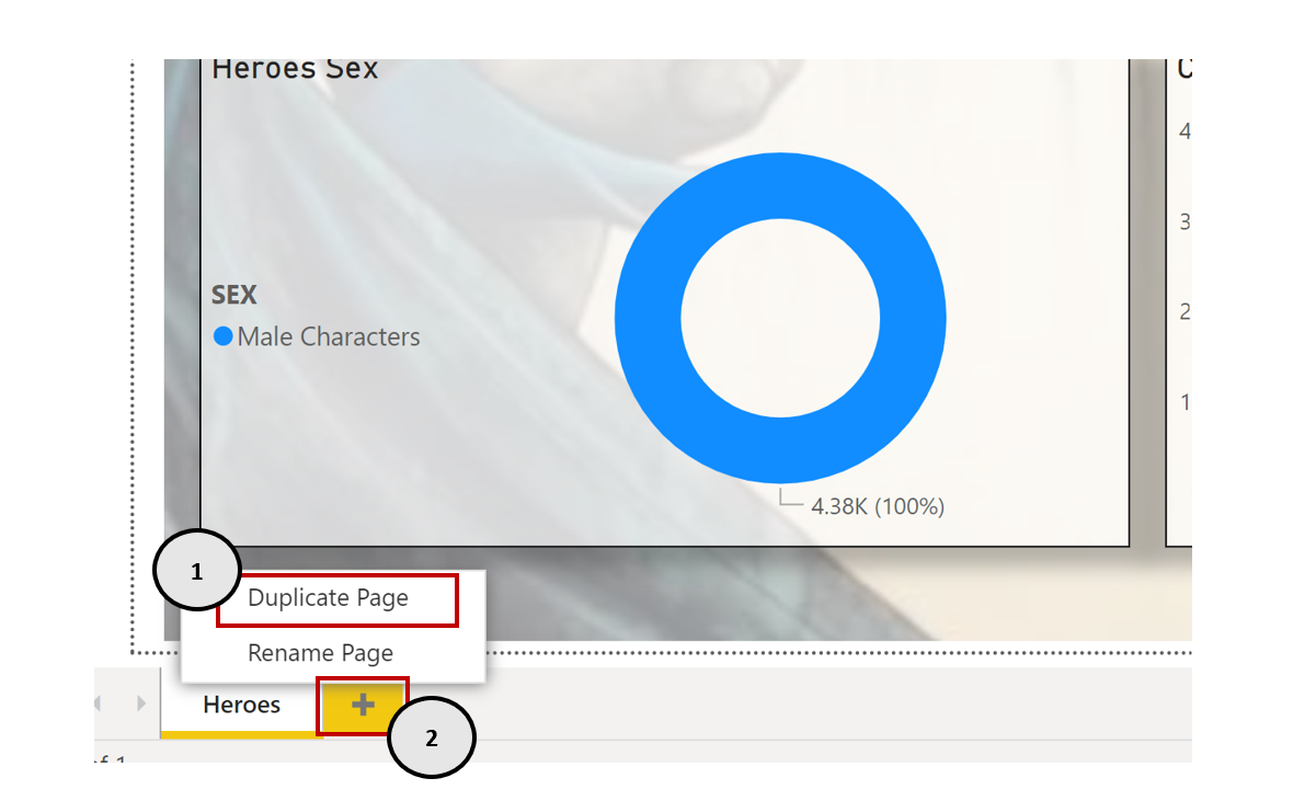
Adding a second report page
What is needed to build a transition between two report pages? First of all, we should create a new page where we have the equivalent report for villains. We can either duplicate the existing report page and edit it accordingly or make a new one from scratch.
After we have set up our report pages, we are ready to build the bookmarks that will allow us to move between those two pages seamlessly.
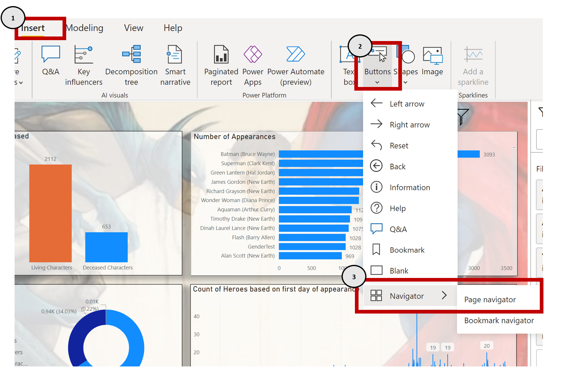
Adding Page Navigation
To make that happen we will first construct a Page Navigator to each report page. Page Navigator automatically recognizes the report pages we have and provides instantly the appropriate buttons which we can use in order to transition to each page.
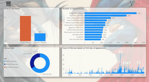
As you can see below the result (after some formatting on the Navigation Pane) is this:

Tips & best practices
| Tip |
|---|
You can format your buttons appropriately, so that the user can understand which page is selected. This can be done by going to the Format option of the Navigation Pane and playing around with the options. |
As you can see below, we have with default color the Heroes Button and when we hover to the Villains Button, we see that it changes color. With this we indicate that we are in the Heroes Page and the only Page available for selection is the Villains Page. The same stands for the Villains page.

Then to enhance the user experience we will use an icon to make the Navigation Pane appear when needed. This adds a nice touch to our report, making it have a more professional look…for someone who analyzes superhero data
Again, we follow the same procedure with the one we have followed for making the filter pane (see part 1 for that), but here we need to emphasize to a few things and propose some best practices.
In order to have a coherent and uniform look across the report, we have to preserve the same visuals with the same functionality. For this to work, we need to re construct the bookmarks and their functionality for each page of the report. Therefore, the bookmarks should be arranged properly into groups and have proper naming. This will help us handle the bookmarks easily, and know which functionality they have.
As you can see below, we have named each bookmark based on functionality and grouped per report page.

Also, another useful insight is that when we add a new bookmark functionality to our report, we should amend all the other bookmarks accordingly. Remember that the bookmark holds the current state of the report. Check the example below, where we have added the icon for appearing the navigation pane and an X button for closing the navigation button. But what happens if we press the filter button?

As you can see when we are hitting the filter button, we do not have the expected result because the navigation button seems to be affected as well. In order to fix this, we have to update the bookmark accordingly. We should go to selection Pane select the bookmark and update it, setting which elements we want to show or hide.
This should be done for all bookmarks in all report pages!

Let’s check out the final result.
Perfect! All work!
The third and final article for the bookmarks is where we show how to add a reset button and a help button.