Add a pie chart layer
This article describes how to add a pie chart layer to an Azure Maps Power BI visual.
A pie chart is a visual representation of data in the form of a circular chart or pie where each slice represents an element of the dataset that is shown as a percentage of the whole. A list of numerical variables along with categorical (location) variables are required to represent data in the form of a pie chart.

Note
The data used in this article comes from the Power BI Sales and Marketing Sample.
Prerequisites
Add the pie chart layer
The pie chart layer is added automatically based on what fields in the Visualizations pane have values, these fields include location, size and legend.
The following steps walk you through creating a pie chart layer.
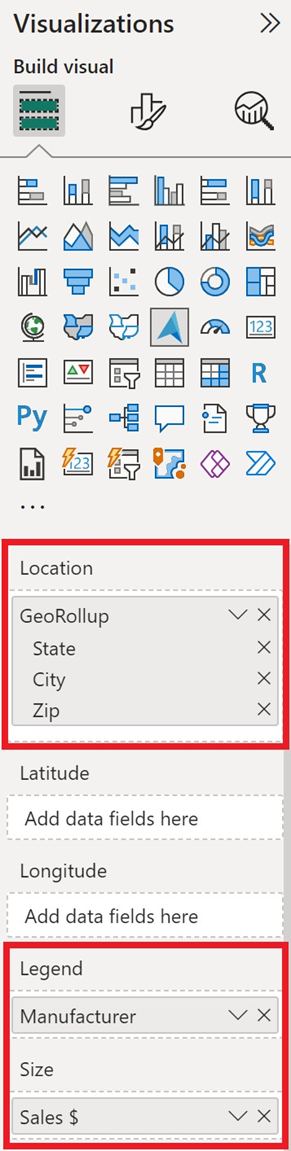
- Select two location sources from the Fields pane, such as city/state, to add to the Location field.
- Select a numerical field from your table, such as sales, and add it to the Size field in the Visualizations pane. This field must contain the numerical values used in the pie chart.
- Select a data field from your table that can be used as the category that the numerical field applies to, such as manufacturer, and add it to the Legend field in the Visualizations pane. This appears as the slices of the pie, the size of each slice is a percentage of the whole based on the value in the size field, such as the number of sales broken out by manufacturer.
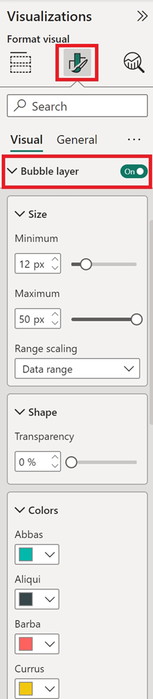
- Next, in the Format tab of the Visualizations pane, switch the Bubbles toggle to On.
The pie chart layer should now appear. Next you can adjust the Pie chart settings such as size and transparency.
Pie chart layer settings
Pie Chart layer is an extension of the bubbles layer, so all settings are made in the Bubbles section. If a field is passed into the Legend bucket of the Fields pane, the pie charts are populated and colored based on their categorization. The outline of the pie chart is white by default but can be changed to a new color. The following are the settings in the Format tab of the Visualizations pane that are available to a Pie Chart layer.
| Setting | Description |
|---|---|
| Size | The size of each bubble. |
| Fill transparency | Transparency of each pie chart. |
| Outline color | Color that outlines the pie chart. |
| Outline transparency | Transparency of the outline. |
| Outline width | Width of the outline in pixels. |
| Min zoom | Minimum zoom level tiles are available. |
| Max zoom | Maximum zoom level tiles are available. |
| Layer position | Specifies the position of the layer relative to other map layers. |
Next steps
Change how your data is displayed on the map:
Feedback
Coming soon: Throughout 2024 we will be phasing out GitHub Issues as the feedback mechanism for content and replacing it with a new feedback system. For more information see: https://aka.ms/ContentUserFeedback.
Submit and view feedback for