Events
Sep 16, 11 PM - Oct 18, 11 PM
Join us on a learning journey combining AI, apps and cloud-scale data to build unique solutions.
Learn moreThis browser is no longer supported.
Upgrade to Microsoft Edge to take advantage of the latest features, security updates, and technical support.
There are several ways that you can create interactive reports and experiences in workbooks:
Make sure you're in edit mode by selecting Edit.
Select Add query to add a log query control to the workbook.
Select the log query type, the resource type, and the target resources.
Use the query editor to enter the KQL for your analysis:
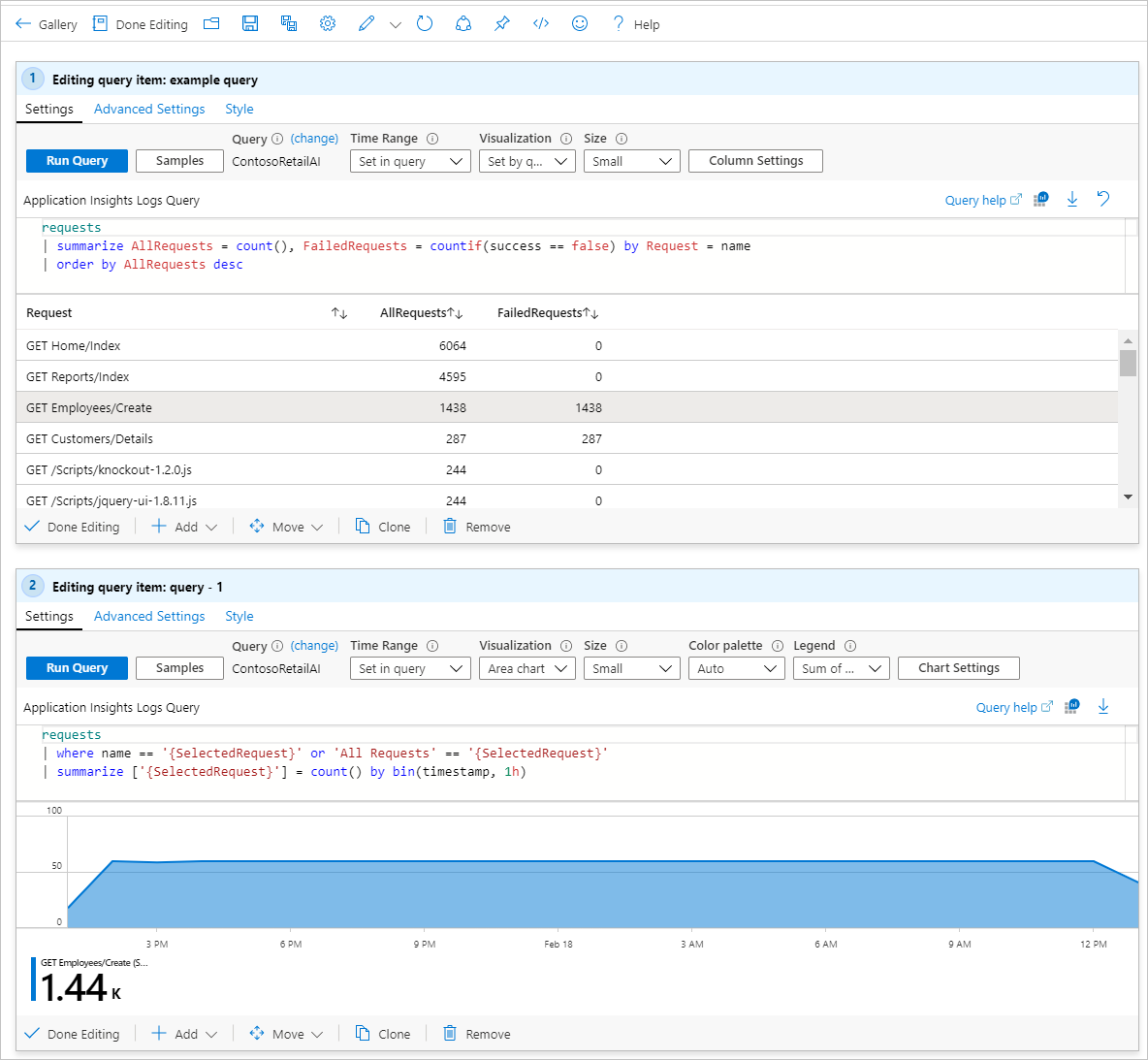
requests
| summarize AllRequests = count(), FailedRequests = countif(success == false) by Request = name
| order by AllRequests desc
Select Run query to see the results.
Select Advanced Settings to open the Advanced Settings pane.
Select the When an item is selected, export a parameter checkbox.
Select Add Parameter and fill in the following information:
RequestSelectedRequestAll requests
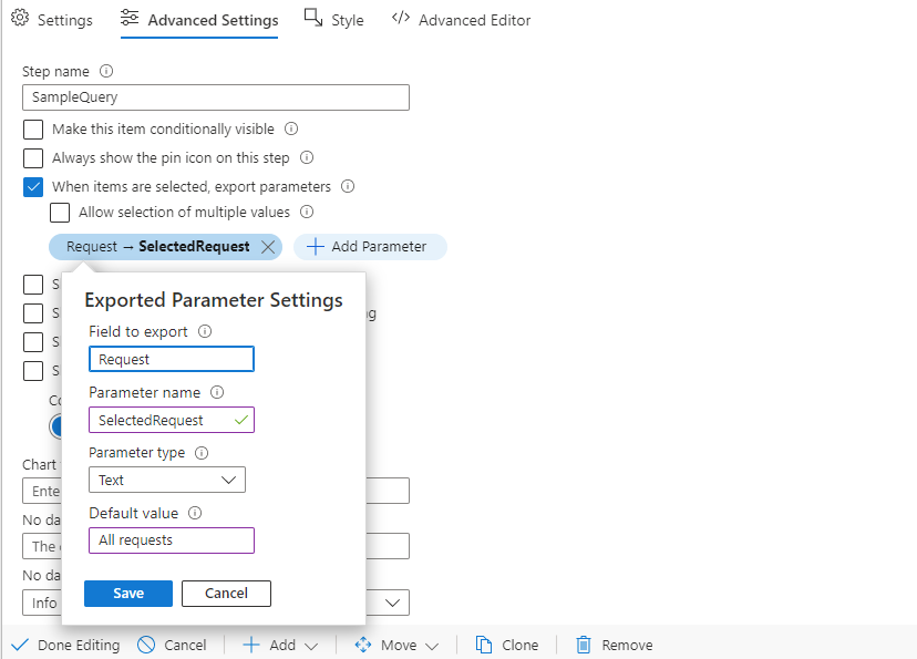
Optional. If you want to export the entire contents of the selected row instead of a specific column, leave Field to export unset. The entire row's contents are exported as JSON to the parameter. On the referencing KQL control, use the todynamic function to parse the JSON and access the individual columns.
Select Save.
Select Done Editing.
Add another query control as in the preceding steps.
Use the query editor to enter the KQL for your analysis.
requests
| where name == '{SelectedRequest}' or 'All Requests' == '{SelectedRequest}'
| summarize ['{SelectedRequest}'] = count() by bin(timestamp, 1h)
Select Run query to see the results.
Change Visualization to Area chart.
Choose a row to select in the first grid. Note how the area chart below filters to the selected request.
The resulting report looks like this example in edit mode:
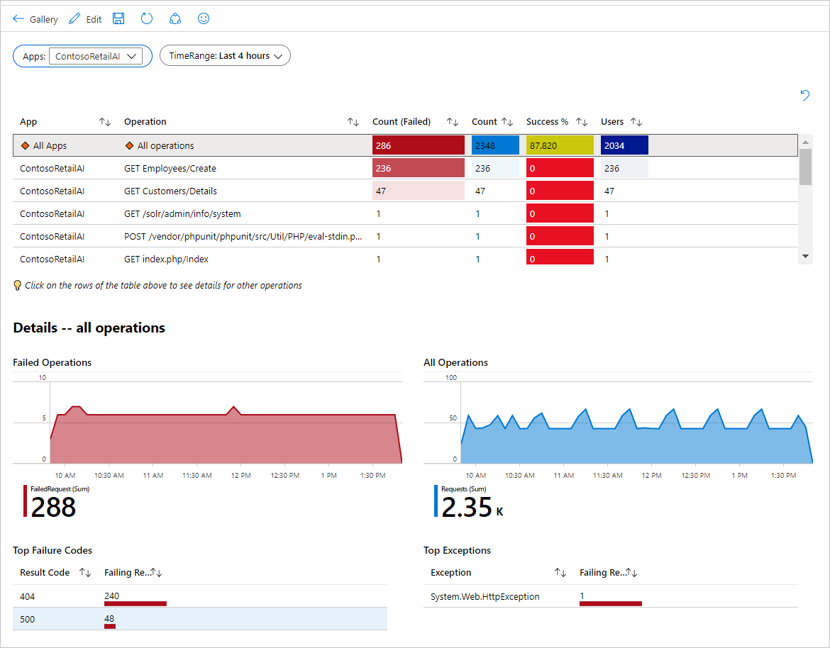
The following image shows a more elaborate interactive report in read mode based on the same principles. The report uses grid clicks to export parameters, which in turn are used in two charts and a text block.
Make sure you're in edit mode by selecting Edit.
Select Add query to add a log query control to the workbook.
Select the log query type, resource type, and target resources.
Use the query editor to enter the KQL for your analysis:
requests
| summarize Count = count(), Sample = any(pack_all()) by Request = name
| order by Count desc
Select Run query to see the results.
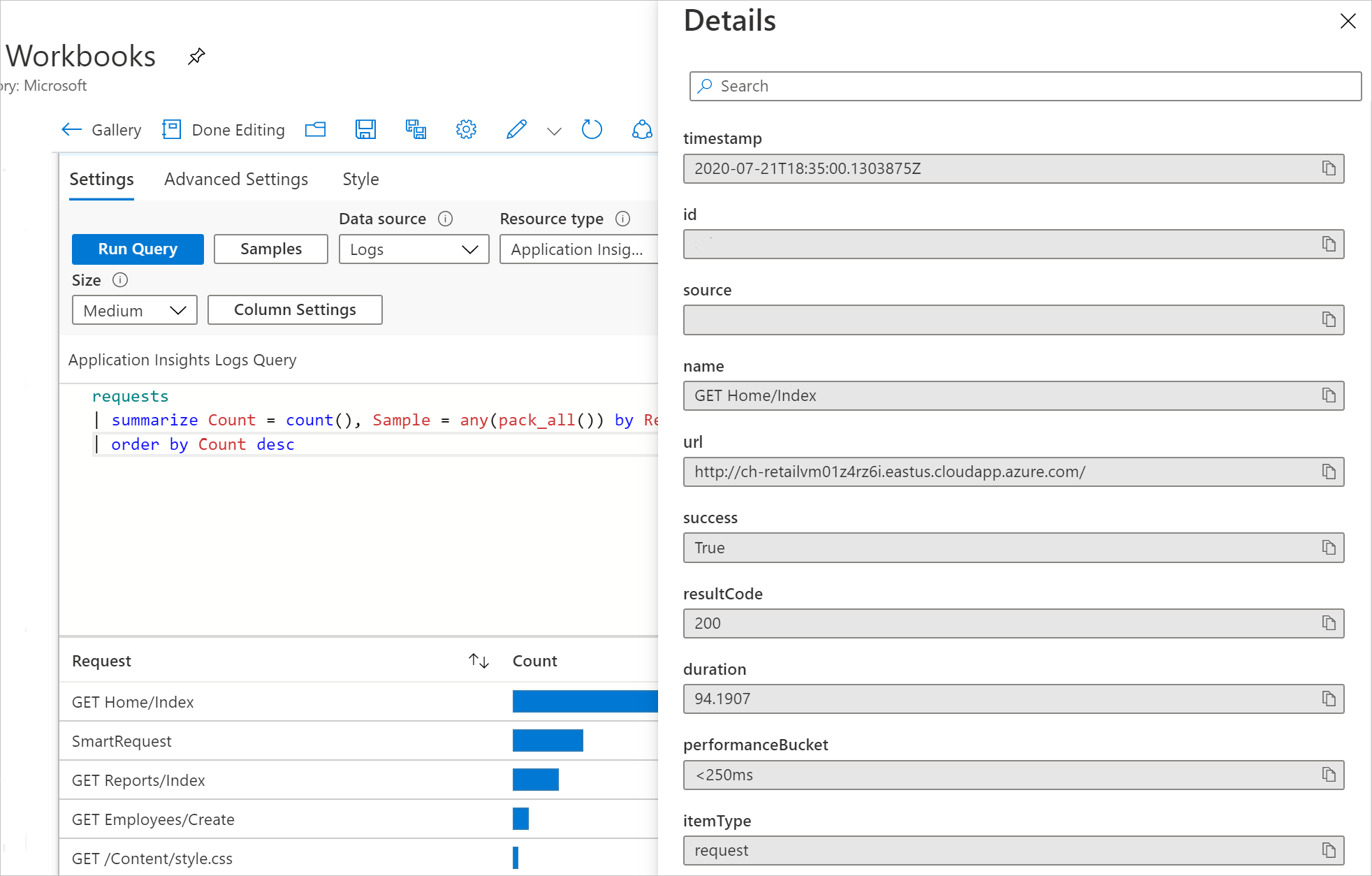
Select Column Settings to open the settings pane.
In the Columns section, set:
LinkCell DetailsSampleBarBlue0AutomaticSelect Save and Close to apply changes.

Select a Sample link in the grid to open a pane with the details of a sampled request.
Learn about how link actions work to enhance workbook interactivity.
Follow the steps in the Set up a grid row click section to set up two interactive controls.
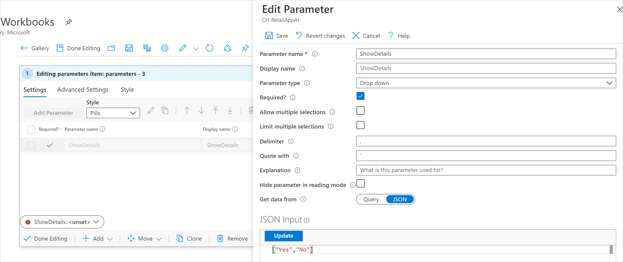
Add a new parameter with these values:
ShowDetailsDrop downcheckedJSON["Yes", "No"]Select Save to commit changes.
Set the parameter value to Yes.

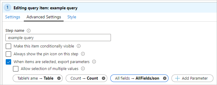
In the query control with the area chart, select Advanced Settings (the gear icon).
If ShowDetails is set to Yes, select Make this item conditionally visible.
Select Done Editing to commit the changes.
On the workbook toolbar, select Done Editing.
Switch the value of ShowDetails to No. Notice that the chart below disappears.
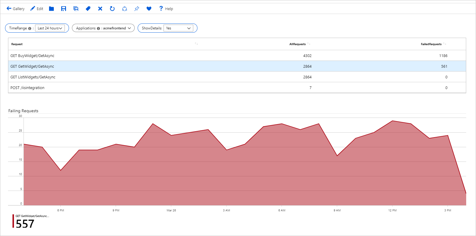
The following image shows the case where ShowDetails is Yes:
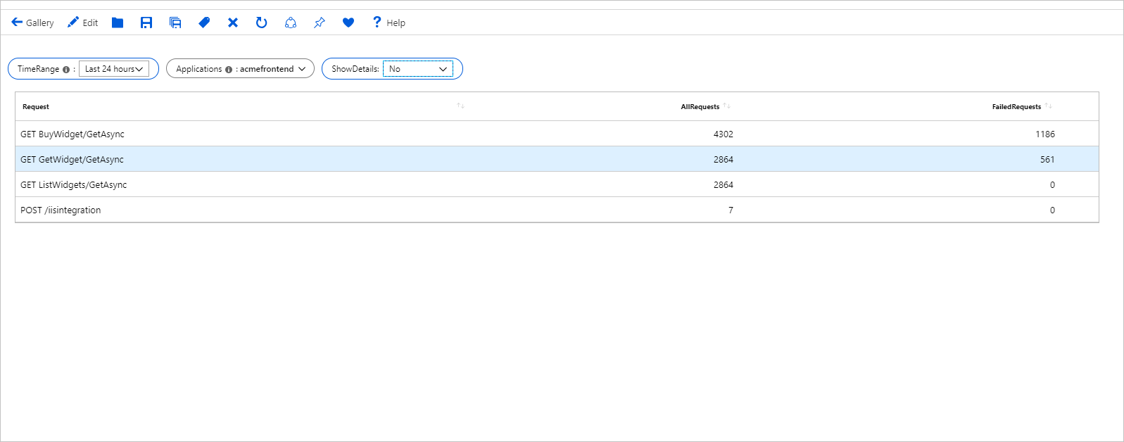
The following image shows the hidden case where ShowDetails is No:
Query and metrics components can export parameters when a row or multiple rows are selected.
When you enable single selection, you can specify which field of the original data to export. Fields include parameter name, parameter type, and default value to use if nothing is selected.
When you enable multi-selection, you specify which field of the original data to export. Fields include parameter name, parameter type, quote with, and delimiter. The quote with and delimiter values are used when turning arrow values into text when they're being replaced in a query. In multi-selection, if no values are selected, the default value is an empty array.
Note
For multi-selection, only unique values are exported. For example, you won't see output array values like "1,1,2,1". The array output will be "1,2".
If you leave the Field to export setting empty in the export settings, all the available fields in the data will be exported as a stringified JSON object of key:value pairs. For grids and titles, the string includes the fields in the grid. For charts, the available fields are x,y,series, and label, depending on the type of chart.
While the default behavior is to export a parameter as text, if you know the field is a subscription or resource ID, use that information as the export parameter type. Then the parameter can be used downstream in places that require those types of parameters.
You can capture user input by using dropdown lists and use the selections in your queries. For example, you can have a dropdown list to accept a set of virtual machines and then filter your KQL to include just the selected machines. In most cases, this step is as simple as including the parameter's value in the query:
    Perf
    | where Computer in ({Computers})
    | take 5
In more advanced scenarios, you might need to transform the parameter results before they can be used in queries. Take this OData filter payload:
{
    "name": "deviceComplianceTrend",
    "filter": "(OSFamily eq 'Android' or OSFamily eq 'OS X') and (ComplianceState eq 'Compliant')"
}
The following example shows how to enable this scenario. Let's say you want the values of the OSFamily and ComplianceState filters to come from dropdown lists in the workbook. The filter could include multiple values as in the preceding OsFamily case. It needs to also support the case where you want to include all dimension values, that is to say, with no filters.
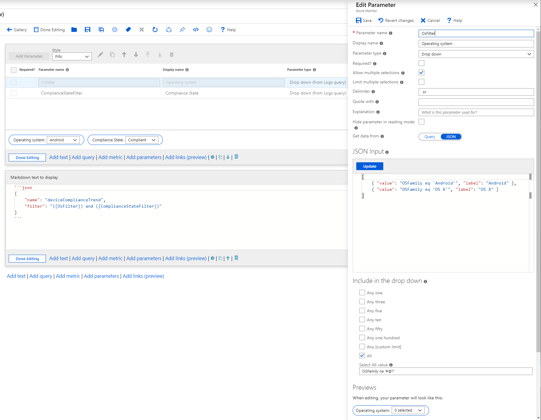
Select Add parameter to create a new parameter. Use the following settings:
Parameter name: OsFilter
Display name: Operating system
Parameter type: drop-down
Allow multiple selections: Checked
Delimiter: or (with spaces before and after)
Quote with: <empty>
Get data from: JSON
JSON Input:
[
    { "value": "OSFamily eq 'Android'", "label": "Android" },
    { "value": "OSFamily eq 'OS X'", "label": "OS X" }
]
In the Include in the drop down section:
OSFamily ne '#@?'Select Save to save this parameter.
Add another parameter with these settings:
Parameter name: ComplianceStateFilter
Display name: Compliance State
Parameter type: drop-down
Allow multiple selections: Checked
Delimiter: or (with spaces before and after)
Quote with: <empty>
Get data from: JSON
JSON Input:
[
    { "value": "ComplianceState eq 'Compliant'", "label": "Compliant" },
    { "value": "ComplianceState eq 'Non-compliant'", "label": "Non compliant" }
]
In the Include in the drop down section:
ComplianceState ne '#@?'Select Save to save this parameter.
Select Add text to add a text block. In the Markdown text to display block, add:
{
    "name": "deviceComplianceTrend",
    "filter": "({OsFilter}) and ({ComplianceStateFilter})"
}
This screenshot shows the parameter settings:
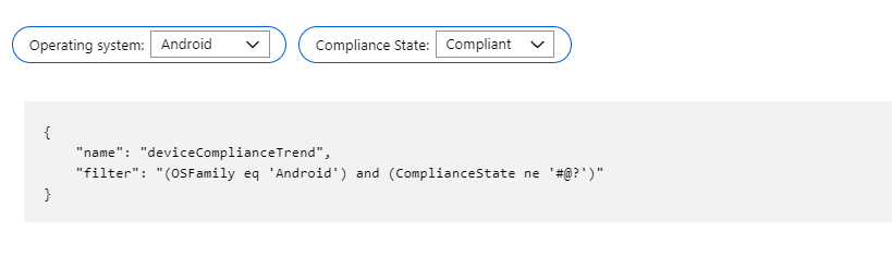
The simplest case is the selection of a single filter value in each of the dimensions. The dropdown control uses the JSON input field's value as the parameter's value.
{
    "name": "deviceComplianceTrend",
    "filter": "(OSFamily eq 'OS X') and (ComplianceState eq 'Compliant')"
}
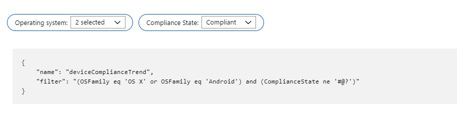
If you choose multiple filter values, for example, both Android and OS X operating systems, the Delimiter and Quote with parameter settings kick in and produce this compound filter:
{
    "name": "deviceComplianceTrend",
    "filter": "(OSFamily eq 'OS X' or OSFamily eq 'Android') and (ComplianceState eq 'Compliant')"
}
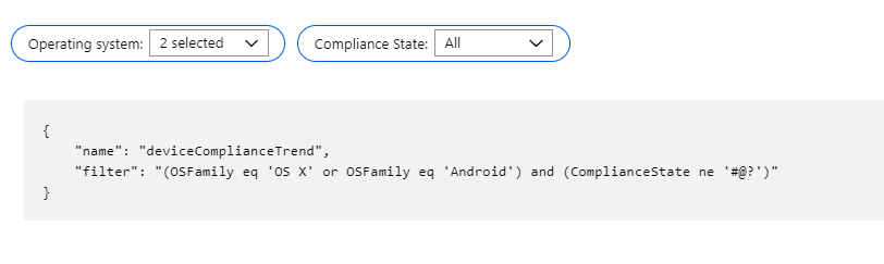
Another common case is having no filter for that dimension. This scenario is equivalent to including all values of the dimensions as part of the result set. The way to enable it is by having an All option on the dropdown and have it return a filter expression that always evaluates to true. An example is ComplianceState eq '#@?'.
{
    "name": "deviceComplianceTrend",
    "filter": "(OSFamily eq 'OS X' or OSFamily eq 'Android') and (ComplianceState ne '#@?')"
}
There are times where you want to visualize the underlying dataset in different ways without having to pay the cost of the query each time. This sample shows you how to do so by using the Merge option in the query control.
Select Add query to create a query control, and enter these values:
Data source: Logs
Resource type: Log Analytics
Log Analytics workspace: Pick one of your workspaces that has performance data
Log Analytics workspace logs query:
Perf
| where CounterName == '% Processor Time'
| summarize CpuAverage = avg(CounterValue), CpuP95 = percentile(CounterValue, 95) by Computer
| order by CpuAverage desc
Select Run Query to see the results.
This result dataset is the one we want to reuse in multiple visualizations.

Go to the Advanced settings tab, and for the name, enter Cpu data.
Select Add query to create another query control.
For Data source, select Merge.
Select Add Merge.
In the settings pane, set:
Duplicate tableCpu dataSelect Run Merge. You'll get the same result as the preceding.

Set the table options:
CpuAverage to CPU utilization (avg), and then use Run Merge to update the result set.[Cpu data].CpuP95 row.Change the order of the columns by selecting Move up or Move down.
Add new columns based on values of other columns by selecting Add new item.
Style the table by using the options in Column settings to get the visualization you want.
Add more query controls working against the Cpu data result set if needed.
This example shows Average and P95 CPU utilization side by side:

This sample shows you how to use the Azure Resource Manager query control to list all existing alerts in a subscription. This guide will also use JSON Path transformations to format the results. See the list of supported Resource Manager calls.
Select Add parameter, and set:
SubscriptionSubscription pickerCheckedDefault SubscriptionsSelect Save.
Select Add query to create a query control, and use these settings. For this example, we're using the Alerts Get All REST call to get a list of existing alerts for a subscription. For supported api-versions, see the Azure REST API reference.
Azure Resource Manager (Preview)GET/subscriptions/{Subscription:id}/providers/Microsoft.AlertsManagement/alertsapi-version2018-05-05Select a subscription from the created subscription parameter, and select Run Query to see the results.
This raw JSON is returned from Resource Manager:

You might be satisfied with the information here. But let's extract some interesting properties and format the response in a way that's easy to read.
Content to JSON Path. JSON Path is a workbook transformer.$.value.[*].properties.essentials. This extracts all "value.*.properties.essentials" fields from the returned JSON.

JSON Path also allows you to choose information from the generated table to show as columns.
For example, if you want to filter the results to the columns TargetResource, Severity, AlertState, AlertRule, Description, StartTime, and ResolvedTime, you could add the following rows in the columns table in JSON Path:
| Column ID | Column JSON Path |
|---|---|
| TargetResource | $.targetResource |
| Severity | $.severity |
| AlertState | $.alertState |
| AlertRule | $.alertRule |
| Description | $.description |
| StartTime | $.startDateTime |
| ResolvedTime | $.monitorConditionResolvedDateTime |

Events
Sep 16, 11 PM - Oct 18, 11 PM
Join us on a learning journey combining AI, apps and cloud-scale data to build unique solutions.
Learn moreTraining
Learning path
Embed Power BI analytics - Training
This learning path teaches you how to embed Power BI content in apps, develop programmatic solutions using the Power BI REST API and the Power BI Client APIs, enforce row-level security (RLS) for embedded content, automate common Power BI setup tasks, configure a development environment, and determine appropriate licensing.
Certification
Microsoft Certified: Security Operations Analyst Associate - Certifications
Investigate, search for, and mitigate threats using Microsoft Sentinel, Microsoft Defender for Cloud, and Microsoft 365 Defender.