Note
Access to this page requires authorization. You can try signing in or changing directories.
Access to this page requires authorization. You can try changing directories.
Azure Data Explorer dashboards are a collection of tiles that feature a visual representation supported by an underlying Kusto Query Language (KQL) query. This article explains how to edit the visualizations and queries of a dashboard tile and provides an overview of customization properties specific to each visualization type.
All visualizations that you create in the context of the render operator are available in dashboard visualizations. Along with these visualizations, you can use some dashboard-specific visuals.
Prerequisites
Review Visualize data with Azure Data Explorer dashboards.
- Ensure that you have the editor permission on an Azure Data Explorer dashboard.
- Visualize data with Azure Data Explorer dashboards
- Editor permissions on an Azure Data Explorer dashboard
Customize visuals
To make changes to your dashboard:
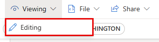
In the top menu, select Viewing and toggle to Editing mode.
On the tile that you want to customize, select the Edit icon. Edit the underlying query or the visualization properties.

Select Apply changes to save your changes and return to the dashboard.

Set customization properties
The following table describes the available customization properties, categorized alphabetically by section, and specifies which visuals support the given property.
| Section | Property | Description | Visual types |
|---|---|---|---|
| Colors | Color palette | Determines the set of colors to use for the heatmap. | Heatmap |
| Conditional formatting | Hide or Show | A toggle option to turn off or turn on conditional formatting. For more information, see Apply conditional formatting. | Anomaly chart, Area chart, Bar chart, Column chart, Multi Stat, Scatter chart, Table, Time chart |
| Data | Y columns | The columns that provide data for the vertical axis. | Anomaly chart, Area chart, Bar chart, Column chart, Line chart, Scatter chart, Time chart |
| X column | The column that provides data for the horizontal axis. | Anomaly chart, Area chart, Bar chart, Column chart, Line chart, Scatter chart, Time chart | |
| Series columns | The columns used to categorize data into different series. | Anomaly chart, Area chart, Bar chart, Column chart, Line chart, Scatter chart, Time chart | |
| Category column | The column that determines the data categories. | Funnel chart, Heatmap, Pie chart | |
| Label column | Assigns labels to each slot using the designated column. | Multi Stat | |
| Value column | The column that provides data for the visualization. | Funnel chart, Multi stat | |
| Value | The numeric column that serves as the primary variable for the heatmap. | Heatmap | |
| Numeric column | The column that provides the numeric value for the data category. | Pie chart | |
| Define location by | Determines the method used to define the location: Infer, Latitude and longitude, or Geo point. | Map | |
| Data series colors | Color palette | Customizes the colors presented in the visualization. | Anomaly chart, Area chart, Bar chart, Column chart, Line chart, Pie chart, Scatter chart, Time chart |
| Display options | Order by | How to order the results in the chart: Name, Size, or None. | Pie chart |
| Top N | Option to only show sections for the top n values in the chart. | Pie chart | |
| General | Display orientation | Determines the orientation of the display: Horizontal or Vertical. | Multi Stat |
| Text size | Determines the size of the text: Recommended, Small, or Large. | Multi Stat, Stat | |
| Visual format | Determines the format for the chart. For area, bar, and column charts, the format can be standard, stacked, or stacked 100%. For pie charts, the format can be pie or donut. | Area chart, Bar chart, Column chart, Pie chart | |
| Layout | Slot configuration | Customizes the grid layout with options ranging from 1 column by 1 row (1 slot) to 5 columns by 5 rows (25 slots). | Multi Stat |
| Legend | Hide or Show | Hides or shows a legend explaining data series in the chart. | Anomaly chart, Area chart, Bar chart, Column chart, Multi Stat, Scatter chart, Time chart |
| Size | Hide or Show | Toggles sizing for the map points on or off. | Map |
| Size column | The column used to determine the size of the map point. | Map | |
| URLs | Apply link on column | When enabled, selecting a value in this column directs to the URL specified in the URL column. | Table |
| URL column | The column that contains URL values. | Table | |
| X Axis | Label | Sets a custom label for the horizontal axis. | Anomaly chart, Area chart, Bar chart, Column chart, Multi Stat, Scatter chart, Time chart |
| Vertical line value | Specifies a value on the horizontal axis for vertical reference lines. | Anomaly chart, Area chart, Bar chart, Column chart, Multi Stat, Scatter chart, Time chart | |
| X axis scale | Adjusts the scale of the horizontal axis to linear or logarithmic. | Anomaly chart, Area chart, Bar chart, Multi Stat, Scatter chart, Table, Time chart | |
| Y Axis | Label | Sets a custom label for the vertical axis. | Anomaly chart, Area chart, Bar chart, Column chart, Multi Stat, Scatter chart, Time chart |
| Maximum value | Defines the maximum value on the vertical axis. | Anomaly chart, Area chart, Bar chart, Column chart, Multi Stat, Scatter chart, Time chart | |
| Minimum value | Defines the minimum value on the vertical axis. | Anomaly chart, Area chart, Bar chart, Column chart, Multi Stat, Scatter chart, Time chart | |
| Reference lines | Marks a value on the chart as a reference line for visual guidance. | Anomaly chart, Area chart, Bar chart, Column chart, Multi Stat, Scatter chart, Time chart |
Data series colors
Data series colors give you direct control over how colors are applied to your visuals. Instead of relying on automatic color assignments, assign specific colors to each data series to convey meaning and maintain consistency across your dashboards.
By using data series colors, you can:
Assign colors directly to each data series.
Override system defaults with intentional choices.
Maintain color consistency across visuals and dashboards.
This feature is supported for the following visual types: Anomaly chart, Area chart, Bar chart, Column chart, Line chart, Pie chart, Scatter chart, and Time chart.
To configure data series colors:
In the top menu, select Viewing and toggle to Editing mode.
On the tile you want to customize, select the Edit icon.
In the Visual tab of the formatting pane, expand the Data series colors section.
Select a color for each data series in your visual.
Select Apply changes to save your settings.

When you assign colors intentionally, viewers can interpret visuals at a glance without needing to read legends or labels. Consider using colors that align with your organization's standards or that naturally convey the meaning of each series, such as red for critical states or green for healthy metrics.
Embed images
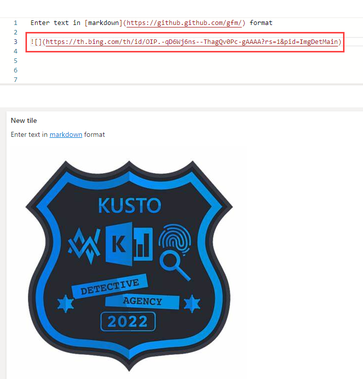
You can embed images in your dashboard tiles by using Markdown text.
For more information on GitHub Flavored Markdown, see GitHub Flavored Markdown Spec.
Open a dashboard.
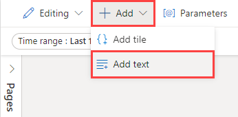
In the top menu, select + Add > Add text to open a text tile.
In the query pane, paste the URL of an image located in an image hosting service by using the following syntax:
The image renders in the tile's preview.
In the top menu, select Apply changes to save the tile.

For more information on image syntax in GitHub Flavored Markdown, see Images.