Note
Access to this page requires authorization. You can try signing in or changing directories.
Access to this page requires authorization. You can try changing directories.
Important
This feature is in Beta. To use it, a workspace admin must turn on Governed agentic app-building from the Previews page. See Manage Azure Databricks previews.
The form of a Designer App is how app users tell the workflow what they want. For example, a business analyst can use the form to upload sales data, pick a region, and choose the product categories to include before they click Run. Each input in the form sends a value to a parameter of the visual data prep. You can group inputs in sections, show inputs only when another input has a certain value, and offer choices whose options show their own inputs. To create an app, see Build and publish a Designer App.
Prerequisites
- You must have edit access to the visual data prep file.
- The visual data prep must define the parameters that the form sends. See Define parameters.
- To ask app users to upload a file, you need a Unity Catalog volume to store the uploads. See What are Unity Catalog volumes?.
Build and preview the form
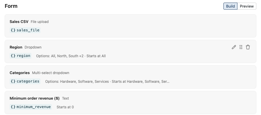
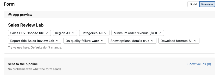
The form appears under Form in the app. Use the Build and Preview toggle next to the Form heading to switch between views:
- Build: Lists the items of the form. Each row shows the item's label and control, the parameter that it sends (or Form only), the options that app users see, and the value that the input starts at. To edit, move, or remove an item, hover over its row and click the edit, drag, or remove icon.
- Preview: Shows the form under App preview as app users see it in the published app. Enter values to try the form. The values that you enter don't change the defaults. Under Sent to the pipeline, Lakeflow Designer lists problems with what the form sends. To see the value that each parameter gets and where it comes from, click Show values. To change an input's settings from the preview, click its chip, and then click Edit settings.
Add an input
An input asks app users for a value and sends it to a parameter of the visual data prep.
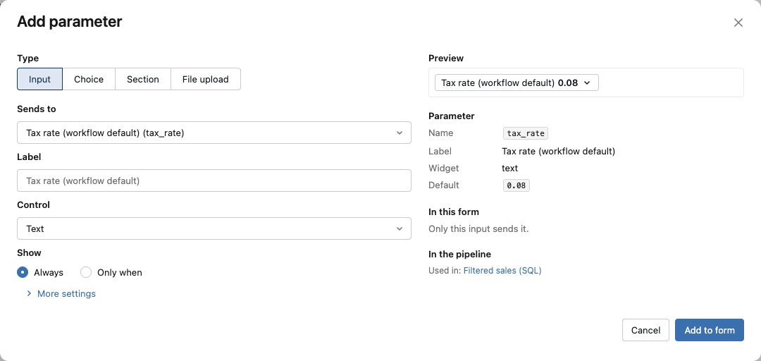
- Click Add, and then click Parameter.
- For Type, select Input.
- For Sends to, select the parameter that the input fills. To find a parameter, enter its name or label in Search parameters. Parameters that already have an input are marked (already in the form).
- To create a text parameter for the input, click Create a parameter. Lakeflow Designer names the parameter after the label.
- To use the input only to show other inputs or in a choice's Sets, select Nothing (form only). A form-only input isn't sent to the visual data prep.
- For Label, enter the text that app users see. An input that sends a parameter uses the parameter's label by default.
- For Control, select how app users enter the value. See Controls.
- Optionally, under Options, hide some of the parameter's choices or give them friendlier labels. You can't add values that the parameter doesn't accept.
- Optionally, click More settings to set the following:
- Help text: Text that appears with the input.
- Starts at: The value that the input starts at. By default, the input starts at the parameter default.
- Required while shown: App users can't run the app while the input is shown and empty. A value of only spaces counts as a value. This setting is available for the Text, Long text, Number, Date, and Combobox controls.
- Click Add to form.
Beside the settings, the dialog shows a preview of the input, the parameter's name, widget, default, and choices, other inputs that send the same parameter, and the operators that read it. To select an operator on the canvas, click its name.
Controls
The controls that you can select depend on the parameter's widget type and data type:
| Parameter | Controls |
|---|---|
| Text widget, String | Text, Long text, Date, Dropdown, Radio buttons, Segmented buttons |
| Text widget, Integer or Decimal | Number, Dropdown, Radio buttons, Segmented buttons |
| Text widget, Date | Date |
| Text widget, Timestamp | Text |
| Dropdown widget | Dropdown, Radio buttons, Segmented buttons, and Toggle when the parameter has exactly two choices |
| Combobox widget | Combobox |
| Multiselect widget | Multi-select dropdown, Checkboxes |
| Form only | Text, Long text, Number, Date, Dropdown, Radio buttons, Segmented buttons, Toggle, Multi-select dropdown, Checkboxes |
For a text parameter without a data type, you can select any text control. With a choice control on a text parameter or a form-only input, you enter the values to offer.
A toggle on a two-choice parameter sends the choice that reads as on, such as true or yes. To pick the choice it sends, use On sends. To let app users pick several values, make the parameter a multiselect parameter.
Show an input only when a condition is met
By default, an item always shows. To show it only when another input has a certain value:
- In the item's settings, for Show, select Only when.
- Select an Input, an Operator, and a Value. The operators are is, is not, is one of, is empty, and is not empty.
- For is one of, select several of the input's options. For an input without fixed options, enter the values separated by commas, such as
a, b, c. - For a toggle, select On or Off.
- For is one of, select several of the input's options. For an input without fixed options, enter the values separated by commas, such as
- To add more conditions, add them under Condition (all must match). The item shows only when all conditions match.
The input in a condition must come earlier in the form, in the same part of the form as the item: the top level, including sections, or the same choice option. An item at the top level can't depend on an input in a choice option, and an item in an option can't depend on an input outside it. A condition can't read a file upload.
A hidden input sends nothing, so runs use the parameter default. The dialog shows the value that runs send while the input is hidden.
Group inputs in a section
A section groups inputs under a heading in the builder. In the published app, a section's inputs appear in order with the rest of the form.
- Click Add, and then click Parameter.
- For Type, select Section, and enter a Heading.
- Click Add to form.
- To add an input to the section, click Add here in the section.
Sections can only be at the top level of the form. A section can have an Only when condition, which applies to every item in it.
Offer a choice between options
A choice lets app users pick one of several options, each with its own inputs. For example, a Report window choice can offer Date range with From and To dates, and Last N days with a Days back number. Only the selected option's inputs show and send values.
- Click Add, and then click Parameter.
- For Type, select Choice.
- Enter a Label, and select how the options appear in Show as: dropdown, radio buttons, or segmented buttons.
- Add at least two options, each with a label and a distinct value.
- Click Add to form.
- To add inputs to an option, click Add here under the option.
When app users switch options, an input keeps the value entered for the same parameter, if the value fits.
To create the parameter that an input sends, or to change its type, use the Parameters pane:
- In the left pane, select Parameters.
- Create a parameter, or select an existing one.
- Set the parameter's widget type, such as Dropdown or Multiselect, and its data type.
- For a widget that offers choices, enter the choices that app users can pick from.
The Create a parameter shortcut in the form creates only text parameters. To offer a dropdown or multiselect input, set the widget type in the Parameters pane first. See Define parameters.
A choice can sit at the top level or in a section, but not in another choice's option. To send the selected option's value to a parameter, select a dropdown parameter in the choice's Sends to. The choice then uses that parameter's choices as its options. Otherwise, the visual data prep doesn't see which option was picked.
Fill parameters from an option
An option can set parameters when app users select it. For example, Last N days can set the start date to the number of days in Days back before today, and the end date to today.
- In the choice's settings, under Sets in option, click Set a parameter when option is selected.
- Select the Parameter and the Value kind:
- Value: A fixed value.
- Copy of input: The value of another input. The input must be in the same option, or at the top level and always shown.
- Date, counted back from today: A number of days, weeks, or months before today. The amount can be A fixed number or a number input. App users must enter a value in a number input that a Set counts back by.
- Click Add to form. If you're editing an existing choice, click Save.
Ask app users to upload a file
A file upload asks app users for a file, which the app reads in place of the file of a Source operator. Published runs read the uploaded file. Runs in Lakeflow Designer keep reading the Source operator's file.
- Click Add, and then click Parameter.
- For Type, select File upload.
- For Source, select the Source operator that reads the uploaded file.
- If the Source operator's file path is a parameter, the upload fills that parameter.
- If the Source operator has a fixed path, keep or change the suggested name in New parameter. Lakeflow Designer creates the parameter, sets it to the current file path so that runs in Lakeflow Designer still read that file, and sets the Source operator's file path to the parameter.
- If no output of the app reads the Source operator, the list marks it (no App output reads it yet). To add the Source's data to the app, select Also show source**'s data in the App**. Otherwise, the files that app users upload don't change what the app shows.
- For Storage volume, click Choose volume and select a Unity Catalog volume. Every upload in the app uses this volume.
- Click Add to form.
A Source operator can't take an upload when it already has one, when its file path parameter is already in the form or used elsewhere, or when its file path is built from an expression. The Source list shows the reason for each.
Uploaded files can be up to 5 GB, can't be empty, and must match the format and options of the Source operator. An upload can sit at the top level, in a section, or in a choice option, and can have Only when conditions. No other input, choice, or Set can fill an upload's parameter, and no condition or Set can read an upload's value.
Choose what runs do while an upload is hidden
When a condition, section, or choice can hide an upload, the upload's settings show When hidden:
- Don't run: there is no file to read: App users can't run the app while the upload is hidden. This is the default.
- Read the file the Source reads in Designer: Runs read the Source operator's file, which the option shows. App users see results from this file. This option is available only when the Source operator reads a fixed file path.
Arrange the form
To move an item, drag its handle to a new position. You can drag an item into or out of a section or a choice option. To move an item with the keyboard, focus the handle, press Space, use the arrow keys, and then press Space again. You can also move an item with Location in its settings.
To undo a move, use undo in Lakeflow Designer.
To remove an item, hover over its row and click the remove icon. Lakeflow Designer removes it right away, without asking you to confirm. Removing a section or a choice also removes the items in it. Removing an input also removes the conditions and Sets that read it.
Fix problems in the form
When you add or save an item, Lakeflow Designer checks it and shows errors under the fields. For example, Lakeflow Designer checks for an empty label, a choice with fewer than two options, two options with the same value, and an incomplete condition or Set.
Lakeflow Designer also checks the whole form. Each problem appears under its row, and a banner shows how many items need fixing. You can't publish the app until you fix them. The checks include the following:
- An input that sends a parameter that no longer exists in the visual data prep.
- A parameter that can't be shown in an app.
- A control that doesn't work with the parameter's widget. Select another control.
- Options that aren't among the parameter's choices.
- Two inputs that can fill the same parameter at the same time. To fix this, move one input into a different option of the same choice, show the inputs under conditions that can't both hold, or remove one.
- A condition that reads an input that is no longer above the item, for example, after a move.
In Preview, Sent to the pipeline also describes what runs send in specific cases. For example, it notes when no input in an option fills a parameter, so runs send the parameter default, and when a hidden upload keeps runs from starting.
If the form was saved by a newer version of Lakeflow Designer, Lakeflow Designer shows This App's form was saved by a newer version of Lakeflow Designer, so it can't be edited here, and you can't edit the form.
How app users fill in the form
In the published app, the form appears as a row of chips. Each chip shows an input's label and value. App users click a chip to change its value. A choice's chip opens its options and the selected option's inputs.
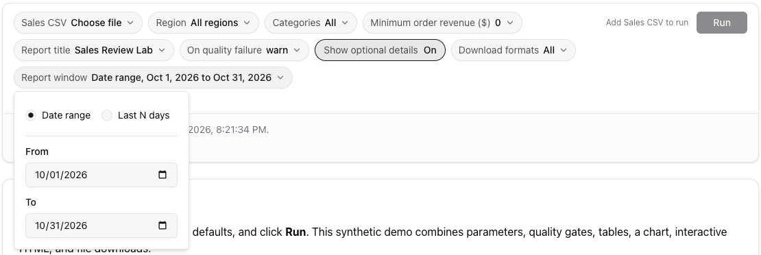
A dot marks each chip that differs from its default. Next to Run, the app shows how many values changed, with a Reset link to restore the defaults. Until app users select a file for an upload, its chip shows Choose file, Run is turned off, and the app shows Add upload label to run in place of the changed count.
In the published app, inputs that use the Multi-select dropdown control appear as a list of checkboxes, the same as the Checkboxes control.