Create trends and statistics reports
Trends and statistics reports are dashboards that provide insight into network trends in traffic detected by a specific OT network sensor.
Create custom dashboards to track specific data needed by your organization, such as traffic, device state, alerts, connectivity, or protocols.
Prerequisites
To create trends and statistics dashboards, you must be able to access the OT network sensor you want to generate data for, as an Administrator or Security Analyst user.
For more information, see On-premises users and roles for OT monitoring with Defender for IoT
Create custom dashboards
Sign into your OT sensor and select Trends & Statistics > Create Dashboard.
In the Create Dashboard pane, in the Dashboard name field, enter a meaningful name for your dashboard.
From the Dashboard widget type menu, either leave All selected, or select a specific type of widget to view.
Scroll down the list of available widgets and select any widget you want to add to your dashboard.
When you're done, select Save to add your dashboard to the drop-down menu under the toolbar.
Use any of the following tools to modify your dashboard:
Tool Description  Edit dashboards layout
Change the layout of the gadgets in your selected dashboard.  Add widget
Add another widget to your selected dashboard.  Edit dashboard
Edit the name of your selected dashboard.  Delete dashboard
Delete the selected dashboard.  Set as Default
Set the selected dashboard as your default dashboard.
Timestamps shown in each widget are set according to the sensor’s machine time.
By default, results display detections for the current day. Select the ![]() Filter icon at the top left of each widget to change this range. You can view data for up to a maximum of 14 days.
Filter icon at the top left of each widget to change this range. You can view data for up to a maximum of 14 days.
For example:
Commonly used dashboard widgets
The following table summarizes common use cases for dashboard widgets.
| Widget name | Sample use case |
|---|---|
| Busy devices | Lists the five busiest devices. In Edit mode, you can filter by known protocols. |
| Total bandwidth | Tracks the bandwidth in Mbps (megabits per second). The bandwidth is indicated on the y-axis, with the date appearing on the x-axis. Edit mode allows you to filter results. |
| Channels bandwidth | Displays the top five traffic channels. You can filter by Address, and set the number of Presented Results. Select the down arrow to show more channels. |
| Traffic by port | Displays the traffic by port using a pie chart where each port is a different color. For each port, the size of its slice of the pie reflects the amount of traffic in it. |
| New devices | Displays the new devices bar chart, showing how many new devices were discovered on a particular date. |
| Protocol dissection | Displays a pie chart showing the traffic per protocol, dissected by function codes and services. The size of each slice of the pie reflects the relative amount of traffic in it compared to the other slices. |
| Active TCP connections | Displays a chart showing the number of active TCP connections in the system. |
| Incident by type | Displays a pie chart showing the number of incidents by type. This is the number of alerts generated by each engine over a predefined time period. |
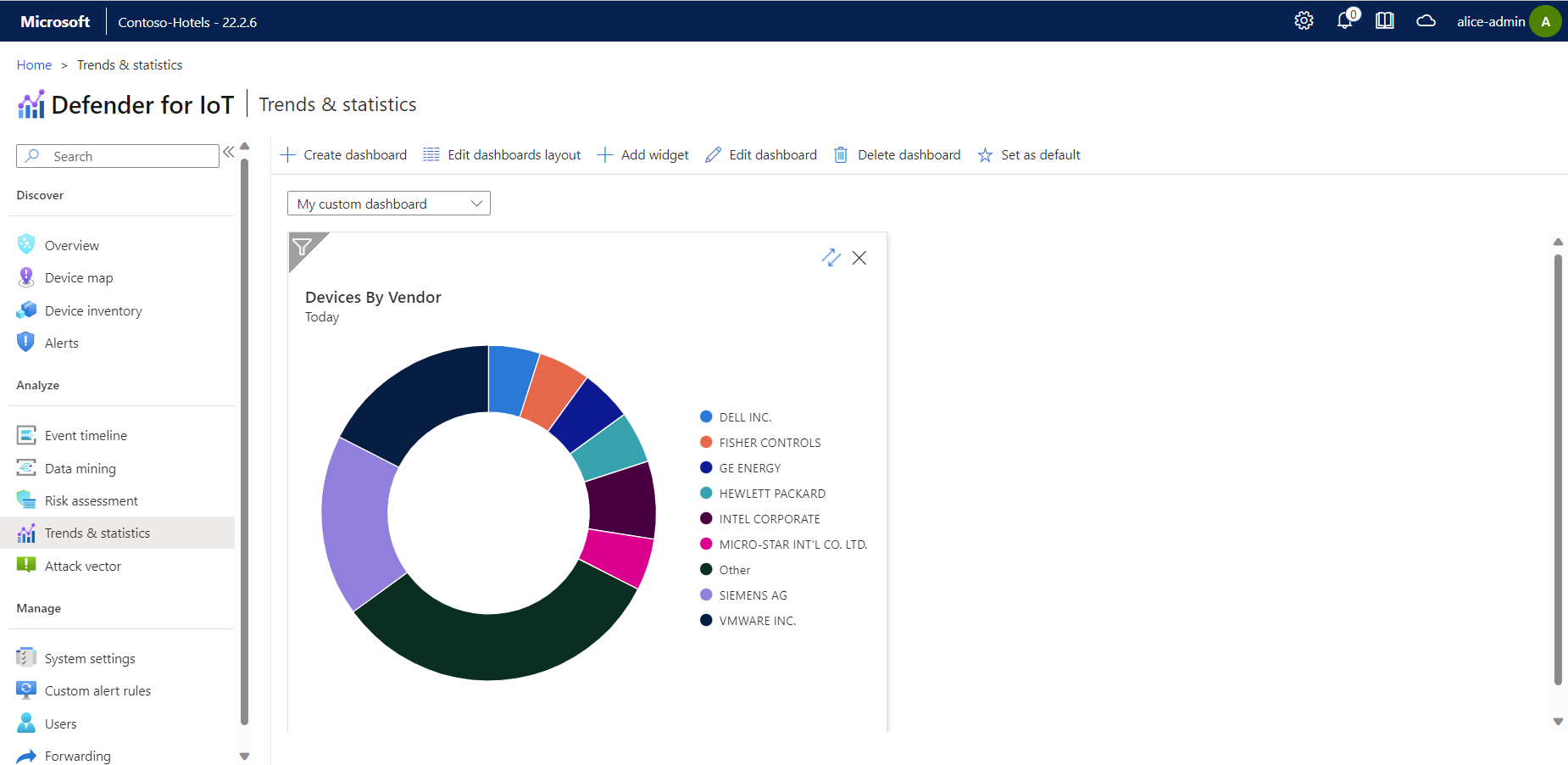
| Devices by vendor | Displays a pie chart showing the number of devices by vendor. For each vendor, the size of their slice of the pie reflects the number of their devices. |
| Number of devices per VLAN | Displays a pie chart showing the number of discovered devices per VLAN. The size of each slice of the pie reflects the relative number of discovered device compared to the other slices. Each VLAN appears with the VLAN tag assigned by the sensor or the name that you've manually added. |
| Top bandwidth by VLAN | Displays the bandwidth consumption by VLAN. By default, the widget shows five VLANs with the highest bandwidth usage. You can filter the data by the period presented in the widget. Select the down arrow to show more results. |
Next steps
View additional reports based on cloud-connected sensors in the Azure portal. For more information, see Visualize Microsoft Defender for IoT data with Azure Monitor workbooks
Continue creating other reports for more security data from your OT sensor. For more information, see:
Feedback
Coming soon: Throughout 2024 we will be phasing out GitHub Issues as the feedback mechanism for content and replacing it with a new feedback system. For more information see: https://aka.ms/ContentUserFeedback.
Submit and view feedback for
