Note
Access to this page requires authorization. You can try signing in or changing directories.
Access to this page requires authorization. You can try changing directories.
Azure DevOps Services | Azure DevOps Server | Azure DevOps Server 2022
Widgets are implemented as contributions in the extension framework. A single extension can include multiple widget contributions. This article shows how to create an extension that provides one or more widgets.
Tip
For the latest extension development guidance, including theming and migration from VSS.SDK, see the Azure DevOps Extension SDK developer portal.
Tip
If you're starting a new Azure DevOps extension, try these maintained sample collections first—they work with current product builds and cover modern scenarios (for example, adding tabs on pull request pages).
- Azure DevOps extension sample (GitHub)—a compact starter sample that demonstrates common extension patterns: https://github.com/microsoft/azure-devops-extension-sample
- Azure DevOps extension samples (legacy collection and contributions guide)—install to inspect UI targets, or view the source: https://marketplace.visualstudio.com/items/ms-samples.samples-contributions-guide and https://github.com/Microsoft/vso-extension-samples/tree/master/contributions-guide
- Microsoft Learn samples (browse Azure DevOps samples)—curated, up-to-date samples across Microsoft docs: /samples/browse/?terms=azure%20devops%20extension
If a sample doesn't work in your organization, install it into a personal or test organization and compare the extension manifest's target IDs and API versions with the current docs. For reference and APIs, see:
Prerequisites
| Requirement | Description |
|---|---|
| Programming knowledge | JavaScript, HTML, and CSS knowledge for widget development |
| Azure DevOps organization | Create an organization |
| Text editor | We use Visual Studio Code for tutorials |
| Node.js | Latest version of Node.js |
| Cross-platform CLI | tfx-cli to package extensions Install using: npm i -g tfx-cli |
| Project directory | Home directory with this structure after completing the tutorial:|--- README.md|--- sdk |--- node_modules |--- scripts |--- VSS.SDK.min.js|--- img |--- logo.png|--- scripts|--- hello-world.html // html page for your widget|--- vss-extension.json // extension manifest |
Tutorial overview
This tutorial teaches widget development through three progressive examples:
| Part | Focus | What you learn |
|---|---|---|
| Part 1: Hello World | Basic widget creation | Create a widget that displays text |
| Part 2: REST API integration | Azure DevOps API calls | Add REST API functionality to fetch and display data |
| Part 3: Widget configuration | User customization | Implement configuration options for your widget |
Tip
If you prefer to jump straight to working examples, the included samples (see the previous note) show a set of widgets you can package and publish.
Before you begin, review the basic widget styles and structural guidance we provide.
Part 1: Hello World
Create a basic widget that displays "Hello World" using JavaScript. This foundation demonstrates the core widget development concepts.
Install the client SDK
The VSS SDK enables your widget to communicate with Azure DevOps. Install it using npm:
npm install vss-web-extension-sdk
Copy the VSS.SDK.min.js file from vss-web-extension-sdk/lib to your home/sdk/scripts folder.
For more SDK documentation, see the Client SDK GitHub page.
Create the HTML structure
Create hello-world.html in your project directory. This file provides the widget's layout and references to required scripts.
<!DOCTYPE html>
<html>
    <head>
        <script src="sdk/scripts/VSS.SDK.min.js"></script>
    </head>
    <body>
        <div class="widget">
            <h2 class="title"></h2>
        </div>
    </body>
</html>
Widgets run in iframes, so most HTML head elements except <script> and <link> get ignored by the framework.
Add widget JavaScript
To implement the widget functionality, add this script to the <head> section of your HTML file:
<script type="text/javascript">
    VSS.init({
        explicitNotifyLoaded: true,
        usePlatformStyles: true
    });

    VSS.require(["AzureDevOps/Dashboards/WidgetHelpers"], function (WidgetHelpers) {
        WidgetHelpers.IncludeWidgetStyles();
        VSS.register("HelloWorldWidget", function () {
            return {
                load: function (widgetSettings) {
                    var $title = $('h2.title');
                    $title.text('Hello World');

                    return WidgetHelpers.WidgetStatusHelper.Success();
                }
            };
        });
        VSS.notifyLoadSucceeded();
    });
</script>
Key JavaScript components
| Function | Purpose |
|---|---|
VSS.init() |
Initializes communication between widget and Azure DevOps |
VSS.require() |
Loads required SDK libraries and widget helpers |
VSS.register() |
Registers your widget with a unique identifier |
WidgetHelpers.IncludeWidgetStyles() |
Applies default Azure DevOps styling |
VSS.notifyLoadSucceeded() |
Notifies the framework that loading completed successfully |
Important
The widget name in VSS.register() must match the id in your extension manifest (Step 5).
Add extension images
Create the required images for your extension:
- Extension logo: 98x98 pixel image named
logo.pngin theimgfolder - Widget catalog icon: 98x98 pixel image named
CatalogIcon.pngin theimgfolder - Widget preview: 330x160 pixel image named
preview.pngin theimgfolder
These images display in the Marketplace and widget catalog when users browse available extensions.
Create the extension manifest
Create vss-extension.json in your project's root directory. This file defines your extension's metadata and contributions:
{
    "manifestVersion": 1,
    "id": "azure-devops-extensions-myExtensions",
    "version": "1.0.0",
    "name": "My First Set of Widgets",
    "description": "Samples containing different widgets extending dashboards",
    "publisher": "fabrikam",
    "categories": ["Azure Boards"],
    "targets": [
        {
            "id": "Microsoft.VisualStudio.Services"
        }
    ],
    "icons": {
        "default": "img/logo.png"
    },
    "contributions": [
        {
            "id": "HelloWorldWidget",
            "type": "ms.vss-dashboards-web.widget",
            "targets": [
                "ms.vss-dashboards-web.widget-catalog"
            ],
            "properties": {
                "name": "Hello World Widget",
                "description": "My first widget",
                "catalogIconUrl": "img/CatalogIcon.png",
                "previewImageUrl": "img/preview.png",
                "uri": "hello-world.html",
                "supportedSizes": [
                    {
                        "rowSpan": 1,
                        "columnSpan": 2
                    }
                ],
                "supportedScopes": ["project_team"]
            }
        }
    ],
    "files": [
        {
            "path": "hello-world.html",
            "addressable": true
        },
        {
            "path": "sdk/scripts",
            "addressable": true
        },
        {
            "path": "img",
            "addressable": true
        }
    ]
}
Important
Replace "publisher": "fabrikam" with your actual publisher name. Learn how to create a publisher.
Essential manifest properties
| Section | Purpose |
|---|---|
| Basic info | Extension name, version, description, and publisher |
| Icons | Paths to your extension's visual assets |
| Contributions | Widget definitions including ID, type, and properties |
| Files | All files to include in the extension package |
For complete manifest documentation, see Extension manifest reference.
Package and publish the extension
Package your extension and publish it to the Visual Studio Marketplace.
Install the packaging tool
npm i -g tfx-cli
Create your extension package
From your project directory, run:
tfx extension create --manifest-globs vss-extension.json
This action creates a .vsix file that contains your packaged extension.
Set up a publisher
- Go to the Visual Studio Marketplace Publishing Portal.
- Sign in and create a publisher if you don't have one.
- Choose a unique publisher identifier (used in your manifest file).
- Update your
vss-extension.jsonto use your publisher name instead of "fabrikam."
Upload your extension
- In the Publishing Portal, select Upload new extension.
- Choose your
.vsixfile and upload it. - Share the extension with your Azure DevOps organization.
Alternatively, use the command line:
tfx extension publish --manifest-globs vss-extension.json --share-with yourOrganization
Tip
Use --rev-version to automatically increment the version number when updating an existing extension.
Install and test the widget
To test, add your widget to a dashboard:
- Go to your Azure DevOps project:
https://dev.azure.com/{Your_Organization}/{Your_Project}. - Go to Overview > Dashboards.
- Select Add a widget.
- Find your widget in the catalog and select Add.
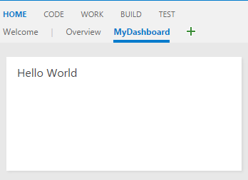
Your "Hello World" widget appears on the dashboard, displaying the text you configured.
Next step: Continue to Part 2 to learn how to integrate Azure DevOps REST APIs into your widget.
Part 2: Hello World with Azure DevOps REST API
Extend your widget to interact with Azure DevOps data using REST APIs. This example demonstrates how to fetch query information and display it dynamically in your widget.
In this part, use the Work Item Tracking REST API to retrieve information about an existing query and display the query details below the "Hello World" text.
Create the HTML file
Create a new widget file that builds on the previous example. Copy hello-world.html and rename it to hello-world2.html. Your project structure now includes:
|--- README.md
|--- node_modules
|--- sdk/
    |--- scripts/
        |--- VSS.SDK.min.js
|--- img/
    |--- logo.png
|--- scripts/
|--- hello-world.html               // Part 1 widget
|--- hello-world2.html              // Part 2 widget (new)
|--- vss-extension.json             // Extension manifest
Update the widget HTML structure
Make these changes to hello-world2.html:
- Add a container for query data: Include a new
<div>element to display query information. - Update the widget identifier: Change the widget name from
HelloWorldWidgettoHelloWorldWidget2for unique identification.
<!DOCTYPE html>
<html>
    <head>
        <script src="sdk/scripts/VSS.SDK.min.js"></script>
        <script type="text/javascript">
            VSS.init({
                explicitNotifyLoaded: true,
                usePlatformStyles: true
            });

            VSS.require(["AzureDevOps/Dashboards/WidgetHelpers"], function (WidgetHelpers) {
                WidgetHelpers.IncludeWidgetStyles();
                VSS.register("HelloWorldWidget2", function () {
                    return {
                        load: function (widgetSettings) {
                            var $title = $('h2.title');
                            $title.text('Hello World');

                            return WidgetHelpers.WidgetStatusHelper.Success();
                        }
                    }
                });
                VSS.notifyLoadSucceeded();
            });
        </script>
    </head>
    <body>
        <div class="widget">
            <h2 class="title"></h2>
            <div id="query-info-container"></div>
        </div>
    </body>
</html>
Configure API permissions
Before making REST API calls, configure the required permissions in your extension manifest.
Add the work scope
The vso.work scope grants read-only access to work items and queries. Add this scope to your vss-extension.json:
{
    "scopes": [
        "vso.work"
    ]
}
Manifest example
For a complete manifest with other properties, structure it like this:
{
    "name": "example-widget",
    "publisher": "example-publisher",
    "version": "1.0.0",
    "scopes": [
        "vso.work"
    ]
}
Important
Scope limitations: Adding or changing scopes after publishing isn't supported. If you already published your extension, you must remove it from the Marketplace first. Go to the Visual Studio Marketplace Publishing Portal, find your extension, and select Remove.
Implement REST API calls
Azure DevOps provides JavaScript REST client libraries through the SDK. These libraries wrap AJAX calls and map API responses to usable objects.
Update the widget JavaScript
Replace the VSS.require call in your hello-world2.html to include the Work Item Tracking REST client:
VSS.require(["AzureDevOps/Dashboards/WidgetHelpers", "AzureDevOps/WorkItemTracking/RestClient"],
    function (WidgetHelpers, WorkItemTrackingRestClient) {
        WidgetHelpers.IncludeWidgetStyles();
        VSS.register("HelloWorldWidget2", function () {
            var projectId = VSS.getWebContext().project.id;

            var getQueryInfo = function (widgetSettings) {
                // Get a WIT client to make REST calls to Azure DevOps Services
                return WorkItemTrackingRestClient.getClient().getQuery(projectId, "Shared Queries/Feedback")
                    .then(function (query) {
                        // Process query data (implemented in Step 4)

                        return WidgetHelpers.WidgetStatusHelper.Success();
                    }, function (error) {
                        return WidgetHelpers.WidgetStatusHelper.Failure(error.message);
                    });
            }

            return {
                load: function (widgetSettings) {
                    // Set your title
                    var $title = $('h2.title');
                    $title.text('Hello World');

                    return getQueryInfo(widgetSettings);
                }
            }
        });
        VSS.notifyLoadSucceeded();
    });
Key implementation details
| Component | Purpose |
|---|---|
WorkItemTrackingRestClient.getClient() |
Gets an instance of the Work Item Tracking REST client |
getQuery() |
Retrieves query information wrapped in a promise |
WidgetStatusHelper.Failure() |
Provides consistent error handling for widget failures |
projectId |
Current project context required for API calls |
Tip
Custom query paths: If you don't have a "Feedback" query in "Shared Queries", replace "Shared Queries/Feedback" with the path to any query that exists in your project.
Step 4: Display API response data
Render the query information in your widget by processing the REST API response.
Add query data rendering
Replace the // Process query data comment with this implementation:
// Create a list with query details
var $list = $('<ul>');
$list.append($('<li>').text("Query ID: " + query.id));
$list.append($('<li>').text("Query Name: " + query.name));
$list.append($('<li>').text("Created By: " + (query.createdBy ? query.createdBy.displayName : "<unknown>")));

// Append the list to the query-info-container
var $container = $('#query-info-container');
$container.empty();
$container.append($list);
The getQuery() method returns a Contracts.QueryHierarchyItem object with properties for query metadata. This example displays three key pieces of information below the "Hello World" text.
Full example
Your final hello-world2.html file should look like this:
<!DOCTYPE html>
<html>
<head>
    <script src="sdk/scripts/VSS.SDK.min.js"></script>
    <script type="text/javascript">
        VSS.init({
            explicitNotifyLoaded: true,
            usePlatformStyles: true
        });

        VSS.require(["AzureDevOps/Dashboards/WidgetHelpers", "AzureDevOps/WorkItemTracking/RestClient"],
            function (WidgetHelpers, WorkItemTrackingRestClient) {
                WidgetHelpers.IncludeWidgetStyles();
                VSS.register("HelloWorldWidget2", function () {
                    var projectId = VSS.getWebContext().project.id;

                    var getQueryInfo = function (widgetSettings) {
                        // Get a WIT client to make REST calls to Azure DevOps Services
                        return WorkItemTrackingRestClient.getClient().getQuery(projectId, "Shared Queries/Feedback")
                            .then(function (query) {
                                // Create a list with query details
                                var $list = $('<ul>');
                                $list.append($('<li>').text("Query ID: " + query.id));
                                $list.append($('<li>').text("Query Name: " + query.name));
                                $list.append($('<li>').text("Created By: " + (query.createdBy ? query.createdBy.displayName : "<unknown>")));

                                // Append the list to the query-info-container
                                var $container = $('#query-info-container');
                                $container.empty();
                                $container.append($list);

                                // Use the widget helper and return success as Widget Status
                                return WidgetHelpers.WidgetStatusHelper.Success();
                            }, function (error) {
                                // Use the widget helper and return failure as Widget Status
                                return WidgetHelpers.WidgetStatusHelper.Failure(error.message);
                            });
                    }

                    return {
                        load: function (widgetSettings) {
                            // Set your title
                            var $title = $('h2.title');
                            $title.text('Hello World');

                            return getQueryInfo(widgetSettings);
                        }
                    }
                });
            VSS.notifyLoadSucceeded();
        });
    </script>

</head>
<body>
    <div class="widget">
        <h2 class="title"></h2>
        <div id="query-info-container"></div>
    </div>
</body>
</html>
Update the manifest
To make it available in the widget catalog, add your new widget to the extension manifest.
Add the widget contribution
Update vss-extension.json to include your REST API-enabled widget. Add this contribution to the contributions array:
{
    "contributions": [
        // ...existing HelloWorldWidget contribution...,
        {
            "id": "HelloWorldWidget2",
            "type": "ms.vss-dashboards-web.widget",
            "targets": [
                "ms.vss-dashboards-web.widget-catalog"
            ],
            "properties": {
                "name": "Hello World Widget 2 (with API)",
                "description": "My second widget",
                "previewImageUrl": "img/preview2.png",
                "uri": "hello-world2.html",
                "supportedSizes": [
                    {
                        "rowSpan": 1,
                        "columnSpan": 2
                    }
                ],
                "supportedScopes": ["project_team"]
            }
        }
    ],
    "files": [
        {
            "path": "hello-world.html",
            "addressable": true
        },
        {
            "path": "hello-world2.html",
            "addressable": true
        },
        {
            "path": "sdk/scripts",
            "addressable": true
        },
        {
            "path": "img",
            "addressable": true
        }
    ],
    "scopes": [
        "vso.work"
    ]
}
Tip
Preview image: Create a preview2.png image (330x160 pixels) and place it in the img folder to show users what your widget looks like in the catalog.
Package and publish
Package, publish, and share your extension. If you already published the extension, you can repackage and update it directly in the Marketplace.
Test the REST API widget
To view the REST API integration in action, add the new widget to your dashboard:
- Go to your Azure DevOps project:
https://dev.azure.com/{Your_Organization}/{Your_Project}. - Select Overview > Dashboards.
- Select Add a widget.
- Find "Hello World Widget 2 (with API)" and select Add.
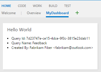
Your enhanced widget displays both the "Hello World" text and live query information from your Azure DevOps project.
Next steps: Continue to Part 3 to add configuration options that let users customize which query to display.
Part 3: Configurable widget
Build on Part 2 by adding user configuration capabilities to your widget. Instead of hard-coding the query path, create a configuration interface that lets users select which query to display, with live preview functionality.
This part demonstrates how to create configurable widgets that users can customize to their specific needs while providing real-time feedback during configuration.
Create configuration files
Widget configurations share many similarities with widgets themselves—both use the same SDK, HTML structure, and JavaScript patterns, but serve different purposes within the extension framework.
Project structure
To support widget configuration, create two new files:
- Copy
hello-world2.htmland rename it tohello-world3.html, your configurable widget. - Create a new file called
configuration.html, which handles the configuration interface.
Your project structure now includes:
|--- README.md
|--- sdk/
    |--- node_modules
    |--- scripts/
        |--- VSS.SDK.min.js
|--- img/
    |--- logo.png
|--- scripts/
|--- configuration.html              // New: Configuration interface
|--- hello-world.html               // Part 1: Basic widget
|--- hello-world2.html              // Part 2: REST API widget
|--- hello-world3.html              // Part 3: Configurable widget (new)
|--- vss-extension.json             // Extension manifest
Configuration interface
Add this HTML structure to configuration.html, which creates a dropdown selector for choosing queries:
<!DOCTYPE html>
<html xmlns="http://www.w3.org/1999/xhtml">
    <head>
        <script src="sdk/scripts/VSS.SDK.min.js"></script>
    </head>
    <body>
        <div class="container">
            <fieldset>
                <label class="label">Query: </label>
                <select id="query-path-dropdown" style="margin-top:10px">
                    <option value="" selected disabled hidden>Please select a query</option>
                    <option value="Shared Queries/Feedback">Shared Queries/Feedback</option>
                    <option value="Shared Queries/My Bugs">Shared Queries/My Bugs</option>
                    <option value="Shared Queries/My Tasks">Shared Queries/My Tasks</option>
                </select>
            </fieldset>
        </div>
    </body>
</html>
Implement configuration logic
Configuration JavaScript follows the same initialization pattern as widgets, but implements the IWidgetConfiguration contract instead of the basic IWidget contract.
Configuration code
Insert this script into the <head> section of configuration.html:
<script type="text/javascript">
    VSS.init({
        explicitNotifyLoaded: true,
        usePlatformStyles: true
    });

    VSS.require(["AzureDevOps/Dashboards/WidgetHelpers"], function (WidgetHelpers) {
        VSS.register("HelloWorldWidget.Configuration", function () {
            var $queryDropdown = $("#query-path-dropdown");

            return {
                load: function (widgetSettings, widgetConfigurationContext) {
                    var settings = JSON.parse(widgetSettings.customSettings.data);
                    if (settings && settings.queryPath) {
                         $queryDropdown.val(settings.queryPath);
                     }

                    return WidgetHelpers.WidgetStatusHelper.Success();
                },
                onSave: function() {
                    var customSettings = {
                        data: JSON.stringify({
                                queryPath: $queryDropdown.val()
                            })
                    };
                    return WidgetHelpers.WidgetConfigurationSave.Valid(customSettings);
                }
            }
        });
        VSS.notifyLoadSucceeded();
    });
</script>
Configuration contract
The IWidgetConfiguration contract requires these key functions:
| Function | Purpose | When called |
|---|---|---|
load() |
Initialize configuration UI with existing settings | When configuration dialog opens |
onSave() |
Serialize user input and validate settings | When user selects Save |
Tip
Data serialization: This example uses JSON to serialize settings. The widget accesses these settings via widgetSettings.customSettings.data and must deserialize them accordingly.
Enable live preview
Live preview allows users to see widget changes immediately as they modify configuration settings, providing instant feedback before saving.
Change notifications
To enable live preview, add this event handler within the load function:
$queryDropdown.on("change", function () {
    var customSettings = {
       data: JSON.stringify({
               queryPath: $queryDropdown.val()
           })
    };
    var eventName = WidgetHelpers.WidgetEvent.ConfigurationChange;
    var eventArgs = WidgetHelpers.WidgetEvent.Args(customSettings);
    widgetConfigurationContext.notify(eventName, eventArgs);
});
Full configuration file
Your final configuration.html should look like this:
<!DOCTYPE html>
<html xmlns="http://www.w3.org/1999/xhtml">
    <head>
        <script src="sdk/scripts/VSS.SDK.min.js"></script>
        <script type="text/javascript">
            VSS.init({
                explicitNotifyLoaded: true,
                usePlatformStyles: true
            });

            VSS.require(["AzureDevOps/Dashboards/WidgetHelpers"], function (WidgetHelpers) {
                VSS.register("HelloWorldWidget.Configuration", function () {
                    var $queryDropdown = $("#query-path-dropdown");

                    return {
                        load: function (widgetSettings, widgetConfigurationContext) {
                            var settings = JSON.parse(widgetSettings.customSettings.data);
                            if (settings && settings.queryPath) {
                                 $queryDropdown.val(settings.queryPath);
                             }

                             $queryDropdown.on("change", function () {
                                 var customSettings = {data: JSON.stringify({queryPath: $queryDropdown.val()})};
                                 var eventName = WidgetHelpers.WidgetEvent.ConfigurationChange;
                                 var eventArgs = WidgetHelpers.WidgetEvent.Args(customSettings);
                                 widgetConfigurationContext.notify(eventName, eventArgs);
                             });

                            return WidgetHelpers.WidgetStatusHelper.Success();
                        },
                        onSave: function() {
                            var customSettings = {data: JSON.stringify({queryPath: $queryDropdown.val()})};
                            return WidgetHelpers.WidgetConfigurationSave.Valid(customSettings);
                        }
                    }
                });
                VSS.notifyLoadSucceeded();
            });
        </script>
    </head>
    <body>
        <div class="container">
            <fieldset>
                <label class="label">Query: </label>
                <select id="query-path-dropdown" style="margin-top:10px">
                    <option value="" selected disabled hidden>Please select a query</option>
                    <option value="Shared Queries/Feedback">Shared Queries/Feedback</option>
                    <option value="Shared Queries/My Bugs">Shared Queries/My Bugs</option>
                    <option value="Shared Queries/My Tasks">Shared Queries/My Tasks</option>
                </select>
            </fieldset>
        </div>
    </body>
</html>
Important
Enable Save button: The framework requires at least one configuration change notification to enable the Save button. The change event handler ensures this action occurs when users select an option.
Make the widget configurable
Transform your widget from Part 2 to use configuration data instead of hard-coded values. This step requires implementing the IConfigurableWidget contract.
Update widget registration
In hello-world3.html, make these changes:
- Update widget ID: Change from
HelloWorldWidget2toHelloWorldWidget3. - Add reload function: Implement the
IConfigurableWidgetcontract.
return {
    load: function (widgetSettings) {
        // Set your title
        var $title = $('h2.title');
        $title.text('Hello World');

        return getQueryInfo(widgetSettings);
    },
    reload: function (widgetSettings) {
        return getQueryInfo(widgetSettings);
    }
}
Handle configuration data
Update the getQueryInfo function to use configuration settings instead of hard-coded query paths:
var settings = JSON.parse(widgetSettings.customSettings.data);
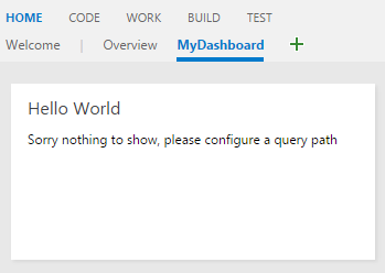
if (!settings || !settings.queryPath) {
var $container = $('#query-info-container');
$container.empty();
$container.text("Please configure a query path to display data.");
return WidgetHelpers.WidgetStatusHelper.Success();
}
Widget lifecycle
| Function | Purpose | Usage guidelines |
|---|---|---|
load() |
Initial widget rendering and one-time setup | Heavy operations, resource initialization |
reload() |
Update widget with new configuration | Lightweight updates, data refresh |
Tip
Performance optimization: Use load() for expensive operations that only need to run once, and reload() for quick updates when configuration changes.
Add a lightbox (optional)
Dashboard widgets have limited space, making it challenging to display comprehensive information. A lightbox provides an elegant solution by showing detailed data in a modal overlay without navigating away from the dashboard.
Lightbox use cases
| Benefit | Description |
|---|---|
| Space efficiency | Keep widget compact while offering detailed views |
| User experience | Maintain dashboard context while showing more information |
| Progressive disclosure | Show summary data in widget, details on demand |
| Responsive design | Adapt to different screen sizes and widget configurations |
Clickable elements
Update your query data rendering to include clickable elements that trigger the lightbox:
// Create a list with clickable query details
var $list = $('<ul class="query-summary">');
$list.append($('<li>').text("Query ID: " + query.id));
$list.append($('<li>').text("Query Name: " + query.name));
$list.append($('<li>').text("Created By: " + (query.createdBy ? query.createdBy.displayName : "<unknown>"));

// Add a clickable element to open detailed view
var $detailsLink = $('<button class="details-link">View Details</button>');
$detailsLink.on('click', function() {
    showQueryDetails(query);
});

// Append to the container
var $container = $('#query-info-container');
$container.empty();
$container.append($list);
$container.append($detailsLink);
Lightbox implementation
Add this lightbox implementation to your widget JavaScript:
function showQueryDetails(query) {
// Create lightbox overlay
var $overlay = $('<div class="lightbox-overlay">');
var $lightbox = $('<div class="lightbox-content">');
// Add close button
var $closeBtn = $('<button class="lightbox-close">×</button>');
$closeBtn.on('click', function() {
$overlay.remove();
});
// Create detailed content
var $content = $('<div class="query-details">');
$content.append($('<h3>').text(query.name || 'Query Details'));
$content.append($('<p>').html('<strong>ID:</strong> ' + query.id));
$content.append($('<p>').html('<strong>Path:</strong> ' + query.path));
$content.append($('<p>').html('<strong>Created:</strong> ' + (query.createdDate ? new Date(query.createdDate).toLocaleDateString() : 'Unknown')));
$content.append($('<p>').html('<strong>Modified:</strong> ' + (query.lastModifiedDate ? new Date(query.lastModifiedDate).toLocaleDateString() : 'Unknown')));
$content.append($('<p>').html('<strong>Created By:</strong> ' + (query.createdBy ? query.createdBy.displayName : 'Unknown')));
$content.append($('<p>').html('<strong>Modified By:</strong> ' + (query.lastModifiedBy ? query.lastModifiedBy.displayName : 'Unknown')));
if (query.queryType) {
$content.append($('<p>').html('<strong>Type:</strong> ' + query.queryType));
}
// Assemble lightbox
$lightbox.append($closeBtn);
$lightbox.append($content);
$overlay.append($lightbox);
// Add to document and show
$('body').append($overlay);
// Close on overlay click
$overlay.on('click', function(e) {
if (e.target === $overlay[0]) {
$overlay.remove();
}
});
// Close on Escape key
$(document).on('keydown.lightbox', function(e) {
if (e.keyCode === 27) { // Escape key
$overlay.remove();
$(document).off('keydown.lightbox');
}
});
}
Lightbox styling
Include CSS styles for the lightbox in your widget HTML <head> section:
<style>
.query-summary {
    list-style: none;
    padding: 0;
    margin: 10px 0;
}

.query-summary li {
    padding: 2px 0;
    font-size: 12px;
}

.details-link {
    background: #0078d4;
    color: white;
    border: none;
    padding: 4px 8px;
    font-size: 11px;
    cursor: pointer;
    border-radius: 2px;
    margin-top: 8px;
}

.details-link:hover {
    background: #106ebe;
}

.lightbox-overlay {
    position: fixed;
    top: 0;
    left: 0;
    width: 100%;
    height: 100%;
    background: rgba(0, 0, 0, 0.7);
    z-index: 10000;
    display: flex;
    align-items: center;
    justify-content: center;
}

.lightbox-content {
    background: white;
    border-radius: 4px;
    padding: 20px;
    max-width: 500px;
    max-height: 80vh;
    overflow-y: auto;
    position: relative;
    box-shadow: 0 4px 12px rgba(0, 0, 0, 0.3);
}

.lightbox-close {
    position: absolute;
    top: 10px;
    right: 15px;
    background: none;
    border: none;
    font-size: 24px;
    cursor: pointer;
    color: #666;
    line-height: 1;
}

.lightbox-close:hover {
    color: #000;
}

.query-details h3 {
    margin-top: 0;
    color: #323130;
}

.query-details p {
    margin: 8px 0;
    font-size: 14px;
    line-height: 1.4;
}
</style>
Full widget implementation
Your complete enhanced widget with lightbox functionality:
<!DOCTYPE html>
<html>
<head>
    <script src="sdk/scripts/VSS.SDK.min.js"></script>
    <style>
        /* Lightbox styles from above */
        .query-summary {
            list-style: none;
            padding: 0;
            margin: 10px 0;
        }

        .query-summary li {
            padding: 2px 0;
            font-size: 12px;
        }

        .details-link {
            background: #0078d4;
            color: white;
            border: none;
            padding: 4px 8px;
            font-size: 11px;
            cursor: pointer;
            border-radius: 2px;
            margin-top: 8px;
        }

        .details-link:hover {
            background: #106ebe;
        }

        .lightbox-overlay {
            position: fixed;
            top: 0;
            left: 0;
            width: 100%;
            height: 100%;
            background: rgba(0, 0, 0, 0.7);
            z-index: 10000;
            display: flex;
            align-items: center;
            justify-content: center;
        }

        .lightbox-content {
            background: white;
            border-radius: 4px;
            padding: 20px;
            max-width: 500px;
            max-height: 80vh;
            overflow-y: auto;
            position: relative;
            box-shadow: 0 4px 12px rgba(0, 0, 0, 0.3);
        }

        .lightbox-close {
            position: absolute;
            top: 10px;
            right: 15px;
            background: none;
            border: none;
            font-size: 24px;
            cursor: pointer;
            color: #666;
            line-height: 1;
        }

        .lightbox-close:hover {
            color: #000;
        }

        .query-details h3 {
            margin-top: 0;
            color: #323130;
        }

        .query-details p {
            margin: 8px 0;
            font-size: 14px;
            line-height: 1.4;
        }
    </style>
    <script type="text/javascript">
        VSS.init({
            explicitNotifyLoaded: true,
            usePlatformStyles: true
        });

        VSS.require(["AzureDevOps/Dashboards/WidgetHelpers", "AzureDevOps/WorkItemTracking/RestClient"],
            function (WidgetHelpers, WorkItemTrackingRestClient) {
                WidgetHelpers.IncludeWidgetStyles();

                function showQueryDetails(query) {
                    // Lightbox implementation from above
                }

                VSS.register("HelloWorldWidget2", function () {
                    var projectId = VSS.getWebContext().project.id;

                    var getQueryInfo = function (widgetSettings) {
                        return WorkItemTrackingRestClient.getClient().getQuery(projectId, "Shared Queries/Feedback")
                            .then(function (query) {
                                // Enhanced display with lightbox trigger
                                var $list = $('<ul class="query-summary">');
                                $list.append($('<li>').text("Query ID: " + query.id));
                                $list.append($('<li>').text("Query Name: " + query.name));
                                $list.append($('<li>').text("Created By: " + (query.createdBy ? query.createdBy.displayName : "<unknown>")));

                                var $detailsLink = $('<button class="details-link">View Details</button>');
                                $detailsLink.on('click', function() {
                                    showQueryDetails(query);
                                });

                                var $container = $('#query-info-container');
                                $container.empty();
                                $container.append($list);
                                $container.append($detailsLink);

                                return WidgetHelpers.WidgetStatusHelper.Success();
                            }, function (error) {
                                return WidgetHelpers.WidgetStatusHelper.Failure(error.message);
                            });
                    }

                    return {
                        load: function (widgetSettings) {
                            // Set your title
                            var $title = $('h2.title');
                            $title.text('Hello World');

                            return getQueryInfo(widgetSettings);
                        }
                    }
                });
            VSS.notifyLoadSucceeded();
        });
    </script>
</head>
<body>
    <div class="widget">
        <h2 class="title"></h2>
        <div id="query-info-container"></div>
    </div>
</body>
</html>
Accessibility considerations: Ensure your lightbox is keyboard accessible and includes proper labels for screen readers. Test with Azure DevOps' built-in accessibility features.
Important
Performance: Lightboxes should load quickly. Consider lazy-loading detailed data only when the lightbox opens, rather than fetching everything upfront.
Configure the manifest
Register both the configurable widget
Widget and configuration contributions
Update vss-extension.json to include two new contributions:
{
    "contributions": [
        {
             "id": "HelloWorldWidget3",
             "type": "ms.vss-dashboards-web.widget",
             "targets": [
                 "ms.vss-dashboards-web.widget-catalog",
                 "fabrikam.azuredevops-extensions-myExtensions.HelloWorldWidget.Configuration"
             ],
             "properties": {
                 "name": "Hello World Widget 3 (with config)",
                 "description": "My third widget",
                 "previewImageUrl": "img/preview3.png",
                 "uri": "hello-world3.html",
                 "supportedSizes": [
                    {
                        "rowSpan": 1,
                        "columnSpan": 2
                    },
                    {
                        "rowSpan": 2,
                        "columnSpan": 2
                    }
                 ],
                 "supportedScopes": ["project_team"]
             }
         },
         {
             "id": "HelloWorldWidget.Configuration",
             "type": "ms.vss-dashboards-web.widget-configuration",
             "targets": [ "ms.vss-dashboards-web.widget-configuration" ],
             "properties": {
                 "name": "HelloWorldWidget Configuration",
                 "description": "Configures HelloWorldWidget",
                 "uri": "configuration.html"
             }
         }
    ],
    "files": [
        {
            "path": "hello-world.html", "addressable": true
        },
        {
            "path": "hello-world2.html", "addressable": true
        },
        {
            "path": "hello-world3.html", "addressable": true
        },
        {
            "path": "configuration.html", "addressable": true
        },
        {
            "path": "sdk/scripts", "addressable": true
        },
        {
            "path": "img", "addressable": true
        }
    ]
}
Contribution requirements
| Property | Purpose | Required value |
|---|---|---|
type |
Identifies contribution as widget configuration | ms.vss-dashboards-web.widget-configuration |
targets |
Where configuration appears | ms.vss-dashboards-web.widget-configuration |
uri |
Path to configuration HTML file | Your configuration file path |
Widget targeting pattern
For configurable widgets, the targets array must include a reference to the configuration:
<publisher>.<extension-id>.<configuration-id>
Warning
Configuration button visibility: If the widget doesn't properly target its configuration contribution, the Configure button doesn't appear. Verify the publisher and extension names match your manifest exactly.
Package and publish
Deploy your enhanced extension with configuration capabilities.
If it's your first publication, follow Step 6: Package, publish, and share. For existing extensions, repackage and update directly in the Marketplace.
Test the configurable widget
Experience the full configuration workflow by adding and configuring your widget.
Add to dashboard
- Go to
https://dev.azure.com/{Your_Organization}/{Your_Project}. - Go to Overview > Dashboards.
- Select Add a widget.
- Find "Hello World Widget 3 (with config)" and select Add.
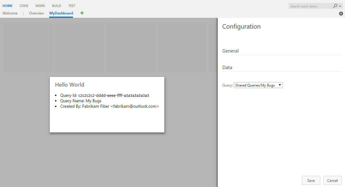
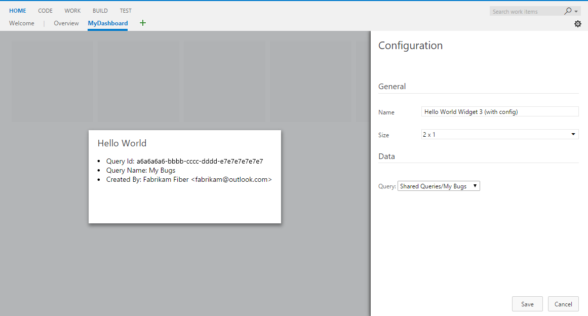
A configuration prompt displays since the widget requires setup:
Configure the widget
Access configuration through either method:
- Widget menu: Hover over the widget, select the ellipsis (⋯), then Configure
- Dashboard edit mode: Select Edit on the dashboard, then the configure button on the widget
The configuration panel opens with a live preview in the center. Select a query from the dropdown to see immediate updates, then select Save to apply your changes.
Add advanced options
Extend your widget with more built-in configuration features like custom names and sizes.
Name and size options
Azure DevOps provides two configurable features out-of-the-box:
| Feature | Manifest property | Purpose |
|---|---|---|
| Custom names | isNameConfigurable: true |
Users can override the default widget name |
| Multiple sizes | Multiple supportedSizes entries |
Users can resize widgets |
Manifest example
{
    "contributions": [
        {
             "id": "HelloWorldWidget3",
             "type": "ms.vss-dashboards-web.widget",
             "targets": [
                 "ms.vss-dashboards-web.widget-catalog",
                 "fabrikam.azuredevops-extensions-myExtensions.HelloWorldWidget.Configuration"
             ],
             "properties": {
                 "name": "Hello World Widget 3 (with config)",
                 "description": "My third widget",
                 "previewImageUrl": "img/preview3.png",
                 "uri": "hello-world3.html",
                 "isNameConfigurable": true,
                 "supportedSizes": [
                    {
                        "rowSpan": 1,
                        "columnSpan": 2
                    },
                    {
                        "rowSpan": 2,
                        "columnSpan": 2
                    }
                 ],
                 "supportedScopes": ["project_team"]
             }
         }
    ]
}
Display configured names
To show custom widget names, update your widget to use widgetSettings.name:
return {
    load: function (widgetSettings) {
        // Display configured name instead of hard-coded text
        var $title = $('h2.title');
        $title.text(widgetSettings.name);

        return getQueryInfo(widgetSettings);
    },
    reload: function (widgetSettings) {
        // Update name during configuration changes
        var $title = $('h2.title');
        $title.text(widgetSettings.name);

        return getQueryInfo(widgetSettings);
    }
}
After you update your extension, you can configure both the widget name and size:
Repackage and update your extension to enable these advanced configuration options.
Congratulations! You created a complete, configurable Azure DevOps dashboard widget with live preview capabilities and user customization options.