Note
Access to this page requires authorization. You can try signing in or changing directories.
Access to this page requires authorization. You can try changing directories.
Azure DevOps Services | Azure DevOps Server | Azure DevOps Server 2022
View the status of planned tests or monitor testing progress by defining test case or test result charts. For more information about test planning, see Create test plans and test suites. For information about test result terms, see Test objects and terms.
To track the progress of more than one test plan or test suite, open the Progress Report.
Prerequisites
| Category | Requirements |
|---|---|
| Project access | Project member. |
| Access levels | At least Basic access. For more information, see Manual test access and permissions. |
Track testing progress
Use test results charts to track how your testing is going. Choose from a fixed set of prepopulated fields related to results.
Add your own charts for test results to visualize what's important for your team. If you already know how to add a chart, jump to the examples that you can create.
To add a chart, follow these steps:
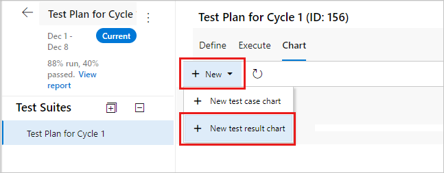
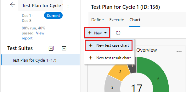
Select Test Plans to open the Test Plans page. Open a test plan and then select the Charts tab.
Under Charts, select New > New test result chart.
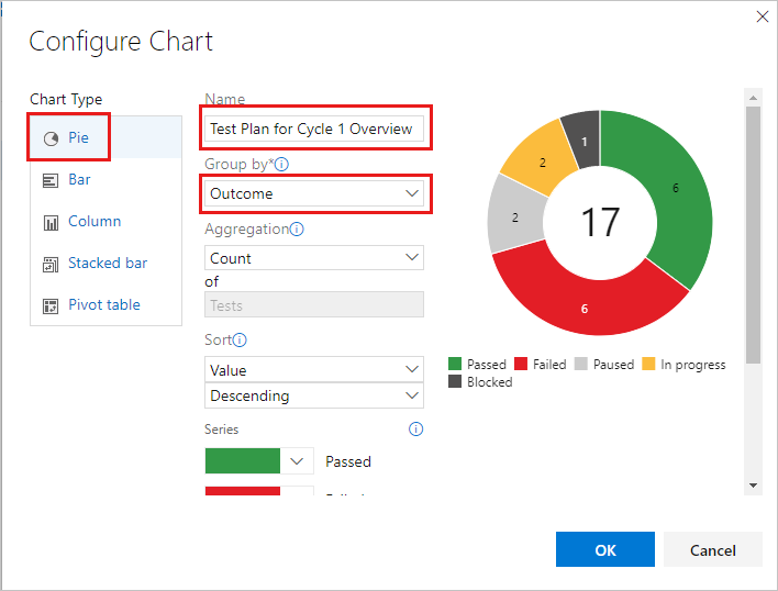
Select the chart type, in this example, a pie chart. Based on the chart, configure the fields that you want to use to group by, or for the rows and columns.
All charts roll up the information for any child test suites of the test plan or test suite that you selected.
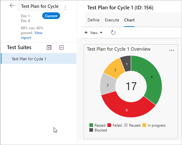
Select OK to save the chart. The chart displays in the Charts page for your test plan or test suite.
Test results examples
This section includes examples of useful charts.
Check test status for a test suite
Do the following steps to check the test status for a specific test suite.
- Select Test Plans to open the Test Plans page, and then select a plan to view a test suite.
- Select New > New test result chart to create a test results pie chart.
- Group by Outcome.
Check status for user stories per sprint
If you created requirement-based test suites in your test plan for your user stories, you can create a chart to review status for user stories that your team is testing in the current sprint.
- Create a static test suite that groups your requirement-based test suites together.
- Select that static test suite in the Test Plans page.
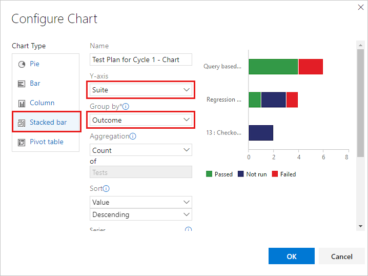
- Add a test results stacked bar chart.
- Select Suite as the Y-axis and Outcome as Group by.
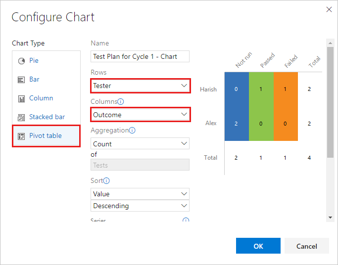
Check tests for each tester
You can check how many tests that each tester left to run.
- Select your test plan in the Test Plans page and add a test results pivot table chart.
- Choose Tester as Rows and Outcome as Columns pivot.
Check quality based on the configuration
Use either a stacked bar chart or a pivot table chart. Specify Configuration and Outcome as pivots.
Track why tests are failing
You can track why tests are failing for your team.
For failure analysis, use either a stacked bar chart or a pivot table chart. Select Tester and Failure type.
Note
Failure type for test results can only be set using Microsoft Test Manager.
Track resolutions for failing tests
You can track the resolution for failing tests for your team.
For resolution analysis, use either a stacked bar chart or a pivot table chart. Choose Tester and Resolution.
Note
Resolution type for test results can only be set using Microsoft Test Manager.
Track test case status
Use test case charts to find out the progress of your test case authoring. The charts for test cases give you the flexibility to report on columns that you add to the tests page. By default, test case fields aren't added to the view in the tests page.
If you already know how to add a chart, jump to the examples that you can create for test cases.
From the Define or Execute tabs, add any fields you want to use for your test case chart by using Column Options. Those fields appear as choices in the lists for grouping for your test case charts.
Select the test plan or test suite for your chart in the Test Plans page. Under Charts, select New > New test case chart.
All charts roll up the information for any child test suites of the test plan or test suite that you selected.
Select the chart type. Based on the chart, configure the fields that you want to use to group by, for rows and columns, or the range for trend charts.

You can't group by test suite for the test case charts.
Select OK to save the chart. The chart displays in the Charts page for your test plan or test suite.
Test case examples
These examples show common ways to interact with test case results.
View recent test results
You can view the recent test results for an individual test case.
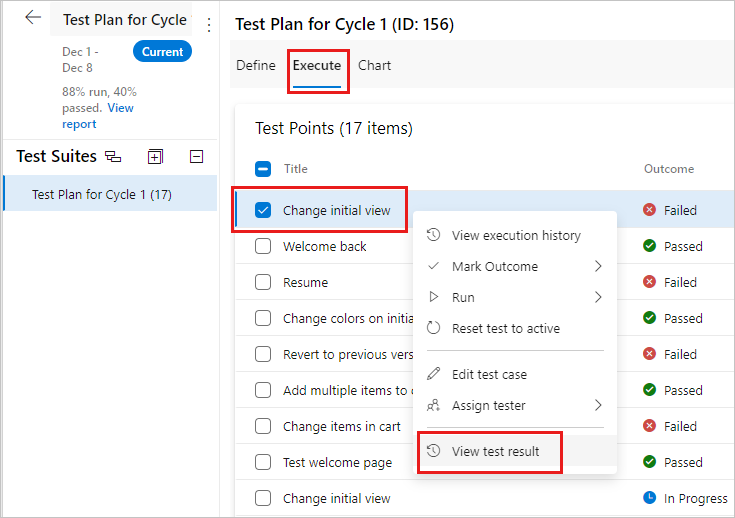
- Select the Execute tab in a test suite and then select a test case.
- Select More options or right-select to open the context menu.
- Select View test result.
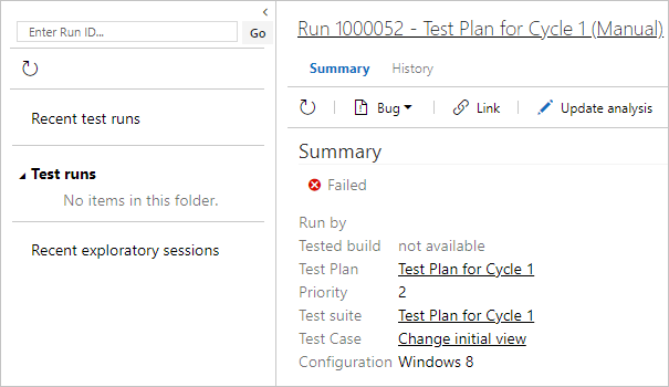
- View the recent test results for this test case.
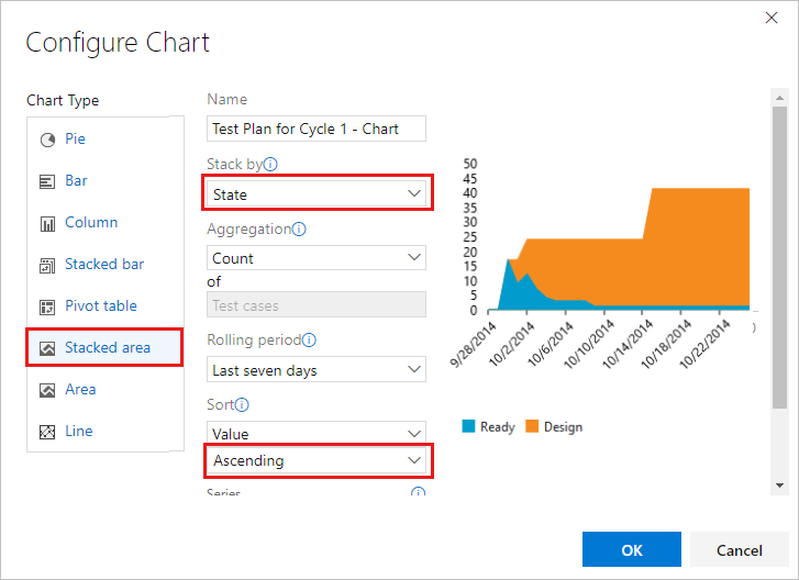
Track burn down by using a stacked area chart
You can track burn down for test case creation.
- Create a stacked area trend chart to view the burn down for how many test cases are ready to be run.
- Select State for the stack by field and Ascending for the sort field.
You can track burn down for automation status.
Use a stacked area trend chart to view the burn down for automated test cases. Select Automation status for the Stack by field and Ascending for the Sort field.
See test ownership and priorities
If multiple teams own test cases in your test plan, you can see how many test cases each team owns and the priorities of the tests.
If your teams organize by area path, use a test case pie chart. Select Area path for Group by.
If you want to know the priorities of these tests, create a stacked bar chart. Select Area path for the Y-axis and Priority for Group by.
Track test creation status
You can track test creation status for team members by creating a chart that includes the Assigned to value.
- Use a stacked bar chart or a pivot table chart.
- Select Assigned to for Y-axis or Rows.
- Select State for Group by or Columns.
Share charts on your team's dashboard
Pin a chart to your team's dashboard for all the team to view. Use the chart's context menu.
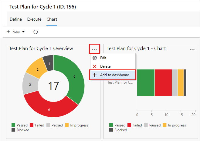
You can configure the dashboard widget to show a range of chart types.
Note
Be a team administrator to configure the dashboard widget, but team members with Stakeholder access can view the charts on the dashboard.