Note
Access to this page requires authorization. You can try signing in or changing directories.
Access to this page requires authorization. You can try changing directories.
Responsible AI (RAI) dashboards include visualizations and functionality to help you analyze your machine learning model and make data-driven business decisions. The steps to view and configure RAI dashboards are similar across scenarios, but some features are unique to image scenarios. This article describes how to access and configure RAI image dashboard components and functionality.
Responsible AI image dashboards are linked to your registered computer vision models in Azure Machine Learning. The Responsible AI Vision Insights component supports image classification and object detection scenarios.
Important
The Responsible AI image dashboard is currently in public preview. This preview is provided without a service-level agreement, and isn't recommended for production workloads. Certain features might not be supported or might have constrained capabilities. For more information, see Supplemental Terms of Use for Microsoft Azure Previews.
Prerequisites
An Azure subscription with an Azure Machine Learning workspace.
A registered machine learning model that has a responsible AI image dashboard created with a running compute resource connected.
You can create a Responsible AI image dashboard by using:
- The Azure Machine Learning studio UI
- YAML and Python via a pipeline job
- A preconfigured sample Jupyter notebook like Image Classification scenario with RAI Dashboard or Object Detection scenario with RAI Dashboard.
Some features of the RAI image dashboard require dynamic, on-the-fly, and real-time computation. For complete functionality of the image scenarios, you need to connect a running compute resource to your dashboard.
- For object detection, setting an Intersection over Union (IOU) threshold is disabled by default, and is enabled only if a compute resource is attached.
- When you submit a Distributed Parallel Version 2 (DPv2) job, attaching a compute resource enables precomputing of all model explanations instead of loading explanations on-demand.
For more information, see Enable full functionality of the Responsible AI dashboard.
To open the Responsible AI image dashboard in Machine Learning studio, select your registered model in the Models list, select Responsible AI at the top of the model page, and then select the name of your Responsible AI image dashboard from the list.
Cohorts
In the RAI image dashboard, you can select or create data cohorts, which are subsets of data created by manually adding filters or saving selected data. You can view, create, edit, duplicate, and delete cohorts.
The default dashboard view shows the Global cohort, which is all of the data. At the top of the dashboard, you can select Switch cohort to select a different cohort or New cohort to create a new cohort. You can also select the Settings icon to open a side panel that lists the names and details of all cohorts, and lets you switch or create new cohorts.

RAI image dashboard components
The following sections describe the Responsible AI image dashboard components. Available components and functionality differ between image classification and object detection scenarios.
For image classification and multilabel classification models, the Responsible AI image dashboard includes Error analysis, Vision data explorer, Model overview, and Data analysis components.
Error analysis
Error analysis tools are available for image classification and multiclassification tasks. These tools accelerate detection of fairness errors and identify under/overrepresentation in your dataset.
Instead of passing in tabular data, you can run error analysis on specified image metadata features by including the metadata as added columns in your mltable dataset. To learn more about error analysis, see Assess errors in machine learning models.

Vision data explorer
The Vision data explorer component has several views to provide various perspectives on your dataset. You can choose among Image explorer view, Table view, or Class view by selecting one of the tabs at the top of the component.
Image explorer view
The Image explorer view displays image instances of model predictions, automatically categorized by correctly and incorrectly labeled predictions. This view helps you quickly identify high-level error patterns in your data and select which instances to investigate further.
- Select a dataset cohort to explore lets you select or search for a user-defined dataset cohort to view.
- The Set thumbnail size slider adjusts the size of the image cards on the page.

For image classification and multiclassification, incorrect predictions refer to images where the predicted class label differs from ground truth. Each image card displays the image, the predicted class label, and the ground truth class label.

Selecting an image card opens a flyout with the following information that supports model prediction analysis.
- Selected instance: View the predicted and ground truth outcomes for the image.
- Explanation: View a Shapley Additive explanations (SHAP) feature attributions visualization to gain insight on model behavior leading to the execution of a computer vision task.
- Information: View image metadata values for the selected instance.


Table view
Table view shows your dataset with rows for each image instance and columns for the corresponding index, ground truth class labels, predicted class labels, and metadata features.

- Select a dataset cohort to explore lets you can select or search for a user-defined dataset cohort to view.
- Save cohort lets you save new dataset cohorts you create by manually selecting images.
Hover on an image row and select the checkbox to include the image in the new cohort. You can filter your dataset by index, metadata values, and classification outcome. You can add more filters, save the resulting filtered data with a new cohort name, and automatically switch to display the new cohort.
Table view for multiclass classification:


Class view
Class view breaks down your model predictions by class label. You can identify error patterns per class to diagnose fairness concerns and evaluate under/overrepresentation in your dataset.
- Under Select a dataset cohort to explore, you can select or search for a user-defined dataset cohort to view.
- The Set thumbnail size slider adjusts the size of the image cards on the page.
- Rows selects the number of image rows to display before scrolling the view.
Images display by label and show the distribution of each label in the dataset. A class label of 10/120 examples means there are 10 images of that class out of 120 total images in the dataset. Success instances have solid green underscores, and Error instances have red outline underscores.
- Under Select label type, choose to view images by the predicted or ground truth label.
- Under Select labels to display, choose one or more class labels to view image instances containing those labels.


Model overview
The model overview component provides a comprehensive set of performance metrics for evaluating your computer vision model, along with key performance disparity metrics across dataset cohorts. You can choose between Dataset cohorts or Feature cohorts views by selecting either tab at the top of the component.
Dataset cohorts view
The Dataset cohorts view displays the selected metrics across the global cohort and all user-defined cohorts in the dashboard.

Select Metric(s) from the dropdown list, or select Help me choose metrics to open a sidebar screen that explains, recommends, and lets you select metrics to display. You can adjust which metrics to view by using the multiselect dropdown list to select and deselect performance metrics.
You can also choose to Show heatmap for the displayed data.
Note
Performance metrics display N/A at their initial state and while metrics computations are loading.
Recommended metrics for image classification and image multilabel classification include Accuracy score, Macro Precision score, Macro Recall score, and Macro F1 score.


Feature cohorts view
In the Feature cohorts view, you can investigate your model by comparing model performance across user-specified sensitive and nonsensitive features. For example, compare performance for cohorts across various image metadata values like gender, race, and income.
This view also shows Fairness metrics such as Difference and Ratio parity. To learn more about feature cohorts, see Feature cohorts.


Visualizations
In the lower half of the Model overview component, you can select between Metrics visualizations or a Confusion matrix view of the data:
Metrics visualizations shows a bar graph that compares aggregated performance metrics across selected dataset cohorts.
- Select Choose cohorts to open a sidebar that lets you select the dataset and feature cohorts to apply.
- Select Choose metric to open a sidebar that lets you select metrics to show.

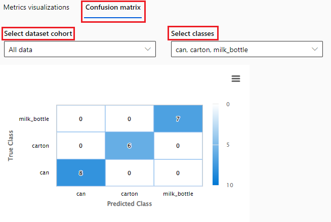
Confusion matrix shows a selected model performance metric across selected dataset cohorts and classes.
- Select Select dataset cohort to select a dataset cohort to display from the dropdown list.
- Select Select classes to select classes to display from the dropdown list.


Data analysis
The Data analysis component creates dataset cohorts to analyze dataset statistics along filters such as predicted outcome, dataset features, and error groups. You can choose between Table view or Chart view by selecting either tab at the top of the component.
Table view
Table view shows true and predicted values and the tabular extracted features.


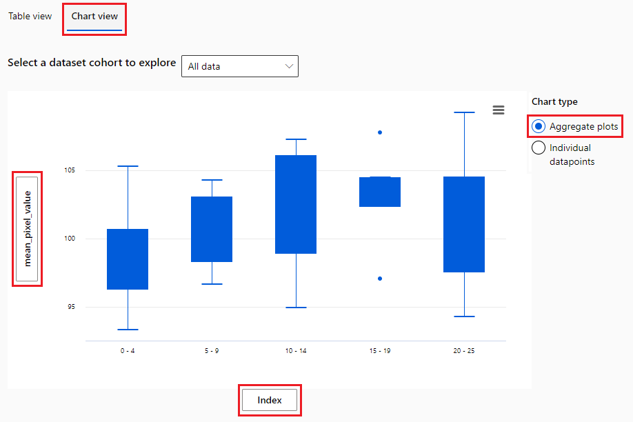
Chart view
In the Chart view , the X axis and Y axis show the values being plotted horizontally and vertically.
Chart view lets you choose between customized aggregation and local data exploration. Under Chart type, you can select whether to aggregate values or show individual datapoints.
Aggregate plot displays data in bins or categories along the X axis.
Individual datapoints displays a disaggregated view of the data.
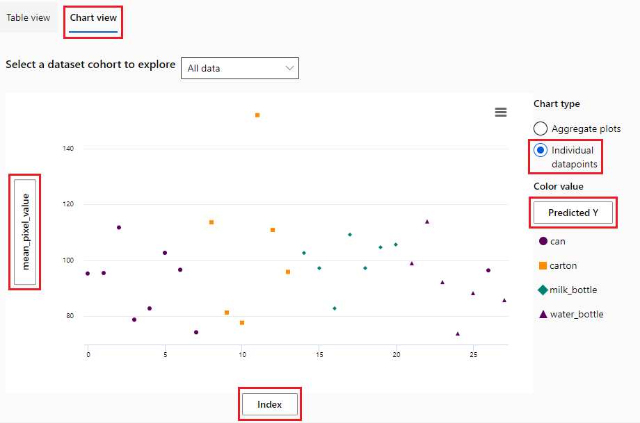


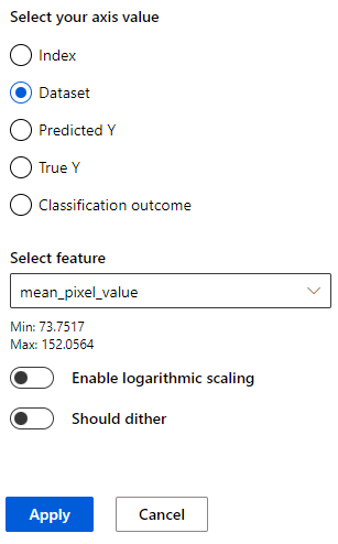
In either type of chart, you can select the axis labels to open a sidebar pane to select features and configure the axes. For Individual datapoints charts, selecting the label under Color value opens the sidebar pane to select the value used to group datapoints.
In the sidebar pane, depending on the type of chart and values, you can configure options such as Apply binning to data, Number of bins, or Enable logarithmic scaling. Should dither adds optional noise to the data to avoid overlapping points in the scatterplot.
Model interpretability
For AutoML image classification models, four kinds of explainability methods are supported:
The explanations are generated only for the predicted class. For multilabel classification, a threshold on confidence score is required to select the classes to generate explanations for. See the parameter list for the parameter name.
These four methods are specific to AutoML image classification only, and don't work with other task types such as object detection and instance segmentation. Non-AutoML image classification models can use SHAP vision for model interpretability. Both AutoML and non-AutoML object detection models can use D-RISE to generate visual explanations for model predictions.
To learn more about the four explainability methods, see Generate explanations for predictions. For more information about vision model interpretability techniques and how to interpret visual explanations of model behavior, see Model interpretability.
Related content
- Learn more about the concepts and techniques behind the Responsible AI dashboard.
- View sample YAML and Python notebooks to generate a Responsible AI dashboard with YAML or Python.
- Learn more about how you can use the Responsible AI image dashboard to debug image data and models and inform better decision-making in this tech community blog post.
- Learn about how the Responsible AI dashboard was used by Clearsight in a real-life customer story.