Note
Access to this page requires authorization. You can try signing in or changing directories.
Access to this page requires authorization. You can try changing directories.
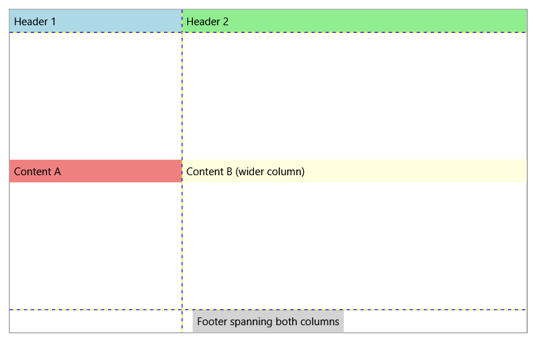
Grid is a layout control that enables flexible positioning of child elements in rows and columns.
Common tasks
The following table shows common tasks you can accomplish with the Grid control.
| Title | Description |
|---|---|
| Build a Standard UI Dialog Box by Using Grid | Learn how to create a standard dialog box layout using Grid. |
| Create a Complex Grid | Learn how to build sophisticated Grid layouts with multiple rows and columns. |
| Create a Grid Element | Learn how to create and configure a Grid control. |
| Create and Use a GridLengthConverter Object | Learn how to work with GridLengthConverter for dynamic sizing. |
| Manipulate Columns and Rows by Using ColumnDefinitionsCollections and RowDefinitionsCollections | Learn how to programmatically manipulate grid structure. |
| Position the Child Elements of a Grid | Learn how to position and align elements within grid cells. |
| Share Sizing Properties Between Grids | Learn how to synchronize sizing between multiple Grid controls. |
Styles and templates
You can modify the default ControlTemplate to give the control a unique appearance. For more information about modifying a control's template, see What are styles and templates? and How to create a template for a control.
Content property
The Grid control does not define a content property. It's a panel control that hosts child elements positioned using the Row, Column, RowSpan, and ColumnSpan attached properties.
See also
Collaborate with us on GitHub
The source for this content can be found on GitHub, where you can also create and review issues and pull requests. For more information, see our contributor guide.
.NET Desktop feedback