Note
Access to this page requires authorization. You can try signing in or changing directories.
Access to this page requires authorization. You can try changing directories.
 Browse the sample
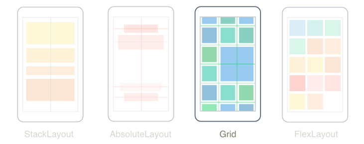
The .NET Multi-platform App UI (.NET MAUI) Grid, is a layout that organizes its children into rows and columns, which can have proportional or absolute sizes. By default, a Grid contains one row and one column. In addition, a Grid can be used as a parent layout that contains other child layouts.
The Grid should not be confused with tables, and is not intended to present tabular data. Unlike HTML tables, a Grid is intended for laying out content. For displaying tabular data, consider using a ListView or CollectionView.
The Grid class defines the following properties:
Column, of typeint, which is an attached property that indicates the column alignment of a view within a parent Grid. The default value of this property is 0. A validation callback ensures that when the property is set, its value is greater than or equal to 0.ColumnDefinitions, of typeColumnDefinitionCollection, is a list ofColumnDefinitionobjects that define the width of the grid columns.ColumnSpacing, of typedouble, indicates the distance between grid columns. The default value of this property is 0.ColumnSpan, of typeint, which is an attached property that indicates the total number of columns that a view spans within a parent Grid. The default value of this property is 1. A validation callback ensures that when the property is set, its value is greater than or equal to 1.Row, of typeint, which is an attached property that indicates the row alignment of a view within a parent Grid. The default value of this property is 0. A validation callback ensures that when the property is set, its value is greater than or equal to 0.RowDefinitions, of typeRowDefinitionCollection, is a list ofRowDefinitionobjects that define the height of the grid rows.RowSpacing, of typedouble, indicates the distance between grid rows. The default value of this property is 0.RowSpan, of typeint, which is an attached property that indicates the total number of rows that a view spans within a parent Grid. The default value of this property is 1. A validation callback ensures that when the property is set, its value is greater than or equal to 1.
These properties are backed by BindableProperty objects, which means that the properties can be targets of data bindings and styled.
Rows and columns
By default, a Grid contains one row and one column:
<ContentPage xmlns="http://schemas.microsoft.com/dotnet/2021/maui"
             xmlns:x="http://schemas.microsoft.com/winfx/2009/xaml"
             x:Class="GridTutorial.MainPage">
    <Grid Margin="20,35,20,20">
        <Label Text="By default, a Grid contains one row and one column." />
    </Grid>
</ContentPage>
In this example, the Grid contains a single child Label that's automatically positioned in a single location:

The layout behavior of a Grid can be defined with the RowDefinitions and ColumnDefinitions properties, which are collections of RowDefinition and ColumnDefinition objects, respectively. These collections define the row and column characteristics of a Grid, and should contain one RowDefinition object for each row in the Grid, and one ColumnDefinition object for each column in the Grid.
The RowDefinition class defines a Height property, of type GridLength, and the ColumnDefinition class defines a Width property, of type GridLength. The GridLength struct specifies a row height or a column width in terms of the GridUnitType enumeration, which has three members:
Absolute– the row height or column width is a value in device-independent units (a number in XAML).Auto– the row height or column width is autosized based on the cell contents (Autoin XAML).Star– leftover row height or column width is allocated proportionally (a number followed by*in XAML).
A Grid row with a Height property of Auto constrains the height of views in that row in the same way as a vertical StackLayout. Similarly, a column with a Width property of Auto works much like a horizontal StackLayout.
Caution
Try to ensure that as few rows and columns as possible are set to Auto size. Each auto-sized row or column will cause the layout engine to perform additional layout calculations. Instead, use fixed size rows and columns if possible. Alternatively, set rows and columns to occupy a proportional amount of space with the GridUnitType.Star enumeration value.
The following XAML shows how to create a Grid with three rows and two columns:
<ContentPage xmlns="http://schemas.microsoft.com/dotnet/2021/maui"
             xmlns:x="http://schemas.microsoft.com/winfx/2009/xaml"
             x:Class="GridDemos.Views.XAML.BasicGridPage"
             Title="Basic Grid demo">
   <Grid>
        <Grid.RowDefinitions>
            <RowDefinition Height="2*" />
            <RowDefinition Height="*" />
            <RowDefinition Height="100" />
        </Grid.RowDefinitions>
        <Grid.ColumnDefinitions>
            <ColumnDefinition Width="*" />
            <ColumnDefinition Width="*" />
        </Grid.ColumnDefinitions>
        ...
    </Grid>
</ContentPage>
In this example, the Grid has an overall height that is the height of the page. The Grid knows that the height of the third row is 100 device-independent units. It subtracts that height from its own height, and allocates the remaining height proportionally between the first and second rows based on the number before the star. In this example, the height of the first row is twice that of the second row.
The two ColumnDefinition objects both set the Width to *, which is the same as 1*, meaning that the width of the screen is divided equally beneath the two columns.
Important
The default value of the RowDefinition.Height property is *. Similarly, the default value of the ColumnDefinition.Width property is *. Therefore, it's not necessary to set these properties in cases where these defaults are acceptable.
Child views can be positioned in specific Grid cells with the Grid.Column and Grid.Row attached properties. In addition, to make child views span across multiple rows and columns, use the Grid.RowSpan and Grid.ColumnSpan attached properties.
The following XAML shows the same Grid definition, and also positions child views in specific Grid cells:
<ContentPage xmlns="http://schemas.microsoft.com/dotnet/2021/maui"
             xmlns:x="http://schemas.microsoft.com/winfx/2009/xaml"
             x:Class="GridDemos.Views.XAML.BasicGridPage"
             Title="Basic Grid demo">
   <Grid>
        <Grid.RowDefinitions>
            <RowDefinition Height="2*" />
            <RowDefinition />
            <RowDefinition Height="100" />
        </Grid.RowDefinitions>
        <Grid.ColumnDefinitions>
            <ColumnDefinition />
            <ColumnDefinition />
        </Grid.ColumnDefinitions>
        <BoxView Color="Green" />
        <Label Text="Row 0, Column 0"
               HorizontalOptions="Center"
               VerticalOptions="Center" />
        <BoxView Grid.Column="1"
                 Color="Blue" />
        <Label Grid.Column="1"
               Text="Row 0, Column 1"
               HorizontalOptions="Center"
               VerticalOptions="Center" />
        <BoxView Grid.Row="1"
                 Color="Teal" />
        <Label Grid.Row="1"
               Text="Row 1, Column 0"
               HorizontalOptions="Center"
               VerticalOptions="Center" />
        <BoxView Grid.Row="1"
                 Grid.Column="1"
                 Color="Purple" />
        <Label Grid.Row="1"
               Grid.Column="1"
               Text="Row1, Column 1"
               HorizontalOptions="Center"
               VerticalOptions="Center" />
        <BoxView Grid.Row="2"
                 Grid.ColumnSpan="2"
                 Color="Red" />
        <Label Grid.Row="2"
               Grid.ColumnSpan="2"
               Text="Row 2, Columns 0 and 1"
               HorizontalOptions="Center"
               VerticalOptions="Center" />
    </Grid>
</ContentPage>
Note
The Grid.Row and Grid.Column properties are both indexed from 0, and so Grid.Row="2" refers to the third row while Grid.Column="1" refers to the second column. In addition, both of these properties have a default value of 0, and so don't need to be set on child views that occupy the first row or first column of a Grid.
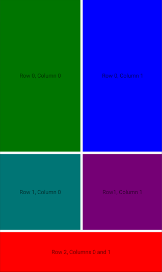
In this example, all three Grid rows are occupied by BoxView and Label views. The third row is 100 device-independent units high, with the first two rows occupying the remaining space (the first row is twice as high as the second row). The two columns are equal in width and divide the Grid in half. The BoxView in the third row spans both columns:

In addition, child views in a Grid can share cells. The order that the children appear in the XAML is the order that the children are placed in the Grid. In the previous example, the Label objects are only visible because they are rendered on top of the BoxView objects. The Label objects would not be visible if the BoxView objects were rendered on top of them.
The equivalent C# code is:
public class BasicGridPage : ContentPage
{
    public BasicGridPage()
    {
        Grid grid = new Grid
        {
            RowDefinitions =
            {
                new RowDefinition { Height = new GridLength(2, GridUnitType.Star) },
                new RowDefinition(),
                new RowDefinition { Height = new GridLength(100) }
            },
            ColumnDefinitions =
            {
                new ColumnDefinition(),
                new ColumnDefinition()
            }
        };

        // Row 0
        // The BoxView and Label are in row 0 and column 0, and so only need to be added to the
        // Grid to obtain the default row and column settings.
        grid.Add(new BoxView
        {
            Color = Colors.Green
        });
        grid.Add(new Label
        {
            Text = "Row 0, Column 0",
            HorizontalOptions = LayoutOptions.Center,
            VerticalOptions = LayoutOptions.Center
        });

        // This BoxView and Label are in row 0 and column 1, which are specified as arguments
        // to the Add method.
        grid.Add(new BoxView
        {
            Color = Colors.Blue
        }, 1, 0);
        grid.Add(new Label
        {
            Text = "Row 0, Column 1",
            HorizontalOptions = LayoutOptions.Center,
            VerticalOptions = LayoutOptions.Center
        }, 1, 0);

        // Row 1
        // This BoxView and Label are in row 1 and column 0, which are specified as arguments
        // to the Add method overload.
        grid.Add(new BoxView
        {
            Color = Colors.Teal
        }, 0, 1);
        grid.Add(new Label
        {
            Text = "Row 1, Column 0",
            HorizontalOptions = LayoutOptions.Center,
            VerticalOptions = LayoutOptions.Center
        }, 0, 1);

        // This BoxView and Label are in row 1 and column 1, which are specified as arguments
        // to the Add method overload.
        grid.Add(new BoxView
        {
            Color = Colors.Purple
        }, 1, 1);
        grid.Add(new Label
        {
            Text = "Row1, Column 1",
            HorizontalOptions = LayoutOptions.Center,
            VerticalOptions = LayoutOptions.Center
        }, 1, 1);

        // Row 2
        // Alternatively, the BoxView and Label can be positioned in cells with the Grid.SetRow
        // and Grid.SetColumn methods. Here, the Grid.SetColumnSpan method is used to span two columns.
        BoxView boxView = new BoxView { Color = Colors.Red };
        Grid.SetRow(boxView, 2);
        Grid.SetColumnSpan(boxView, 2);
        Label label = new Label
        {
            Text = "Row 2, Column 0 and 1",
            HorizontalOptions = LayoutOptions.Center,
            VerticalOptions = LayoutOptions.Center
        };
        Grid.SetRow(label, 2);
        Grid.SetColumnSpan(label, 2);

        grid.Add(boxView);
        grid.Add(label);

        Title = "Basic Grid demo";
        Content = grid;
    }
}
In code, to specify the height of a RowDefinition object, and the width of a ColumnDefinition object, you use values of the GridLength structure, often in combination with the GridUnitType enumeration.
Note
Grid also defines an AddWithSpan extension method that adds a view to the Grid at the specified row and column with the specified row and column spans.
Simplify row and column definitions
In XAML, the row and column characteristics of a Grid can be specified using a simplified syntax that avoids having to define RowDefinition and ColumnDefinition objects for each row and column. Instead, the RowDefinitions and ColumnDefinitions properties can be set to strings containing comma-delimited GridUnitType values, from which type converters built into .NET MAUI create RowDefinition and ColumnDefinition objects:
<Grid RowDefinitions="1*, Auto, 25, 14, 20"
      ColumnDefinitions="*, 2*, Auto, 300">
    ...
</Grid>
In this example, the Grid has five rows and four columns. The third, forth, and fifth rows are set to absolute heights, with the second row auto-sizing to its content. The remaining height is then allocated to the first row.
The forth column is set to an absolute width, with the third column auto-sizing to its content. The remaining width is allocated proportionally between the first and second columns based on the number before the star. In this example, the width of the second column is twice that of the first column (because * is identical to 1*).
Space between rows and columns
By default, Grid rows and columns have no space between them. This can be changed by setting the RowSpacing and ColumnSpacing properties, respectively:
<ContentPage xmlns="http://schemas.microsoft.com/dotnet/2021/maui"
             xmlns:x="http://schemas.microsoft.com/winfx/2009/xaml"
             x:Class="GridDemos.Views.XAML.GridSpacingPage"
             Title="Grid spacing demo">
    <Grid RowSpacing="6"
          ColumnSpacing="6">
        ...
    </Grid>
</ContentPage>
This example creates a Grid whose rows and columns are separated by 6 device-independent units of space:
Tip
The RowSpacing and ColumnSpacing properties can be set to negative values to make cell contents overlap.
The equivalent C# code is:
public class GridSpacingPage : ContentPage
{
    public GridSpacingPage()
    {
        Grid grid = new Grid
        {
            RowSpacing = 6,
            ColumnSpacing = 6,
            ...
        };
        ...

        Content = grid;
    }
}
Alignment
Child views in a Grid can be positioned within their cells by the HorizontalOptions and VerticalOptions properties. These properties can be set to the following fields from the LayoutOptions struct:
StartCenterEndFill
The following XAML creates a Grid with nine equal-size cells, and places a Label in each cell with a different alignment:
<ContentPage xmlns="http://schemas.microsoft.com/dotnet/2021/maui"
             xmlns:x="http://schemas.microsoft.com/winfx/2009/xaml"
             x:Class="GridDemos.Views.XAML.GridAlignmentPage"
             Title="Grid alignment demo">
    <Grid>
        <Grid.RowDefinitions>
            <RowDefinition />
            <RowDefinition />
            <RowDefinition />
        </Grid.RowDefinitions>
        <Grid.ColumnDefinitions>
            <ColumnDefinition />
            <ColumnDefinition />
            <ColumnDefinition />
        </Grid.ColumnDefinitions>

        <BoxView Color="AliceBlue" />
        <Label Text="Upper left"
               HorizontalOptions="Start"
               VerticalOptions="Start" />
        <BoxView Grid.Column="1"
                 Color="LightSkyBlue" />
        <Label Grid.Column="1"
               Text="Upper center"
               HorizontalOptions="Center"
               VerticalOptions="Start"/>
        <BoxView Grid.Column="2"
                 Color="CadetBlue" />
        <Label Grid.Column="2"
               Text="Upper right"
               HorizontalOptions="End"
               VerticalOptions="Start" />
        <BoxView Grid.Row="1"
                 Color="CornflowerBlue" />
        <Label Grid.Row="1"
               Text="Center left"
               HorizontalOptions="Start"
               VerticalOptions="Center" />
        <BoxView Grid.Row="1"
                 Grid.Column="1"
                 Color="DodgerBlue" />
        <Label Grid.Row="1"
               Grid.Column="1"
               Text="Center center"
               HorizontalOptions="Center"
               VerticalOptions="Center" />
        <BoxView Grid.Row="1"
                 Grid.Column="2"
                 Color="DarkSlateBlue" />
        <Label Grid.Row="1"
               Grid.Column="2"
               Text="Center right"
               HorizontalOptions="End"
               VerticalOptions="Center" />
        <BoxView Grid.Row="2"
                 Color="SteelBlue" />
        <Label Grid.Row="2"
               Text="Lower left"
               HorizontalOptions="Start"
               VerticalOptions="End" />
        <BoxView Grid.Row="2"
                 Grid.Column="1"
                 Color="LightBlue" />
        <Label Grid.Row="2"
               Grid.Column="1"
               Text="Lower center"
               HorizontalOptions="Center"
               VerticalOptions="End" />
        <BoxView Grid.Row="2"
                 Grid.Column="2"
                 Color="BlueViolet" />
        <Label Grid.Row="2"
               Grid.Column="2"
               Text="Lower right"
               HorizontalOptions="End"
               VerticalOptions="End" />
    </Grid>
</ContentPage>
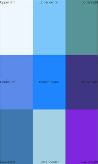
In this example, the Label objects in each row are all identically aligned vertically, but use different horizontal alignments. Alternatively, this can be thought of as the Label objects in each column being identically aligned horizontally, but using different vertical alignments:
The equivalent C# code is:
public class GridAlignmentPage : ContentPage
{
    public GridAlignmentPage()
    {
        Grid grid = new Grid
        {
            RowDefinitions =
            {
                new RowDefinition(),
                new RowDefinition(),
                new RowDefinition()
            },
            ColumnDefinitions =
            {
                new ColumnDefinition(),
                new ColumnDefinition(),
                new ColumnDefinition()
            }
        };

        // Row 0
        grid.Add(new BoxView
        {
            Color = Colors.AliceBlue
        });
        grid.Add(new Label
        {
            Text = "Upper left",
            HorizontalOptions = LayoutOptions.Start,
            VerticalOptions = LayoutOptions.Start
        });

        grid.Add(new BoxView
        {
            Color = Colors.LightSkyBlue
        }, 1, 0);
        grid.Add(new Label
        {
            Text = "Upper center",
            HorizontalOptions = LayoutOptions.Center,
            VerticalOptions = LayoutOptions.Start
        }, 1, 0);

        grid.Add(new BoxView
        {
            Color = Colors.CadetBlue
        }, 2, 0);
        grid.Add(new Label
        {
            Text = "Upper right",
            HorizontalOptions = LayoutOptions.End,
            VerticalOptions = LayoutOptions.Start
        }, 2, 0);

        // Row 1
        grid.Add(new BoxView
        {
            Color = Colors.CornflowerBlue
        }, 0, 1);
        grid.Add(new Label
        {
            Text = "Center left",
            HorizontalOptions = LayoutOptions.Start,
            VerticalOptions = LayoutOptions.Center
        }, 0, 1);

        grid.Add(new BoxView
        {
            Color = Colors.DodgerBlue
        }, 1, 1);
        grid.Add(new Label
        {
            Text = "Center center",
            HorizontalOptions = LayoutOptions.Center,
            VerticalOptions = LayoutOptions.Center
        }, 1, 1);

        grid.Add(new BoxView
        {
            Color = Colors.DarkSlateBlue
        }, 2, 1);
        grid.Add(new Label
        {
            Text = "Center right",
            HorizontalOptions = LayoutOptions.End,
            VerticalOptions = LayoutOptions.Center
        }, 2, 1);

        // Row 2
        grid.Add(new BoxView
        {
            Color = Colors.SteelBlue
        }, 0, 2);
        grid.Add(new Label
        {
            Text = "Lower left",
            HorizontalOptions = LayoutOptions.Start,
            VerticalOptions = LayoutOptions.End
        }, 0, 2);

        grid.Add(new BoxView
        {
            Color = Colors.LightBlue
        }, 1, 2);
        grid.Add(new Label
        {
            Text = "Lower center",
            HorizontalOptions = LayoutOptions.Center,
            VerticalOptions = LayoutOptions.End
        }, 1, 2);

        grid.Add(new BoxView
        {
            Color = Colors.BlueViolet
        }, 2, 2);
        grid.Add(new Label
        {
            Text = "Lower right",
            HorizontalOptions = LayoutOptions.End,
            VerticalOptions = LayoutOptions.End
        }, 2, 2);

        Title = "Grid alignment demo";
        Content = grid;
    }
}
Nested Grid objects
A Grid can be used as a parent layout that contains nested child Grid objects, or other child layouts. When nesting Grid objects, the Grid.Row, Grid.Column, Grid.RowSpan, and Grid.ColumnSpan attached properties always refer to the position of views within their parent Grid.
The following XAML shows an example of nesting Grid objects:
<ContentPage xmlns="http://schemas.microsoft.com/dotnet/2021/maui"
             xmlns:x="http://schemas.microsoft.com/winfx/2009/xaml"
             xmlns:converters="clr-namespace:GridDemos.Converters"
             x:Class="GridDemos.Views.XAML.ColorSlidersGridPage"
             Title="Nested Grids demo">

    <ContentPage.Resources>
        <converters:DoubleToIntConverter x:Key="doubleToInt" />

        <Style TargetType="Label">
            <Setter Property="HorizontalTextAlignment"
                    Value="Center" />
        </Style>
    </ContentPage.Resources>

    <Grid>
        <Grid.RowDefinitions>
            <RowDefinition Height="500" />
            <RowDefinition Height="Auto" />
        </Grid.RowDefinitions>

        <BoxView x:Name="boxView"
                 Color="Black" />
        <Grid Grid.Row="1"
              Margin="20">
            <Grid.RowDefinitions>
                <RowDefinition />
                <RowDefinition />
                <RowDefinition />
                <RowDefinition />
                <RowDefinition />
                <RowDefinition />
            </Grid.RowDefinitions>
            <Slider x:Name="redSlider"
                    ValueChanged="OnSliderValueChanged" />
            <Label x:DataType="Slider"
                   Grid.Row="1"
                   Text="{Binding Source={x:Reference redSlider},
                                  Path=Value,
                                  Converter={StaticResource doubleToInt},
                                  ConverterParameter=255,
                                  StringFormat='Red = {0}'}" />
            <Slider x:Name="greenSlider"
                    Grid.Row="2"
                    ValueChanged="OnSliderValueChanged" />
            <Label x:DataType="Slider"
                   Grid.Row="3"
                   Text="{Binding Source={x:Reference greenSlider},
                                  Path=Value,
                                  Converter={StaticResource doubleToInt},
                                  ConverterParameter=255,
                                  StringFormat='Green = {0}'}" />
            <Slider x:Name="blueSlider"
                    Grid.Row="4"
                    ValueChanged="OnSliderValueChanged" />
            <Label x:DataType="Slider"
                   Grid.Row="5"
                   Text="{Binding Source={x:Reference blueSlider},
                                  Path=Value,
                                  Converter={StaticResource doubleToInt},
                                  ConverterParameter=255,
                                  StringFormat='Blue = {0}'}" />
        </Grid>
    </Grid>
</ContentPage>
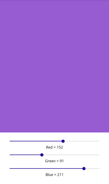
In this example, the root Grid contains a BoxView in its first row, and a child Grid in its second row. The child Grid contains Slider objects that manipulate the color displayed by the BoxView, and Label objects that display the value of each Slider:
Important
The deeper you nest Grid objects and other layouts, the more layout calculations will be performed which may impact performance. For more information, see Choose the correct layout.
The equivalent C# code is:
public class ColorSlidersGridPage : ContentPage
{
    BoxView boxView;
    Slider redSlider;
    Slider greenSlider;
    Slider blueSlider;

    public ColorSlidersGridPage()
    {
        // Create an implicit style for the Labels
        Style labelStyle = new Style(typeof(Label))
        {
            Setters =
            {
                new Setter { Property = Label.HorizontalTextAlignmentProperty, Value = TextAlignment.Center }
            }
        };
        Resources.Add(labelStyle);

        // Root page layout
        Grid rootGrid = new Grid
        {
            RowDefinitions =
            {
                new RowDefinition { HeightRequest = 500 },
                new RowDefinition()
            }
        };

        boxView = new BoxView { Color = Colors.Black };
        rootGrid.Add(boxView);

        // Child page layout
        Grid childGrid = new Grid
        {
            Margin = new Thickness(20),
            RowDefinitions =
            {
                new RowDefinition(),
                new RowDefinition(),
                new RowDefinition(),
                new RowDefinition(),
                new RowDefinition(),
                new RowDefinition()
            }
        };

        DoubleToIntConverter doubleToInt = new DoubleToIntConverter();

        redSlider = new Slider();
        redSlider.ValueChanged += OnSliderValueChanged;
        childGrid.Add(redSlider);

        Label redLabel = new Label();
        redLabel.SetBinding(Label.TextProperty, Binding.Create(static (Slider slider) => slider.Value, converter: doubleToInt, converterParameter: "255", stringFormat: "Red = {0}", source: redSlider));
        Grid.SetRow(redLabel, 1);
        childGrid.Add(redLabel);

        greenSlider = new Slider();
        greenSlider.ValueChanged += OnSliderValueChanged;
        Grid.SetRow(greenSlider, 2);
        childGrid.Add(greenSlider);

        Label greenLabel = new Label();
        greenLabel.SetBinding(Label.TextProperty, Binding.Create(static (Slider slider) => slider.Value, converter: doubleToInt, converterParameter: "255", stringFormat: "Green = {0}", source: greenSlider));
        Grid.SetRow(greenLabel, 3);
        childGrid.Add(greenLabel);

        blueSlider = new Slider();
        blueSlider.ValueChanged += OnSliderValueChanged;
        Grid.SetRow(blueSlider, 4);
        childGrid.Add(blueSlider);

        Label blueLabel = new Label();
        blueLabel.SetBinding(Label.TextProperty, Binding.Create(static (Slider slider) => slider.Value, converter: doubleToInt, converterParameter: "255", stringFormat: "Blue = {0}", source: blueSlider));
        Grid.SetRow(blueLabel, 5);
        childGrid.Add(blueLabel);

        // Place the child Grid in the root Grid
        rootGrid.Add(childGrid, 0, 1);

        Title = "Nested Grids demo";
        Content = rootGrid;
    }

    void OnSliderValueChanged(object sender, ValueChangedEventArgs e)
    {
        boxView.Color = new Color(redSlider.Value, greenSlider.Value, blueSlider.Value);
    }
}
Collaborate with us on GitHub
The source for this content can be found on GitHub, where you can also create and review issues and pull requests. For more information, see our contributor guide.