Note
Access to this page requires authorization. You can try signing in or changing directories.
Access to this page requires authorization. You can try changing directories.
The .NET Multi-platform App UI (.NET MAUI) Visual State Manager provides a structured way to make visual changes to the user interface from code. In most cases, the user interface of an app is defined in XAML, and this XAML can include markup describing how the Visual State Manager affects the visuals of the user interface.
The Visual State Manager introduces the concept of visual states. A .NET MAUI view such as a Button can have several different visual appearances depending on its underlying state — whether it's disabled, or pressed, or has input focus. These are the button's states. Visual states are collected in visual state groups. All the visual states within a visual state group are mutually exclusive. Both visual states and visual state groups are identified by simple text strings.
The .NET MAUI Visual State Manager defines a visual state group named CommonStates with the following visual states:
- Normal
- Disabled
- Focused
- Selected
- PointerOver
The Normal, Disabled, Focused, and PointerOver visual states are supported on all classes that derive from VisualElement, which is the base class for View and Page. In addition, you can also define your own visual state groups and visual states.
The advantage of using the Visual State Manager to define appearance, rather than accessing visual elements directly from code-behind, is that you can control how visual elements react to different state entirely in XAML, which keeps all of the UI design in one location.
Note
Triggers can also make changes to visuals in the user interface based on changes in a view's properties or the firing of events. However, using triggers to deal with various combinations of these changes can become confusing. With the Visual State Manager, the visual states within a visual state group are always mutually exclusive. At any time, only one state in each group is the current state.
Common visual states
The Visual State Manager allows you to include markup in your XAML file that can change the visual appearance of a view if the view is normal, disabled, has input focus, is selected, or has the mouse cursor hovering over it but not pressed. These are known as the common states.
For example, suppose you have an Entry view on your page, and you want the visual appearance of the Entry to change in the following ways:
- The Entry should have a pink background when the Entry is disabled.
- The Entry should have a lime background normally.
- The Entry should expand to twice its normal height when it has input focus.
- The Entry should have a light blue background when it has the mouse cursor hovering over it but not pressed.
You can attach the Visual State Manager markup to an individual view, or you can define it in a style if it applies to multiple views.
Define visual states on a view
The VisualStateManager class defines a VisualStateGroups attached property, that's used to attach visual states to a view. The VisualStateGroups property is of type VisualStateGroupList, which is a collection of VisualStateGroup objects. Therefore, the child of the VisualStateManager.VisualStateGroups attached property is a VisualStateGroup object. This object defines an x:Name attribute that indicates the name of the group. Alternatively, the VisualStateGroup class defines a Name property that you can use instead. For more information about attached properties, see Attached properties.
The VisualStateGroup class defines a property named States, which is a collection of VisualState objects. States is the content property of the VisualStateGroups class so you can include the VisualState objects as children of the VisualStateGroup. Each VisualState object should be identified using x:Name or Name.
The VisualState class defines a property named Setters, which is a collection of Setter objects. These are the same Setter objects that you use in a Style object. Setters isn't the content property of VisualState, so it's necessary to include property element tags for the Setters property. Setter objects should be inserted as children of Setters. Each Setter object indicates the value of a property when that state is current. Any property referenced by a Setter object must be backed by a bindable property.
Important
In order for visual state Setter objects to function correctly, a VisualStateGroup must contain a VisualState object for the Normal state. If this visual state does not have any Setter objects, it should be included as an empty visual state (<VisualState Name="Normal" />).
The following example shows visual states defined on an Entry:
<Entry FontSize="18">
    <VisualStateManager.VisualStateGroups>
        <VisualStateGroupList>
            <VisualStateGroup Name="CommonStates">
                <VisualState Name="Normal">
                    <VisualState.Setters>
                        <Setter Property="BackgroundColor" Value="Lime" />
                    </VisualState.Setters>
                </VisualState>

                <VisualState Name="Focused">
                    <VisualState.Setters>
                        <Setter Property="FontSize" Value="36" />
                    </VisualState.Setters>
                </VisualState>

                <VisualState Name="Disabled">
                    <VisualState.Setters>
                        <Setter Property="BackgroundColor" Value="Pink" />
                    </VisualState.Setters>
                </VisualState>

                <VisualState Name="PointerOver">
                    <VisualState.Setters>
                        <Setter Property="BackgroundColor" Value="LightBlue" />
                    </VisualState.Setters>
                </VisualState>
            </VisualStateGroup>
        </VisualStateGroupList>
    </VisualStateManager.VisualStateGroups>
</Entry>
The following screenshot shows the Entry in its four defined visual states:

When the Entry is in the Normal state, its background is lime. When the Entry gains input focus its font size doubles. When the Entry becomes disabled, its background becomes pink. The Entry doesn't retain its lime background when it gains input focus. When the mouse pointer hovers over the Entry, but isn't pressed, the Entry background becomes light blue. As the Visual State Manager switches between the visual states, the properties set by the previous state are unset. Therefore, the visual states are mutually exclusive.
If you want the Entry to have a lime background in the Focused state, add another Setter to that visual state:
<VisualState Name="Focused">
    <VisualState.Setters>
        <Setter Property="FontSize" Value="36" />
        <Setter Property="BackgroundColor" Value="Lime" />
    </VisualState.Setters>
</VisualState>
Define visual states in a style
It's often necessary to share the same visual states in two or more views. In this scenario, the visual states can be defined in a Style. This can be achieved by adding a Setter object for the VisualStateManager.VisualStateGroups property. The content property for the Setter object is its Value property, which can therefore be specified as the child of the Setter object. The VisualStateGroups property is of type VisualStateGroupList, and so the child of the Setter object is a VisualStateGroupList to which a VisualStateGroup can be added that contains VisualState objects.
The following example shows an implicit style for an Entry that defines the common visual states:
<Style TargetType="Entry">
    <Setter Property="FontSize" Value="18" />
    <Setter Property="VisualStateManager.VisualStateGroups">
        <VisualStateGroupList>
            <VisualStateGroup Name="CommonStates">
                <VisualState Name="Normal">
                    <VisualState.Setters>
                        <Setter Property="BackgroundColor" Value="Lime" />
                    </VisualState.Setters>
                </VisualState>
                <VisualState Name="Focused">
                    <VisualState.Setters>
                        <Setter Property="FontSize" Value="36" />
                        <Setter Property="BackgroundColor" Value="Lime" />
                    </VisualState.Setters>
                </VisualState>
                <VisualState Name="Disabled">
                    <VisualState.Setters>
                        <Setter Property="BackgroundColor" Value="Pink" />
                    </VisualState.Setters>
                </VisualState>
                <VisualState Name="PointerOver">
                    <VisualState.Setters>
                        <Setter Property="BackgroundColor" Value="LightBlue" />
                    </VisualState.Setters>
                </VisualState>
            </VisualStateGroup>
        </VisualStateGroupList>
    </Setter>
</Style>
When this style is included in a page-level resource dictionary, the Style object will be applied to all Entry objects on the page. Therefore, all Entry objects on the page will respond in the same way to their visual states.
Visual states in .NET MAUI
The following table lists the visual states that are defined in .NET MAUI:
| Class | States | More Information |
|---|---|---|
| Button | Pressed |
Button visual states |
| CarouselView | DefaultItem, CurrentItem, PreviousItem, NextItem |
CarouselView visual states |
| CheckBox | IsChecked |
CheckBox visual states |
| CollectionView | Selected |
CollectionView visual states |
| ImageButton | Pressed |
ImageButton visual states |
| RadioButton | Checked, Unchecked |
RadioButton visual states |
| Switch | On, Off |
Switch visual states |
| VisualElement | Normal, Disabled, Focused, PointerOver |
Common states |
Set state on multiple elements
In the previous examples, visual states were attached to and operated on single elements. However, it's also possible to create visual states that are attached to a single element, but that set properties on other elements within the same scope. This avoids having to repeat visual states on each element the states operate on.
The Setter type has a TargetName property, of type string, that represents the target object that the Setter for a visual state will manipulate. When the TargetName property is defined, the Setter sets the Property of the object defined in TargetName to Value:
<Setter TargetName="label"
        Property="Label.TextColor"
        Value="Red" />
In this example, a Label named label will have its TextColor property set to Red. When setting the TargetName property you must specify the full path to the property in Property. Therefore, to set the TextColor property on a Label, Property is specified as Label.TextColor.
Note
Any property referenced by a Setter object must be backed by a bindable property.
The following example shows how to set state on multiple objects, from a single visual state group:
<StackLayout>
    <Label Text="What is the capital of France?" />
    <Entry x:Name="entry"
           Placeholder="Enter answer" />
    <Button Text="Reveal answer">
        <VisualStateManager.VisualStateGroups>
            <VisualStateGroup Name="CommonStates">
                <VisualState Name="Normal" />
                <VisualState Name="Pressed">
                    <VisualState.Setters>
                        <Setter Property="Scale"
                                Value="0.8" />
                        <Setter TargetName="entry"
                                Property="Entry.Text"
                                Value="Paris" />
                    </VisualState.Setters>
                </VisualState>
            </VisualStateGroup>
        </VisualStateManager.VisualStateGroups>
    </Button>
</StackLayout>
In this example, the Normal state is active when the Button isn't pressed, and a response can be entered into the Entry. The Pressed state becomes active when the Button is pressed, and specifies that its Scale property will be changed from the default value of 1 to 0.8. In addition, the Entry named entry will have its Text property set to Paris. Therefore, the result is that when the Button is pressed it's rescaled to be slightly smaller, and the Entry displays Paris:

Then, when the Button is released it's rescaled to its default value of 1, and the Entry displays any previously entered text.
Important
Property paths are unsupported in Setter elements that specify the TargetName property.
Define custom visual states
Custom visual states can be implemented by defining them as you would define visual states for the common states, but with names of your choosing, and then calling the VisualStateManager.GoToState method to activate a state.
The following example shows how to use the Visual State Manager for input validation:
<ContentPage xmlns="http://schemas.microsoft.com/dotnet/2021/maui"
             xmlns:x="http://schemas.microsoft.com/winfx/2009/xaml"
             x:Class="VsmDemos.VsmValidationPage"
             Title="VSM Validation">
    <StackLayout x:Name="stackLayout"
                 Padding="10, 10">
            <VisualStateManager.VisualStateGroups>
                <VisualStateGroup Name="ValidityStates">
                    <VisualState Name="Valid">
                        <VisualState.Setters>
                            <Setter TargetName="helpLabel"
                                    Property="Label.TextColor"
                                    Value="Transparent" />
                            <Setter TargetName="entry"
                                    Property="Entry.BackgroundColor"
                                    Value="Lime" />
                        </VisualState.Setters>
                    </VisualState>
                    <VisualState Name="Invalid">
                        <VisualState.Setters>
                            <Setter TargetName="entry"
                                    Property="Entry.BackgroundColor"
                                    Value="Pink" />
                            <Setter TargetName="submitButton"
                                    Property="Button.IsEnabled"
                                    Value="False" />
                        </VisualState.Setters>
                    </VisualState>
                </VisualStateGroup>
            </VisualStateManager.VisualStateGroups>
        <Label Text="Enter a U.S. phone number:"
               FontSize="18" />
        <Entry x:Name="entry"
               Placeholder="555-555-5555"
               FontSize="18"
               Margin="30, 0, 0, 0"
               TextChanged="OnTextChanged" />
        <Label x:Name="helpLabel"
               Text="Phone number must be of the form 555-555-5555, and not begin with a 0 or 1" />
        <Button x:Name="submitButton"
                Text="Submit"
                FontSize="18"
                Margin="0, 20"
                VerticalOptions="Center"
                HorizontalOptions="Center" />
    </StackLayout>
</ContentPage>
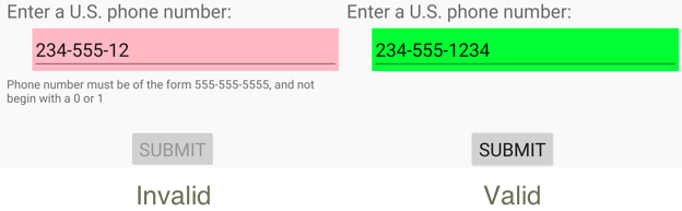
In this example, visual states are attached to the StackLayout, and there are two mutually-exclusive states named Valid and Invalid. If the Entry does not contain a valid phone number, then the current state is Invalid, and so the Entry has a pink background, the second Label is visible, and the Button is disabled. When a valid phone number is entered, then the current state becomes Valid. The Entry gets a lime background, the second Label disappears, and the Button is now enabled:
The code-behind file is responsible for handling the TextChanged event from the Entry. The handler uses a regular expression to determine if the input string is valid or not. The GoToState method in the code-behind file calls the static VisualStateManager.GoToState method on the StackLayout object:
public partial class VsmValidationPage : ContentPage
{
    public VsmValidationPage()
    {
        InitializeComponent();

        GoToState(false);
    }

    void OnTextChanged(object sender, TextChangedEventArgs args)
    {
        bool isValid = Regex.IsMatch(args.NewTextValue, @"^[2-9]\d{2}-\d{3}-\d{4}$");
        GoToState(isValid);
    }

    void GoToState(bool isValid)
    {
        string visualState = isValid ? "Valid" : "Invalid";
        VisualStateManager.GoToState(stackLayout, visualState);
    }
}
In this example, the GoToState method is called from the constructor to initialize the state. There should always be a current state. The code-behind file then calls VisualStateManager.GoToState, with a state name, on the object that defines the visual states.
Visual state triggers
Visual states support state triggers, which are a specialized group of triggers that define the conditions under which a VisualState should be applied.
State triggers are added to the StateTriggers collection of a VisualState. This collection can contain a single state trigger, or multiple state triggers. A VisualState will be applied when any state triggers in the collection are active.
When using state triggers to control visual states, .NET MAUI uses the following precedence rules to determine which trigger (and corresponding VisualState) will be active:
- Any trigger that derives from StateTriggerBase.
- An AdaptiveTrigger activated due to the MinWindowWidth condition being met.
- An AdaptiveTrigger activated due to the MinWindowHeight condition being met.
If multiple triggers are simultaneously active (for example, two custom triggers) then the first trigger declared in the markup takes precedence.
For more information about state triggers, see State triggers.
Collaborate with us on GitHub
The source for this content can be found on GitHub, where you can also create and review issues and pull requests. For more information, see our contributor guide.