Configure a customer snapshot
The customer snapshot component allows flexibility in determining the entity to present and the fields to expose. You can control the component entity and field selection by performing the following steps:
- Configuring a dedicated quick view form for the requested entity
- Mapping the quick view form to the customer snapshot component
Note
Solutions such as Unified customer portal are deployed with a default editable quick view form of the retail banking contact view. You need not create a new form for these solutions.
Configure a quick view form
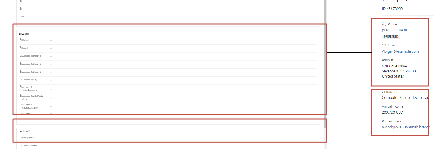
Create a new quick view form for the desired entity. The form contains separate sections to include the various details. It can contain a minimum of two and a maximum of five sections.
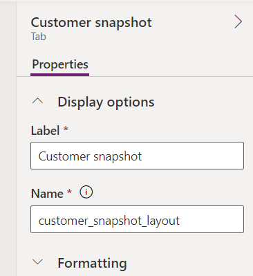
Under the Display options property of the form, edit the value of the Label field to read Customer snapshot.
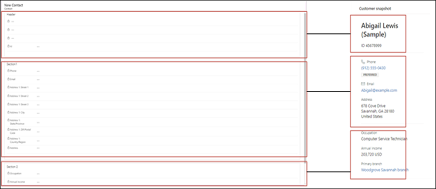
Update the header section as specified.
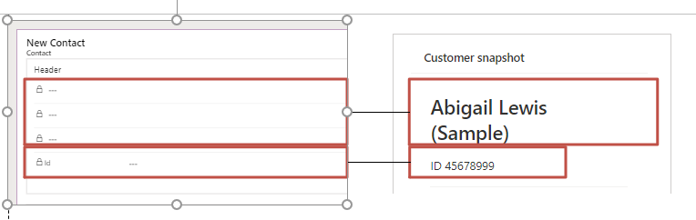
a) Enter the prominent header, the first field in the header section (in this case, Contact Name). Contact name is a composite field of three separate naming fields, and therefore, looks like three fields in the form.
b) If required, you can add up to four additional fields in the header section. The additional fields are displayed as subtitles. When you add multiple fields, they appear as comma-separated values. However, if you add more than four fields, they don't appear. You can control the label display in the subtitle by toggling the Hide label attribute of the field in the form.
c) If you want to exclude the header section from view, make sure that the first header section you add to the form is empty.
Sections in the quick view form
In the quick view form, each section after the header until five additional sections can hold a maximum of 10 fields. The remaining fields are ignored. Further, line separators divide each section from the other.
Additional considerations for fields in the quick view form
You need to consider the following factors when working with fields in the quick view form:
Marking a field as hidden is the same as deleting it.
Hidden labels, including the header label, aren't displayed.
Email or phone type fields are displayed with the relevant icon and action.
The preferred tag is attached to an email or phone type field depending on the value of the PreferredContactMethodCode attribute, if available.
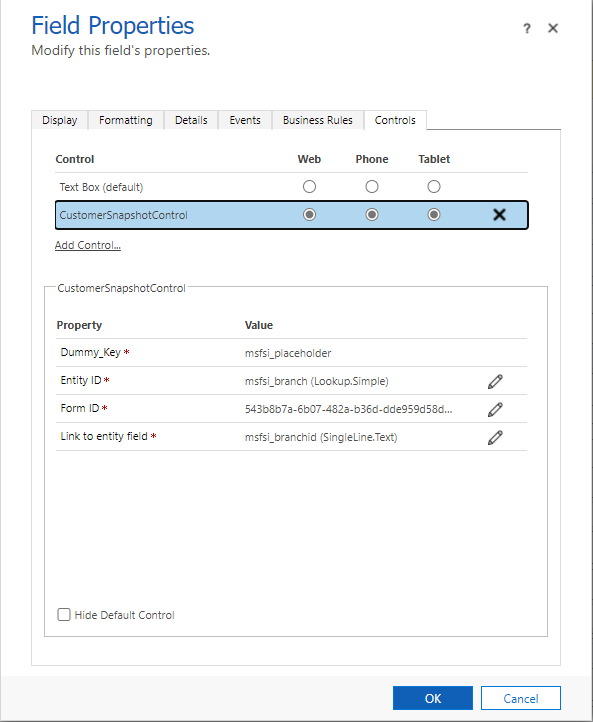
Mapping a quick view form to the customer snapshot component
Sign in to Power Apps, and access the form that uses CustomerSnapshotControl. The form can use either the standalone component or the customer summary component in the Unified customer profile.
Update the following properties associated with CustomerSnapshotControl:
a) Dummy_Key: Placeholder field, use msfsi_placeholder for contact or any other single line text/lookup field.
b) Entity ID: Holds the ID of the entity used to fetch the data.
c) Form ID: Quick view form ID that determines the fields to show. Here, you can provide the ID of the form created in step 1. The value is available in the URL of the form or the ID field.
In Unified customer profile, the default value of Banking customer snapshot provided for CustomerSummaryPortal is used because FSIRetailBankingCoreComponents is deployed.
d) Link to entity field: Name of the field that holds the entity reference ID in the quick view form.
The following example shows the mapping of a quick view form of the branch entity to create a snapshot containing details of a specific branch.