Note
Access to this page requires authorization. You can try signing in or changing directories.
Access to this page requires authorization. You can try changing directories.
Microsoft Fabric is an integrated analytics service that accelerates time to insights across data warehouses and big data systems. Data visualization in notebooks is a key feature that allows you to gain insight into your data, helping users identify patterns, trends, and outliers with ease.
When working with Apache Spark in Fabric, you have built-in options for visualizing data, including Fabric notebook chart features and access to popular open-source libraries.
Fabric notebooks also allow you to convert tabular results into customized charts without writing any code, enabling a more intuitive and seamless data exploration experience.
Built-in visualization command - display() function
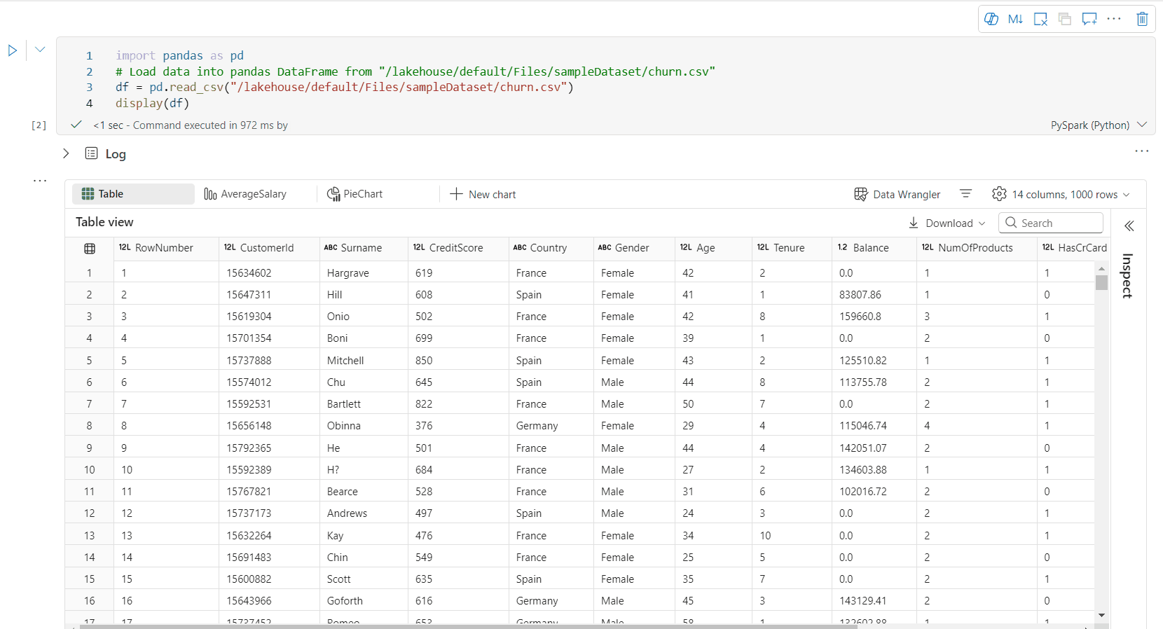
The Fabric built-in visualization function enables you to transform Apache Spark DataFrames, Pandas DataFrames, and SQL query results into rich, interactive data visualizations.
Using the display function, you can render PySpark and Scala Spark DataFrames or Resilient Distributed Datasets (RDDs) as dynamic tables or charts.
You can specify the row count of the dataframe being rendered. The default value is 1000. Notebook display output widget supports to view and profile 10000 rows of a dataframe at most.

You can use the filter function on the global toolbar to apply customized rules to your data. The filter condition is applied to a specified column, and the results are reflected in both the table and chart views.

The output of SQL statement adopts the same output widget with display() by default.
Rich dataframe table view
Free selection support on table view
By default, the Table View is rendered when using the display() command in a Fabric notebook. The rich dataframe preview offers an intuitive free selection function, designed to enhance the data analysis experience by enabling flexible, interactive selection options. This feature allows users to efficiently navigate and explore dataframes with ease.
Column selection
- Single column: Click the column header to select the entire column.
- Multiple columns: After selecting a single column, press and hold the 'Shift' key, then click another column header to select multiple columns.
Row selection
- Single row: Click on a row header to select the entire row.
- Multiple rows: After selecting a single row, press and hold the 'Shift' key, then click another row header to select multiple rows.
Cell content preview: Preview the content of individual cells to get a quick and detailed look at the data without the need to write additional code.
Column summary: Get a summary of each column, including data distribution and key statistics, to quickly understand the characteristics of the data.
Free area selection: Select any continuous segment of the table to get an overview of the total selected cells and the numeric values in the selected area.
Copying Selected Content: In all selection cases, you can quickly copy the selected content using the 'Ctrl + C' shortcut. The selected data is copied in CSV format, making it easy to process in other applications.

Data profiling support via Inspect pane

You can profile your dataframe by clicking on Inspect button. It provides the summarized data distribution and showing statistics of each column.
Each card in the "Inspect" side pane maps to a column of the dataframe, you can view more details by clicking on the card or selecting a column in the table.
You can view the cell details by clicking on the cell of the table. This feature is useful when the dataframe contains long string type of contents.
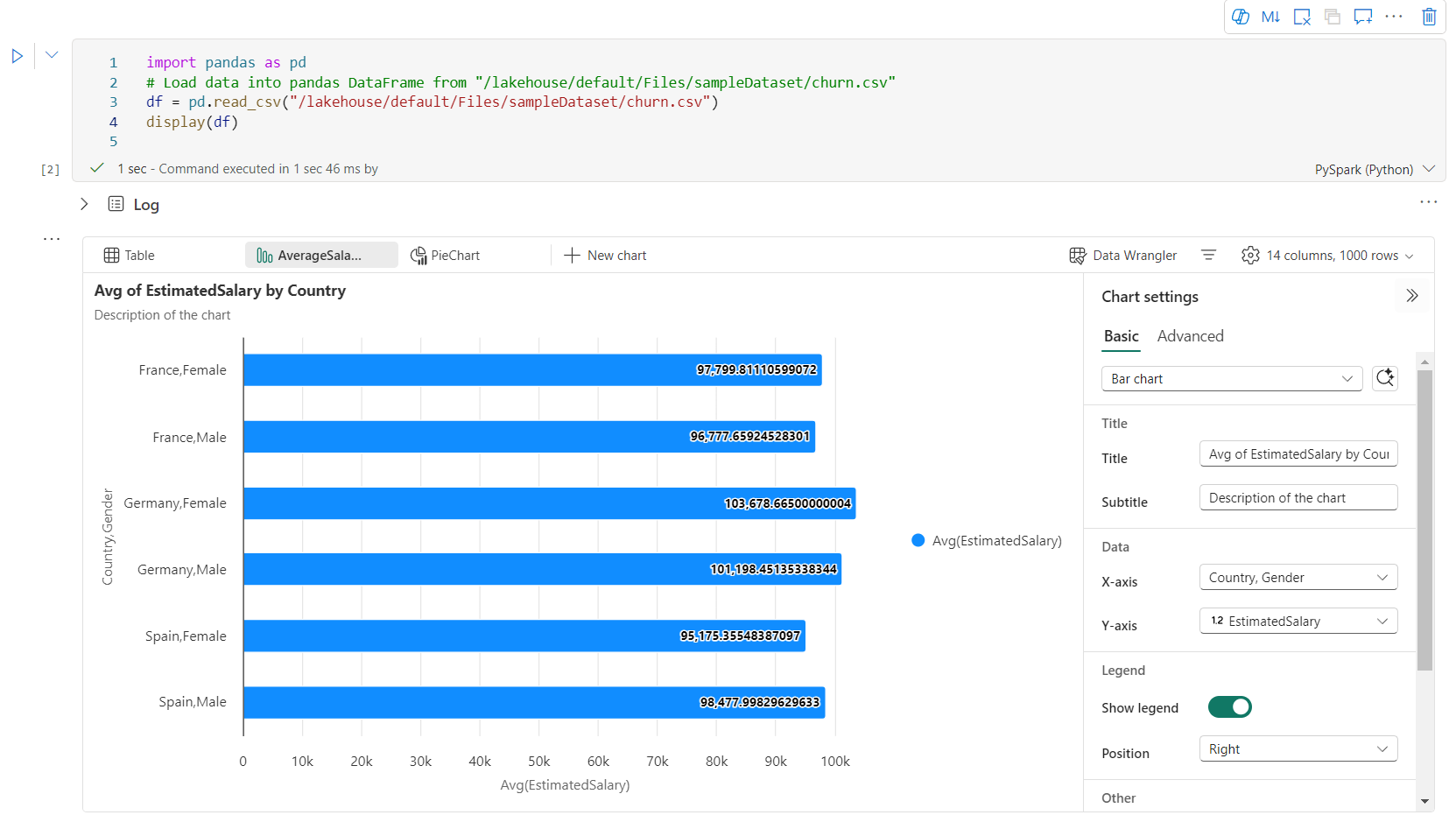
Enhanced Rich DataFrame Chart View
The improved chart view in the display() command offers a more intuitive and dynamic way to visualize your data.
Key Enhancements:
Multi-Chart Support: Add up to five charts within a single display() output widget by selecting New Chart, enabling easy comparisons across different columns.
Smart Chart Recommendations: Get a list of suggested charts based on your DataFrame. Choose to edit a recommended visualization or create a custom chart from scratch.

Flexible Customization: Personalize your visualizations with adjustable settings that adapt based on the selected chart type.
Category Basic settings Description Chart type The display function supports a wide range of chart types, including bar charts, scatter plots, line graphs, pivot table, and more. Title Title The title of the chart. Title Subtitle The subtitle of the chart with more descriptions. Data X-axis Specify the key of the chart. Data Y-axis Specify the values of the chart. Legend Show Legend Enable/disable the legend. Legend Position Customize the position of legend. Other Series group Use this configuration to determine the groups for the aggregation. Other Aggregation Use this method to aggregate data in your visualization. Other Stacked Configure the display style of result. Other Missing and NULL values Configure how missing or NULL chart values are displayed. Note
Additionally, you can specify the number of rows displayed, with a default setting of 1,000. The notebook display output widget supports viewing and profiling up to 10,000 rows of a DataFrame. Select Aggregation over all results and then select Apply to apply the chart generation from the whole dataframe. A Spark job is triggered when the chart setting changes. It might take several minutes to complete the calculation and render the chart.
Category Advanced settings Description Color Theme Define the theme color set of the chart. X-axis Label Specify a label to the X-axis. X-axis Scale Specify the scale function of the X-axis. X-axis Range Specify the value range X-axis. Y-axis Label Specify a label to the Y-axis. Y-axis Scale Specify the scale function of the Y-axis. Y-axis Range Specify the value range Y-axis. Display Show labels Show/hide the result labels on the chart. The changes of configurations take effect immediately, and all the configurations are autosaved in notebook content.
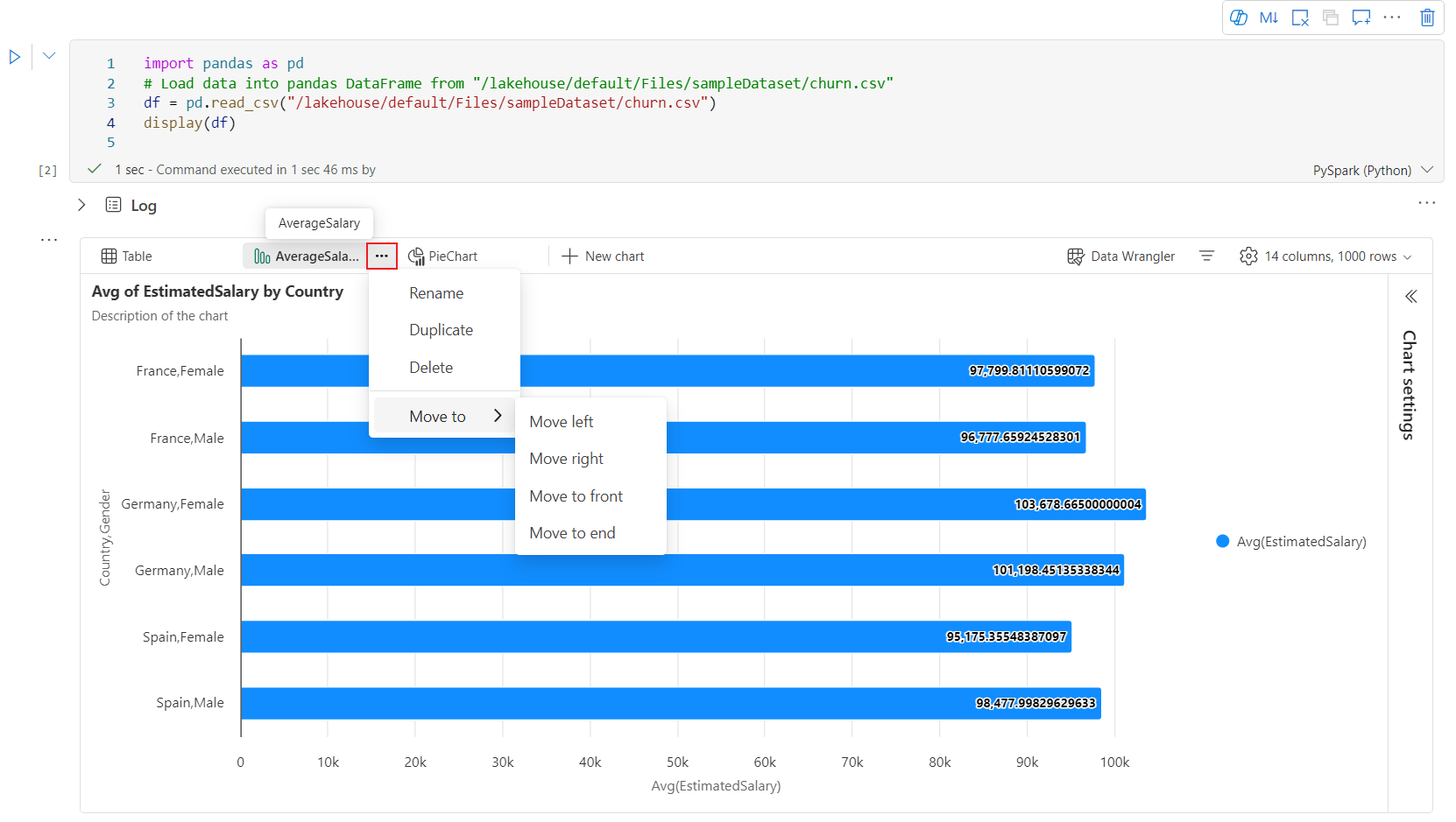
You can easily rename, duplicate, delete, or move charts in the chart tab menu. You can also drag and drop tabs to reorder them. The first tab will be displayed as the default when the notebook is opened.
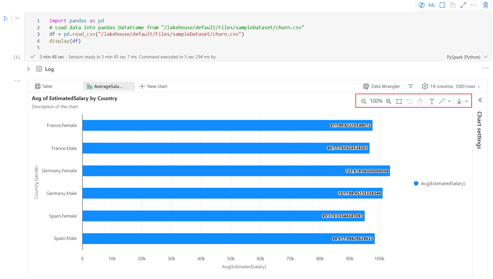
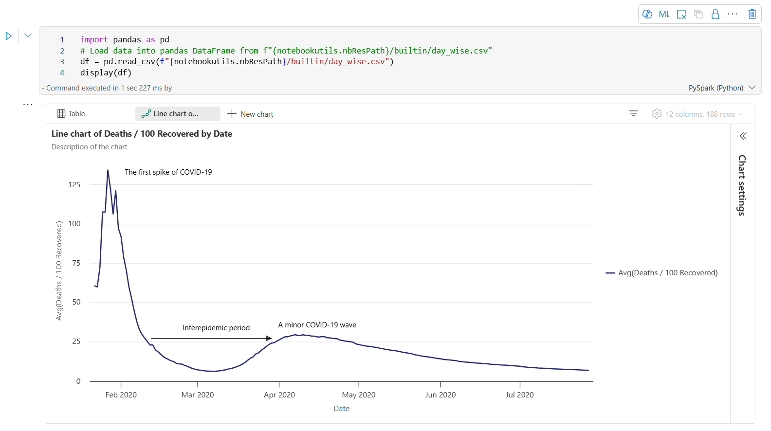
An interactive toolbar is available in the new chart experience when user hovers on a chart. Support operations like zoom in, zoom out, select to zoom, reset, panning, annotation editing, etc.
Here is an example of chart annotation.


display() summary view
Use display(df, summary = true) to check the statistics summary of a given Apache Spark DataFrame. The summary includes the column name, column type, unique values, and missing values for each column. You can also select a specific column to see its minimum value, maximum value, mean value, and standard deviation.

displayHTML() option
Fabric notebooks support HTML graphics using the displayHTML function.
The following image is an example of creating visualizations using D3.js.

To create this visualization, run the following code.
displayHTML("""<!DOCTYPE html>
<meta charset="utf-8">

<!-- Load d3.js -->
<script src="https://d3js.org/d3.v4.js"></script>

<!-- Create a div where the graph will take place -->
<div id="my_dataviz"></div>
<script>

// set the dimensions and margins of the graph
var margin = {top: 10, right: 30, bottom: 30, left: 40},
  width = 400 - margin.left - margin.right,
  height = 400 - margin.top - margin.bottom;

// append the svg object to the body of the page
var svg = d3.select("#my_dataviz")
.append("svg")
  .attr("width", width + margin.left + margin.right)
  .attr("height", height + margin.top + margin.bottom)
.append("g")
  .attr("transform",
        "translate(" + margin.left + "," + margin.top + ")");

// Create Data
var data = [12,19,11,13,12,22,13,4,15,16,18,19,20,12,11,9]

// Compute summary statistics used for the box:
var data_sorted = data.sort(d3.ascending)
var q1 = d3.quantile(data_sorted, .25)
var median = d3.quantile(data_sorted, .5)
var q3 = d3.quantile(data_sorted, .75)
var interQuantileRange = q3 - q1
var min = q1 - 1.5 * interQuantileRange
var max = q1 + 1.5 * interQuantileRange

// Show the Y scale
var y = d3.scaleLinear()
  .domain([0,24])
  .range([height, 0]);
svg.call(d3.axisLeft(y))

// a few features for the box
var center = 200
var width = 100

// Show the main vertical line
svg
.append("line")
  .attr("x1", center)
  .attr("x2", center)
  .attr("y1", y(min) )
  .attr("y2", y(max) )
  .attr("stroke", "black")

// Show the box
svg
.append("rect")
  .attr("x", center - width/2)
  .attr("y", y(q3) )
  .attr("height", (y(q1)-y(q3)) )
  .attr("width", width )
  .attr("stroke", "black")
  .style("fill", "#69b3a2")

// show median, min and max horizontal lines
svg
.selectAll("toto")
.data([min, median, max])
.enter()
.append("line")
  .attr("x1", center-width/2)
  .attr("x2", center+width/2)
  .attr("y1", function(d){ return(y(d))} )
  .attr("y2", function(d){ return(y(d))} )
  .attr("stroke", "black")
</script>

"""
)
Embed a Power BI report in a notebook
Important
This feature is in preview.
The Powerbiclient Python package is now natively supported in Fabric notebooks. You don’t need to do any extra setup (like authentication process) on Fabric notebook Spark runtime 3.4. Just import powerbiclient and then continue your exploration. To learn more about how to use the powerbiclient package, see the powerbiclient documentation.
Powerbiclient supports the following key features.
Render an existing Power BI report
You can easily embed and interact with Power BI reports in your notebooks with just a few lines of code.
The following image is an example of rendering existing Power BI report.

Run the following code to render an existing Power BI report.
from powerbiclient import Report

report_id="Your report id"
report = Report(group_id=None, report_id=report_id)

report
Create report visuals from a Spark DataFrame
You can use a Spark DataFrame in your notebook to quickly generate insightful visualizations. You can also select Save in the embedded report to create a report item in a target workspace.
The following image is an example of a QuickVisualize() from a Spark DataFrame.

Run the following code to render a report from a Spark DataFrame.
# Create a spark dataframe from a Lakehouse parquet table
sdf = spark.sql("SELECT * FROM testlakehouse.table LIMIT 1000")

# Create a Power BI report object from spark data frame
from powerbiclient import QuickVisualize, get_dataset_config
PBI_visualize = QuickVisualize(get_dataset_config(sdf))

# Render new report
PBI_visualize
Create report visuals from a pandas DataFrame
You can also create reports based on a pandas DataFrame in notebook.
The following image is an example of a QuickVisualize() from a pandas DataFrame.

Run the following code to render a report from a Spark DataFrame.
import pandas as pd

# Create a pandas dataframe from a URL
df = pd.read_csv("https://raw.githubusercontent.com/plotly/datasets/master/fips-unemp-16.csv")

# Create a pandas dataframe from a Lakehouse csv file
from powerbiclient import QuickVisualize, get_dataset_config

# Create a Power BI report object from your data
PBI_visualize = QuickVisualize(get_dataset_config(df))

# Render new report
PBI_visualize
Popular libraries
When it comes to data visualization, Python offers multiple graphing libraries that come packed with many different features. By default, every Apache Spark pool in Fabric contains a set of curated and popular open-source libraries.
Matplotlib
You can render standard plotting libraries, like Matplotlib, using the built-in rendering functions for each library.
The following image is an example of creating a bar chart using Matplotlib.


Run the following sample code to draw this bar chart.
# Bar chart

import matplotlib.pyplot as plt

x1 = [1, 3, 4, 5, 6, 7, 9]
y1 = [4, 7, 2, 4, 7, 8, 3]

x2 = [2, 4, 6, 8, 10]
y2 = [5, 6, 2, 6, 2]

plt.bar(x1, y1, label="Blue Bar", color='b')
plt.bar(x2, y2, label="Green Bar", color='g')
plt.plot()

plt.xlabel("bar number")
plt.ylabel("bar height")
plt.title("Bar Chart Example")
plt.legend()
plt.show()
Bokeh
You can render HTML or interactive libraries, like bokeh, using the displayHTML(df).
The following image is an example of plotting glyphs over a map using bokeh.

To draw this image, run the following sample code.
from bokeh.plotting import figure, output_file
from bokeh.tile_providers import get_provider, Vendors
from bokeh.embed import file_html
from bokeh.resources import CDN
from bokeh.models import ColumnDataSource

tile_provider = get_provider(Vendors.CARTODBPOSITRON)

# range bounds supplied in web mercator coordinates
p = figure(x_range=(-9000000,-8000000), y_range=(4000000,5000000),
           x_axis_type="mercator", y_axis_type="mercator")
p.add_tile(tile_provider)

# plot datapoints on the map
source = ColumnDataSource(
    data=dict(x=[ -8800000, -8500000 , -8800000],
              y=[4200000, 4500000, 4900000])
)

p.circle(x="x", y="y", size=15, fill_color="blue", fill_alpha=0.8, source=source)

# create an html document that embeds the Bokeh plot
html = file_html(p, CDN, "my plot1")

# display this html
displayHTML(html)
Plotly
You can render HTML or interactive libraries like Plotly, using the displayHTML().
To draw this image, run the following sample code.

from urllib.request import urlopen
import json
with urlopen('https://raw.githubusercontent.com/plotly/datasets/master/geojson-counties-fips.json') as response:
    counties = json.load(response)

import pandas as pd
df = pd.read_csv("https://raw.githubusercontent.com/plotly/datasets/master/fips-unemp-16.csv",
                   dtype={"fips": str})

import plotly
import plotly.express as px

fig = px.choropleth(df, geojson=counties, locations='fips', color='unemp',
                           color_continuous_scale="Viridis",
                           range_color=(0, 12),
                           scope="usa",
                           labels={'unemp':'unemployment rate'}
                          )
fig.update_layout(margin={"r":0,"t":0,"l":0,"b":0})

# create an html document that embeds the Plotly plot
h = plotly.offline.plot(fig, output_type='div')

# display this html
displayHTML(h)
Pandas
You can view HTML output of pandas DataFrames as the default output. Fabric notebooks automatically show the styled HTML content.

import pandas as pd
import numpy as np

df = pd.DataFrame([[38.0, 2.0, 18.0, 22.0, 21, np.nan],[19, 439, 6, 452, 226,232]],

                  index=pd.Index(['Tumour (Positive)', 'Non-Tumour (Negative)'], name='Actual Label:'),

                  columns=pd.MultiIndex.from_product([['Decision Tree', 'Regression', 'Random'],['Tumour', 'Non-Tumour']], names=['Model:', 'Predicted:']))

df