Note
Access to this page requires authorization. You can try signing in or changing directories.
Access to this page requires authorization. You can try changing directories.
In this article, you learn how to perform exploratory data analysis by using Azure Open Datasets and Apache Spark. This article analyzes the New York City taxi dataset. The data is available through Azure Open Datasets. This subset of the dataset contains information about yellow taxi trips: information about each trip, the start and end time and locations, the cost, and other interesting attributes.
In this article, you:
- Download and prepare data
- Analyze data
- Visualize data
Prerequisites
Get a Microsoft Fabric subscription. Or, sign up for a free Microsoft Fabric trial.
Sign in to Microsoft Fabric.
Switch to Fabric by using the experience switcher on the lower-left side of your home page.

Download and prepare the data
To start, download the New York City (NYC) Taxi dataset and prepare the data.
Create a notebook by using PySpark. For instructions, see Create a notebook.
Note
Because of the PySpark kernel, you don't need to create any contexts explicitly. The Spark context is automatically created for you when you run the first code cell.
In this article, you use several different libraries to help visualize the dataset. To do this analysis, import the following libraries:
import matplotlib.pyplot as plt
import seaborn as sns
import pandas as pd
Because the raw data is in Parquet format, you can use the Spark context to pull the file into memory as a DataFrame directly. Use the Open Datasets API to retrieve the data and create a Spark DataFrame. To infer the datatypes and schema, use the Spark DataFrame schema on read properties.
from azureml.opendatasets import NycTlcYellow

end_date = parser.parse('2018-06-06')
start_date = parser.parse('2018-05-01')
nyc_tlc = NycTlcYellow(start_date=start_date, end_date=end_date)
nyc_tlc_pd = nyc_tlc.to_pandas_dataframe()

df = spark.createDataFrame(nyc_tlc_pd)
After the data is read, do some initial filtering to clean the dataset. You might remove unneeded columns and add columns that extract important information. In addition, you can filter out anomalies within the dataset.
# Filter the dataset
from pyspark.sql.functions import *

filtered_df = df.select('vendorID', 'passengerCount', 'tripDistance','paymentType', 'fareAmount', 'tipAmount'\
                                , date_format('tpepPickupDateTime', 'hh').alias('hour_of_day')\
                                , dayofweek('tpepPickupDateTime').alias('day_of_week')\
                                , dayofmonth(col('tpepPickupDateTime')).alias('day_of_month'))\
                            .filter((df.passengerCount > 0)\
                                & (df.tipAmount >= 0)\
                                & (df.fareAmount >= 1) & (df.fareAmount <= 250)\
                                & (df.tripDistance > 0) & (df.tripDistance <= 200))

filtered_df.createOrReplaceTempView("taxi_dataset")
Analyze data
As a data analyst, you have a wide range of tools available to help you extract insights from the data. In this part of the article, learn about a few useful tools available within Microsoft Fabric notebooks. In this analysis, you want to understand the factors that yield higher taxi tips for the selected period.
Apache Spark SQL Magic
First, do exploratory data analysis by using Apache Spark SQL and magic commands with the Microsoft Fabric notebook. After you have the query, visualize the results by using the built-in chart options capability.
In the notebook, create a new cell and copy the following code. By using this query, you can understand how the average tip amounts change over the period you select. This query also helps you identify other useful insights, including the minimum/maximum tip amount per day and the average fare amount.
%%sql
SELECT
    day_of_month
    , MIN(tipAmount) AS minTipAmount
    , MAX(tipAmount) AS maxTipAmount
    , AVG(tipAmount) AS avgTipAmount
    , AVG(fareAmount) as fareAmount
FROM taxi_dataset
GROUP BY day_of_month
ORDER BY day_of_month ASC
After your query finishes running, you can visualize the results by switching to the chart view. This example creates a line chart by specifying the
day_of_monthfield as the key andavgTipAmountas the value. After you make the selections, select Apply to refresh your chart.
Visualize data
In addition to the built-in notebook charting options, you can use popular open-source libraries to create your own visualizations. In the following examples, use Seaborn and Matplotlib, which are commonly used Python libraries for data visualization.
To make development easier and less expensive, downsample the dataset. Use the built-in Apache Spark sampling capability. In addition, both Seaborn and Matplotlib require a Pandas DataFrame or NumPy array. To get a Pandas DataFrame, use the
toPandas()command to convert the DataFrame.# To make development easier, faster, and less expensive, downsample for now sampled_taxi_df = filtered_df.sample(True, 0.001, seed=1234) # The charting package needs a Pandas DataFrame or NumPy array to do the conversion sampled_taxi_pd_df = sampled_taxi_df.toPandas()You can understand the distribution of tips in the dataset. Use Matplotlib to create a histogram that shows the distribution of tip amount and count. Based on the distribution, you can see that tips are skewed toward amounts less than or equal to $10.
# Look at a histogram of tips by count by using Matplotlib

ax1 = sampled_taxi_pd_df['tipAmount'].plot(kind='hist', bins=25, facecolor='lightblue')
ax1.set_title('Tip amount distribution')
ax1.set_xlabel('Tip Amount ($)')
ax1.set_ylabel('Counts')
plt.suptitle('')
plt.show()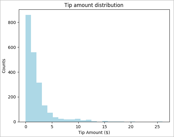
Next, try to understand the relationship between the tips for a given trip and the day of the week. Use Seaborn to create a box plot that summarizes the trends for each day of the week.
# View the distribution of tips by day of week using Seaborn
ax = sns.boxplot(x="day_of_week", y="tipAmount",data=sampled_taxi_pd_df, showfliers = False)
ax.set_title('Tip amount distribution per day')
ax.set_xlabel('Day of Week')
ax.set_ylabel('Tip Amount ($)')
plt.show()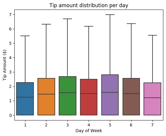
Another hypothesis might be that there's a positive relationship between the number of passengers and the total taxi tip amount. To verify this relationship, run the following code to generate a box plot that illustrates the distribution of tips for each passenger count.
# How many passengers tipped by various amounts
ax2 = sampled_taxi_pd_df.boxplot(column=['tipAmount'], by=['passengerCount'])
ax2.set_title('Tip amount by Passenger count')
ax2.set_xlabel('Passenger count')
ax2.set_ylabel('Tip Amount ($)')
ax2.set_ylim(0,30)
plt.suptitle('')
plt.show()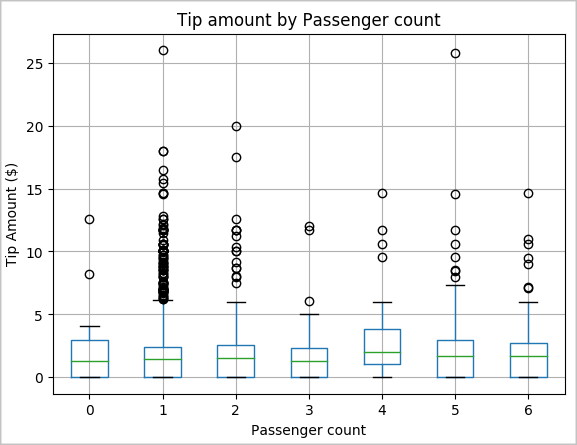
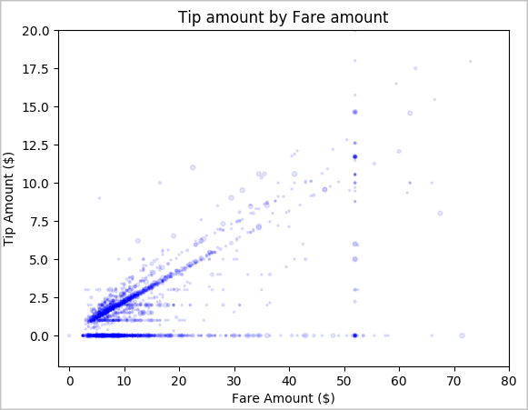
Last, explore the relationship between the fare amount and the tip amount. Based on the results, you can see that there are several observations where people don't tip. However, there's a positive relationship between the overall fare and tip amounts.
# Look at the relationship between fare and tip amounts

ax = sampled_taxi_pd_df.plot(kind='scatter', x= 'fareAmount', y = 'tipAmount', c='blue', alpha = 0.10, s=2.5*(sampled_taxi_pd_df['passengerCount']))
ax.set_title('Tip amount by Fare amount')
ax.set_xlabel('Fare Amount ($)')
ax.set_ylabel('Tip Amount ($)')
plt.axis([-2, 80, -2, 20])
plt.suptitle('')
plt.show()