What's New in DevTools (Microsoft Edge 104)
To check out the latest features of Microsoft Edge DevTools and the Microsoft Edge DevTools extension for Microsoft Visual Studio Code and Visual Studio, read these announcements.
To stay up to date and get the latest DevTools features, download an Insiders preview version of Microsoft Edge. Whether you're on Windows, Linux, or macOS, consider using Canary (or another preview channel) as your default development browser. The Beta, Dev, and Canary versions of Microsoft Edge run as separate apps, side-by-side with the stable, released version of Microsoft Edge. See Microsoft Edge Insider Channels.
For the latest announcements, follow the Microsoft Edge team on Twitter. To report a problem with DevTools or ask for a new feature, file an issue in the MicrosoftEdge/DevTools repo.
Video: What's new in DevTools 104
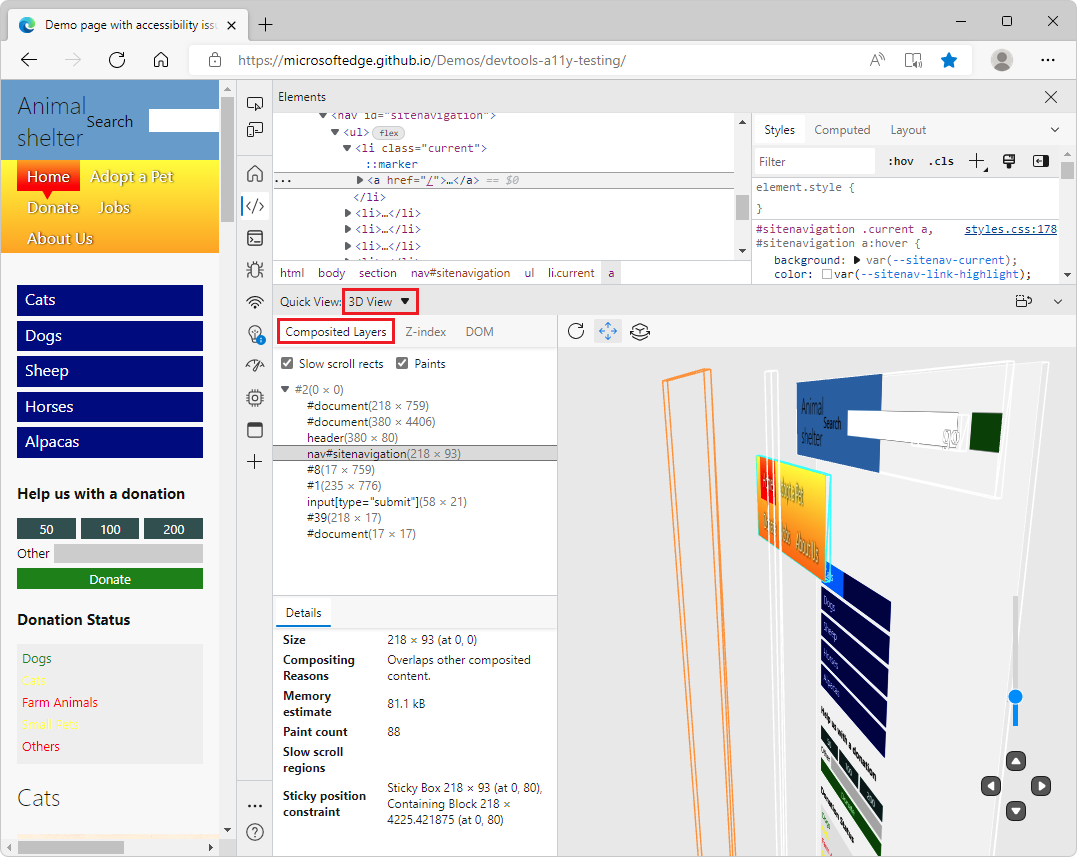
Use Layers in 3D View
The standalone Layers tool has been removed in Microsoft Edge version 104. In previous versions of Microsoft Edge, the Layers tool redirected users to the 3D View tool.
In the 3D View tool, the Composited Layers view has all the features you love from the Layers tool, along with some updates. The Composited Layers view is now complemented by two other visual debugging panes: DOM and Z-index. Combine these additional views with the Composited Layers view for better debugging.
See also:
- Debug the web in 3D with the 3D View tool
- Navigate webpage layers, z-index, and DOM using the 3D View tool
In Issues tool, long request URLs have been shortened
The Issues tool provides recommendations to improve a web page's accessibility, performance, security, and more. Some of these recommendations include a link to a network request that opens in the Network tool.
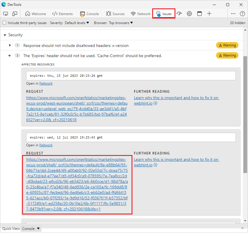
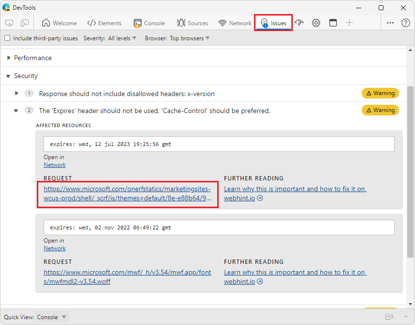
Previously, issues related to network requests displayed the entire URL for the network request. When these URLs were lengthy, they took up a lot of space, making the list of issues difficult to browse. In Microsoft Edge 104, these long request URL links have been truncated to take up less space. The links still direct to the relevant part of the Network tool.
In previous versions of Microsoft Edge:
In Microsoft Edge version 104:
See also:
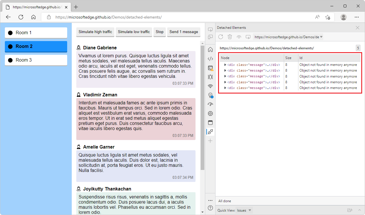
Improved accessibility for the Detached Elements tool
In previous versions of Microsoft Edge, when selecting the table of detached elements in the Detached Elements feature, assistive technology only announced "Table" and the number of rows and columns. In Microsoft Edge version 104, this issue has been fixed. When selecting the table of detached elements in the Detached Elements feature, assistive technology now announces "Detached Elements List, Table" and the number of rows and columns.
See also:
- Tools for investigating detached elements in Fix memory problems.
- Debug DOM memory leaks by using the Detached Elements tool
- Navigate DevTools with assistive technology
Fix: Arrows representing web socket traffic now render correctly in the Network tool
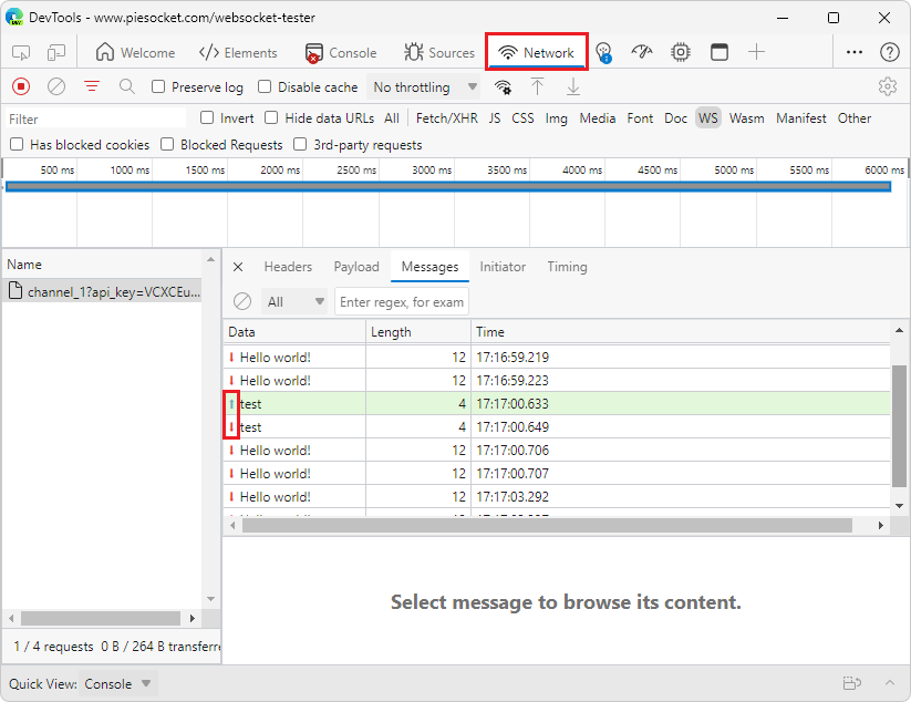
In previous versions of Microsoft Edge, when inspecting web socket traffic in the Network tool, the arrows representing whether a message was sent from the client or server were not rendering correctly. In Microsoft Edge 104, this issue has been fixed. Thank you for sending us your feedback about this issue!
- Green up-arrows (
 ) represent messages sent by the client.
 - Red down-arrows (
 ) represent messages sent by the server.
See also:
Announcements from the Chromium project
Microsoft Edge 104 also includes the following updates from the Chromium project:
- Restart frame during debugging
- Group files by Authored / Deployed in the Sources panel
- New User Timings track in the Performance insights panel
- Reveal assigned slot of an element
- Simulate hardware concurrency for Performance recordings
- Preview non-color value when autocompleting CSS variables
- Identify blocking frames in the Back/forward cache pane
- Improved autocomplete suggestions for JavaScript objects
- Sourcemaps improvements
