Note
Access to this page requires authorization. You can try signing in or changing directories.
Access to this page requires authorization. You can try changing directories.
Icons are the visual representation of a behavior or concept. They're often used to add meaning to controls and commands. Visuals, either realistic or symbolic, enable the user to navigate the UI the same way signs help users navigate their environment. They should be simple, clear, and contain only the necessary details to enable customers to quickly parse what action will occur when they choose a control.
Note
This article is about designing icons for ribbon buttons. For guidance about icons that represent the add-in in the app acquisition and management UIs of Microsoft 365 applications, see Design icons for add-in acquisition and management.
Office app ribbon interfaces have a standard visual style. This ensures consistency and familiarity across Office apps. The guidelines in this article help you design a set of PNG assets for your solution that fit in as a natural part of Office.
Monoline style
The goal of the Monoline style is to have consistent, clear, and accessible iconography to communicate action and features with simple visuals, ensure the icons are accessible to all users, and have a style that is consistent with those used elsewhere in Windows.
The following guidelines are for third-party developers who want to create icons for features that will be consistent with the icons already present in Office products.
Design principles
- Simple, clean, clear.
- Contain only necessary elements.
- Inspired by Windows icon style.
- Accessible to all users.
Convey meaning
- Use descriptive elements such as a page to represent a document or an envelope to represent mail.
- Use the same element to represent the same concept. For example, mail is always represented by an envelope, not a stamp.
- Use a core metaphor during concept development.
Reduction of elements
- Reduce the icon to its core meaning, using only elements that are essential to the metaphor.
- Limit the number of elements in an icon to two, regardless of icon size.
Consistency
Sizes, arrangement, and color of icons should be consistent.
Styling
Perspective
Monoline icons are forward-facing by default. Certain elements that require perspective or rotation, such as a cube, are allowed, but exceptions should be kept to a minimum.
Embellishment
Monoline is a clean minimal style. Everything uses flat color, which means there are no gradients, textures, or light sources.
Designing
Sizes
We recommend that you produce each icon in all these sizes to support high DPI devices. The absolutely required sizes are 16 px, 20 px, and 32 px, as those are the 100% sizes.
16 px, 20 px, 24 px, 32 px, 40 px, 48 px, 64 px, 80 px, 96 px
Important
For guidance on how to create an icon for your add-in that adheres to certain formatting requirements, see Create effective listings in Microsoft Marketplace and within Office.
Layout
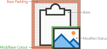
The following is an example of icon layout with a modifier.

Elements
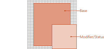
Base: The main concept that the icon represents. This is usually the only visual needed for the icon, but sometimes the main concept can be enhanced with a secondary element, a modifier.
Modifier: Any element that overlays the base; that is, a modifier that typically represents an action or a status. It modifies the base element by acting as an addition, alteration, or a descriptor.
Construction
Element placement
Base elements are placed in the center of the icon within the padding. If it can't be placed perfectly centered, then the base should err to the top right. In the following example, the icon is perfectly centered.
In the following example, the icon is erring to the left.
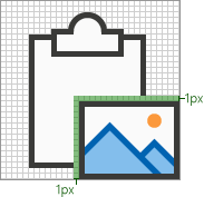
Modifiers are almost always placed in the bottom right corner of the icon canvas. In some rare cases, modifiers are placed in a different corner. For example, if the base element would be unrecognizable with the modifier in the bottom right corner, then consider placing it in the upper left corner.

Padding
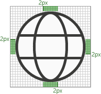
Each size icon has a specified amount of padding around the icon. The base element stays within the padding, but the modifier should align with the edge of the canvas, extending beyond the padding to the edge of the icon border. The following images show the recommended padding to use for each of the icon sizes.
| 16px | 20px | 24px | 32px | 40px | 48px | 64px | 80px | 96px |
|---|---|---|---|---|---|---|---|---|

|

|

|

|

|

|

|

|

|
Line weights
Monoline is a style dominated by line and outlined shapes. Depending on what size you're producing, the icon should use the following line weights.
| Icon Size: | 16px | 20px | 24px | 32px | 40px | 48px | 64px | 80px | 96px |
|---|---|---|---|---|---|---|---|---|---|
| Line Weight: | 1px | 1px | 1px | 1px | 2px | 2px | 2px | 2px | 3px |
| Example icon: |

|

|

|

|

|

|

|

|

|
Cutouts
When an icon element is placed on top of another element, a cutout (of the bottom element) is used to provide space between the two elements, mainly for readability purposes. This usually happens when a modifier is placed on top of a base element, but there are also cases where neither of the elements is a modifier. These cutouts between the two elements are sometimes referred to as a "gap".
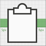
The size of the gap should be the same width as the line weight used on that size. If making a 16 px icon, the gap width would be 1px and if it's a 48 px icon then the gap should be 2px. The following example shows a 32 px icon with a gap of 1px between the modifier and the underlying base.
In some cases, the gap can be increased by a 1/2 px if the modifier has a diagonal or curved edge and the standard gap doesn't provide enough separation. This will likely only affect the icons with 1px line weight: 16 px, 20 px, 24 px, and 32 px.
Background fills
Most icons in the Monoline icon set require background fills. However, there are cases where the object wouldn't naturally have a fill, so no fill should be applied. The following icons have a white fill.

The following icons have no fill. (The gear icon is included to show that the center hole isn't filled.)

Best practices for fills
Do
- Fill any element that has a defined boundary, and would naturally have a fill.
- Use a separate shape to create the background fill.
- Use Background Fill from the color palette.
- Maintain the pixel separation between overlapping elements.
- Fill between multiple objects.
Don't
- Don't fill objects that wouldn't naturally be filled; for example, a paperclip.
- Don't fill brackets.
- Don't fill behind numbers or alpha characters.
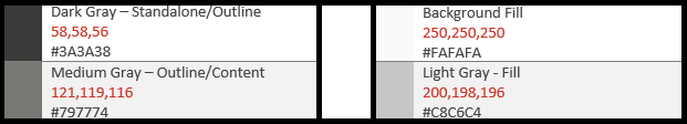
Color
The color palette has been designed for simplicity and accessibility. It contains 4 neutral colors and two variations for blue, green, yellow, red, and purple. Orange is intentionally not included in the Monoline icon color palette. Each color is intended to be used in specific ways as outlined in this section.
Palette
How to use color
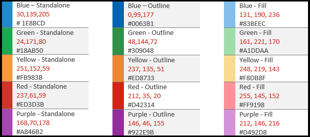
In the Monoline color palette, all colors have Standalone, Outline, and Fill variations. Generally, elements are constructed with a fill and a border. The colors are applied in one of the following patterns.
- The Standalone color alone for objects that have no fill.
- The border uses the Outline color and the fill uses the Fill color.
- The border uses the Standalone color and the fill uses the Background Fill color.
The following are examples of using color.
The most common situation is that an element uses Dark Gray Standalone with Background Fill.
When using a colored Fill, it should always be with its corresponding Outline color. For example, Blue Fill should only be used with Blue Outline. But there are two exceptions to this general rule.
- Background Fill can be used with any color Standalone.
- Light Gray Fill can be used with two different Outline colors: Dark Gray or Medium Gray.
When to use color
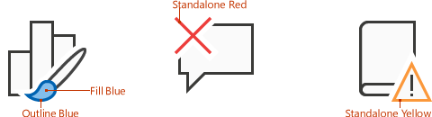
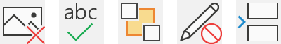
Color should be used to convey the meaning of the icon rather than for embellishment. It should highlight the action to the user. When a modifier is added to a base element that has color, the base element is typically turned into Dark Gray and Background Fill so that the modifier can be the element of color, such as the case below with the "X" modifier being added to the picture base in the leftmost icon of the following set.
You should limit your icons to one additional color, other than the Outline and Fill mentioned above. However, more colors can be used if it's vital for its metaphor, with a limit of two additional colors other than gray. In rare cases, there are exceptions when more colors are needed. The following are good examples of icons that use just one color.
But the following icons use too many colors.
Use Medium Gray for interior "content", such as grid lines in an icon of a spreadsheet. Additional interior colors are used when the content needs to show the behavior of the control.

Text lines
When text lines are in a "container" (for example, text on a document), use medium gray. Text lines not in a container should be Dark Gray.
Text
Avoid using text characters in icons. Since Office products are used around the world, we want to keep icons as language neutral as possible.
Production
Icon file format
The final icons should be saved as .png image files. Use PNG format with a transparent background and have 32-bit depth.
Using icons in your add-in
Add-in commands add buttons, text, and icons to the Office UI. Your add-in command buttons should provide meaningful icons and labels that clearly identify the action the user is taking when they use a command. Follow the stylistic and production guidelines in this article to help you design icons that integrate seamlessly with Office.
Many HTML containers contain controls with iconography. Use Fabric Core's custom font to render Office styled icons in your add-in. The icon font provided by Fabric Core contains many glyphs for common Office metaphors that you can scale, color, and style to suit your needs. If you have an existing visual language with your own set of icons, feel free to use it in your HTML canvases. Building continuity with your own brand with a standard set of icons is an important part of any design language. Be careful to avoid creating confusion for customers by conflicting with Office metaphors.
See also
- Add-in development best practices
- Add-in commands for Excel, Word, and PowerPoint
- Create an icon for your add-in
Unified manifest reference
Add-in only manifest reference
Collaborate with us on GitHub
The source for this content can be found on GitHub, where you can also create and review issues and pull requests. For more information, see our contributor guide.
Office Add-ins