Note
Access to this page requires authorization. You can try signing in or changing directories.
Access to this page requires authorization. You can try changing directories.
Important
Effective August 29, 2025, Cards for Power Apps will be deprecated and no longer supported. As a result, any Cards for Power Apps that have been built and shared in Microsoft Teams will not function. Users will not be able to create new cards or execute existing ones.
We recommend migrating any functionality you rely on from Cards for Power Apps before the deprecation date. Consider transitioning to either Adaptive Cards in Copilot Studio or adaptive cards for Microsoft Teams for similar functionality. More information: Deprecation of Cards for Power Apps
Cards can have multiple screens, each presenting a different interface for a specific scenario or purpose. For example, a polling card might have a screen to collect user responses and a screen to show the current aggregated poll results. Use buttons to let users switch between screens or use Power Fx formulas for more complex scenarios. Insert, modify, and remove them in the card designer.
Prerequisites
- A Power Apps account
- A card
Tree view
View the screens in your card and the controls you've added to them using the card designer tree view.
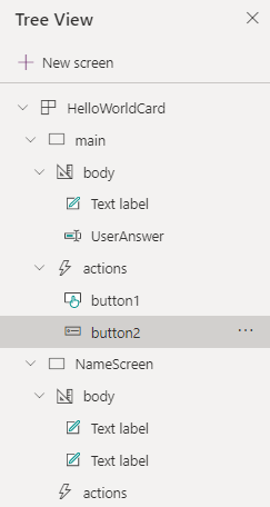
Create a screen
- Sign in to Power Apps. Select Cards, and then select a card. If the Cards tab is not visible, select More and pin the Cards tab.
- In the left pane of the card designer, select Tree View.
- Select + New screen.
- Enter a name for your screen and select Create. Spaces and special characters aren't allowed in screen names.
- Add controls, data, and variables to the screen as needed.
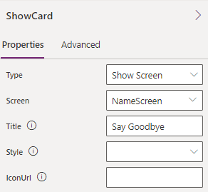
Use a Show Screen button to open a screen
- In the left pane of the card designer, select Insert.
- Select Input to expand the category, and then select Button to add a button to your card.
- In the button properties pane, set Type to Show Screen.
- Set Screen to the screen you want the button to show, and then set Title to the label to display on the button.
This will show a screen directly underneath the existing screen with both being interactive.
Use a Power Fx expression to open a screen
The Power Fx Back and Navigate functions switch between screens.
The Show Screen button opens a screen underneath the existing screen, keeping both screens visible, while the Power Fx Back and Navigate functions change the screen that is visible to the user. The Back and Navigate functions can also be used outside of buttons and are appropriate for more complex screen-switching scenarios.
For more information about Back and Navigate, see the Power Fx reference documentation syntax, examples, and step-by-step instructions.
Screen properties
On show – A Power Fx expression that is executed after the screen is shown.
Fallback text - Text shown when the client doesn't support the version specified (may contain markdown).
Speak - Specifies what should be spoken for this entire card. This is simple text or SSML fragment.
Minimum height - Specifies the minimum height of the card. In pixels, e.g. '500px'.
Content alignment - Defines how the content should be aligned vertically within the container. Only relevant for fixed-height cards, or cards with a minimum height specified.
Background image - A boolean property that indicates whether the screen should have a background image for the screen. Acceptable formats are PNG, JPEG, and GIF.
Url - The url or base64 encoded media that defines the background image for the screen.
Horizontal alignment - How the background image is aligned with the screen.
Vertical alignment - Describes how the image should be aligned if it must be cropped or if using repeat fill mode.
FillMode - Describes how the background image should fill the area.
Select action - Action that is invoked when the screen is selected.