Add controls to a card
Controls are the building blocks of your card's interface and functionality. They add text, images, and other elements to create a rich cards experience. Insert, modify, and remove them in the card designer.
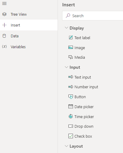
There are three categories of controls that you can add to your card:
- Display: Controls that display information, including text, images, and other media
- Input: Controls that ask for information from users, such as text, numbers, and dates, or that allow the user to interact with the card, such as buttons and lists
- Layout: Controls that modify the layout and appearance of controls
Prerequisites
- A Power Apps account
- A card
Insert a control
To get started, sign in to Power Apps and then select Cards. If the item isn’t in the side panel pane, select …More and then select the item you want.
Select Create a card.
In the left pane of the card designer, select Insert.
In the tool pane, select a category to expand it, and then select a control from the list to place it on the card. You can also drag a control from the list and drop it on the card.
With the control selected, use the properties pane to modify it.
Rename a control
Sign in to Power Apps and then select Cards. If the item isn’t in the side panel pane, select …More and then select the item you want.
Select a card.
In the left pane of the card designer, select Tree View.
Double click a control to rename or select a control and click the pencil icon next to the current control name in the right-hand properties pane.
Controls reference
Learn about the different controls and their properties.
Feedback
Coming soon: Throughout 2024 we will be phasing out GitHub Issues as the feedback mechanism for content and replacing it with a new feedback system. For more information see: https://aka.ms/ContentUserFeedback.
Submit and view feedback for