Note
Access to this page requires authorization. You can try signing in or changing directories.
Access to this page requires authorization. You can try changing directories.
In this tutorial, you'll create a dataset code component, deploy it, and configure it inside a model-driven app using Visual Studio Code. The code component displays a paged, scrollable dataset grid that provides sortable and filterable columns. It also allows highlighting specific rows by configuring an indicator column. The dataset code component can be linked to a table main grid, view, or subgrid.
In addition to these requirements, you'll also ensure the code component follows best practice guidance:
- Use of Microsoft Fluent UI
- Localization of the code component labels at both design and runtime
- Assurance that the component is responsive and renders at 100% of the height available, apart from where the height is provided by the maker when configuring the code component on the subgrid
- Assurance of support for full-screen mode
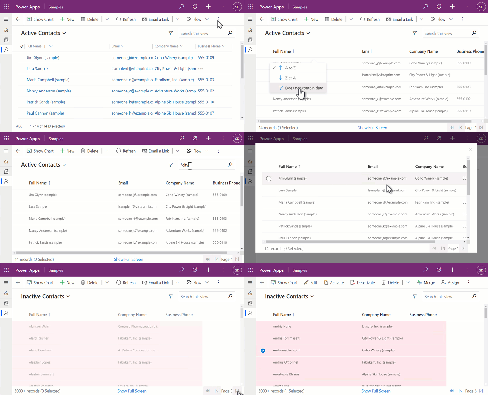
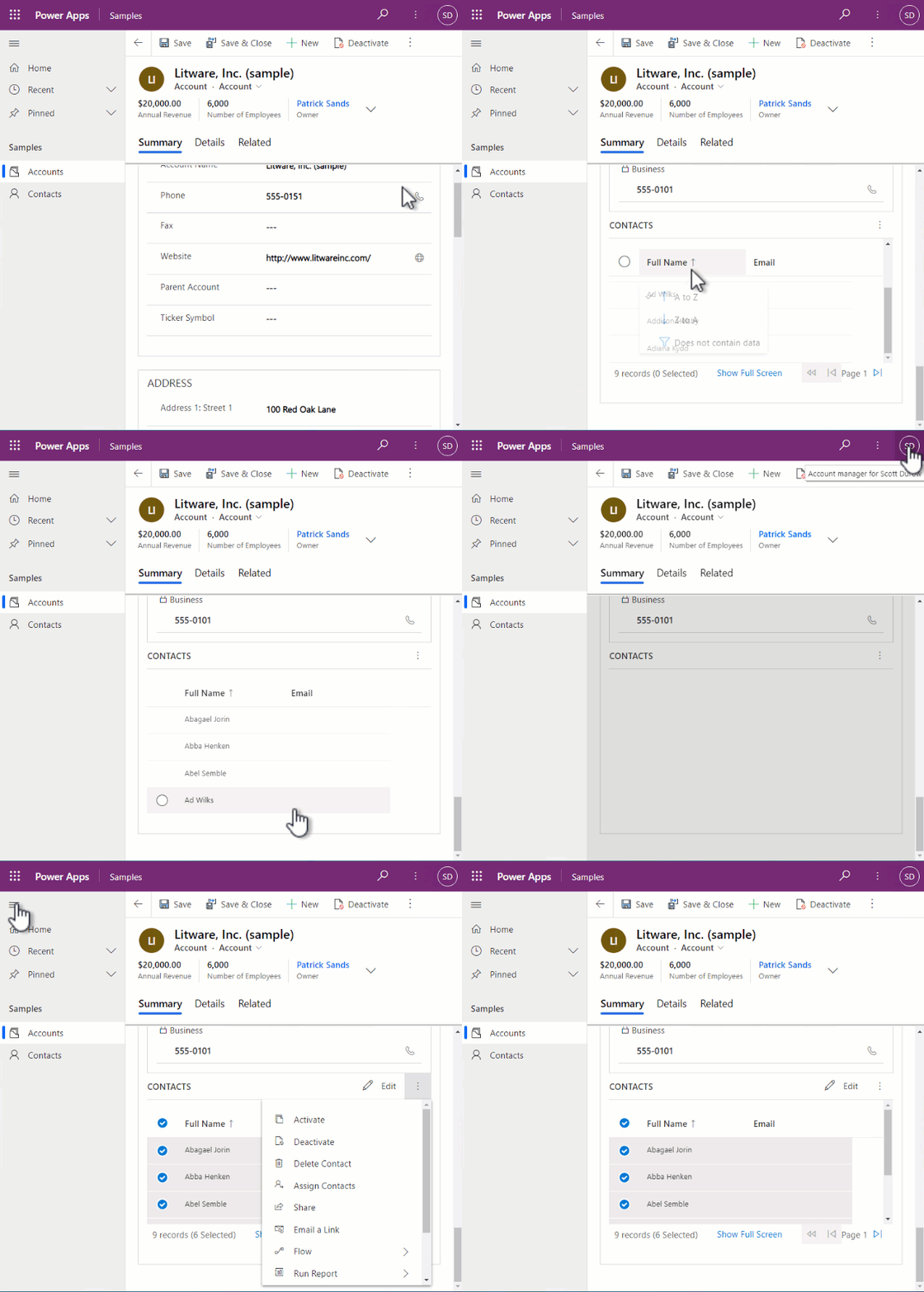
From the above, you'll see that:
- Selecting record(s) on the grid enables the use of the command bar actions associated with the record(s) selected.
- The header row stays in place while the records are scrolled when there's not enough vertical height to accommodate the whole page.
- The code component can be viewed in full-screen mode. This is especially important on small-screen formats. When opening in full-screen, the code component is not reinitialized, but instead, the
allocatedWidthandallocatedHeightare updated, and the component is re-rendered via a call toupdateView. - The quick-find search box can be used with the code component to filter records.
- The footer shows the number of records, current page, and paging controls.
Before you go further, see the Creating a canvas app dataset component tutorial to learn more about prerequisites, techniques used, and how to build and deploy code component.
Download and install the model-driven app sample code
Firstly, download the sample code to a folder called ModelDrivenGrid. To install the code component, open the folder that contains the pcfproj inside Visual Studio Code and, at the terminal, use:
npm install
Ensure that you have a solution publisher created with the samples prefix, described in Creating a canvas app dataset component tutorial: Deploy and configure the component. Also, make sure that you have authenticated against Microsoft Dataverse using pac auth.
At the terminal, use:
pac pcf push -pp samples
This deploys the code component into Dataverse so that it can be configured. More information: Creating a canvas app dataset component tutorial.
Differences between the model-driven and canvas apps dataset samples
Although the two samples are likely the same, there are a few notable differences that must be considered when building code components for model-driven apps compared to canvas apps:
Grid.tsx differences
The column object provided by model-driven apps gives a visualSizeFactor that's configured by the app maker for a specific view. This is used to control the size of columns and is used by the code when creating the
DetailsListcolumns. The columns and their properties supplied to the code component depends on the specific view selected at runtime. This is different from canvas apps. The columns are configured for a particular instance of a code component when added to a screen.When code components are added to a model-driven table main grid or related records grid,
allocatedHeightwill always return -1. The code component must use a CSS style to fill 100% of the available space. When on subgrids, a height must be provided by the maker configuring the code component to define the height to which it should expand. More information:trackContainerResize.Unlike the canvas app grid sample, an overlay message is added when there are no records in the current dataset. This is because in canvas apps, it's recommended to leave as much of the UI to the hosting app as possible, where in model-driven apps, the dataset code component needs to be self-contained.
Unlike canvas apps, the
paging.totalResultCountis used to display the total number of records in the current dataset. If this value is -1, it means there are more than 5,000 in the current dataset.When sorting a dataset that contains no records, the subsequent call to
updateViewwill not containdatasetas it does in canvas apps. Since theisLoadingflag is cleared inupdateViewwhen new data is received, the sample must not set theisLoadingcomponent state when sorting empty datasets, otherwise this flag will never be cleared.
index.tsx differences
The initial call to
updateViewwill not include dataset in theupdatedPropertiesin model-driven apps. For this reason, you must add an additional condition to detect when to update the grid:const initialLoad = !this.sortedRecordsIds && dataset.sortedRecordIds;Since there's a new input property
SubGridHeightthat's set by the maker when the code component is added to a form subgrid, you add an additional check to use this value for the height if it's defined, and when not in full-screen mode:if (!this.isFullScreen && context.parameters.SubGridHeight.raw) { allocatedHeight = context.parameters.SubGridHeight.raw; }
ControlManifest.Input.xml differences
- Since there's no need for the
FilteredRecordCountoutput property (because you display the 'No Records' message internally to the code component), it is removed. Consequently, we don't need to return a value insidegetOutputsor callnotifyOutputChangedwhen the record count has changed. - The property-set
HighlightIndicatoris defined as typeOptionSetsince you're binding it to thestatuscodecolumn on the dataset, which is then used to control row highlighting. - You add a CSS file to the code component. This provides a workaround for ensuring the Fluent UI
StickyHeaderappears on top of the view selector and other flyout components of model-driven apps.
Configuring the code component on main grid
To configure the code component to be displayed on the contact table inside a model-driven app:
Open the Contact table inside the classic solution editor.
Navigate to the Controls tab and select Add Control.
Select the Model Driven Grid code component from the list and then select Add.
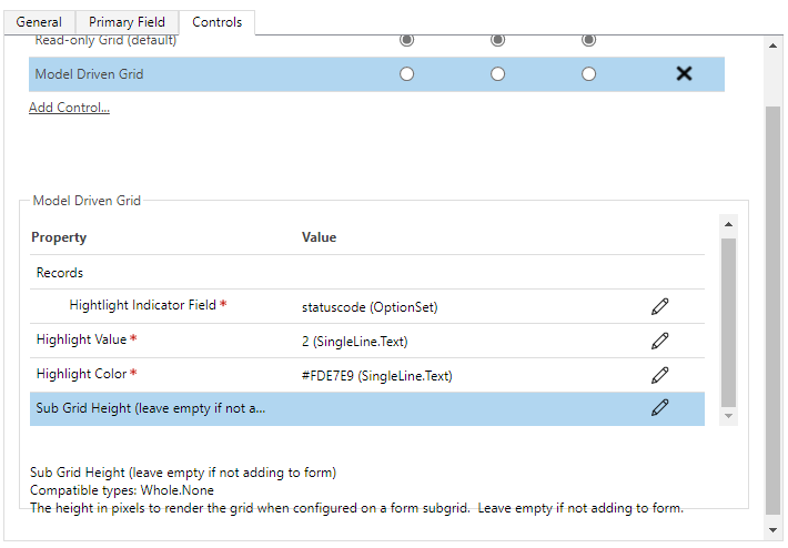
Set the Properties as follows:
- Highlight Indicator Field - This maps to the
property-setin theControlManifest.Input.xmland is used to indicate which column to compare against for row highlighting. Set this to be the columnstatuscode. - Highlight Value - This is the value you compare
statuscodeagainst to control row highlighting. Set this to be 2, which is equivalent to Inactive. - Highlight Color - This is the color that rows will be set to if
statuscodeis Inactive. Set to a color of your choice for highlighting (for example,#FDE7E9, which is light red).
- Highlight Indicator Field - This maps to the
You can also set the code component to show as default for web, phone, or tablet by selecting the corresponding radio buttons.
Save and Publish.
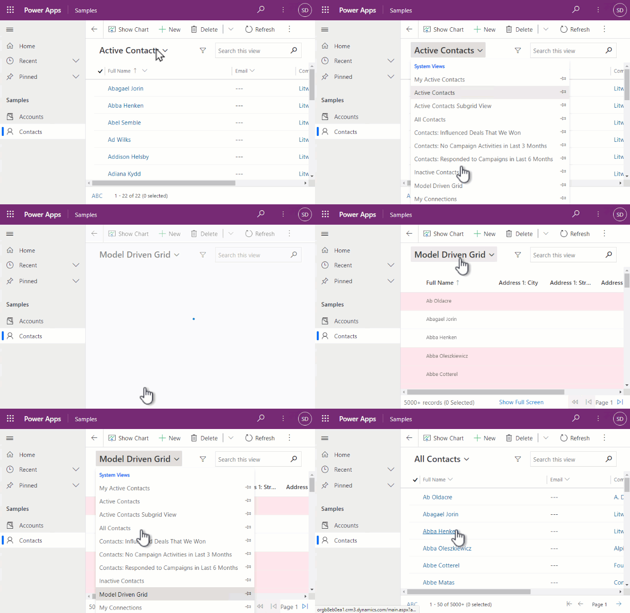
You'll see the Model Driven Grid in the Show As command-bar menu on the Contact table grid in a model-driven app.
Note
At this time, the new solution explorer experience does not support configuring code components, so you must use the classic solution editor to configure them inside model-driven apps.
Configuring the code component on a specific view
You can also configure a specific view always to use a code component to show records when selected.
- Open the Contact table inside the classic solution editor.
- Navigate to Views and open an existing view or create a new one.
- Select Custom controls from the right-hand menu.
- Select Add Control.
- Select Model Driven Grid and then Add.
- Configure the properties as before and leave the subgrid height empty as before.
- Select OK and then select Save and close.
- Select Publish.
Configuring the code component on a form subgrid
Code components can be configured on a specific subgrid on a form. You'll add the code component to the account form on the contacts subgrid:
Open the Account form in the classic form editor.
Select the Contacts subgrid, and then select Change Properties.
Select the Controls tab.
Select Add control and then select the Model Driven Grid code component.
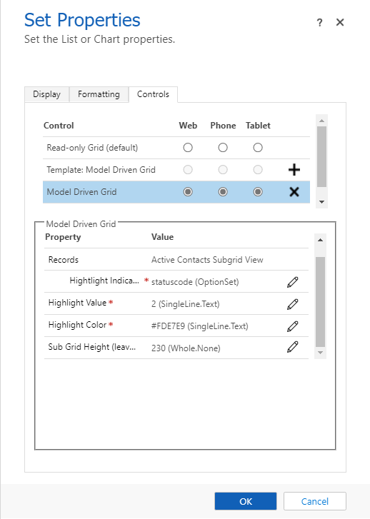
Add the same properties as before, except this time provide a Sub Grid Height of
230.Select the radio button for each form factor (web, phone, and tablet) to indicate that the Model Driven Grid should be used by default. If you want to use a different height for each of the different form factors, the same control may be added more than once, with different configurations.
Note
On model-driven apps forms, the code component container will have a constrained height based on the row span, but only on larger form factors. It won't be constrained on small form factors, meaning we need to provide a specific height. This is the purpose of the input property Sub Grid Height.
Once configured on a subgrid, it will look similar to the following:
Related articles
Creating a canvas app dataset component tutorial: Deploy and configure the component
Application lifecycle management (ALM) with Microsoft Power Platform
Power Apps component framework API reference
Create your first component
Debug code components