Note
Access to this page requires authorization. You can try signing in or changing directories.
Access to this page requires authorization. You can try changing directories.
In this tutorial, you'll create a canvas app dataset code component, deploy it, add it to a screen, and test the component using Visual Studio Code. The code component displays a paged, scrollable dataset grid that provides sortable and filterable columns. It also allows the highlighting of specific rows by configuring an indicator column. This is a common request from app makers and can be complex to implement using native canvas app components. Code components can be written to work on both canvas and model-driven apps. However, this component is written to specifically target use within canvas apps.
In addition to these requirements, you'll also ensure the code component follows best practice guidance:
- Use of Microsoft Fluent UI
- Localization of the code component labels at both design and runtime
- Assurance that the code component renders at the width and height provided by the parent canvas app screen
- Consideration for the app maker to customize the user interface using input properties and external app elements as far as possible
Note
Before you start, make sure you've installed all the prerequisite components.
Code
You can download the complete sample from PowerApps-Samples/component-framework/CanvasGridControl/.
Create a new pcfproj project
Create a new folder to use for your code component. For example,
C:\repos\CanvasGrid.Open Visual Studio Code and then File > Open Folder and select the
CanvasGridfolder. If you've added the Windows Explorer extensions during installation of Visual Studio Code, you can use the Open with Code context menu option inside the folder. You can also load any folder into Visual Studio Code usingcode .at the command prompt when the current directory is set to that location.Inside a new Visual Studio Code PowerShell terminal (Terminal > New Terminal), use the pac pcf init command to create a new code component project:
pac pcf init --namespace SampleNamespace --name CanvasGrid --template datasetor using the short form:
pac pcf init -ns SampleNamespace -n CanvasGrid -t datasetThis adds a new
pcfprojand related files to the current folder, including apackages.jsonthat defines the modules needed. To install the required modules, use npm install:npm installNote
If you receive the message,
The term 'npm' is not recognized as the name of a cmdlet, function, script file, or operable program., make sure you've installed all the prerequisites, specifically node.js (LTS version is recommended).
The template includes an index.ts file along with various configuration files. This is the starting point of your code component and contains the lifecycle methods described in Component implementation.
Install Microsoft Fluent UI
You'll be using Microsoft Fluent UI and React for creating UI, so you must install these as dependencies. Use the following at the terminal:
npm install react react-dom @fluentui/react
This adds the modules to the packages.json and installs them into the node_modules folder. You won't commit node_modules into source control since all the required modules can be restored using npm install.
One of the advantages of Microsoft Fluent UI is that it provides a consistent and highly accessible UI.
Configuring eslint
The template used by pac pcf init installs the eslint module to your project and configures it by adding an .eslintrc.json file. Eslint now requires configuring for TypeScript and React coding styles. More information: Linting - Best practices and guidance for code components.
Define the dataset properties
The CanvasGrid\ControlManifest.Input.xml file defines the metadata describing the behavior of the code component. The control attribute will already contain the namespace and name of the component.
Tip
You may find the XML easier to read by formatting it so that attributes appear on separate lines. Find and install an XML formatting tool of your choice in the Visual Studio Code Marketplace: Search for xml formatting extensions.
The examples below have been formatted with attributes on separate lines to make them easier to read.
You must define the records that the code component can be bound to, by adding the following inside the control element, replacing the existing data-set element:
The records data-set will be bound to a data source when the code component is added to a canvas app. The property-set indicates that the user must configure one of the columns of that dataset to be used as the row highlight indicator.
Tip
You can specify multiple dataset elements. This could be useful if you wanted to search one dataset but show a list of records using a second.
Defining the input and output properties
In addition to the dataset, you can provide the following input properties:
HighlightValue- Allows the app maker to provide a value to be compared against the column defined as theHighlightIndicatorproperty-set. When the values are equal, the row should be highlighted.HighlightColor- Allows the app maker to select a color to use to highlight rows.
Tip
When creating code components for use in canvas apps, it's recommended to provide input properties for the styling of common aspects of your code components.
In addition to the input properties, an output property named FilteredRecordCount will be updated (and triggers the OnChange event) when the rows count is changed because of a filter action applied inside the code component. This is helpful when you want to show a No Rows Found message inside the parent app.
Note
In the future, code components will support custom events so that you can define a specific event rather than using the generic OnChange event.
To define these three properties, add the following to the CanvasGrid\ControlManifest.Input.xml file, below the data-set element:
<property name="FilteredRecordCount"
  display-name-key="FilteredRecordCount_Disp"
  description-key="FilteredRecordCount_Desc"
  of-type="Whole.None"
  usage="output" />
<property name="HighlightValue"
  display-name-key="HighlightValue_Disp"
  description-key="HighlightValue_Desc"
  of-type="SingleLine.Text"
  usage="input"
  required="true"/>
<property name="HighlightColor"
  display-name-key="HighlightColor_Disp"
  description-key="HighlightColor_Desc"
  of-type="SingleLine.Text"
  usage="input"
  required="true"/>
Save this file and then, at the command-line, use:
npm run build
Note
If you get an error like this while running npm run build:
[2:48:57 PM] [build]  Running ESLint...
[2:48:57 PM] [build]  Failed:
[pcf-1065] [Error] ESLint validation error:
C:\repos\CanvasGrid\CanvasGrid\index.ts
  2:47  error  'PropertyHelper' is not defined  no-undef
Open index.ts file and add this: // eslint-disable-next-line no-undef, directly above the line:
import DataSetInterfaces = ComponentFramework.PropertyHelper.DataSetApi;
The run npm run build again.
After the component is built, you'll see that:
An automatically generated file
CanvasGrid\generated\ManifestTypes.d.tsis added to your project. This is generated as part of the build process from theControlManifest.Input.xmland provides the types for interacting with the input/output properties.The build output is added to the
outfolder. Thebundle.jsis the transpiled JavaScript that runs inside the browser, and theControlManifest.xmlis a reformatted version of theControlManifest.Input.xmlfile that's used during deployment.Note
Do not modify the contents of the
generatedandoutfolders directly. They'll be overwritten as part of the build process.
Add the Grid Fluent UI React component
When the code component uses React, there must be a single root component that's rendered within the updateView method. Inside the CanvasGrid folder, add a new TypeScript file named Grid.tsx, and add the following content:
import {
    DetailsList,
    ConstrainMode,
    DetailsListLayoutMode,
    IColumn,
    IDetailsHeaderProps,
} from '@fluentui/react/lib/DetailsList';
import { Overlay } from '@fluentui/react/lib/Overlay';
import {
   ScrollablePane,
   ScrollbarVisibility
} from '@fluentui/react/lib/ScrollablePane';
import { Stack } from '@fluentui/react/lib/Stack';
import { Sticky } from '@fluentui/react/lib/Sticky';
import { StickyPositionType } from '@fluentui/react/lib/Sticky';
import { IObjectWithKey } from '@fluentui/react/lib/Selection';
import { IRenderFunction } from '@fluentui/react/lib/Utilities';
import * as React from 'react';

type DataSet = ComponentFramework.PropertyHelper.DataSetApi.EntityRecord & IObjectWithKey;

export interface GridProps {
    width?: number;
    height?: number;
    columns: ComponentFramework.PropertyHelper.DataSetApi.Column[];
    records: Record<string, ComponentFramework.PropertyHelper.DataSetApi.EntityRecord>;
    sortedRecordIds: string[];
    hasNextPage: boolean;
    hasPreviousPage: boolean;
    totalResultCount: number;
    currentPage: number;
    sorting: ComponentFramework.PropertyHelper.DataSetApi.SortStatus[];
    filtering: ComponentFramework.PropertyHelper.DataSetApi.FilterExpression;
    resources: ComponentFramework.Resources;
    itemsLoading: boolean;
    highlightValue: string | null;
    highlightColor: string | null;
}

const onRenderDetailsHeader: IRenderFunction<IDetailsHeaderProps> = (props, defaultRender) => {
    if (props && defaultRender) {
        return (
            <Sticky stickyPosition={StickyPositionType.Header} isScrollSynced>
                {defaultRender({
                    ...props,
                })}
            </Sticky>
        );
    }
    return null;
};

const onRenderItemColumn = (
    item?: ComponentFramework.PropertyHelper.DataSetApi.EntityRecord,
    index?: number,
    column?: IColumn,
) => {
    if (column && column.fieldName && item) {
        return <>{item?.getFormattedValue(column.fieldName)}</>;
    }
    return <></>;
};

export const Grid = React.memo((props: GridProps) => {
    const {
        records,
        sortedRecordIds,
        columns,
        width,
        height,
        hasNextPage,
        hasPreviousPage,
        sorting,
        filtering,
        currentPage,
        itemsLoading,
    } = props;

    const [isComponentLoading, setIsLoading] = React.useState<boolean>(false);

    const items: (DataSet | undefined)[] = React.useMemo(() => {
        setIsLoading(false);

        const sortedRecords: (DataSet | undefined)[] = sortedRecordIds.map((id) => {
            const record = records[id];
            return record;
        });

        return sortedRecords;
    }, [records, sortedRecordIds, hasNextPage, setIsLoading]);

    const gridColumns = React.useMemo(() => {
        return columns
            .filter((col) => !col.isHidden && col.order >= 0)
            .sort((a, b) => a.order - b.order)
            .map((col) => {
                const sortOn = sorting && sorting.find((s) => s.name === col.name);
                const filtered =
                    filtering &&
                    filtering.conditions &&
                    filtering.conditions.find((f) => f.attributeName == col.name);
                return {
                    key: col.name,
                    name: col.displayName,
                    fieldName: col.name,
                    isSorted: sortOn != null,
                    isSortedDescending: sortOn?.sortDirection === 1,
                    isResizable: true,
                    isFiltered: filtered != null,
                    data: col,
                } as IColumn;
            });
    }, [columns, sorting]);

    const rootContainerStyle: React.CSSProperties = React.useMemo(() => {
        return {
            height: height,
            width: width,
        };
    }, [width, height]);

    return (
        <Stack verticalFill grow style={rootContainerStyle}>
            <Stack.Item grow style={{ position: 'relative', backgroundColor: 'white' }}>
                <ScrollablePane scrollbarVisibility={ScrollbarVisibility.auto}>
                    <DetailsList
                        columns={gridColumns}
                        onRenderItemColumn={onRenderItemColumn}
                        onRenderDetailsHeader={onRenderDetailsHeader}
                        items={items}
                        setKey={`set${currentPage}`} // Ensures that the selection is reset when paging
                        initialFocusedIndex={0}
                        checkButtonAriaLabel="select row"
                        layoutMode={DetailsListLayoutMode.fixedColumns}
                        constrainMode={ConstrainMode.unconstrained}
                    ></DetailsList>
                </ScrollablePane>
                {(itemsLoading || isComponentLoading) && <Overlay />}
            </Stack.Item>
        </Stack>
    );
});

Grid.displayName = 'Grid';
Note
The file has the extension tsx which is a TypeScript file that supports XML style syntax used by React. It's compiled into standard JavaScript by the build process.
Grid design notes
This section includes comments on the design of the Grid.tsx component.
It is a functional component
This is a React functional component, but equally, it could be a class component. This is based on your preferred coding style. Class components and functional components can also be mixed in the same project. Both function and class components use the tsx XML style syntax used by React. More information: Function and Class Components
Minimize bundle.js size
When importing the ChoiceGroup Fluent UI components using path-based imports, instead of:
import {
    DetailsList,
    ConstrainMode,
    DetailsListLayoutMode,
    IColumn,
    IDetailsHeaderProps,
    Stack
} from "@fluentui/react";
This code uses:
import {
    DetailsList,
    ConstrainMode,
    DetailsListLayoutMode,
    IColumn,
    IDetailsHeaderProps,
} from '@fluentui/react/lib/DetailsList';
import { Stack } from '@fluentui/react/lib/Stack';
This way, your bundle size will be smaller, resulting in lower capacity requirements and better runtime performance.
An alternative would be to use tree-shaking.
Destructuring assignment
This code:
export const Grid = React.memo((props: GridProps) => {
    const {
        records,
        sortedRecordIds,
        columns,
        width,
        height,
        hasNextPage,
        hasPreviousPage,
        sorting,
        filtering,
        currentPage,
        itemsLoading,
    } = props;
Uses destructuring assignment. In this way, you extract the attributes required to render from the props, rather than prefixing them with props. each time they're used.
The code also uses React.memo to wrap the functional component so that it won't render unless any of the input props have changed.
Use of React.useMemo
React.useMemo is used in several places to ensure that the item array created is only mutated when the input props options or configuration change. This is a best practice of function components that reduces unnecessary renders of the child components.
Other items to note:
- The
DetailsListin aStackis wrapped because, later you'll add a footer element with the paging controls. - The Fluent UI
Stickycomponent is used to wrap the header columns (usingonRenderDetailsHeader) so that they remain visible when scrolling the grid. setKeyis passed to theDetailsListalong withinitialFocusedIndexso that when the current page changes, the scroll position and selection will be reset.- The function
onRenderItemColumnis used to render the cell contents. It accepts row item and uses getFormattedValue to return the display value of the column. The getValue method returns a value that you could use to provide an alternative rendering. The advantage ofgetFormattedValueis that it contains a formatted string for columns of non-string types such as dates and lookups. - The
gridColumnsblock is mapping the object shape of the columns provided by the dataset context, onto the shape expected by theDetailsListcolumns prop. Since this is wrapped in the React.useMemo hook, the output will only change when thecolumnsorsortingprops change. You can display the sort and filter icons on the columns where the sorting and filtering details provided by the code component context matches the column being mapped. The columns are sorted using thecolumn.orderproperty to ensure that they're in the correct order on the grid as defined by the app maker. - You're maintaining an internal state for
isComponentLoadingin our React component. This is because when the user selects sorting and filtering actions, you can grey out the grid as a visual cue until thesortedRecordIdsare updated and the state is reset. There's an additional input prop calleditemsLoadingwhich is mapped to the dataset.loading property provided by the dataset context. Both flags are used to control the visual loading cue that's implemented using the Fluent UIOverlaycomponent.
Update index.ts
The next step is to make changes to the index.ts file to match properties defined in Grid.tsx.
Add import statements and initialize icons
To the header of index.ts, replace the existing imports with the following:
import {IInputs, IOutputs} from './generated/ManifestTypes';
import DataSetInterfaces = ComponentFramework.PropertyHelper.DataSetApi;
type DataSet = ComponentFramework.PropertyTypes.DataSet;
Note
The import of initializeIcons is required because this code uses the Fluent UI icon set. You call initializeIcons to load the icons inside the test harness. Inside canvas apps, they're already initialized.
Add fields to the CanvasGrid class
Add the following fields to the CanvasGrid class:
export class CanvasGrid implements ComponentFramework.StandardControl<IInputs, IOutputs> {

    /**
     * Empty constructor.
     */
    constructor() {

    }
Update the init method
Add the following to init:
public init(
    context: ComponentFramework.Context<IInputs>,
    notifyOutputChanged: () => void,
    state: ComponentFramework.Dictionary,
    container: HTMLDivElement): void {
    // Add control initialization code
}
The init function is called when the code component is first initialized on an app screen. You store a reference to the following:
notifyOutputChanged: This is the callback provided that you call to notify the canvas app that one of the properties has changed.container:This is the DOM element to which you add your code component UI.resources:This is used to retrieve localized strings in the current user's language.
The context.mode.trackContainerResize(true)) is used so that updateView will be called when the code component changes size.
Note
Currently, there's no way to determine if the code component is running inside the test harness. You need to detect if the control-dimensions div element is present as an indicator.
Update the updateView method
Add the following to updateView:
public updateView(context: ComponentFramework.Context<IInputs>): void {
    // Add code to update control view
}
You can see that:
- You call React.createElement, passing the reference to the DOM container you received inside the
initfunction. - The
Gridcomponent is defined insideGrid.tsxand is imported at the top of the file. - The
allocatedWidthandallocatedHeightwill be provided by the parent context whenever they change (for example, the app resizes the code component or you enter full screen mode), since you made a call to trackContainerResize(true) inside theinitfunction. - You can detect when there are new rows to display when the updatedProperties array contains the
datasetstring. - In the test harness, the
updatedPropertiesarray is not populated, so you can use theisTestHarnessflag you set in theinitfunction to short-circuit the logic that sets thesortedRecordIdandrecords. You maintain a reference to the current values until they change, so that you don't mutate these when passed to the child component unless a re-render of the data is required. - Since the code component maintains the state of which page displayed, the page number is reset when the parent context resets the records to the first page. You know when you're back on the first page when
hasPreviousPageis false.
Update the destroy method
Lastly, you need to tidy up when the code component is destroyed:
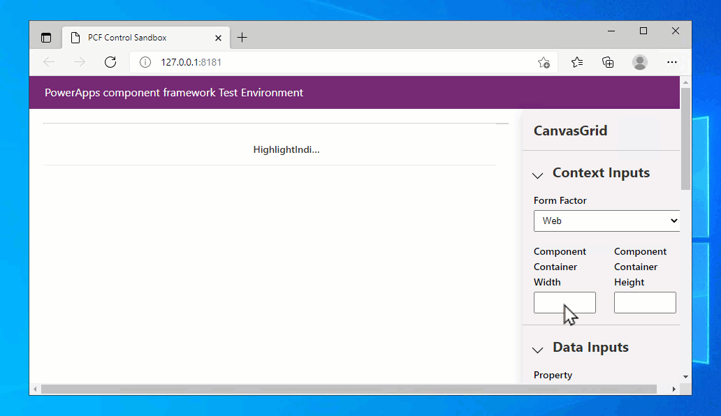
Start the test harness
Ensure all the files are saved and at the terminal use:
npm start watch
You need to set the width and height to see the code component grid that's populated using the sample three records. You can then export a set of records into a CSV file from Dataverse and then load it into the test harness using Data Inputs > Records panel:
Here is some comma separated sample data you can save to a .csv file and use:
address1_city,address1_country,address1_stateorprovince,address1_line1,address1_postalcode,telephone1,emailaddress1,firstname,fullname,jobtitle,lastname
Seattle,U.S.,WA,7842 Ygnacio Valley Road,12150,555-0112,someone_m@example.com,Thomas,Thomas Andersen (sample),Purchasing Manager,Andersen (sample)
Renton,U.S.,WA,7165 Brock Lane,61795,555-0109,someone_j@example.com,Jim,Jim Glynn (sample),Owner,Glynn (sample)
Snohomish,U.S.,WA,7230 Berrellesa Street,78800,555-0106,someone_g@example.com,Robert,Robert Lyon (sample),Owner,Lyon (sample)
Seattle,U.S.,WA,931 Corte De Luna,79465,555-0111,someone_l@example.com,Susan,Susan Burk (sample),Owner,Burk (sample)
Seattle,U.S.,WA,7765 Sunsine Drive,11910,555-0110,someone_k@example.com,Patrick,Patrick Sands (sample),Owner,Sands (sample)
Seattle,U.S.,WA,4948 West Th St,73683,555-0108,someone_i@example.com,Rene,Rene Valdes (sample),Purchasing Assistant,Valdes (sample)
Redmond,U.S.,WA,7723 Firestone Drive,32147,555-0107,someone_h@example.com,Paul,Paul Cannon (sample),Purchasing Assistant,Cannon (sample)
Issaquah,U.S.,WA,989 Caravelle Ct,33597,555-0105,someone_f@example.com,Scott,Scott Konersmann (sample),Purchasing Manager,Konersmann (sample)
Issaquah,U.S.,WA,7691 Benedict Ct.,57065,555-0104,someone_e@example.com,Sidney,Sidney Higa (sample),Owner,Higa (sample)
Monroe,U.S.,WA,3747 Likins Avenue,37925,555-0103,someone_d@example.com,Maria,Maria Campbell (sample),Purchasing Manager,Campbell (sample)
Duvall,U.S.,WA,5086 Nottingham Place,16982,555-0102,someone_c@example.com,Nancy,Nancy Anderson (sample),Purchasing Assistant,Anderson (sample)
Issaquah,U.S.,WA,5979 El Pueblo,23382,555-0101,someone_b@example.com,Susanna,Susanna Stubberod (sample),Purchasing Manager,Stubberod (sample)
Redmond,U.S.,WA,249 Alexander Pl.,86372,555-0100,someone_a@example.com,Yvonne,Yvonne McKay (sample),Purchasing Manager,McKay (sample)
Note
There's only a single column shown in the test harness regardless of the columns you provide in the loaded CSV file. This is because the test harness only shows property-set when there is one defined. If no property-set is defined, then all of the columns in the loaded CSV file will be populated.
Add row selection
Although the Fluent UI DetailsList allows selecting records by default, the selected records are not linked to the output of the code component. You need the Selected and SelectedItems properties to reflect the chosen records inside a canvas app, so that related components can be updated. In this example, you allow selection of only a single item at a time so SelectedItems will only ever contain a single record.
Update Grid.tsx imports
Add the following to the imports inside Grid.tsx:
import {
    DetailsList,
    ConstrainMode,
    DetailsListLayoutMode,
    IColumn,
    IDetailsHeaderProps,
} from '@fluentui/react/lib/DetailsList';
import { Overlay } from '@fluentui/react/lib/Overlay';
import {
   ScrollablePane,
   ScrollbarVisibility
} from '@fluentui/react/lib/ScrollablePane';
import { Stack } from '@fluentui/react/lib/Stack';
import { Sticky } from '@fluentui/react/lib/Sticky';
import { StickyPositionType } from '@fluentui/react/lib/Sticky';
import { IObjectWithKey } from '@fluentui/react/lib/Selection';
import { IRenderFunction } from '@fluentui/react/lib/Utilities';
import * as React from 'react';
Add setSelectedRecords to GridProps
To the GridProps interface, inside Grid.tsx, add the following:
export interface GridProps {
    width?: number;
    height?: number;
    columns: ComponentFramework.PropertyHelper.DataSetApi.Column[];
    records: Record<string, ComponentFramework.PropertyHelper.DataSetApi.EntityRecord>;
    sortedRecordIds: string[];
    hasNextPage: boolean;
    hasPreviousPage: boolean;
    totalResultCount: number;
    currentPage: number;
    sorting: ComponentFramework.PropertyHelper.DataSetApi.SortStatus[];
    filtering: ComponentFramework.PropertyHelper.DataSetApi.FilterExpression;
    resources: ComponentFramework.Resources;
    itemsLoading: boolean;
    highlightValue: string | null;
    highlightColor: string | null;
}
Add the setSelectedRecords property to Grid
Inside the Grid.tsx function component, update the destructuring of the props to add the new prop setSelectedRecords.
export const Grid = React.memo((props: GridProps) => {
    const {
        records,
        sortedRecordIds,
        columns,
        width,
        height,
        hasNextPage,
        hasPreviousPage,
        sorting,
        filtering,
        currentPage,
        itemsLoading,
    } = props;
Directly below that, add:
const forceUpdate = useForceUpdate();
const onSelectionChanged = React.useCallback(() => {
const items = selection.getItems() as DataSet[];
const selected = selection.getSelectedIndices().map((index: number) => {
const item: DataSet | undefined = items[index];
return item && items[index].getRecordId();
});
setSelectedRecords(selected);
forceUpdate();
}, [forceUpdate]);
const selection: Selection = useConst(() => {
return new Selection({
selectionMode: SelectionMode.single,
onSelectionChanged: onSelectionChanged,
});
});
The React.useCallback and useConst hooks ensure that these values do not mutate between renders and cause unnecessary child component rendering.
The useForceUpdate hook ensures that when selection is updated, the component is re-rendered to reflect the updated selection count.
Add selection to DetailsList
The selection object created to maintain the state of the selection is then passed into the DetailsList component:
<DetailsList
columns={gridColumns}
onRenderItemColumn={onRenderItemColumn}
onRenderDetailsHeader={onRenderDetailsHeader}
items={items}
setKey={`set${currentPage}`} // Ensures that the selection is reset when paging
initialFocusedIndex={0}
checkButtonAriaLabel="select row"
layoutMode={DetailsListLayoutMode.fixedColumns}
constrainMode={ConstrainMode.unconstrained}
></DetailsList>
Define the setSelectedRecords callback
You need to define the new setSelectedRecords callback inside index.ts and pass it to the Grid component. Near the top of CanvasGrid class, add the following:
export class CanvasGrid
implements ComponentFramework.StandardControl<IInputs, IOutputs>
{
notifyOutputChanged: () => void;
container: HTMLDivElement;
context: ComponentFramework.Context<IInputs>;
sortedRecordsIds: string[] = [];
resources: ComponentFramework.Resources;
isTestHarness: boolean;
records: {
[id: string]: ComponentFramework.PropertyHelper.DataSetApi.EntityRecord;
};
currentPage = 1;
filteredRecordCount?: number;
Note
The method is defined as an arrow function to bind it to the current this instance of the code component.
The call to setSelectedRecordIds informs the canvas app that the selection has changed so that other components referencing SelectedItems and Selected will be updated.
Add new callback to the input props
Finally, add the new callback to the input props of the Grid component in the updateView method:
ReactDOM.render(
React.createElement(Grid, {
width: allocatedWidth,
height: allocatedHeight,
columns: dataset.columns,
records: this.records,
sortedRecordIds: this.sortedRecordsIds,
hasNextPage: paging.hasNextPage,
hasPreviousPage: paging.hasPreviousPage,
currentPage: this.currentPage,
totalResultCount: paging.totalResultCount,
sorting: dataset.sorting,
filtering: dataset.filtering && dataset.filtering.getFilter(),
resources: this.resources,
itemsLoading: dataset.loading,
highlightValue: this.context.parameters.HighlightValue.raw,
highlightColor: this.context.parameters.HighlightColor.raw,
}),
this.container
);
Invoking the OnSelect event
There's a pattern in canvas apps where if a gallery or grid has an item selection invoked (for example, selecting a chevron icon), it raises the OnSelect event. You can implement this pattern using the openDatasetItem method of the dataset.
Add onNavigate to GridProps interface
As before, you add an additional callback prop on the Grid component by adding the following to the GridProps interface inside Grid.tsx:
export interface GridProps {
width?: number;
height?: number;
columns: ComponentFramework.PropertyHelper.DataSetApi.Column[];
records: Record<
string,
ComponentFramework.PropertyHelper.DataSetApi.EntityRecord
>;
sortedRecordIds: string[];
hasNextPage: boolean;
hasPreviousPage: boolean;
totalResultCount: number;
currentPage: number;
sorting: ComponentFramework.PropertyHelper.DataSetApi.SortStatus[];
filtering: ComponentFramework.PropertyHelper.DataSetApi.FilterExpression;
resources: ComponentFramework.Resources;
itemsLoading: boolean;
highlightValue: string | null;
highlightColor: string | null;
setSelectedRecords: (ids: string[]) => void;
}
Add onNavigate to Grid props
Again, you must add the new prop to the destructuring of the props:
export const Grid = React.memo((props: GridProps) => {
    const {
        records,
        sortedRecordIds,
        columns,
        width,
        height,
        hasNextPage,
        hasPreviousPage,
        sorting,
        filtering,
        currentPage,
        itemsLoading,
        setSelectedRecords,
    } = props;
Add onItemInvoked to DetailsList
The DetailList has a callback prop called onItemInvoked which, in turn, you pass your callback to:
<DetailsList
   columns={gridColumns}
   onRenderItemColumn={onRenderItemColumn}
   onRenderDetailsHeader={onRenderDetailsHeader}
   items={items}
   setKey={`set${currentPage}`} // Ensures that the selection is reset when paging
   initialFocusedIndex={0}
   checkButtonAriaLabel="select row"
   layoutMode={DetailsListLayoutMode.fixedColumns}
   constrainMode={ConstrainMode.unconstrained}
   selection={selection}
></DetailsList>
Add onNavigate method to index.ts
Add the onNavigate method to the index.ts just below the setSelectedRecords method:
onNavigate = (
item?: ComponentFramework.PropertyHelper.DataSetApi.EntityRecord
): void => {
if (item) {
this.context.parameters.records.openDatasetItem(item.getNamedReference());
}
};
This simply invokes the openDatasetItem method on the dataset record so that the code component will raise the OnSelect event. The method is defined as an arrow function to bind it to the current this instance of the code component.
You need to pass this callback into the Grid component props inside the updateView method:
ReactDOM.render(
React.createElement(Grid, {
width: allocatedWidth,
height: allocatedHeight,
columns: dataset.columns,
records: this.records,
sortedRecordIds: this.sortedRecordsIds,
hasNextPage: paging.hasNextPage,
hasPreviousPage: paging.hasPreviousPage,
currentPage: this.currentPage,
totalResultCount: paging.totalResultCount,
sorting: dataset.sorting,
filtering: dataset.filtering && dataset.filtering.getFilter(),
resources: this.resources,
itemsLoading: dataset.loading,
highlightValue: this.context.parameters.HighlightValue.raw,
highlightColor: this.context.parameters.HighlightColor.raw,
setSelectedRecords: this.setSelectedRecords,
}),
this.container
);
When you save all files, the test harness will reload. Use Ctrl + Shift + I (or F12) and use Open File (Ctrl + P) searching for index.ts and you can place a breakpoint inside the onNavigate method. Double-click on a row (or highlight it with the cursor keys and pressing Enter) will hit the breakpoint because the DetailsList invokes the onNavigate callback.
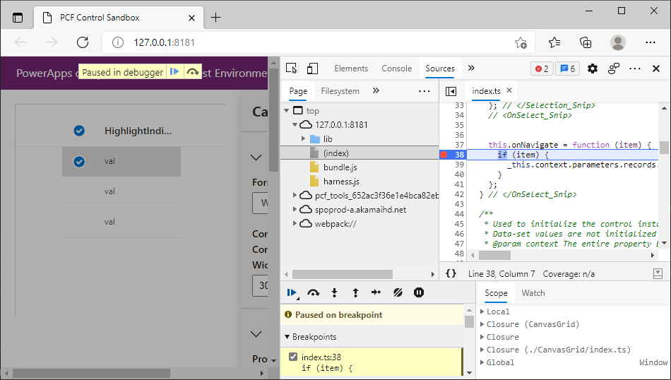
There is a reference to _this because the function is defined as an arrow function and has been transpiled into a JavaScript closure to capture the instance of this.
Add Localization
Before you go any further, you need to add resource strings to the code component so that you can use localized strings for messages such as paging, sorting, and filtering. Add a new file CanvasGrid\strings\CanvasGrid.1033.resx and use the Visual Studio resource editor or Visual Studio Code with an extension to enter the following:
| Name | Value |
|---|---|
Records_Dataset_Display |
Records |
FilteredRecordCount_Disp |
Filtered Record Count |
FilteredRecordCount_Desc |
The number of records after filtering |
HighlightValue_Disp |
Highlight Value |
HighlightValue_Desc |
The value to indicate a row should be highlighted |
HighlightColor_Disp |
Highlight Color |
HighlightColor_Desc |
The color to highlight a row using |
HighlightIndicator_Disp |
Highlight Indicator Field |
HighlightIndicator_Desc |
Set to the name of the field to compare against the Highlight Value |
Label_Grid_Footer |
Page {0} ({1} Selected) |
Label_SortAZ |
A to Z |
Label_SortZA |
Z to A |
Label_DoesNotContainData |
Does not contain data |
Label_ShowFullScreen |
Show Full Screen |
Tip
It's not recommended to edit resx files directly. Instead, use either Visual Studio's resource editor or an extension for Visual Studio Code. Find a Visual Studio Code extension: Search Visual Studio Marketplace for a resx editor
The data for this file can also be set by opening the CanvasGrid.1033.resx file in Notepad and copying the XML content below:
<?xml version="1.0" encoding="utf-8"?>
<root>
<xsd:schema id="root" xmlns="" xmlns:xsd="http://www.w3.org/2001/XMLSchema" xmlns:msdata="urn:schemas-microsoft-com:xml-msdata">
<xsd:import namespace="http://www.w3.org/XML/1998/namespace"/>
<xsd:element name="root" msdata:IsDataSet="true">
<xsd:complexType>
<xsd:choice maxOccurs="unbounded">
<xsd:element name="metadata">
<xsd:complexType>
<xsd:sequence>
<xsd:element name="value" type="xsd:string" minOccurs="0"/>
</xsd:sequence>
<xsd:attribute name="name" use="required" type="xsd:string"/>
<xsd:attribute name="type" type="xsd:string"/>
<xsd:attribute name="mimetype" type="xsd:string"/>
<xsd:attribute ref="xml:space"/>
</xsd:complexType>
</xsd:element>
<xsd:element name="assembly">
<xsd:complexType>
<xsd:attribute name="alias" type="xsd:string"/>
<xsd:attribute name="name" type="xsd:string"/>
</xsd:complexType>
</xsd:element>
<xsd:element name="data">
<xsd:complexType>
<xsd:sequence>
<xsd:element name="value" type="xsd:string" minOccurs="0" msdata:Ordinal="1"/>
<xsd:element name="comment" type="xsd:string" minOccurs="0" msdata:Ordinal="2"/>
</xsd:sequence>
<xsd:attribute name="name" type="xsd:string" use="required" msdata:Ordinal="1"/>
<xsd:attribute name="type" type="xsd:string" msdata:Ordinal="3"/>
<xsd:attribute name="mimetype" type="xsd:string" msdata:Ordinal="4"/>
<xsd:attribute ref="xml:space"/>
</xsd:complexType>
</xsd:element>
<xsd:element name="resheader">
<xsd:complexType>
<xsd:sequence>
<xsd:element name="value" type="xsd:string" minOccurs="0" msdata:Ordinal="1"/>
</xsd:sequence>
<xsd:attribute name="name" type="xsd:string" use="required"/>
</xsd:complexType>
</xsd:element>
</xsd:choice>
</xsd:complexType>
</xsd:element>
</xsd:schema>
<resheader name="resmimetype">
<value>text/microsoft-resx</value>
</resheader>
<resheader name="version">
<value>2.0</value>
</resheader>
<resheader name="reader">
<value>System.Resources.ResXResourceReader, System.Windows.Forms, Version=4.0.0.0, Culture=neutral, PublicKeyToken=b77a5c561934e089</value>
</resheader>
<resheader name="writer">
<value>System.Resources.ResXResourceWriter, System.Windows.Forms, Version=4.0.0.0, Culture=neutral, PublicKeyToken=b77a5c561934e089</value>
</resheader>
<data name="Records_Dataset_Display" xml:space="preserve">
<value>Records</value>
</data>
<data name="FilteredRecordCount_Disp" xml:space="preserve">
<value>Filtered Record Count</value>
</data>
<data name="FilteredRecordCount_Desc" xml:space="preserve">
<value>The number of records after filtering</value>
</data>
<data name="HighlightValue_Disp" xml:space="preserve">
<value>Highlight Value</value>
</data>
<data name="HighlightValue_Desc" xml:space="preserve">
<value>The value to indicate a row should be highlighted</value>
</data>
<data name="HighlightColor_Disp" xml:space="preserve">
<value>Highlight Color</value>
</data>
<data name="HighlightColor_Desc" xml:space="preserve">
<value>The color to highlight a row using</value>
</data>
<data name="HighlightIndicator_Disp" xml:space="preserve">
<value>Highlight Indicator Field</value>
</data>
<data name="HighlightIndicator_Desc" xml:space="preserve">
<value>Set to the name of the field to compare against the Highlight Value</value>
</data>
<data name="Label_Grid_Footer" xml:space="preserve">
<value>Page {0} ({1} Selected)</value>
</data>
<data name="Label_SortAZ" xml:space="preserve">
<value>A to Z</value>
</data>
<data name="Label_SortZA" xml:space="preserve">
<value>Z to A</value>
</data>
<data name="Label_DoesNotContainData" xml:space="preserve">
<value>Does not contain data</value>
</data>
<data name="Label_ShowFullScreen" xml:space="preserve">
<value>Show Full Screen</value>
</data>
</root>
You have resource strings for the input/output properties and the dataset and associated property-set. These will be used in Power Apps Studio at design time based on the maker's browser language. You can also add label strings that can be retrieved at runtime using getString. More information: Implementing localization API component.
Add this new resource file to the ControlManifest.Input.xml file inside the resources element:
Add column sorting and filtering
If you want to allow the user to sort and filter using grid column headers, the Fluent UI DetailList provides an easy way of adding context menus to the column headers.
Add onSort and onFilter to GridProps
First, add onSort and onFilter to the GridProps interface inside Grid.tsx to provide callback functions for sorting and filtering:
export interface GridProps {
width?: number;
height?: number;
columns: ComponentFramework.PropertyHelper.DataSetApi.Column[];
records: Record<
string,
ComponentFramework.PropertyHelper.DataSetApi.EntityRecord
>;
sortedRecordIds: string[];
hasNextPage: boolean;
hasPreviousPage: boolean;
totalResultCount: number;
currentPage: number;
sorting: ComponentFramework.PropertyHelper.DataSetApi.SortStatus[];
filtering: ComponentFramework.PropertyHelper.DataSetApi.FilterExpression;
resources: ComponentFramework.Resources;
itemsLoading: boolean;
highlightValue: string | null;
highlightColor: string | null;
setSelectedRecords: (ids: string[]) => void;
onNavigate: (
item?: ComponentFramework.PropertyHelper.DataSetApi.EntityRecord
) => void;
}
Add onSort, onFilter, and resources to props
Then, add these new props along with the resources reference (so you can retrieve localized labels for sorting and filtering) to the props destructuring:
export const Grid = React.memo((props: GridProps) => {
const {
records,
sortedRecordIds,
columns,
width,
height,
hasNextPage,
hasPreviousPage,
sorting,
filtering,
currentPage,
itemsLoading,
setSelectedRecords,
onNavigate,
} = props;
Import ContextualMenu components
You need to add some imports to the top of Grid.tsx so that you can use the ContextualMenu component provided by Fluent UI. You can use path-based imports to reduce the size of the bundle.
import { ContextualMenu, DirectionalHint, IContextualMenuProps } from '@fluentui/react/lib/ContextualMenu';
Add context menu rendering functionality
Now add the context menu rendering functionality to Grid.tsx just below the line
const [isComponentLoading, setIsLoading] = React.useState<boolean>(false);:
You'll see that:
- The
contextualMenuPropsstate controls the visibility of the context menu that's rendered using the Fluent UIContextualMenucomponent. - This code provides a simple filter to show only values where the field doesn't contain any data. You could extend this to provide additional filtering.
- This code uses
resources.getStringto show labels on the context menu that can be localized. - The
React.useCallbackhook, similar toReact.useMemo, ensures that the callbacks are only mutated when the dependent values change. This optimizes the rendering of child components.
Add new context menu functions to the column select and context menu events
Add these new context menu functions to the column select and context menu events. Update the const gridColumns to add the onColumnContextMenu and onColumnClick callbacks:
const gridColumns = React.useMemo(() => {
return columns
.filter((col) => !col.isHidden && col.order >= 0)
.sort((a, b) => a.order - b.order)
.map((col) => {
const sortOn = sorting && sorting.find((s) => s.name === col.name);
const filtered =
filtering &&
filtering.conditions &&
filtering.conditions.find((f) => f.attributeName == col.name);
return {
key: col.name,
name: col.displayName,
fieldName: col.name,
isSorted: sortOn != null,
isSortedDescending: sortOn?.sortDirection === 1,
isResizable: true,
isFiltered: filtered != null,
data: col,
} as IColumn;
});
}, [columns, sorting]);
Add context menu to rendered output
For the context menu to be shown, you need to add it to the rendered output. Add the following directly underneath the DetailsList component in the returned output:
<ScrollablePane scrollbarVisibility={ScrollbarVisibility.auto}>
<DetailsList
columns={gridColumns}
onRenderItemColumn={onRenderItemColumn}
onRenderDetailsHeader={onRenderDetailsHeader}
items={items}
setKey={`set${currentPage}`} // Ensures that the selection is reset when paging
initialFocusedIndex={0}
checkButtonAriaLabel="select row"
layoutMode={DetailsListLayoutMode.fixedColumns}
constrainMode={ConstrainMode.unconstrained}
selection={selection}
onItemInvoked={onNavigate}
></DetailsList>
</ScrollablePane>
Add onSort and OnFilter functions
Now that you've added the sorting and filtering UI, you need to add the callbacks to index.ts to actually perform the sort and filter on the records bound to the code component. Add the following to index.ts just below the onNavigate function:
onSort = (name: string, desc: boolean): void => {
const sorting = this.context.parameters.records.sorting;
while (sorting.length > 0) {
sorting.pop();
}
this.context.parameters.records.sorting.push({
name: name,
sortDirection: desc ? 1 : 0,
});
this.context.parameters.records.refresh();
};
onFilter = (name: string, filter: boolean): void => {
const filtering = this.context.parameters.records.filtering;
if (filter) {
filtering.setFilter({
conditions: [
{
attributeName: name,
conditionOperator: 12, // Does not contain Data
},
],
} as ComponentFramework.PropertyHelper.DataSetApi.FilterExpression);
} else {
filtering.clearFilter();
}
this.context.parameters.records.refresh();
};
You'll see that:
- The sort and filter are applied to the dataset using the sorting and filtering properties.
- When modifying the sort columns, the existing sort definitions must be removed using pop rather than the sorting array itself being replaced.
- Refresh must be called after sorting and filtering is applied. If a filter and sort are applied at the same time, refresh only needs to be called once.
Add OnSort and OnFilter callbacks to Grid rendering
Lastly, you can pass these two callbacks into the Grid rendering call:
ReactDOM.render(
React.createElement(Grid, {
width: allocatedWidth,
height: allocatedHeight,
columns: dataset.columns,
records: this.records,
sortedRecordIds: this.sortedRecordsIds,
hasNextPage: paging.hasNextPage,
hasPreviousPage: paging.hasPreviousPage,
currentPage: this.currentPage,
totalResultCount: paging.totalResultCount,
sorting: dataset.sorting,
filtering: dataset.filtering && dataset.filtering.getFilter(),
resources: this.resources,
itemsLoading: dataset.loading,
highlightValue: this.context.parameters.HighlightValue.raw,
highlightColor: this.context.parameters.HighlightColor.raw,
setSelectedRecords: this.setSelectedRecords,
onNavigate: this.onNavigate,
}),
this.container
);
Note
At this point, you can no longer test using the test harness because it doesn't provide support for sorting and filtering. Later, you can deploy using pac pcf push and then add to a canvas app for testing. If you wish, you can skip to that step to see how the code component looks inside canvas apps.
Update the FilteredRecordCount output property
Since the grid can now filter records internally, it's important to report back to the canvas app how many records are displayed. This is so that you can show a 'No Records' type message.
Tip
You could implement this internally within the code component, however it's recommended that as much user interface is left up to the canvas app since it will give the app maker more flexibility.
You have already defined an output property called FilteredRecordCount in the ControlManifest.Input.xml. When the filtering takes place and the filtered records are loaded, the updateView function will be called with string dataset in the updatedProperties array. If the number of records has changed, you need to make a call to notifyOutputChanged so that the canvas app knows it must update any controls that use the FilteredRecordCount property. Inside the updateView method of index.ts, add the following just above the ReactDOM.render and below allocatedHeight:
Add FilteredRecordCount to getOutputs
This updates the filteredRecordCount on the code component class you defined earlier when it's different from the new data received. After notifyOutputChanged is called, you need to ensure the value is returned when getOutputs is called, so update the getOutputs method to be:
Add paging to the grid
For large datasets, canvas apps will split the records across multiple pages. You can add a footer that shows page navigation controls. Each button will be rendered using a Fluent UI IconButton, which you must import.
Add IconButton to imports
Add this to the imports inside Grid.tsx:
import { IconButton } from '@fluentui/react/lib/Button';
Add stringFormat function
The following step will add capabilities to load the format for the page indicator label from the resource strings ("Page {0} ({1} Selected)") and format using a simple stringFormat function. This function could equally be in a separate file and shared between your components for convenience:
In this tutorial, add it at the top of Grid.tsx, right below type DataSet ....
function stringFormat(template: string, ...args: string[]): string {
for (const k in args) {
template = template.replace("{" + k + "}", args[k]);
}
return template;
}
Add Paging buttons
In Grid.tsx, add the following Stack.Item below the existing Stack.Item that contains the ScrollablePane:
return (
<Stack verticalFill grow style={rootContainerStyle}>
<Stack.Item grow style={{ position: 'relative', backgroundColor: 'white' }}>
<ScrollablePane scrollbarVisibility={ScrollbarVisibility.auto}>
<DetailsList
columns={gridColumns}
onRenderItemColumn={onRenderItemColumn}
onRenderDetailsHeader={onRenderDetailsHeader}
items={items}
setKey={`set${currentPage}`} // Ensures that the selection is reset when paging
initialFocusedIndex={0}
checkButtonAriaLabel="select row"
layoutMode={DetailsListLayoutMode.fixedColumns}
constrainMode={ConstrainMode.unconstrained}
selection={selection}
onItemInvoked={onNavigate}
></DetailsList>
{contextualMenuProps && <ContextualMenu {...contextualMenuProps} />}
</ScrollablePane>
{(itemsLoading || isComponentLoading) && <Overlay />}
</Stack.Item>
</Stack>
);
You'll see that:
- The
Stackensures that the footer will stack below theDetailsList. Thegrowattribute is used to make sure that the grid expands to fill the available space. - You load the format for the page indicator label from the resource strings (
"Page {0} ({1} Selected)") and format using thestringFormatfunction you added in the previous step. - You can provide
alttext for accessibility on the pagingIconButtons. - The style on the footer could equally be applied using a CSS class name referencing a CSS file added to the code component.
Add callback props to support paging
Next, you must add the missing loadFirstPage, loadNextPage, and loadPreviousPage callback props.
To the GridProps interface, add the following:
export interface GridProps {
width?: number;
height?: number;
columns: ComponentFramework.PropertyHelper.DataSetApi.Column[];
records: Record<string, ComponentFramework.PropertyHelper.DataSetApi.EntityRecord>;
sortedRecordIds: string[];
hasNextPage: boolean;
hasPreviousPage: boolean;
totalResultCount: number;
currentPage: number;
sorting: ComponentFramework.PropertyHelper.DataSetApi.SortStatus[];
filtering: ComponentFramework.PropertyHelper.DataSetApi.FilterExpression;
resources: ComponentFramework.Resources;
itemsLoading: boolean;
highlightValue: string | null;
highlightColor: string | null;
setSelectedRecords: (ids: string[]) => void;
onNavigate: (item?: ComponentFramework.PropertyHelper.DataSetApi.EntityRecord) => void;
onSort: (name: string, desc: boolean) => void;
onFilter: (name: string, filtered: boolean) => void;
}
Add new paging props to the Grid
Add these new props to the props destructuring:
export const Grid = React.memo((props: GridProps) => {
const {
records,
sortedRecordIds,
columns,
width,
height,
hasNextPage,
hasPreviousPage,
sorting,
filtering,
currentPage,
itemsLoading,
setSelectedRecords,
onNavigate,
onSort,
onFilter,
resources,
} = props;
Add callbacks to index.ts
Add these callbacks to index.ts below the onFilter method:
loadFirstPage = (): void => {
this.currentPage = 1;
this.context.parameters.records.paging.loadExactPage(1);
};
loadNextPage = (): void => {
this.currentPage++;
this.context.parameters.records.paging.loadExactPage(this.currentPage);
};
loadPreviousPage = (): void => {
this.currentPage--;
this.context.parameters.records.paging.loadExactPage(this.currentPage);
};
Then update the Grid rendering call to include these callbacks:
ReactDOM.render(
React.createElement(Grid, {
width: allocatedWidth,
height: allocatedHeight,
columns: dataset.columns,
records: this.records,
sortedRecordIds: this.sortedRecordsIds,
hasNextPage: paging.hasNextPage,
hasPreviousPage: paging.hasPreviousPage,
currentPage: this.currentPage,
totalResultCount: paging.totalResultCount,
sorting: dataset.sorting,
filtering: dataset.filtering && dataset.filtering.getFilter(),
resources: this.resources,
itemsLoading: dataset.loading,
highlightValue: this.context.parameters.HighlightValue.raw,
highlightColor: this.context.parameters.HighlightColor.raw,
setSelectedRecords: this.setSelectedRecords,
onNavigate: this.onNavigate,
onSort: this.onSort,
onFilter: this.onFilter,
}),
this.container
);
Add full screen support
Code components offer the ability to show in full screen mode. This is especially useful on small screen sizes or where there's limited space for the code component within a canvas app screen.
Import Fluent UI Link component
To launch the full screen mode, you can use the Fluent UI Link component. Add it to the imports at the top of Grid.tsx:
import { Link } from '@fluentui/react/lib/Link';
Add the Link control
To add a full screen link, you add the following to the existing Stack that contains the paging controls.
Note
Be sure to add this to the nested Stack, and not the root Stack.
<Stack horizontal style={{ width: '100%', paddingLeft: 8, paddingRight: 8 }}>
<IconButton
alt="First Page"
iconProps={{ iconName: 'Rewind' }}
disabled={!hasPreviousPage}
onClick={loadFirstPage}
/>
<IconButton
alt="Previous Page"
iconProps={{ iconName: 'Previous' }}
disabled={!hasPreviousPage}
onClick={loadPreviousPage}
/>
<Stack.Item align="center">
{stringFormat(
resources.getString('Label_Grid_Footer'),
currentPage.toString(),
selection.getSelectedCount().toString(),
)}
</Stack.Item>
<IconButton
alt="Next Page"
iconProps={{ iconName: 'Next' }}
disabled={!hasNextPage}
onClick={loadNextPage}
/>
</Stack>
You'll see that:
- This code uses resources to show the label to support localization.
- If full screen mode is open, then the link is not shown. Instead, the parent app context automatically renders a close icon.
Add props to support full screen to GridProps
Add the onFullScreen and isFullScreen props to the GridProps interface inside Grid.tsx to provide callback functions for sorting and filtering:
export interface GridProps {
width?: number;
height?: number;
columns: ComponentFramework.PropertyHelper.DataSetApi.Column[];
records: Record<string, ComponentFramework.PropertyHelper.DataSetApi.EntityRecord>;
sortedRecordIds: string[];
hasNextPage: boolean;
hasPreviousPage: boolean;
totalResultCount: number;
currentPage: number;
sorting: ComponentFramework.PropertyHelper.DataSetApi.SortStatus[];
filtering: ComponentFramework.PropertyHelper.DataSetApi.FilterExpression;
resources: ComponentFramework.Resources;
itemsLoading: boolean;
highlightValue: string | null;
highlightColor: string | null;
setSelectedRecords: (ids: string[]) => void;
onNavigate: (item?: ComponentFramework.PropertyHelper.DataSetApi.EntityRecord) => void;
onSort: (name: string, desc: boolean) => void;
onFilter: (name: string, filtered: boolean) => void;
loadFirstPage: () => void;
loadNextPage: () => void;
loadPreviousPage: () => void;
}
Add props to support full screen to the Grid
Add these new props to the props destructuring:
export const Grid = React.memo((props: GridProps) => {
const {
records,
sortedRecordIds,
columns,
width,
height,
hasNextPage,
hasPreviousPage,
sorting,
filtering,
currentPage,
itemsLoading,
setSelectedRecords,
onNavigate,
onSort,
onFilter,
resources,
loadFirstPage,
loadNextPage,
loadPreviousPage,
} = props;
Update index.ts to support full screen to the Grid
To provide these new props, inside index.ts, add the following callback method below loadPreviousPage:
onFullScreen = (): void => {
this.context.mode.setFullScreen(true);
};
The call to setFullScreen causes the code component to open the full screen mode and adjust the allocatedHeight and allocatedWidth accordingly because of the call to trackContainerResize(true) in the init method. Once the full screen mode is open, updateView will be called, updating the rendering of the component with the new size. The updatedProperties contains fullscreen_open or fullscreen_close, depending on the transition that is happening.
To store the state of the full screen mode, add a new isFullScreen field to the CanvasGrid class inside index.ts:
export class CanvasGrid
  implements ComponentFramework.StandardControl<IInputs, IOutputs>
{
  notifyOutputChanged: () => void;
  container: HTMLDivElement;
  context: ComponentFramework.Context<IInputs>;
  sortedRecordsIds: string[] = [];
  resources: ComponentFramework.Resources;
  isTestHarness: boolean;
  records: {
    [id: string]: ComponentFramework.PropertyHelper.DataSetApi.EntityRecord;
  };
  currentPage = 1;
  filteredRecordCount?: number;
Edit updateView to track the state
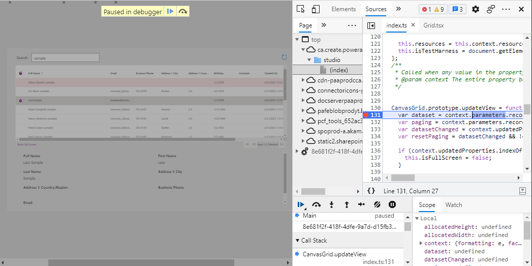
Add the following to the updateView method to track the state:
public updateView(context: ComponentFramework.Context<IInputs>): void {
const dataset = context.parameters.records;
const paging = context.parameters.records.paging;
const datasetChanged = context.updatedProperties.indexOf("dataset") > -1;
const resetPaging =
datasetChanged &&
!dataset.loading &&
!dataset.paging.hasPreviousPage &&
this.currentPage !== 1;
if (resetPaging) {
this.currentPage = 1;
}
Pass the callback and isFullScreen field to render in the Grid
Now you can pass the callback and isFullScreen field into the Grid rendering props:
ReactDOM.render(
React.createElement(Grid, {
width: allocatedWidth,
height: allocatedHeight,
columns: dataset.columns,
records: this.records,
sortedRecordIds: this.sortedRecordsIds,
hasNextPage: paging.hasNextPage,
hasPreviousPage: paging.hasPreviousPage,
currentPage: this.currentPage,
totalResultCount: paging.totalResultCount,
sorting: dataset.sorting,
filtering: dataset.filtering && dataset.filtering.getFilter(),
resources: this.resources,
itemsLoading: dataset.loading,
highlightValue: this.context.parameters.HighlightValue.raw,
highlightColor: this.context.parameters.HighlightColor.raw,
setSelectedRecords: this.setSelectedRecords,
onNavigate: this.onNavigate,
onSort: this.onSort,
onFilter: this.onFilter,
loadFirstPage: this.loadFirstPage,
loadNextPage: this.loadNextPage,
loadPreviousPage: this.loadPreviousPage,
}),
this.container
);
Highlighting rows
Now you're ready to add the conditional row highlighting functionality. You've already defined the HighlightValue and HighlightColor input properties, and the HighlightIndicator property-set. The property-set allows the maker to choose a field to use to compare with the value they provide in HighlightValue.
Import types to support highlighting
Custom row rendering in the DetailsList requires some additional imports. There are already some types from @fluentui/react/lib/DetailsList, so add IDetailsListProps, IDetailsRowStyles and DetailsRow to that import statement in Grid.tsx:
import {
DetailsList,
ConstrainMode,
DetailsListLayoutMode,
IColumn,
IDetailsHeaderProps
} from '@fluentui/react/lib/DetailsList';
Now, create the custom row renderer by adding the following just below the const rootContainerStyle block:
const onRenderRow: IDetailsListProps['onRenderRow'] = (props) => {
const customStyles: Partial<IDetailsRowStyles> = {};
if (props && props.item) {
const item = props.item as DataSet | undefined;
if (highlightColor && highlightValue && item?.getValue('HighlightIndicator') == highlightValue) {
customStyles.root = { backgroundColor: highlightColor };
}
return <DetailsRow {...props} styles={customStyles} />;
}
return null;
};
You'll see that:
- You can retrieve the value of the field chosen by the maker via the
HighlightIndicatoralias using:
item?.getValue('HighlightIndicator'). - When the value of the
HighlightIndicatorfield matches the value of thehighlightValueprovided by the input property on the code component, you can add a background color to the row. - The
DetailsRowcomponent is used by theDetailsListto render the columns you defined. You don't need to change the behavior other than the background color.
Add additional props to support highlighting
Add some additional props for highlightColor and highlightValue that will be provided by the rendering inside updateView. You've already added to the GridProps interface, so you just need to add them to the props destructuring:
export const Grid = React.memo((props: GridProps) => {
const {
records,
sortedRecordIds,
columns,
width,
height,
hasNextPage,
hasPreviousPage,
sorting,
filtering,
currentPage,
itemsLoading,
setSelectedRecords,
onNavigate,
onSort,
onFilter,
resources,
loadFirstPage,
loadNextPage,
loadPreviousPage,
onFullScreen,
isFullScreen,
} = props;
Add the onRenderRow method to the DetailsList
Pass the onRenderRow method into the DetailsList props:
<DetailsList
   columns={gridColumns}
   onRenderItemColumn={onRenderItemColumn}
   onRenderDetailsHeader={onRenderDetailsHeader}
   items={items}
   setKey={`set${currentPage}`} // Ensures that the selection is reset when paging
   initialFocusedIndex={0}
   checkButtonAriaLabel="select row"
   layoutMode={DetailsListLayoutMode.fixedColumns}
   constrainMode={ConstrainMode.unconstrained}
   selection={selection}
   onItemInvoked={onNavigate}
></DetailsList>
Deploy and configure the component
Now that you've implemented all the features, you must deploy the code component to Microsoft Dataverse for testing.
Inside your Dataverse environment, ensure there's a publisher created with a prefix of
samples: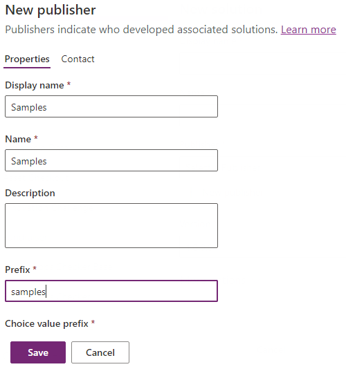
This could also be your own publisher, provided you update the publisher prefix parameter in the call to pac pcf push below. More information: Create a solution publisher.
Once you've saved the publisher, you're ready to authorize the CLI against your environment so that we can push the compiled code component. At the command-line, use:
pac auth create --url https://myorg.crm.dynamics.comReplace
myorg.crm.dynamics.comwith the URL of your own Dataverse environment. Sign in with an administrator/customizer user when prompted. The privileges provided by these user roles are needed to deploy any code components to Dataverse.To deploy your code component, use:
pac pcf push --publisher-prefix samplesNote
If you receive the error,
Missing required tool: MSBuild.exe/dotnet.exe. Please add MSBuild.exe/dotnet.exe in Path environment variable or use 'Developer Command Prompt for VS, you must install either Visual Studio 2019 for Windows & Mac or Build Tools for Visual Studio 2019, being sure to select the '.NET build tools' workload as described in the prerequisites.Once completed, this process will have created a small temporary solution named PowerAppTools_samples in your environment, and the
CanvasGridcode component will be added to this solution. You can move the code component into your own solution later if necessary. More information: Code Component Application Lifecycle Management (ALM).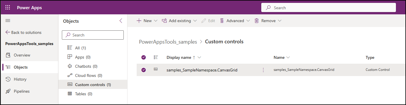
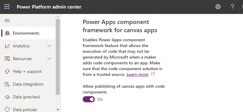
To use code components inside canvas apps, you must enable the Power Apps component framework for canvas apps on the environment you're using.
a. Open the Admin center (admin.powerplatform.microsoft.com) and navigate to your environment. b. Navigate to Settings > Product > Features . Ensure Power Apps component framework for canvas apps is turned On:
Create a new canvas app using the Tablet layout.
From the Insert panel, select Get more components.
Select the Code tab on the Import components pane.
Select the
CanvasGridcomponent.Select Import. The code component will now appear under Code components on the Insert panel.
Drag the
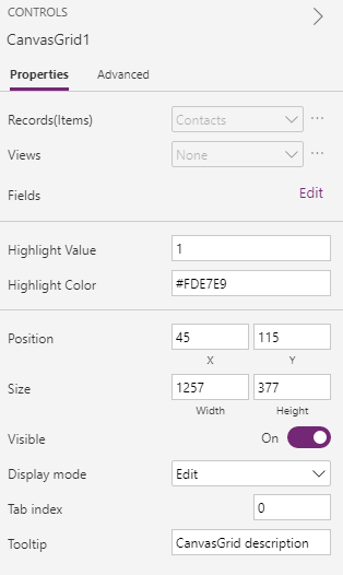
CanvasGridcomponent onto the screen and bind to theContactstable in Microsoft Dataverse.Set the following properties on the
CanvasGridcode component using the properties panel:- Highlight Value =
1- This is the value thatstatecodehas when the record is inactive. - Highlight Color =
#FDE7E9- This is the color to use when the record is inactive. HighlightIndicator="statecode"- This is the field to compare against. This will be on the Advanced panel in the DATA section.
- Highlight Value =
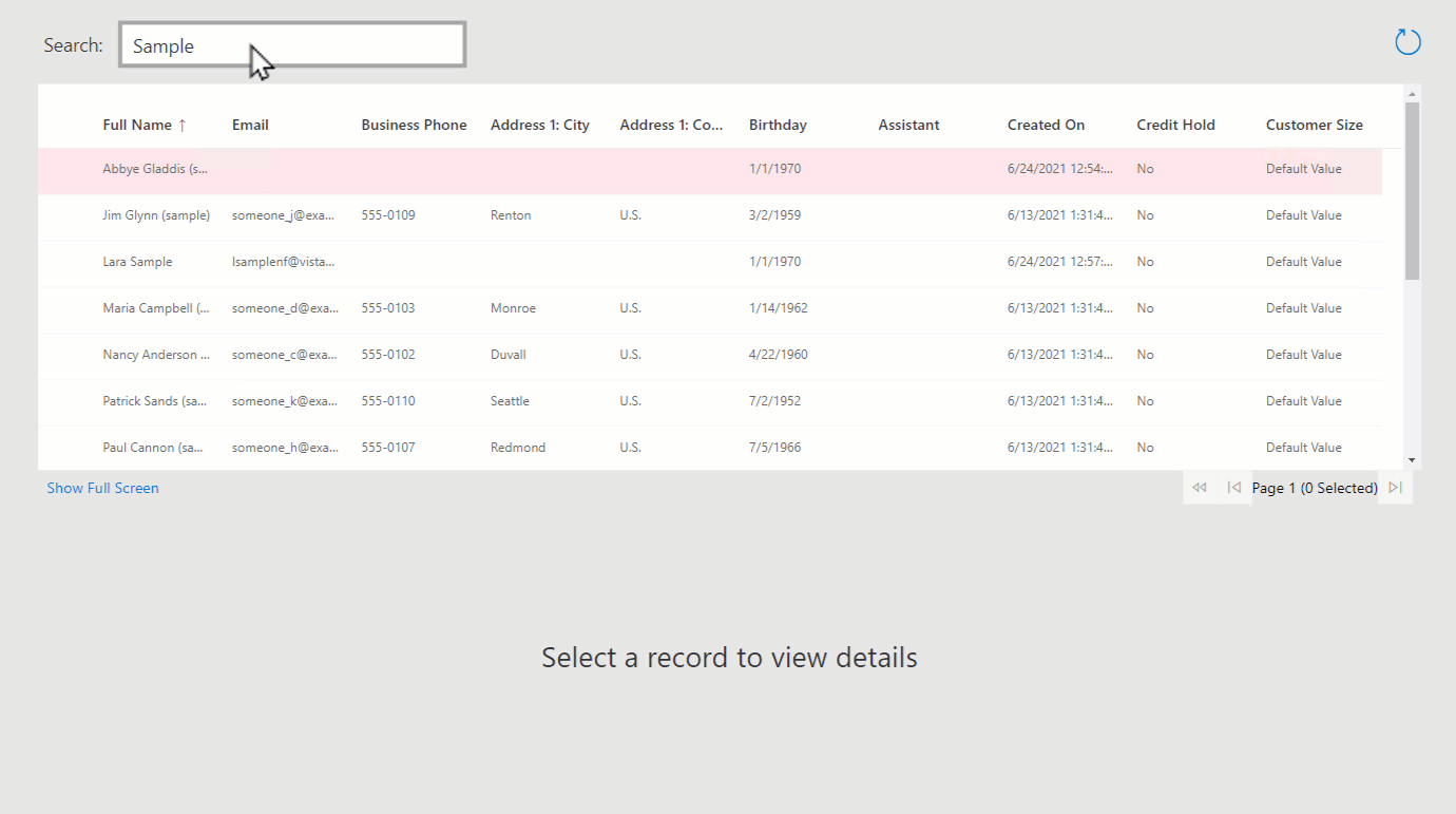
Add a new
TextInputcomponent and name ittxtSearch.Update the
CanvasGrid.Itemsproperty to beSearch(Contacts,txtSearch.Text,"fullname").As you type in the Text Input, you'll see that the contacts are filtered in the grid.
Add a new Text label and set the text to be "No records found". Position the label on top of the Canvas Grid.
Set the Visible property of the Text label to be
CanvasGrid1.FilteredRecordCount=0.
This means that when there are no records matching the txtSearch value, or if a column filter is applied using the context menu that returns no records (for example, Full Name does not contain data), the label will be displayed.
Add a Display Form (from the Input group in the Insert panel).
Set the form
DataSourceto theContactstable and add some form fields.Set the form
Itemproperty toCanvasGrid1.Selected.You should now see that when you select items on the grid, the form displays the item selected.
Add a new Screen to the canvas app called
scrDetails.Copy the form from the previous screen and paste it onto the new screen.
Set the
CanvasGrid1.OnSelectproperty to beNavigate(scrDetails).When you invoke the grid row select action, you should now see that the app navigates to the second screen with the item selected.
Debugging after deploying
You can easily debug your code component while it's running inside the canvas app by opening Developer Tools using Ctrl+Shift+I.
Select Ctrl+P and type Grid.tsx or Index.ts. You can then set a break point and step through your code.
If you need to make further changes to your component, you don't need to deploy each time. Instead, use the technique described in Debug code components to create a Fiddler AutoResponder to load the file from your local file system while npm start watch is running.
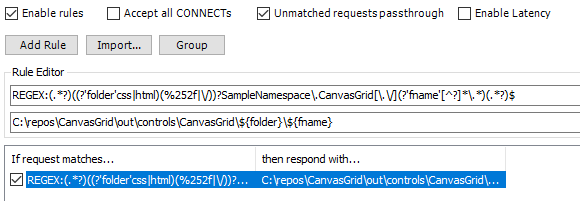
The AutoResponder would look similar to the following:
REGEX:(.*?)((?'folder'css|html)(%252f|\/))?SampleNamespace\.CanvasGrid[\.\/](?'fname'[^?]*\.*)(.*?)$
C:\repos\CanvasGrid\out\controls\CanvasGrid\${folder}\${fname}
You'll also need to enable the filters to add the Access-Control-Allow-Origin header. More information: Debugging after deploying into Microsoft Dataverse.
You'll need to Empty cache and hard refresh on your browser session for the AutoResponder file to be picked up. Once loaded, you can simply refresh the browser since Fiddler will add a cache control header to the file to prevent it from being cached.
Once you're happy with your changes, you can increment the patch version in the manifest, and then redeploy using pac pcf push.
So far, you've deployed a development build, which is not optimized and will run slower at runtime. You can choose to deploy an optimized build using pac pcf push by editing the CanvasGrid.pcfproj. Underneath the OutputPath, add the following: <PcfBuildMode>production</PcfBuildMode>
  <PropertyGroup>
    <Name>CanvasGrid</Name>
    <ProjectGuid>a670bba8-e0ae-49ed-8cd2-73917bace346</ProjectGuid>
    <OutputPath>$(MSBuildThisFileDirectory)out\controls</OutputPath>
  </PropertyGroup>
Related articles
Application lifecycle management (ALM) with Microsoft Power Platform
Power Apps component framework API reference
Create your first component
Debug code components