Note
Access to this page requires authorization. You can try signing in or changing directories.
Access to this page requires authorization. You can try changing directories.
This article describes the classic form editor. We recommend that you u se the modern form designer to add and edit tabs for your model-driven app forms. More information: Add, configure, move, or delete tabs on a form
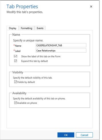
These are the properties available to configure when using a tab on a form using the classic form designer. The following table shows properties that you can set for tabs on the form:
| Tab | Property | Description |
|---|---|---|
| Display | Name | Required: The unique name for the tab that is used when referencing it in scripts. The name can contain only alphanumeric characters and underscores. |
| Label | Required: The localizable label for the tab visible to users. | |
| Show the label of this tab on the Form | When the label is displayed people can select it to toggle whether the tab is expanded or collapsed. Choose whether you want to show the label. | |
| Expand this tab by default | The tab state can toggle between expanded or collapsed using form scripts or by people selecting the label. Choose the default state for the tab. | |
| Visible by default | Showing the tab is optional and can be controlled using scripts. Choose whether to make the tab visible. More information: Visibility options | |
| Availability | Choose if you want the tab to be available on the phone. | |
| Formatting | Layout | Tabs may have up to three columns. Use these options to set the number of tabs and what percentage of the total width they should fill. |
| Events | Form Libraries | Specify any JavaScript web resources that will be used in the tab TabStateChange event handler. |
| Event Handlers | Configure the functions from the libraries that should be called for the tab TabStateChange event. More information: Configure Event Handlers |
