Note
Access to this page requires authorization. You can try signing in or changing directories.
Access to this page requires authorization. You can try changing directories.
Creating and publishing a UI elements collection is possible through the flow designer of any desktop flow, existing or new. In the UI elements pane, there are now two different tabs available, Flow repository and Collections.

The Flow repository tab contains all the UI elements that are available only to that particular desktop flow. Desktop flows created using version 2.42 or earlier, which include UI elements, show these elements within the Flow repository tab after upgrading to version 2.43 or higher, if these flows are part of a schema v2 environment.
Note
The UI elements collections is a premium feature, available only to organization premium or trial users. Users with a work or school account or a free Microsoft account do not have access to UI elements collections.
To create a new collection of UI elements, the UI elements need to be captured first in the desktop flow, added by default under the Flow repository tab. The tree structure here remains the same. The desktop where the elements were captured appears on top, followed by the web pages or desktop application screens containing the elements, followed by the individual UI elements themselves.
Note
Any new UI element that is captured via the button Add UI element is automatically added under the Flow repository tab. You can't add a new UI element directly into a collection.
Marking multiple UI elements as checked
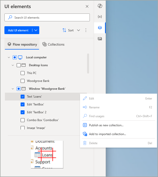
Every item in this tree structure comes with a checkbox, which is checked when that item is selected. Selecting a desktop such as Local computer also checks all its contained screens/web pages and UI elements. Similarly, selecting a screen or web page also checks all its related UI elements. This works in the opposite way as well. Checking all the UI elements under a screen/web page also checks the latter. The same behavior applies to screens/web pages and their desktop respectively.
There can only be one selected (highlighted) item at a time, even if more items are checked (either automatically when these items are related to the selected one in the elements structure, or manually when multiple items are checked directly via their checkbox). In the context menu of a selected item, the options 'Edit', 'Rename', 'Find usages' and 'Delete' are individual and apply only to the selected item. However, if more, unrelated items are checked, these options are disabled to prevent any ambiguity regarding which item they target.

Publish a new UI elements collection
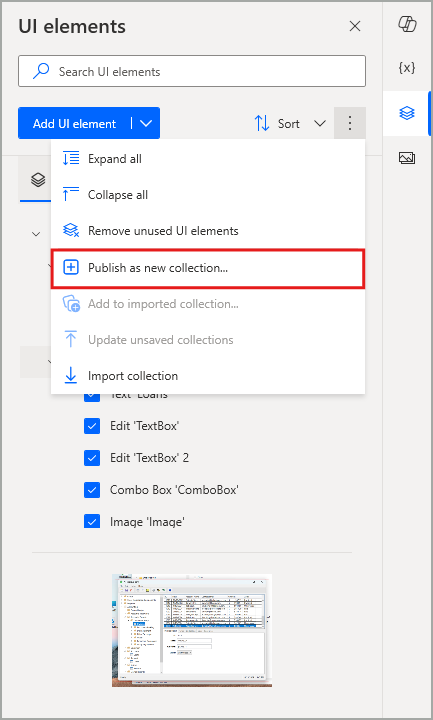
After you check the UI elements you need to include in a new collection, you can select the option Publish as new collection. This can be done through the main context menu located at the upper right of the UI elements pane or by using the context menu for the currently active (highlighted) element.

Note
The collection related options in the items' context menus apply to all checked UI elements and screens/web pages.
Important
If you check screens/web pages and UI elements that belong to different desktops at the same time, the option Publish as new collection is disabled. To create a new collection, all its UI elements need to be captured in the same desktop (Local computer, RDP, or Citrix).
Selecting this option opens a confirmation dialog, where you can provide a name for the new collection. If you associated any or all of the selected UI elements with UI or web automation actions in your desktop flow, you can also check the 'Auto-update' option below the collection name field. This automatically updates the related actions, ensuring they reference the newly established counterparts in the collection, rather than the UI elements previously accessible only within this flow.

When you select Publish, the popup dialog enters a Publishing state, during which the collection is saved and uploaded in Dataverse to become available in the specific environment. While publishing takes place, the UI of the dialog remains disabled. If the same name of another existing collection is used, an error occurs and you have to provide a new one.
When the collection is successfully published in this way, a corresponding success banner appears in the UI elements pane to inform you accordingly. In addition, if you look at the Collections tab, that collection is now automatically imported into this flow from which it was created. More precisely, it's imported by default into the same desktop (for instance Local computer or Remote desktop) in which the collection's UI elements were originally captured. This step is automatically completed for you, so you don't have to manually import each new collection you create into the same flow it was generated from.

Note
Picking some UI elements to create a new collection effectively copies (rather than moving) those elements from the context of a single flow to the collection entity, which can then be shared and reused in other flows. While the new collection now appears in the Collections tab, the flow's original UI elements are also still available in the Flow repository tab. If the latter are no longer needed and used in the current flow, you can always use the option Remove unused UI elements in the UI elements pane's main context menu.
Important
A collection can only include screens/web pages and their UI elements, not the desktop in which they were captured. This accommodates using the same collection for a target application, independently of whether it's installed in the local computer for some makers, or in a remote desktop for others. The collection would be imported under the proper desktop in each maker's separate flow.
In the Collections tab, as shown in the prior screenshot, the tree structure of the items therein now consists of four levels:
- The desktop in which the collection is imported
- The imported collection
- The screens/web pages included in the collection
- The UI elements included in the collection
Note
If needed, you can check multiple UI elements of one or more collections in the Collections tab to create and publish yet another, new collection, following the same steps that were explained earlier. In this scenario, auto-updating will still adjust any affected actions, so they reference the UI elements of the new collection instead of the existing one(s).
After you publish a new collection, the desktop flow needs to be saved to confirm the import of that collection, as this is considered an unsaved change for the flow. However, even if the flow isn't saved, the collection still remains published and available in the environment, so that it can be used in other flows.
Known limitations
- When selected to create a new collection, individual screens and web pages always carry over their child UI elements with them, as the latter are automatically checked.
Next steps
Manage UI elements collections