Use the Analyze feature to explain fluctuations in report visuals (Preview)
APPLIES TO: ![]() Power BI service for business users
Power BI service for business users ![]() Power BI service for designers & developers
Power BI service for designers & developers ![]() Power BI Desktop
Power BI Desktop ![]() Requires Pro or Premium license
Requires Pro or Premium license
When there are large increases and sharp drops in values on report visuals, you might wonder about the cause of such fluctuations. With Analyze in the Power BI service, you can easily find the reason.
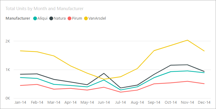
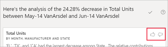
For example, consider the following visual that shows Total units by Month and Manufacturer. VanArsdel is outperforming its competitors but has a deep dip in June 2014. In such cases, you can explore the data and help explain the change that occurred.
You can ask the Power BI service to explain increases, decreases, or unusual distributions in visuals, and get fast, automated, insightful analysis about your data. Right-click on a data point, select Analyze > Explain the decrease (or increase if the previous bar was lower), or Analyze > Find where this distribution is different. Then the insight is displayed in an easy-to-use window.
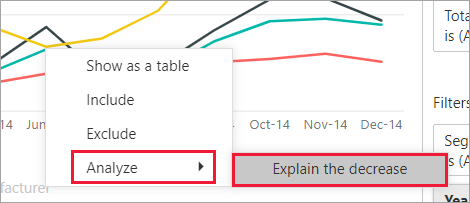
The Analyze feature is contextual, and is based on the immediately previous data point—such as the previous bar or column.
Note
This feature is in preview, and is subject to change. The insight feature is enabled and on by default (you don't need to check a Preview box to enable it).
Which factors and categories are chosen
After Power BI examines different columns, the factors that show the biggest change to relative contribution display. For each, the values that have the most significant change to contribution are called out in the description. In addition, the values that have the largest actual increases and decreases are also called out.
To see all of the insights generated by Power BI, use the scrollbar. The order is ranked with the most significant contributor displayed first.
Using insights
To use insights to explain trends seen on visuals, right-click on any data point in a bar or line chart and select Analyze. Then choose an option that appears: explain the increase, explain the decrease, or explain the difference.
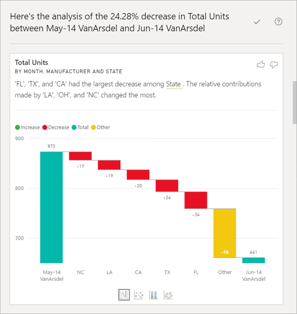
Power BI then runs its machine learning algorithms over the data and populates a window with a visual and a description. The description details which categories most influenced the increase, decrease, or difference. In the following example, the first insight is a waterfall chart.
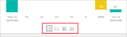
To have insights display a scatter chart, stacked column chart, or ribbon chart, select the small icons at the bottom of the waterfall visual.
Use the thumbs up and thumbs down icons at the top of the page to provide feedback about the visual and the feature.
You can use insights when your report is in Reading or Editing view. It's versatile for analyzing data and creating visuals you can easily add to your reports. If the report is open in Editing view, you see a plus icon next to the thumb icons. Select the plus icon to add the insight to your report as a new visual.

Details of the results returned
The details returned by insights are intended to highlight the differences between the two time periods to help you understand the change between them.
You can think of the algorithm like this—it takes all the other columns in the model and calculates the breakdown by that column (for the before and after time periods) to determine how much change occurred in that breakdown. Then returns those columns with the biggest change. In the previous example, State is selected in the waterfall insight, as the contribution made by Louisiana, Texas, and California fell from 13% to 19% from June to July. This change contributed the most to the decrease in Total units.
For each insight returned, there are four visuals that can be displayed. Three of those visuals are intended to highlight the change in contribution between the two periods, such as the explanation of the increase from Qtr 2 to Qtr 3. The ribbon chart shows change both before and after the selected data point.
The scatter plot
![]()
The scatter plot visual shows the value of the measure in the first period (x-axis) against the value of the measure in the second period (y-axis) for each value of the column (State in this case). Data points are in the green region if they increased and in the red region if they decreased.
The dotted line shows the best fit, and data points above this line increased by more than the overall trend and those below this line by less.
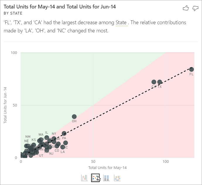
Data items whose value was blank in either period don't appear on the scatter plot.
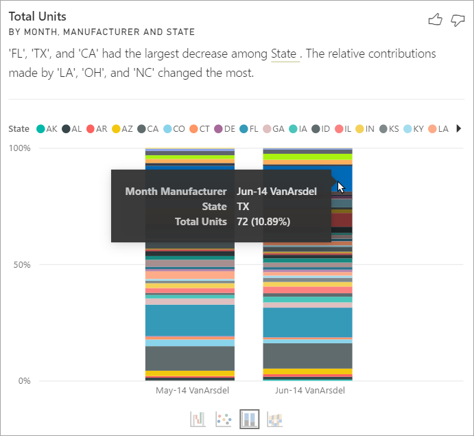
The 100% stacked column chart
![]()
The 100% stacked column chart visual shows the value of the contribution to the total (100%) for the selected data point and the previous. This view allows side-by-side comparison of the contribution for each data point. In the following example, tooltips shows the actual contribution for the selected value of Texas. Because the list of states is long, tooltips helps you see the details. With the use of tooltips, you see that Texas contributed about the same percent to the total units (31% and 32%), but the actual number of total units decreased from 89 to 71. Remember, the Y axis is a percentage, not a total, and each column band is a percentage, not a value.
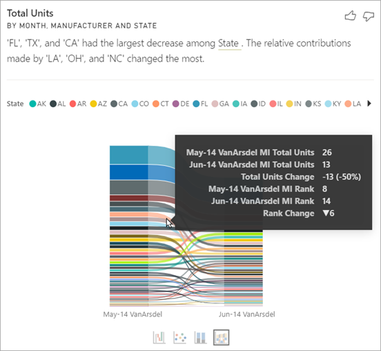
The ribbon chart
![]()
The ribbon chart visual shows the value of the measure before and after. It helps show the changes in contributions when the ordering of contributors changed (for example, LA dropped from number two contributor to number 11). TX is represented by a wide ribbon at the top, signifying that it's the most significant contributor before and after. The drop shows that the value of the contribution dropped both during the selected period and after.
The waterfall chart
![]()
The fourth visual is a waterfall chart, showing actual increases or decreases between the periods. This visual clearly shows one significant contributor to the decrease for June 2014—in this case, State. And the particulars of State's influence on total units are that declines in Louisiana, Texas, and Colorado played the most significant role.
Considerations and limitations
Since these insights are based on the change from the previous data point, they aren't available when you select the first data point in a visual.
The Analyze feature isn't available for all visual types.
The following list is the collection of currently unsupported scenarios for the Analyze feature (Explain the increase, Explain the decrease, Find where the distribution is different):
- TopN filters
- Include or exclude filters.
- Measure filters
- Non-numeric measures
- Use of "Show value as."
- Filtered measures. Filtered measures are visual level calculations with a specific filter applied (for example, Total Sales for France) and are used on some of the visuals created by the insights feature.
- Categorical columns on X-axis unless it defines a sort by column that is scalar. If using a hierarchy, then every column in the active hierarchy has to match this condition.
- RLS (Row Level Security) or DirectQuery enabled data models